It’s time to get our hands dirty with some survival analysis! In this post, I’ll explore reliability modeling techniques that are applicable to Class III medical device testing. My goal is to expand on what I’ve been learning about GLM’s and get comfortable fitting data to Weibull distributions. I don’t have a ton of experience with Weibull analysis so I’ll be taking this opportunity to ask questions, probe assumptions, run simulations, explore different libraries, and develop some intuition about what to expect. I will look at the problem from both a frequentist and Bayesian perspective and explore censored and un-censored data types. Fair warning - expect the workflow to be less linear than normal to allow for these excursions.
First - a bit of background. FDA expects data supporting the durability of implantable devices over a specified service life. Engineers develop and execute benchtop tests that accelerate the cyclic stresses and strains, typically by increasing the frequency. Such a test is shown here for a coronary stent:1

The most common experimental design for this type of testing is to treat the data as attribute i.e. pass/fail by recording whether or not each test article fractured or not after some pre-determined duration t. By treating each tested device as a Bernoulli trial, a 1-sided confidence interval can be established on the reliability of the population based on the binomial distribution. This approach is not optimal however since it is generally only practical when all tested units pass the test and even then the sample size requirement are quite restricting. Additionally, designers cannot establish any sort of safety margin or understand the failure mode(s) of the design. We can do better by borrowing reliability techniques from other engineering domains where tests are run to failure and modeled as events vs. time. Such data often follows a Weibull distribution which is flexible enough to accommodate many different failure rates and patterns.
- Part 1 - Fitting Models to Weibull Data Without Censoring [Frequentist Perspective]
- Part 2 - Fitting Models to Weibull Data Without Censoring [Bayesian Perspective]
- Part 3 - Fitting Models to Weibull Data with Right-Censoring [Frequentist Perspective]
- Part 4 - Fitting Models to Weibull Data with Right-Censoring [Bayesian Perspective]
- Wrap-up
- APPENDIX - Prior Predictive Simulation - BEWARE it’s ugly in here
library(patchwork)
library(skimr)
library(ggrepel)
library(tidyverse)
library(knitr)
library(rayshader)
library(fitdistrplus)
library(tidymodels)
library(tidybayes)
library(ggridges)
library(ggExtra)
library(brms)
Part 1 - Fitting Models to Weibull Data Without Censoring [Frequentist Perspective]
- Tools: fitdist() function form fitdistrplus package
- Goal: Obtain maximum likelihood point estimate of shape and scale parameters from best fitting Weibull distribution
In the following section I work with test data representing the number of days a set of devices were on test before failure.2 Each day on test represents 1 month in service. All devices were tested until failure (no censored data). To start, I’ll read in the data and take a look at it. There are 100 data points, which is more than typically tested for stents or implants but is reasonable for electronic components. We’ll assume that domain knowledge indicates these data come from a process that can be well described by a Weibull distribution.
# Read data in and scan with skim()
data <- read.csv(file = "Example3.1Data.txt", header = FALSE) %>% as_tibble()
data_tbl <- data %>% rename(fatigue_duration = V1)

data_tbl %>% skim()
## Skim summary statistics
## n obs: 100
## n variables: 1
##
## -- Variable type:integer --------------------------------------------------------------------------------------------------------------------
## variable missing complete n mean sd p0 p25 p50 p75
## fatigue_duration 0 100 100 89.44 51.42 5 51.75 79.5 119.5
## p100 hist
## 290 <U+2583><U+2587><U+2586><U+2583><U+2582><U+2581><U+2581><U+2581>data_tbl %>%
head(10) %>%
kable(align = rep("c", 1))| fatigue_duration |
|---|
| 75 |
| 28 |
| 52 |
| 67 |
| 78 |
| 5 |
| 46 |
| 132 |
| 169 |
| 97 |
Construct Weibull model from un-censored data using fitdistrplus
To start out with, let’s take a frequentist approach and fit a 2-parameter Weibull distribution to these data. Once the parameters of the best fitting Weibull distribution of determined, they can be used to make useful inferences and predictions.
I’ll use the fitdist() function from the fitdistrplus package to identify the best fit via maximum likelihood. The parameters we care about estimating are the shape and scale.
# Fit model and extract parameters of interest
mle_wieb_nocens_fit <- fitdist(data_tbl$fatigue_duration, "weibull")
weib_shape <- mle_wieb_nocens_fit$estimate["shape"]
weib_scale <- mle_wieb_nocens_fit$estimate["scale"]

# Summarize and plot
summary(mle_wieb_nocens_fit)
## Fitting of the distribution ' weibull ' by maximum likelihood
## Parameters :
## estimate Std. Error
## shape 1.832201 0.1401198
## scale 100.841802 5.8068570
## Loglikelihood: -526.2573 AIC: 1056.515 BIC: 1061.725
## Correlation matrix:
## shape scale
## shape 1.0000000 0.3186071
## scale 0.3186071 1.0000000plot(mle_wieb_nocens_fit)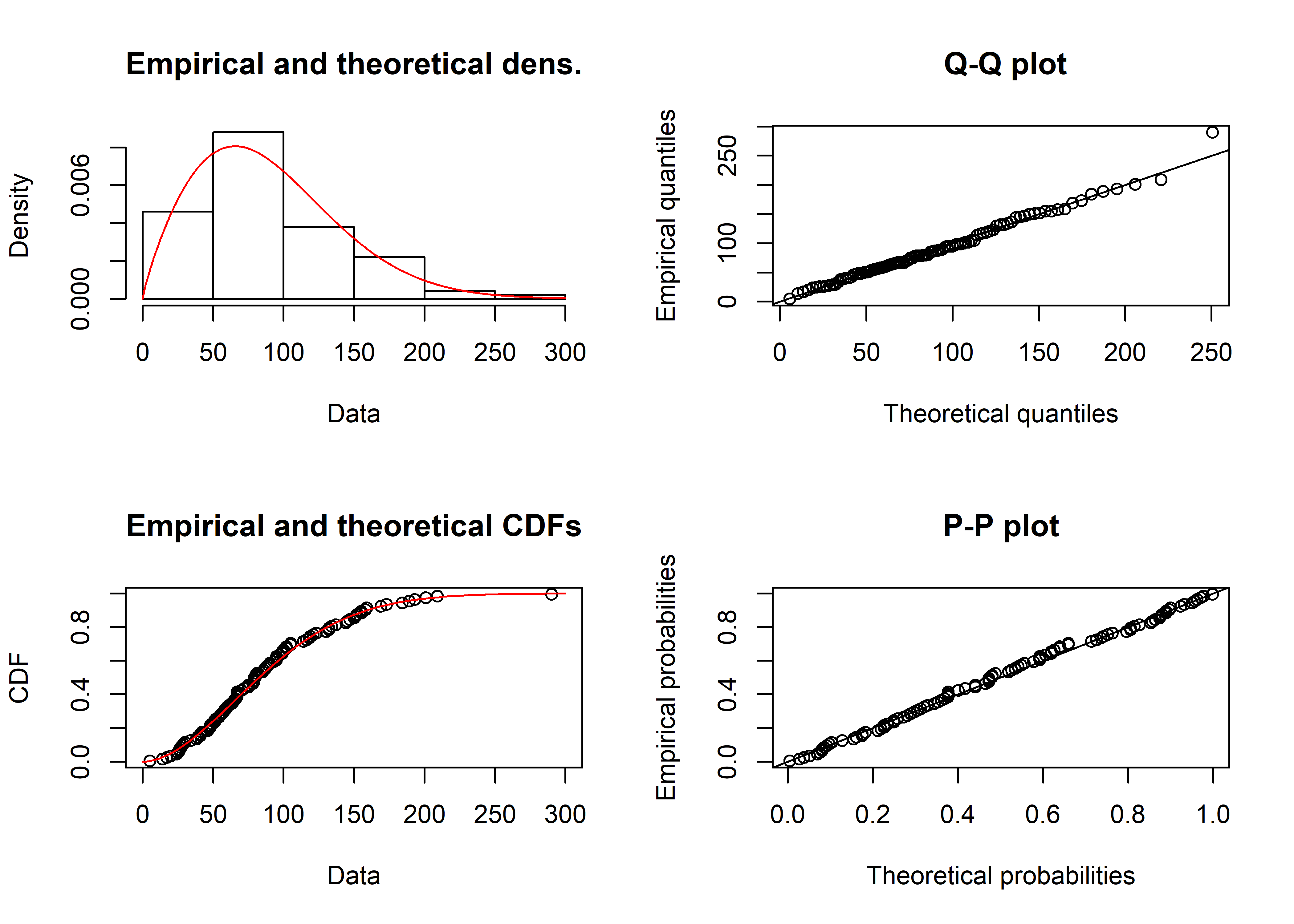 The Weibull isn’t the only possible distribution we could have fit. Lognormal and gamma are both known to model time-to-failure data well. They are shown below using the denscomp() function from fitdistrplus.
# Fit gamma model, extract shape, rate
mle_gamma_nocens_fit <- fitdist(data_tbl$fatigue_duration, "gamma")
gamma_shape <- mle_gamma_nocens_fit$estimate["shape"]
gamma_rate <- mle_gamma_nocens_fit$estimate["rate"]

# Fit lognormal model, extract mean, sd
mle_lognormal_nocens_fit <- fitdist(data_tbl$fatigue_duration, "lnorm")
lnorm_meanlog <- mle_lognormal_nocens_fit$estimate["meanlog"]
lnorm_sdlog <- mle_lognormal_nocens_fit$estimate["sdlog"]

# visualize in fitdistrplus
plot.legend <- c("gamma", "lognormal", "Weibull")
denscomp(list(mle_gamma_nocens_fit, mle_lognormal_nocens_fit, mle_wieb_nocens_fit), legendtext = plot.legend)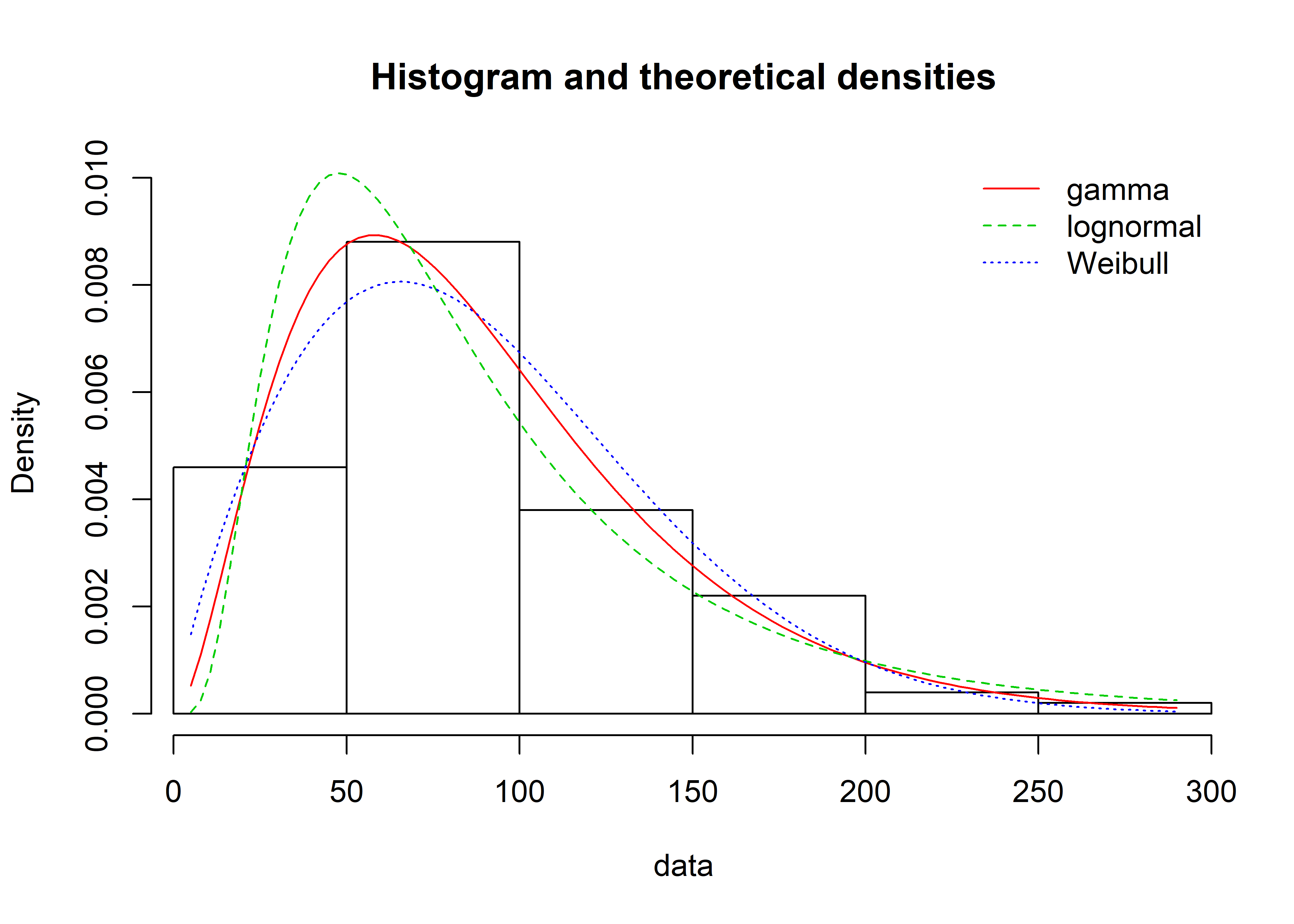
I recreate the above in ggplot2, for fun and practice.
x_series <- seq(0, 300, by = 1)
x_tbl <- tibble(x = x_series)


wide_densities_tbl <- x_tbl %>%
  mutate(
    Weibull = dweibull(x, shape = weib_shape, scale = weib_scale),
    gamma = dgamma(x, shape = gamma_shape, rate = gamma_rate),
    lognormal = dlnorm(x, meanlog = lnorm_meanlog, sdlog = lnorm_sdlog)
  ) %>%
  gather("distribution", "value", -x)

wide_densities_tbl %>% ggplot(aes(x = x)) +
  geom_line(aes(
    x = x,
    y = value,
    color = distribution,
    linetype = distribution
  ),
  size = .8
  ) +
  geom_histogram(
    data = data_tbl,
    aes(
      x = fatigue_duration,
      y = ..density..
    ),
    binwidth = 50,
    boundary = 300,
    color = "white",
    fill = "#2c3e50",
    alpha = .6
  ) +
  labs(
    x = "Time to Fatigue Failure Event (Days)",
    y = "Density",
    title = "Histogram and theoretical densities for Fatigue Data",
    subtitle = "Parametric fits using MLE via fitdist() function"
  ) +
  theme(legend.title = element_blank())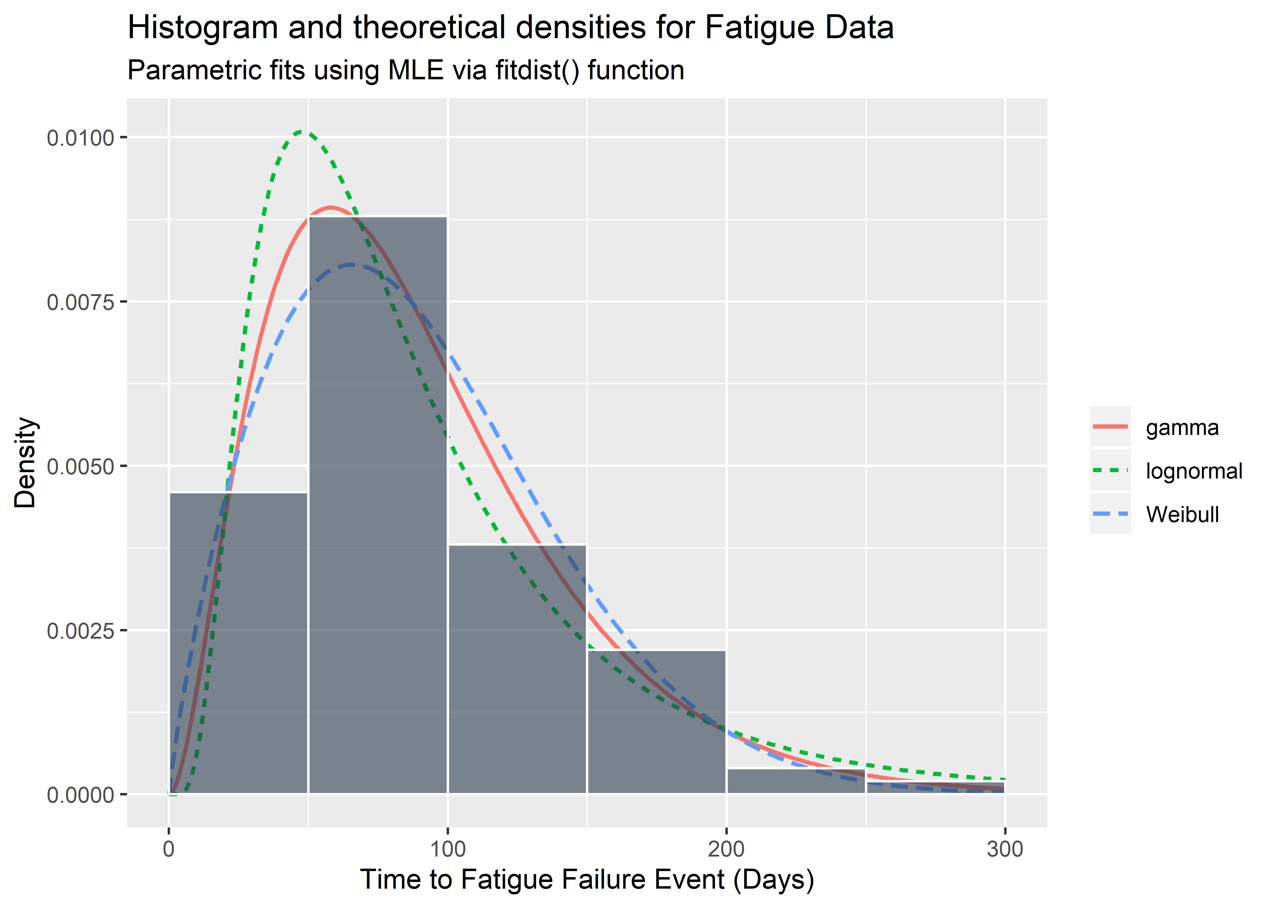
Goodness-of-fit statistics are available and shown below for reference. If available, we would prefer to use domain knowledge and experience to identify what the true distribution is instead of these statistics which are subject to sampling variation. It is not good practice to stare at the histogram and attempt to identify the distribution of the population from which it was drawn. Nevertheless, we might look at the statistics below if we had absolutely no idea the nature of the data generating process / test.
# get goodness-of-fit
gofstat(list(mle_wieb_nocens_fit, mle_gamma_nocens_fit, mle_lognormal_nocens_fit),
  fitnames = c("weib", "gamma", "lnorm")
)
## Goodness-of-fit statistics
## weib gamma lnorm
## Kolmogorov-Smirnov statistic 0.05066902 0.03643609 0.06948557
## Cramer-von Mises statistic 0.03408173 0.02106615 0.12076742
## Anderson-Darling statistic 0.21634543 0.17192106 0.81630880
##
## Goodness-of-fit criteria
## weib gamma lnorm
## Akaike's Information Criterion 1056.515 1056.408 1067.427
## Bayesian Information Criterion 1061.725 1061.618 1072.637Using the model to infer device reliability
The model by itself isn’t what we are after. It is the vehicle from which we can infer some very important information about the reliability of the implant design. First and foremost - we would be very interested in understanding the reliability of the device at a time of interest. For instance, suppose our voice of customer research indicates that our new generation of device needs to last 10 months in vivo to be safe and competitive. Recall that each day on test represents 1 month in service. Once we fit a Weibull model to the test data for our device, we can use the reliability function to calculate the probability of survival beyond time t.3
\[\text{R} (t | \beta, \eta) = e ^ {- \bigg (\frac{t}{\eta} \bigg ) ^ {\beta}}\]
Note:
t = the time of interest (for example, 10 years)
\(\beta\) = the Weibull scale parameter
\(\eta\) = the Weibull shape parameter
This looks a little nasty but it reads something like “the probability of a device surviving beyond time t conditional on parameters \(\beta\) and \(\eta\) is [some mathy function of t, \(\beta\) and \(\eta\)]. For the model we fit above using MLE, a point estimate of the reliability at t=10 years (per the above VoC) can be calculated with a simple 1-liner:
reliability_at_10 <- exp(-(10 / weib_scale)**(weib_shape))
reliability_at_10 %>%
  scales::percent() %>%
kable(align = "c")| x |
|---|
| 98.6% |
In this way we infer something important about the quality of the product by fitting a model from benchtop data.
It is common to report confidence intervals about the reliability estimate but this practice suffers many limitations. The intervals change with different stopping intentions and/or additional comparisons. They also do not represent true probabilistic distributions as our intuition expects them to and cannot be propagated through complex systems or simulations. What we’d really like is the posterior distribution for each of the parameters in the Weibull model, which provides all credible pairs of \(\beta\) and \(\eta\) that are supported by the data. For that, we need Bayesian methods which happen to also be more fun.
Part 2 - Fitting Models to Weibull Data Without Censoring [Bayesian Perspective]
- Tools: Grid Approximation [manual calculations]
- Goal: Approximate true posterior distributions for shape and scale via discretization of priors
Use grid approximation to estimate posterior
This problem is simple enough that we can apply grid approximation to obtain the posterior. In this method we feed in a sequence of candidate combinations for \(\beta\) and \(\eta\) and determine which pairs were most likely to give rise to the data. The likelihood is multiplied by the prior and converted to a probability for each set of candidate \(\beta\) and \(\eta\). Flat priors are used here for simplicity - I’ll put more effort into the priors later on in this post. Since the priors are flat, the posterior estimates should agree with the maximum likelihood point estimate.
Calculate posterior via grid approximation:4
# function to get log-likelihood of the data for a given shape & scale pair
grid_function <- function(shape, scale) {
  dweibull(data_tbl$fatigue_duration, shape = shape, scale = scale, log = T) %>%
    sum()
}

# set up grid of possible shape, scale parameters
n <- 100
shape_grid <- seq(1, 3, length.out = n)
scale_grid <- seq(60, 130, length.out = n)
two_param_grid <- expand_grid(shape_grid, scale_grid)

# map the grid_function over all candidate parameter pairs
# multiply LL by prior and convert to probability
full_tbl <- two_param_grid %>%
  mutate(log_likelihood = map2(shape_grid, scale_grid, grid_function)) %>%
  unnest() %>%
  mutate(
    shape_prior = 1,
    scale_prior = 1
  ) %>%
  mutate(product = log_likelihood + shape_prior + scale_prior) %>%
  mutate(probability = exp(product - max(product)))

full_tbl %>%
  head(10) %>%
kable(align = rep("c", 7))| shape_grid | scale_grid | log_likelihood | shape_prior | scale_prior | product | probability |
|---|---|---|---|---|---|---|
| 1 | 60.00000 | -558.5011 | 1 | 1 | -556.5011 | 0 |
| 1 | 60.70707 | -557.9365 | 1 | 1 | -555.9365 | 0 |
| 1 | 61.41414 | -557.3982 | 1 | 1 | -555.3982 | 0 |
| 1 | 62.12121 | -556.8853 | 1 | 1 | -554.8853 | 0 |
| 1 | 62.82828 | -556.3968 | 1 | 1 | -554.3968 | 0 |
| 1 | 63.53535 | -555.9317 | 1 | 1 | -553.9317 | 0 |
| 1 | 64.24242 | -555.4890 | 1 | 1 | -553.4890 | 0 |
| 1 | 64.94949 | -555.0680 | 1 | 1 | -553.0680 | 0 |
| 1 | 65.65657 | -554.6678 | 1 | 1 | -552.6678 | 0 |
| 1 | 66.36364 | -554.2875 | 1 | 1 | -552.2875 | 0 |
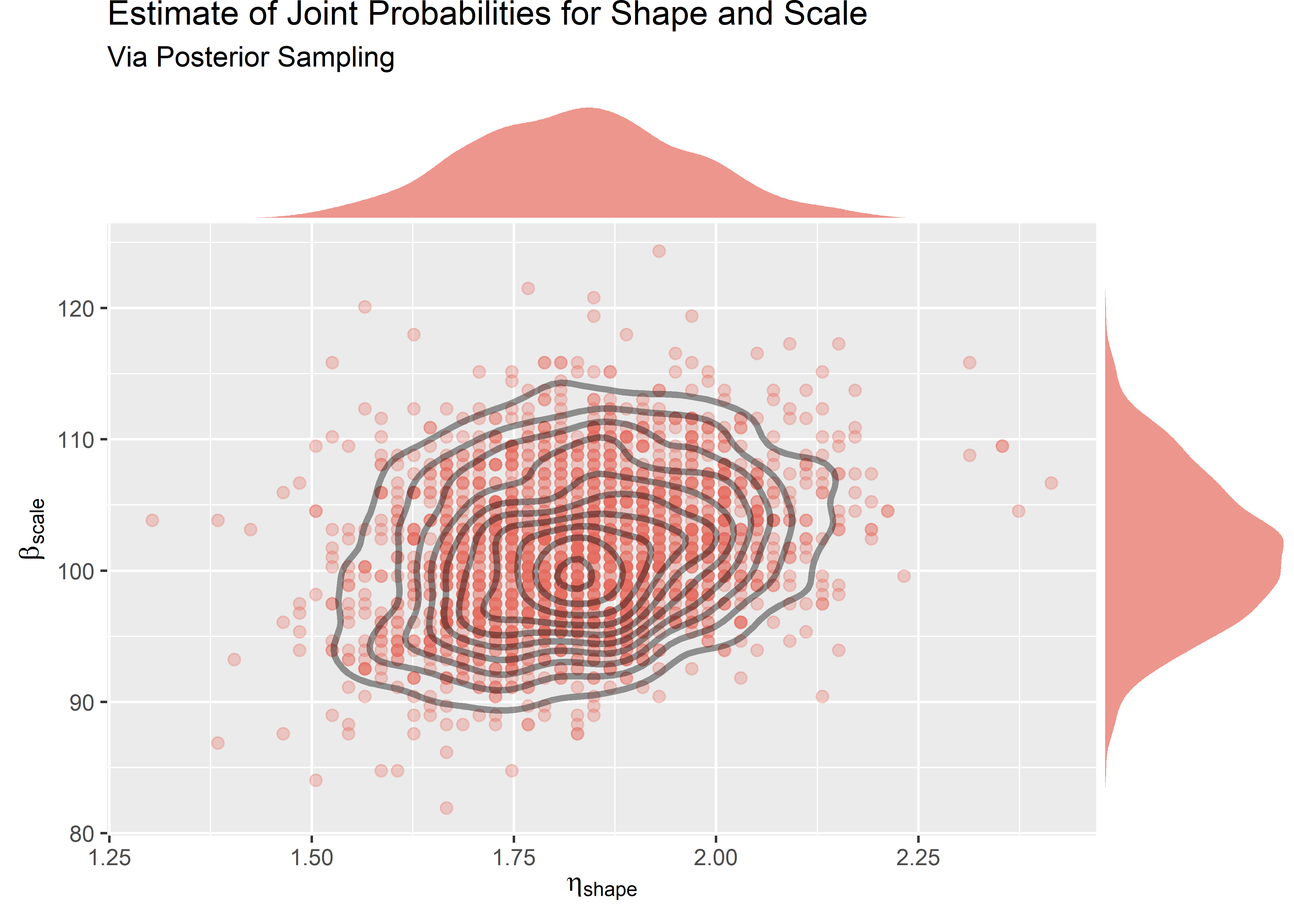
Plot the grid approximation of the posterior. If we super-impose our point estimate from Part 1, we see the maximum likelihood estimate agrees well with the mode of the joint posterior distributions for shape and scale.
# need this data to feed to gg_label_repel to tell it where to attach label
point_tbl <- tibble(x = weib_shape, y = weib_scale)

# visualize and compare to MLE
plt_1 <- full_tbl %>%
  ggplot(aes(x = shape_grid, y = scale_grid)) +
  geom_raster(aes(fill = probability),
    interpolate = T
  ) +
  geom_point(x = weib_shape, y = weib_scale, size = 1.3) +
  geom_label_repel(
    data = point_tbl, aes(x, y),
    label = "Maximum Likelihood Estimate \n[from Part 1]",
    fill = "#8bd646ff",
    color = "black",
    segment.color = "black",
    segment.size = 1,
    #                   min.segment.length = unit(1, "lines"),
    nudge_y = -16,
    nudge_x = .5
  ) +
  scale_fill_viridis_c() +
  labs(
    title = "Posterior for Weibull Shape and Scale Parameters",
    subtitle = "Calculated with Grid Approximation",
    x = expression(eta ["shape"]),
    y = expression(beta ["scale"])
  ) +
  theme(panel.grid = element_blank())

plt_1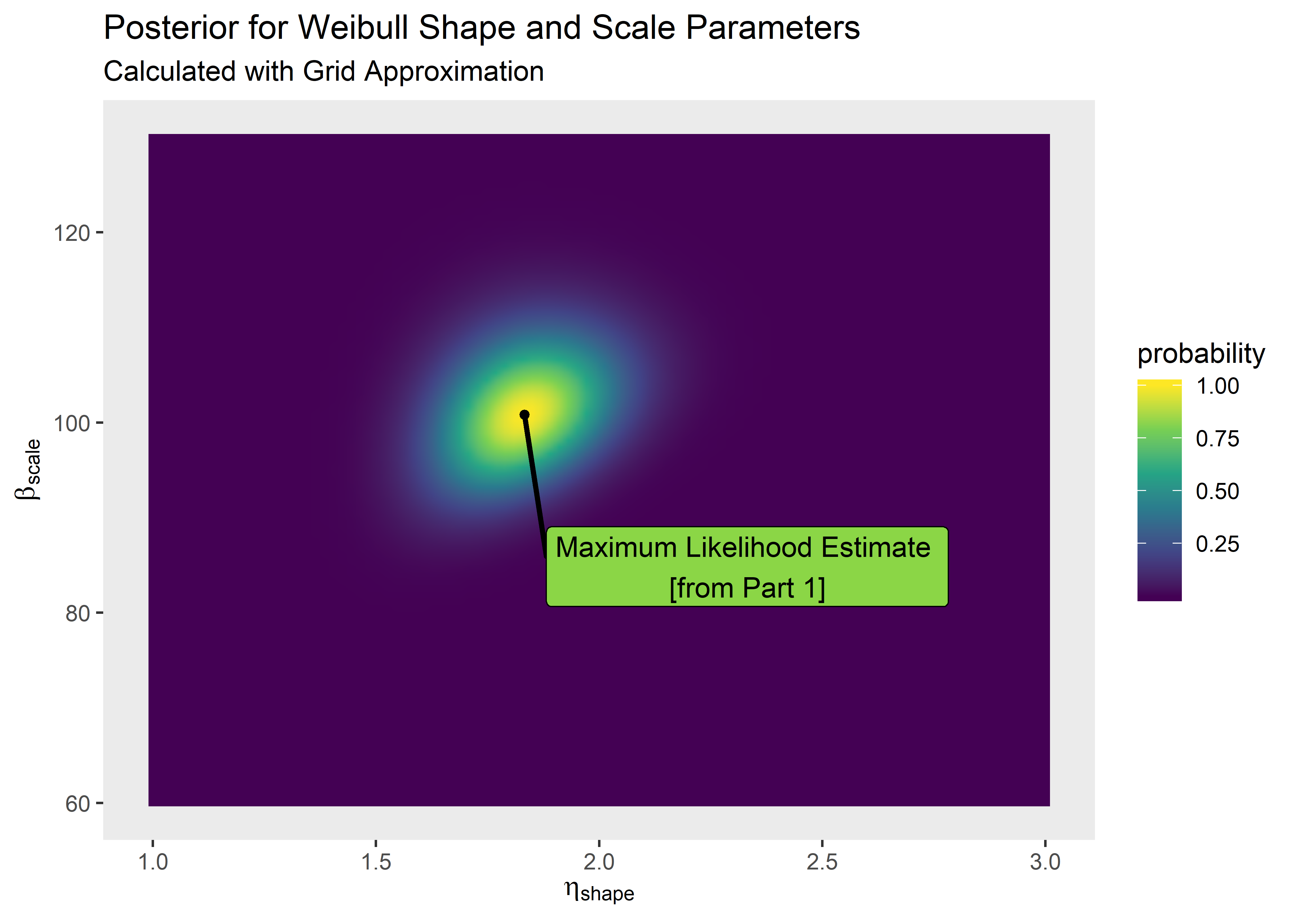
3d with rayshader just to flex :)
# par(mfrow = c(1, 1))
# plot_gg(plt_1, width = 5, height = 4, scale = 300, multicore = TRUE, windowsize = c(1200, 960),
#        fov = 70, zoom = 0.45, theta = 330, phi = 40)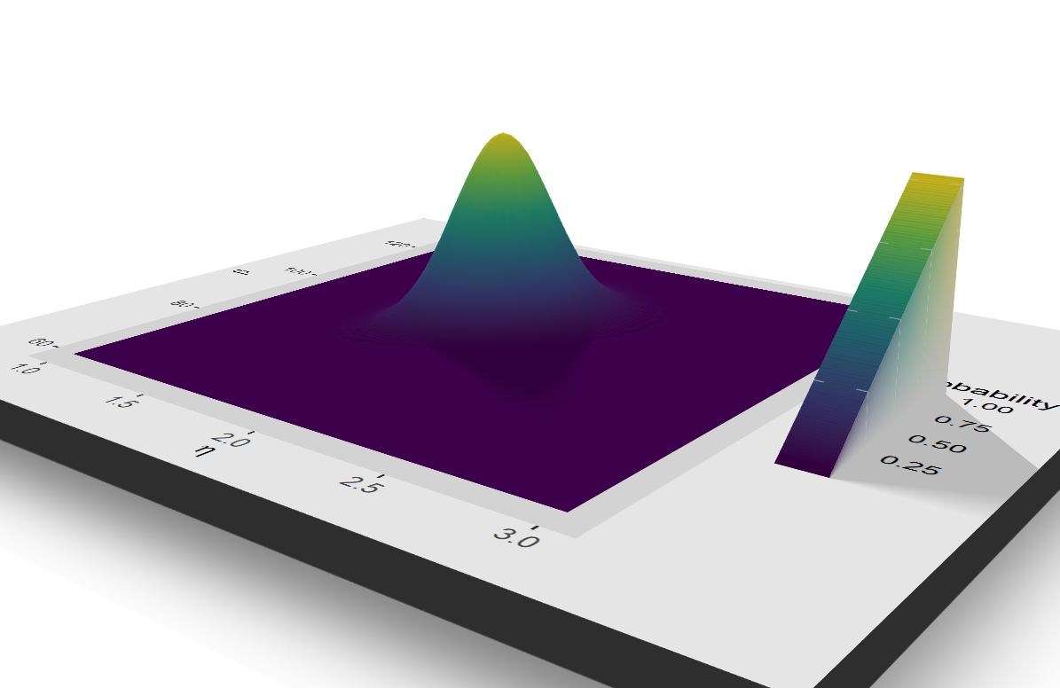
Visualize draws from the posterior
We can sample from the grid to get the same if we weight the draws by probability.
set.seed(2020)

# take a weighted sample from the posterior
grid_approx_posterior_samples <- full_tbl %>%
  sample_n(size = 2000, replace = T, weight = probability)

# visualize
grid_approx_plot <- grid_approx_posterior_samples %>%
  ggplot(aes(x = shape_grid, y = scale_grid)) +
  geom_point(
    colour = "#e56a5dff",
    size = 2,
    alpha = 0.3
  ) +
  labs(
    x = expression(eta ["shape"]),
    y = expression(beta ["scale"])
  ) +
  geom_density_2d(color = "black", size = 1.2, alpha = .4) +
  labs(
    title = "Estimate of Joint Probabilities for Shape and Scale",
    subtitle = "Via Posterior Sampling"
  )

grid_approx_marg_plot <- ggMarginal(grid_approx_plot,
  type = "density",
  color = "white",
  alpha = 0.7,
  fill = "#e56a5dff"
)
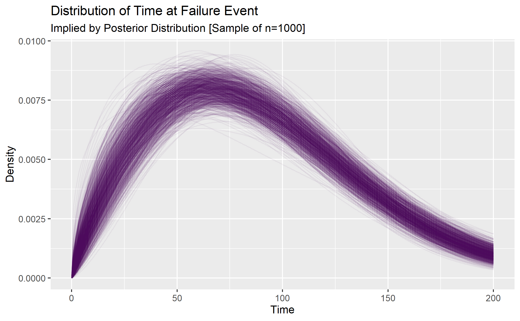
Uncertainty in the implied time-to-failure curves
Each of the credible parameter values implies a possible Weibull distribution of time-to-failure data from which a reliability estimate can be inferred. This is a good way to visualize the uncertainty in a way that makes intuitive sense.
# sample from posterior; weighted as prob
grid_approx_posterior_samples_4plot <- full_tbl %>%
  sample_n(size = 1000, replace = T, weight = probability) %>%
  select(shape_grid, scale_grid)

# plot 1000 Weibull curves from samples parameters
weib_uncertainty_plt <- grid_approx_posterior_samples_4plot %>%
  mutate(p_y_data = map2(
    shape_grid, scale_grid,
    ~ tibble(
      x = seq(0, 200, length.out = 400),
      y = dweibull(x, .x, .y)
    )
  )) %>%
  mutate(row_id = row_number()) %>%
  unnest(p_y_data) %>%
  ggplot(aes(x = x, y = y)) +
  geom_line(aes(group = row_id), alpha = .05, color = "#440154ff") +
  labs(
    x = "Time",
    y = "Density",
    title = "Distribution of Time at Failure Event",
    subtitle = "Implied by Posterior Distribution [Sample of n=1000]"
  )
Uncertainty in the implied reliabilty of the device
Any row-wise operations performed will retain the uncertainty in the posterior distribution. This allows for a straightforward computation of the range of credible reliabilities at t=10 via the reliability function.
# use params in posterior to calculate correstponding reliabilities at t=10
grid_approx_posterior_samples_4relplot <- full_tbl %>%
sample_n(size = 4000, replace = T, weight = probability) %>%
select(shape_grid, scale_grid) %>%
mutate(reliability_at_10 = exp(-(10 / scale_grid)**(shape_grid)))
# visualize reliability distribution
grid_approx_posterior_samples_4relplot %>%
ggplot(aes(reliability_at_10)) +
geom_histogram(aes(y = ..density..), fill = "#2c3e50", color = "white", alpha = .6) +
labs(
title = "Reliability Distribution",
subtitle = "Calculated from Grid Approximation with Flat Priors"
)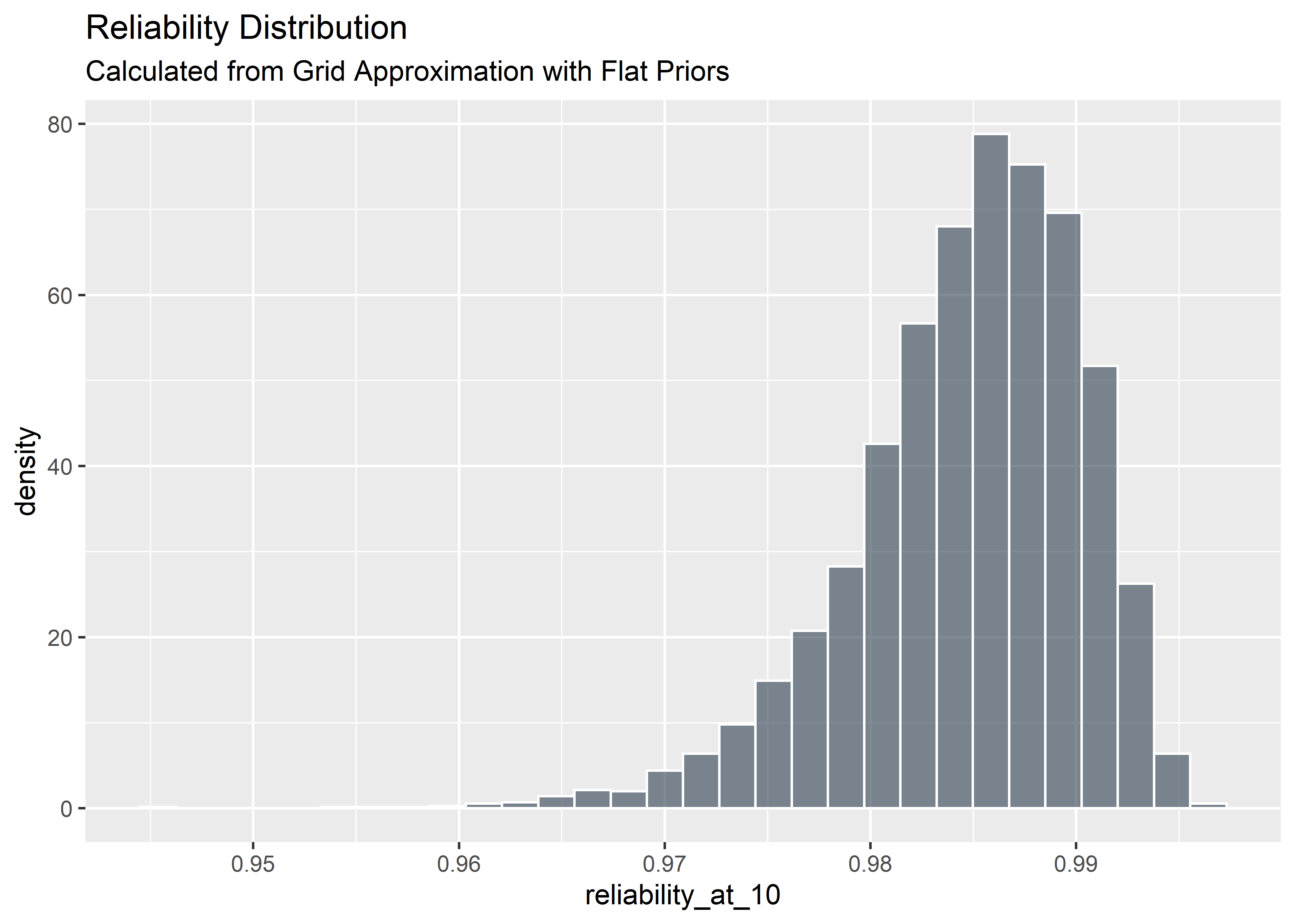 This distribution gives much richer information than the MLE point estimate of reliability. The most credible estimate of reliability is ~ 98.8%, but it could plausibly also be as low as 96%. This delta can mean the difference between a successful and a failing product and should be considered as you move through project phase gates.
Part 3 - Fitting Models to Weibull Data with Right-Censoring [Frequentist Perspective]
- Tools: survreg() function form survival package
- Goal: Obtain maximum likelihood point estimate of shape and scale parameters from best fitting Weibull distribution
In survival analysis we are waiting to observe the event of interest. For benchtop testing, we wait for fracture or some other failure. In a clinical study, we might be waiting for death, re-intervention, or endpoint. Sometimes the events don’t happen within the observation window but we still must draw the study to a close and crunch the data. Cases in which no events were observed are considered “right-censored” in that we know the start date (and therefore how long they were under observation) but don’t know if and when the event of interest would occur. They must inform the analysis in some way - generally within the likelihood.
Point estimate with right-censored data
First, I’ll set up a function to generate simulated data from a Weibull distribution and censor any observations greater than 100. I set the function up in anticipation of using the survreg() function from the survival package in R. The syntax is a little funky so some additional detail is provided below.
# function to generate random Weibull data and censor data > 100
rweibull_cens_mod_fcn <- function(n, shape, scale) {
  raw_times <- rweibull(n, shape = shape, scale = scale)
  tibble(failure_time_raw = raw_times) %>%
    mutate(time = case_when(
      failure_time_raw < 100 ~ failure_time_raw,
      TRUE ~ 100
    )) %>%
    mutate(censor = case_when(
      time == 100 ~ 0,
      TRUE ~ 1
    )) %>%
    mutate(censor = censor == 1) %>%
    mutate(time = time %>% round(digits = 2)) %>%
    select(-failure_time_raw)
}

# set seed for repeatability
set.seed(54)
first_test_fit_tbl <- rweibull_cens_mod_fcn(30, 3, 100)
first_test_fit_tbl %>%
  head(10) %>%
kable(align = rep("c", 2))| time | censor |
|---|---|
| 31.16 | TRUE |
| 73.94 | TRUE |
| 71.90 | TRUE |
| 100.00 | FALSE |
| 100.00 | FALSE |
| 74.91 | TRUE |
| 37.79 | TRUE |
| 72.28 | TRUE |
| 50.63 | TRUE |
| 45.88 | TRUE |
I admit this looks a little strange because the data that were just described as censored (duration greater than 100) show as “FALSE” in the censored column. This is due to the default syntax of the survreg() function in the survival package that we intend to fit the model with:5
survival package defaults for censoring:
- 0 or FALSE for censoring, 1 or TRUE for observed event
To further throw us off the trail, the survreg() function returns “scale”" and “intercept”" that must be converted to recover the shape and scale parameters that align with the rweibull() function used to create the data. Don’t fall for these tricks - just extract the desired information as follows:
survival package defaults for parameterizing the Weibull distribution:
- survreg’s scale parameter = 1/(rweibull shape parameter)
- survreg’s intercept = log(rweibull scale parameter)
Ok let’s see if the model can recover the parameters when we providing survreg() the tibble with n=30 data points (some censored):
# fit model to simulated data (n=30)
test_fit <- survival::survreg(Surv(time, censor) ~ 1,
  data = first_test_fit_tbl,
  dist = "weibull"
)

# evaluate the fit
summary(test_fit)
##
## Call:
## survival::survreg(formula = Surv(time, censor) ~ 1, data = first_test_fit_tbl,
## dist = "weibull")
## Value Std. Error z p
## (Intercept) 4.5469 0.0896 50.7 < 2e-16
## Log(scale) -0.9266 0.1972 -4.7 2.6e-06
##
## Scale= 0.396
##
## Weibull distribution
## Loglik(model)= -106.7 Loglik(intercept only)= -106.7
## Number of Newton-Raphson Iterations: 5
## n= 30Extract and covert shape and scale with broom::tidy() and dplyr:
# extract scale parameter
scale <- tidy(test_fit)[1, 2] %>%
  rename(scale = estimate) %>%
  exp() %>%
  round(2)

# extract shape parameter
shape <- tidy(test_fit)[2, 2] %>%
  rename(shape = estimate) %>%
  exp() %>%
  .^-1 %>%
  round(2)

# summarize
point_estimates <- bind_cols(shape, scale)
point_estimates %>% kable(align = rep("c", 2))| shape | scale |
|---|---|
| 2.53 | 94.34 |
What has happened here? We know the true parameters are shape = 3, scale = 100 because that’s how the data were generated. These point estimates are pretty far off. Is the survreg() fitting function broken? Are there too few data and we are just seeing sampling variation? Is it confused by the censored data? I honestly don’t know. To answer these questions, we need a new function that fits a model using survreg() for any provided sample size. The data to make the fit are generated internal to the function. The function returns a tibble with estimates of shape and scale for that particular trial:
Simulation to understand point estimate sensitivity to sample size
# seed for repeatability
set.seed(2025)

# fcn takes sample size n, simulates weibull(3, 100) data, fits model, estimates params
test_map_fcn <- function(n) {
  holder <- rweibull_cens_mod_fcn(n, 3, 100)

  sr1_fit <- survival::survreg(Surv(time, censor) ~ 1, data = holder, dist = "weibull")

  scale <- tidy(sr1_fit)[1, 2] %>%
    rename(scale = estimate) %>%
    exp() %>%
    round(2)

  shape <- tidy(sr1_fit)[2, 2] %>%
    rename(shape = estimate) %>%
    exp() %>%
    .^-1 %>%
    round(2)

  point_estimates <- bind_cols(shape, scale)
  point_estimates
}
Now that we have a function that takes a sample size n and returns fitted shape and scale values, we want to apply the function across many values of n. Let’s look at what happens to our point estimates of shape and scale as the sample size n increases from 10 to 1000 by 1.
# create sequence of n's
n_sim_mle <- seq(10, 1000, by = 1) %>%
  tibble() %>%
  rename(n = ".")

# map the fitting function across vector of n's.
results_tbl <- n_sim_mle %>%
  mutate(results = map(n, test_map_fcn)) %>%
  unnest()

# peek at format of results
results_tbl %>%
  head(5) %>%
kable(align = rep("c", 3))| n | shape | scale |
|---|---|---|
| 10 | 5.99 | 85.94 |
| 11 | 2.89 | 108.29 |
| 12 | 2.96 | 103.04 |
| 13 | 1.88 | 82.20 |
| 14 | 4.98 | 101.62 |
Visualize results of the simulation:
results_tbl %>%
  gather(key = key, value = value, -n) %>%
  ggplot(aes(x = n, y = value)) +
  geom_point(color = "#5C126EFF", alpha = 0.3) +
  facet_wrap(~key, scales = "free_y") +
  geom_smooth(color = "#F17020FF", alpha = 0.9) +
  labs(
    x = "Sample Size",
    y = "",
    title = "Estimated Shape and Scale Parameters for Different Data Set Sizes",
    subtitle = "Weibull Regressions using survival package.  Data generated from Weibull(3, 100)"
  )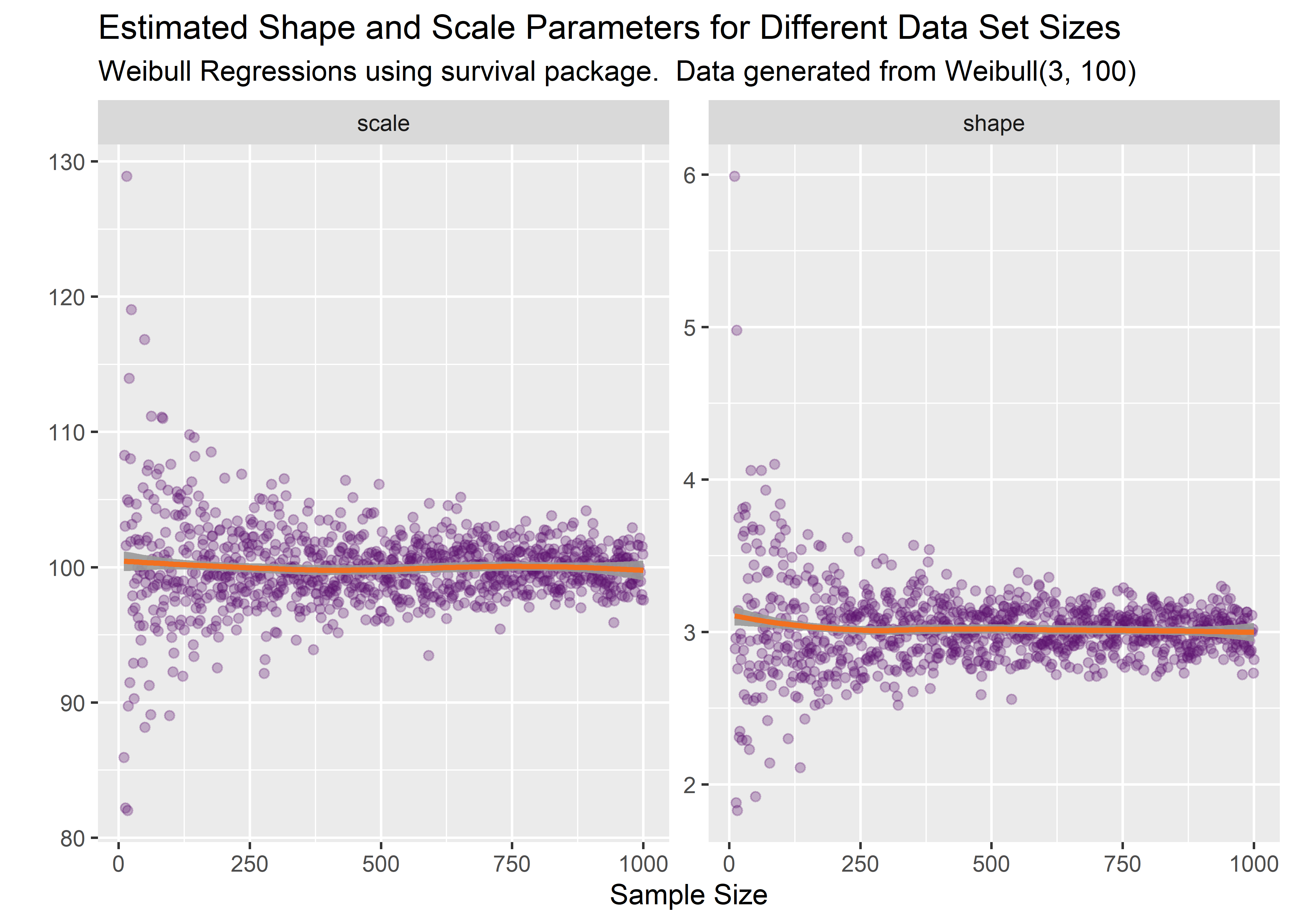
This simulation is illuminating. It’s apparent that there is sampling variability effecting the estimates. On average, the true parameters of shape = 3 and scale = 100 are correctly estimated. But on any given experimental run, the estimate might be off by quite a bit. The precision increases with sample size as expected but the variation is still relevant even at large n.
Based on this simulation we can conclude that our initial point estimate of 2.5, 94.3 fit from n=30 is within the range of what is to be expected and not a software bug or coding error.
Estimates for product reliability at 15, 30, 45, and 60 months are shown below.
results_tbl %>%
  mutate(reliability_at_15 = exp(-(15 / scale)**(shape))) %>%
  mutate(reliability_at_30 = exp(-(30 / scale)**(shape))) %>%
  mutate(reliability_at_45 = exp(-(45 / scale)**(shape))) %>%
  mutate(reliability_at_60 = exp(-(60 / scale)**(shape))) %>%
  select(-c(shape, scale)) %>%
  gather(key = "key", value = "value", -n) %>%
  ggplot(aes(x = n, y = value)) +
  geom_point(aes(color = key), alpha = .4) +
  #  geom_smooth(aes(group = key), color = "black", size = .4, alpha = .5) +
  ylim(c(.73, 1)) +
  scale_color_viridis_d(option = "C", begin = 0, end = .8, direction = -1) +
  guides(colour = guide_legend(override.aes = list(alpha = 1))) +
  labs(
    title = "Reliability Point Estimates",
    subtitle = "Effect of Sample Size and Sampling Variability",
    x = "Sample Size",
    y = "Reliability Estimate"
  ) +
  theme(legend.title = element_blank())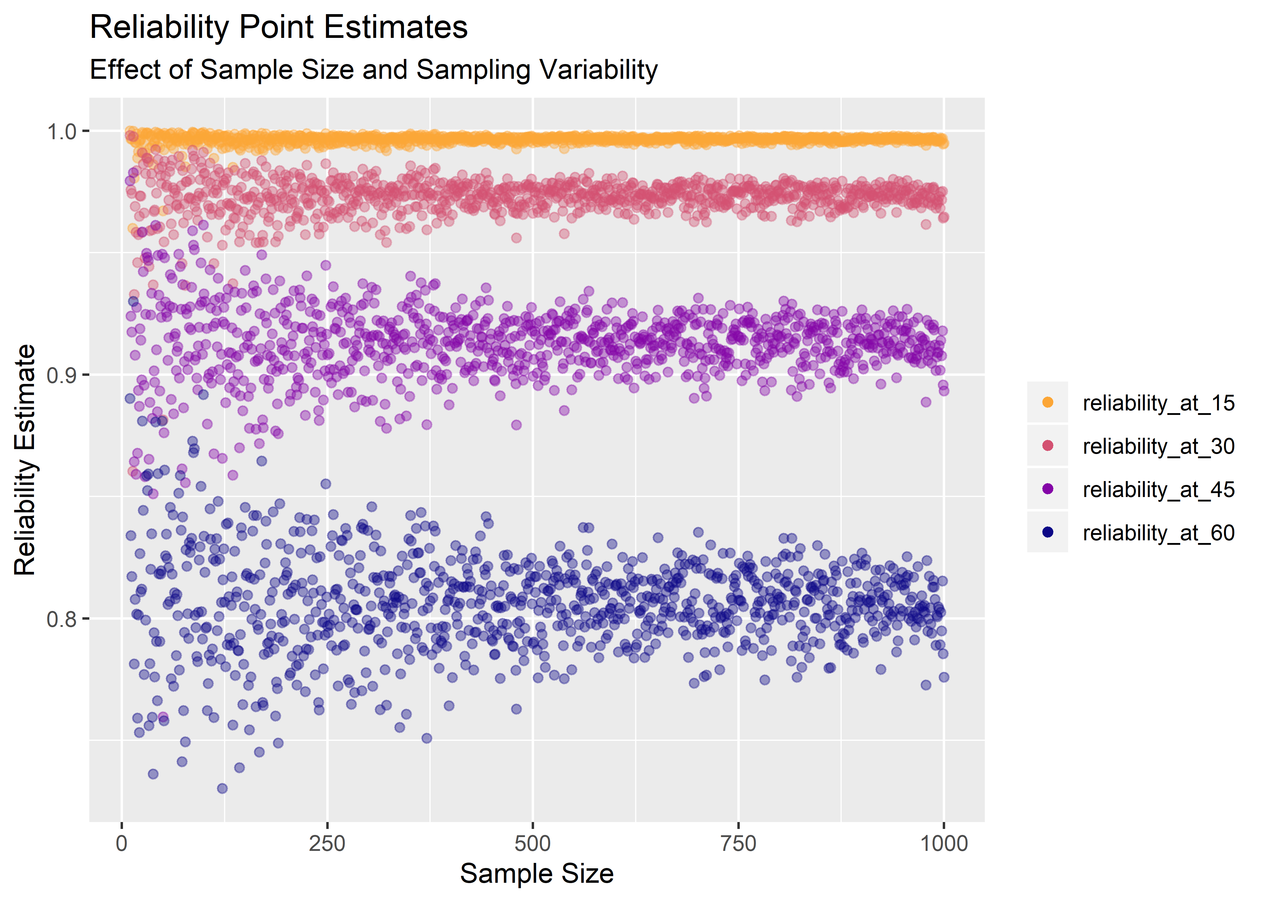
The above gives a nice sense of the uncertainty in the reliability estimate as sample size increases, but you can’t actually simulate a confidence interval from those data because there aren’t enough data points at any one sample size. To do that, we need many runs at the same sample size.
Simulation of 95% confidence intervals on reliability
In the code below, I generate n=1000 simulations of n=30 samples drawn from a Weibull distribution with shape = 3 and scale = 100. For each set of 30 I fit a model and record the MLE for the parameters.
# each simulation will be like a benchtop test of n=30 parts
ci_reps_tbl <- tibble(sample_size = rep(30, 1000))

set.seed(98)

# loop: draw 30 from rweibull(30, 100); fit model, estimate parameters
ci_results_tbl <- ci_reps_tbl %>%
  mutate(results = map(sample_size, test_map_fcn)) %>%
  unnest()

# peek at results
ci_results_tbl %>%
  head(10) %>%
kable(align = rep("c", 3))| sample_size | shape | scale |
|---|---|---|
| 30 | 3.06 | 107.10 |
| 30 | 3.80 | 98.42 |
| 30 | 2.99 | 111.44 |
| 30 | 2.78 | 108.50 |
| 30 | 2.91 | 100.25 |
| 30 | 2.84 | 102.01 |
| 30 | 2.84 | 95.47 |
| 30 | 2.72 | 97.98 |
| 30 | 4.21 | 96.99 |
| 30 | 3.74 | 98.30 |
95% of the reliability estimates lik above the .05 quantile. This means the .05 quantile is the analogous boundary for a simulated 95% confidence interval. In the code below, the .05 quantile of reliability is estimated for each time requirement of interest where we have 1000 simulation at each.
# function will take a time of interest and calculate the implied reliability
# only works with the params from the ci_results_tbl above
reliability95_fcn <- function(t_requirement) {
  ci_results2tbl <- ci_results_tbl %>%
    mutate(reliability_at_t = exp(-(t_requirement / scale)**(shape))) %>%
    mutate(q_05 = quantile(reliability_at_t, .05))
  ci_results2tbl
}

# map the function across a sequence of candidate time requirements
reliability_seq_tbl <- tibble(time_requirement = seq(5, 100, by = 5)) %>% mutate(rel_tbl = map(time_requirement, reliability95_fcn))

# calculate the .05 quantile for reliability in each set of 1000 (each candidate time requirement)
reliability_summary_tbl <- reliability_seq_tbl %>%
  unnest(rel_tbl) %>%
  group_by(time_requirement) %>%
  summarize(rel_q05 = mean(q_05)) %>%
  ungroup()

# Peek
reliability_summary_tbl %>% kable(align = rep("c", 2))| time_requirement | rel_q05 |
|---|---|
| 5 | 0.9987176 |
| 10 | 0.9942133 |
| 15 | 0.9858520 |
| 20 | 0.9730873 |
| 25 | 0.9558373 |
| 30 | 0.9344743 |
| 35 | 0.9076116 |
| 40 | 0.8775053 |
| 45 | 0.8429503 |
| 50 | 0.8015775 |
| 55 | 0.7562483 |
| 60 | 0.7054836 |
| 65 | 0.6544688 |
| 70 | 0.5948305 |
| 75 | 0.5358066 |
| 80 | 0.4756331 |
| 85 | 0.4150847 |
| 90 | 0.3500516 |
| 95 | 0.2880577 |
| 100 | 0.2288761 |
# reference tibbles for labeling w/ gg_label_repel
label_ci_tbl <- tibble(x = 45, y = 0.8429503)
label_95rel_tbl <- tibble(x = 10, y = 0.95)
# visualize
reliability_seq_tbl %>%
unnest(rel_tbl) %>%
ggplot(aes(x = time_requirement, y = reliability_at_t)) +
geom_jitter(alpha = 0.03) +
# geom_point(data = reliability_summary_tbl, aes(x = time_requirement, y = rel_q05), color = "#c44c74ff", size = 1) +
geom_smooth(data = reliability_summary_tbl, aes(x = time_requirement, y = rel_q05), color = "#c44c74ff", size = 1, alpha = .2) +
geom_hline(aes(yintercept = .95), color = "#240691ff", size = 1) +
geom_label_repel(
data = label_ci_tbl, aes(x, y),
label = "1-sided 95% Confidence\n bound on Reliability",
fill = "#c44c74ff",
color = "#f0f921ff",
segment.color = "#c44c74ff",
segment.size = 1,
# min.segment.length = unit(1, "lines"),
nudge_y = -.5,
nudge_x = -5
) +
geom_label_repel(
data = label_95rel_tbl, aes(x, y),
label = "Product Reliability\n Requirement: 95%",
fill = "#240691ff",
color = "#f0f921ff",
segment.color = "#240691ff",
segment.size = 1,
# min.segment.length = unit(1, "lines"),
nudge_y = -.25,
nudge_x = 5
) +
labs(
title = "Approximate 95% Confidence Interval for Various Durability Requirements",
subtitle = "Each Sim: 1000 models fit from 1000 draws of n=30 from Weibull(3, 100)",
x = "Device Requirement (Service Life without Failure)",
y = "Reliability"
)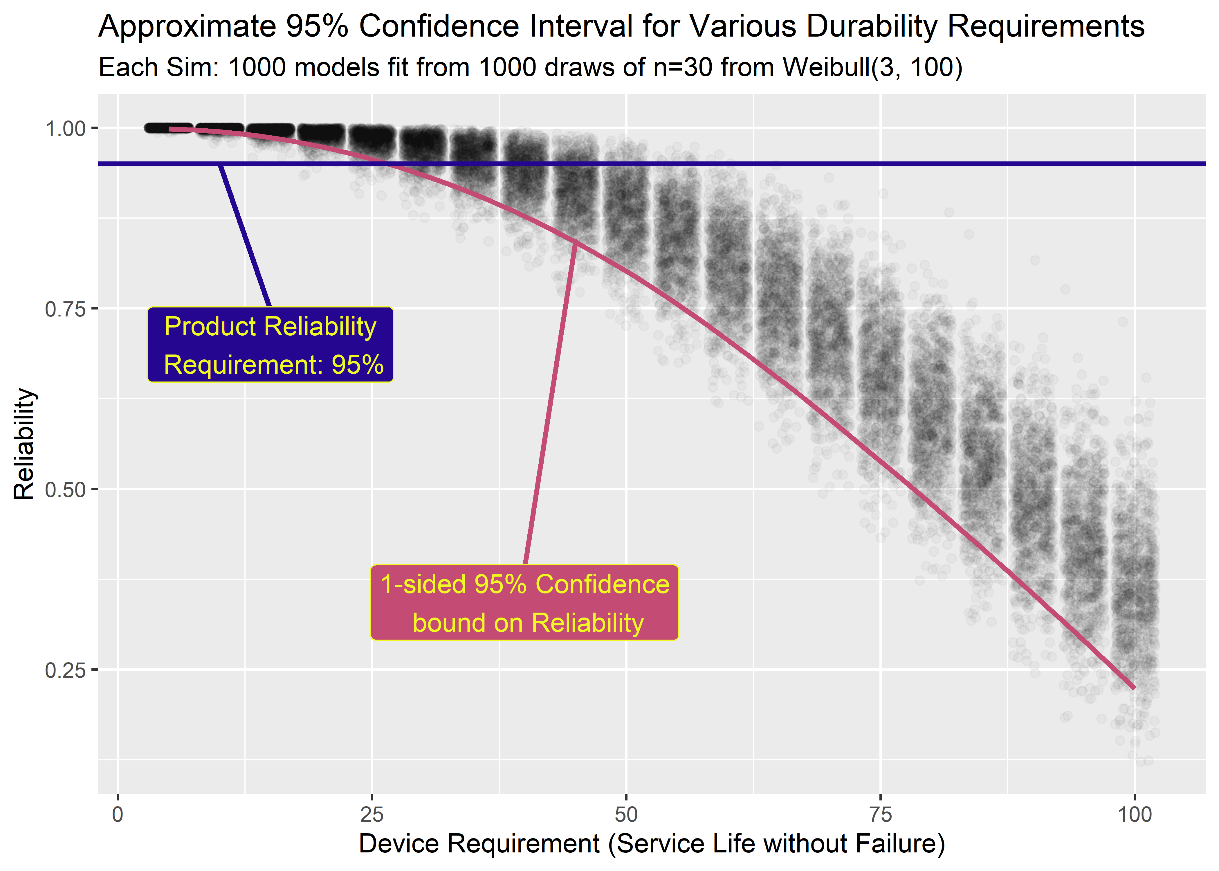 There’s a lot going on here so it’s worth it to pause for a minute. If I was to try to communicate this in words, I would say:
- Assume we have designed a medical device that fails according to a Weibull distribution with shape = 3 and scale = 100.
- Assume the service life requirement for the device is known and specified within the product’s requirements
- Assume we can only test n=30 units in 1 test run and that testing is expensive and resource intensive
- The n=30 failure/censor times will be subject to sampling variability and the model fit from the data will likely not be Weibull(3, 100)
- The variability in the parameter estimates is propagated to the reliability estimates - a distribution of reliability is generated for each potential service life requirement (in practice we would only have 1 requirement)
- The .05 quantile of the reliability distribution at each requirement approximates the 1-sided lower bound of the 95% confidence interval. This threshold changes for each candidate service life requirement.
Why does any of this even matter? Here’s the TLDR of this whole section:
Suppose the service life requirement for our device is 24 months (2 years). Our boss asks us to set up an experiment to verify with 95% confidence that 95% of our product will meet the 24 month service requirement without failing. The industry standard way to do this is to test n=59 parts for 24 days (each day on test representing 1 month in service). If all n=59 pass then we can claim 95% reliability with 95% confidence. However, if we are willing to test a bit longer then the above figure indicates we can run the test to failure with only n=30 parts instead of n=59. If it cost a lot to obtain and prep test articles (which it often does), then we just saved a ton of money and test resources by treating the data as variable instead of attribute. 6 We also get information about the failure mode for free.
Part 4 - Fitting Models to Weibull Data with Right-Censoring [Bayesian Perspective]
- Tools: brm() function in brms; stan under the hood
- Goal: Obtain posterior distributions of shape and scale parameters via Hamiltonian Markov Chain Monte Carlo –> calculate reliability distributions
These data are just like those used before - a set of n=30 generated from a Weibull with shape = 3 and scale = 100. They represent months to failure as determined by accelerated testing. In the brms framework, censored data are designated by a 1 (not a 0 as with the survival package).
# test data
ttf <- c(100, 84.8, 87.8, 61.5, 99.3, 100, 100, 60.3, 80.3, 100, 51.7, 68.5, 99.6, 100, 53.2, 46.6, 26.4, 72.3, 62.9, 70.5, 22.2, 100, 100, 75.2, 87.2, 47.4, 100, 47.1, 98.2, 67.3)

# indicator of run-out / censoring
censored <- c(1, 0, 0, 0, 0, 1, 1, 0, 0, 1, 0, 0, 0, 1, 0, 0, 0, 0, 0, 0, 0, 1, 1, 0, 0, 0, 1, 0, 0, 0)

# combine
months_to_failure_tbl_4.3.3 <- tibble(
  time = ttf,
  censored = censored
)
Use brm() to generate a posterior distribution for shape and scale
The formula for asking brms to fit a model looks relatively the same as with survival. To start, we fit a simple model with default priors.
# fit model with brm() [use default priors]
# mtf_weib_fit <- brm(time | cens(censored) ~ 1,
# data = months_to_failure_tbl_4.3.3, family = weibull())
Just like with the survival package, the default parameterization in brms can easily trip you up. We are fitting an intercept-only model meaning there are no predictor variables. The parameters that get estimated by brm() are the Intercept and shape. We can use the shape estimate as-is, but it’s a bit tricky to recover the scale. The key is that brm() uses a log-link function on the mean \(\mu\). There is no doubt that this is a rambling post - even so, it is not within scope to try to explain link functions and GLM’s (I’m not expert enough to do it anyways, refer to Statistical Rethinking by McElreath). In short, to convert to scale we need to both undo the link function by taking the exponent and then refer to the brms documentation to understand how the mean \(\mu\) relates to the scale \(\beta\). The operation looks like this:7
#scale = exp(Intercept)/(gamma(1 + 1/shape))Examine the results:
# saveRDS(mtf_weib_fit, file = "censored_data_mtf_weib_fit.rds")
mtf_weib_fit <- readRDS(file = "censored_data_mtf_weib_fit.rds")

summary(mtf_weib_fit)
## Family: weibull
## Links: mu = log; shape = identity
## Formula: time | cens(censored) ~ 1
## Data: months_to_failure_tbl_4.3.3 (Number of observations: 30)
## Samples: 4 chains, each with iter = 2000; warmup = 1000; thin = 1;
## total post-warmup samples = 4000
##
## Population-Level Effects:
## Estimate Est.Error l-95% CI u-95% CI Rhat Bulk_ESS Tail_ESS
## Intercept 4.41 0.08 4.25 4.58 1.00 2349 1782
##
## Family Specific Parameters:
## Estimate Est.Error l-95% CI u-95% CI Rhat Bulk_ESS Tail_ESS
## shape 2.74 0.52 1.82 3.84 1.00 2530 2281
##
## Samples were drawn using sampling(NUTS). For each parameter, Eff.Sample
## is a crude measure of effective sample size, and Rhat is the potential
## scale reduction factor on split chains (at convergence, Rhat = 1).Gut-check on convergence of chains. Things look good visually and Rhat = 1 (also good).
plot(mtf_weib_fit)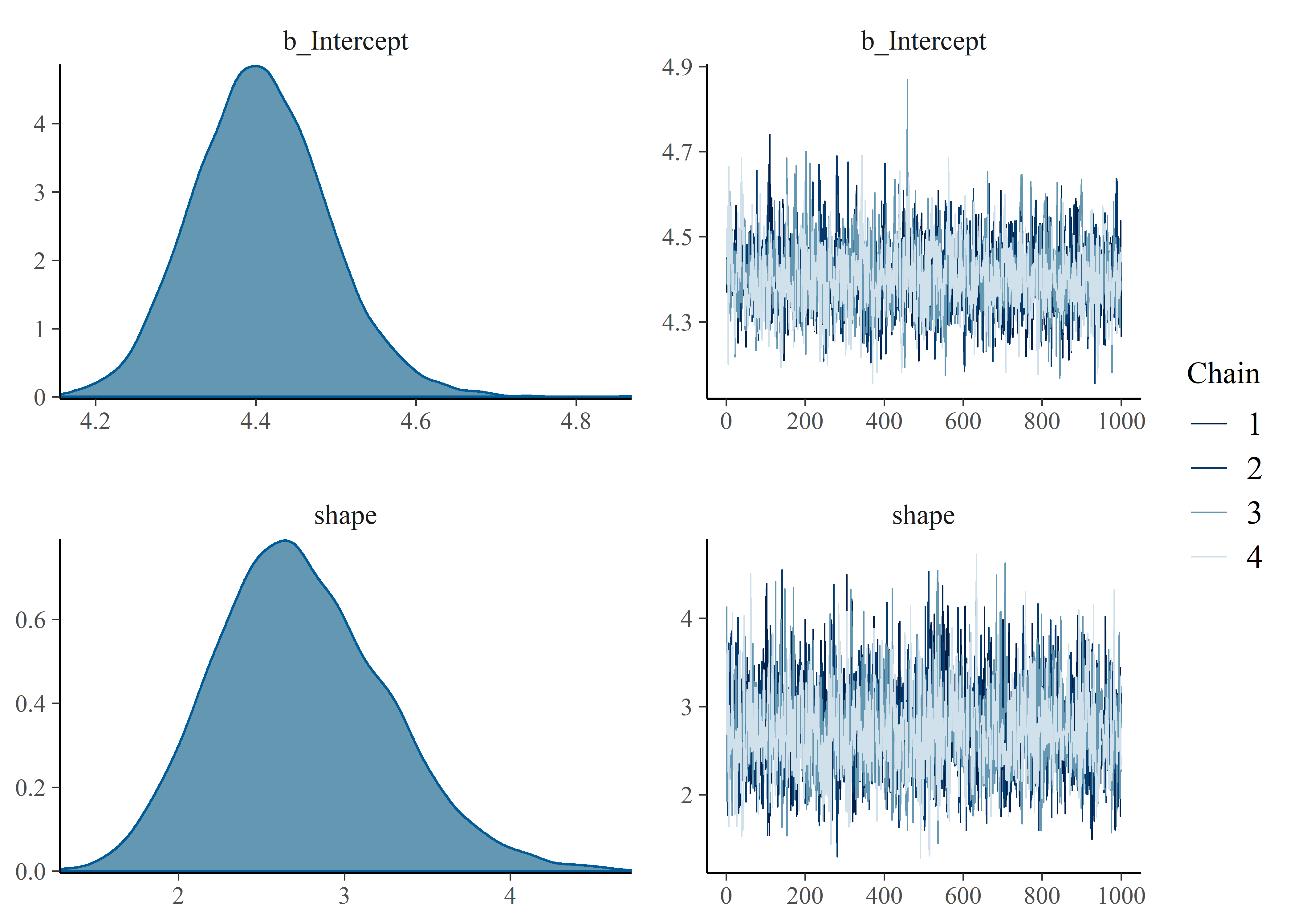
Within the tibble of posterior draws we convert the intercept to scale using the formula previously stated.
# extract scale and shape
post_mtf_weib_samples <- posterior_samples(mtf_weib_fit) %>%
  mutate(scale = exp(b_Intercept) / (gamma(1 + 1 / shape))) %>%
  select(shape, scale)

# peek
post_mtf_weib_samples %>%
  head(10) %>%
kable(align = rep("c", 2), digits = 2)| shape | scale |
|---|---|
| 3.44 | 87.78 |
| 3.07 | 91.80 |
| 2.49 | 93.35 |
| 2.28 | 93.43 |
| 2.10 | 86.42 |
| 3.23 | 103.19 |
| 2.33 | 107.53 |
| 2.37 | 93.37 |
| 3.13 | 91.18 |
| 3.39 | 90.43 |
Here is our first look at the posterior drawn from a model fit with censored data. We know the data were simulated by drawing randomly from a Weibull(3, 100) so the true data generating process is marked with lines.
mtf_plot <- post_mtf_weib_samples %>%
ggplot(aes(x = shape, y = scale)) +
geom_point(
colour = "#453781FF",
size = 2,
alpha = 0.1
) +
geom_hline(aes(yintercept = 100), size = .5, alpha = .3) +
geom_vline(aes(xintercept = 3), size = .5, alpha = .3) +
labs(
title = "Credible Parameters for Shape and Scale",
subtitle = "Run-Out Data Treated as Right-Censored",
x = expression(eta ["shape"]),
y = expression(beta ["scale"])
)
mtf_marg_plot <- ggMarginal(mtf_plot,
type = "density",
color = "white",
alpha = 0.7,
fill = "#453781FF"
)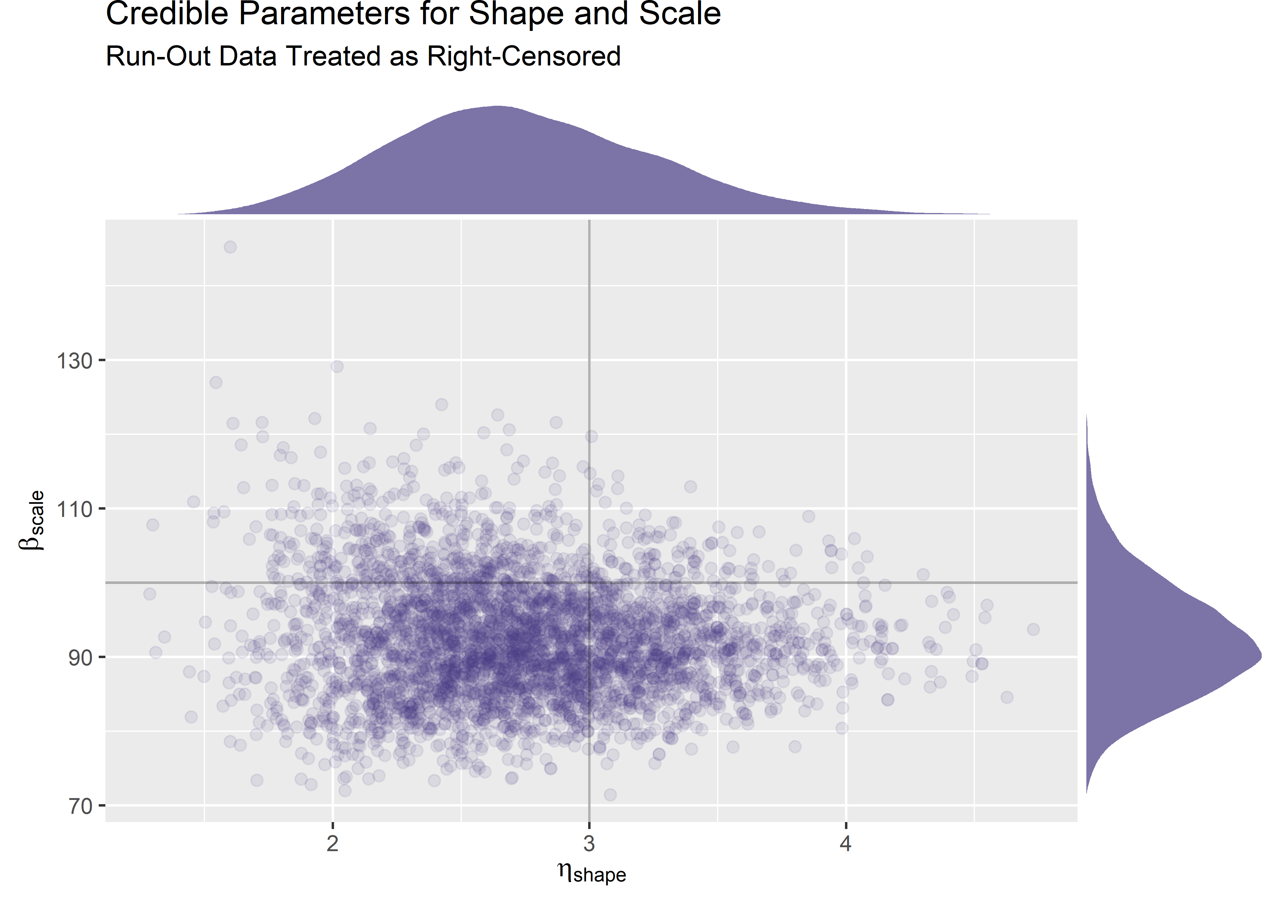 It looks like we did catch the true parameters of the data generating process within the credible range of our posterior. However, it is certainly not centered. Once again we should question: is the software working properly? Is the sample size a problem? Are the priors appropriate? Was the censoring specified and treated appropriately?
Investigation of how to treat censored data points
Let’s start with the question about the censoring. One question that I’d like to know is: What would happen if we omitted the censored data completely or treated it like the device failed at the last observed time point? This hypothetical should be straightforward to simulate. Let’s fit a model to the same data set, but we’ll just treat the last time point as if the device failed there (i.e. we’ll have lots of failures at t=100).
# This model treats the data as though the devices failed at the last observed timepoint
# mtf_weib_nocens_fit <- brm(time ~ 1,
# data = months_to_failure_tbl_4.3.3, family = weibull())
# saveRDS(mtf_weib_nocens_fit, file = "mtf_weib_nocens_fit.rds")
mtf_weib_nocens_fit <- readRDS(file = "mtf_weib_nocens_fit.rds")Now another model where we just omit the censored data completely (i.e. remove any units that don’t fail from the data set completely and fit a model to the rest).
# This model just omits the censored data completely
# mtf_weib_omit_fit <- brm(time ~ 1,
# data = months_to_failure_tbl_4.3.3 %>% filter(censored == 0), family = weibull())
plot(mtf_weib_nocens_fit)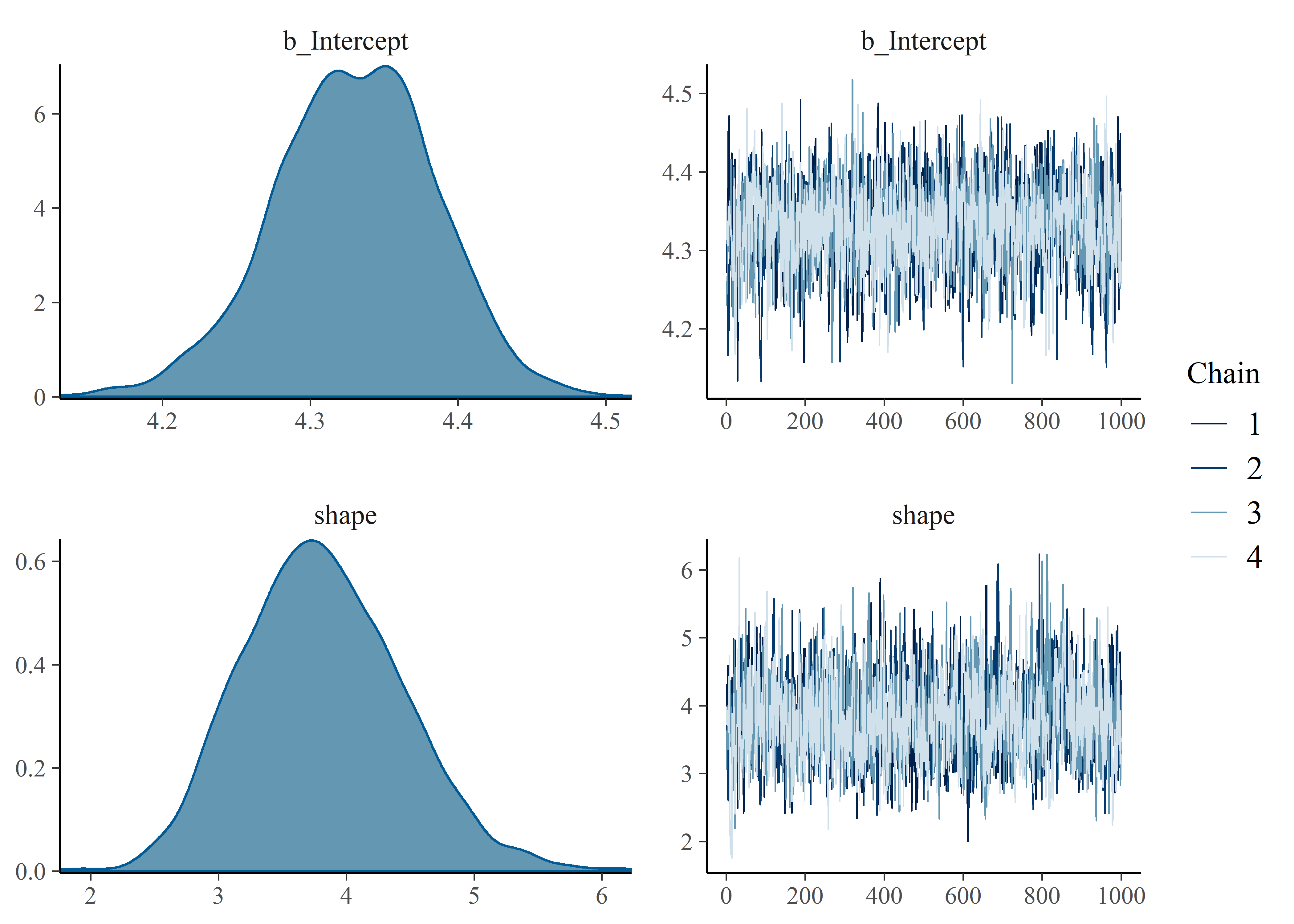
plot(mtf_weib_omit_fit)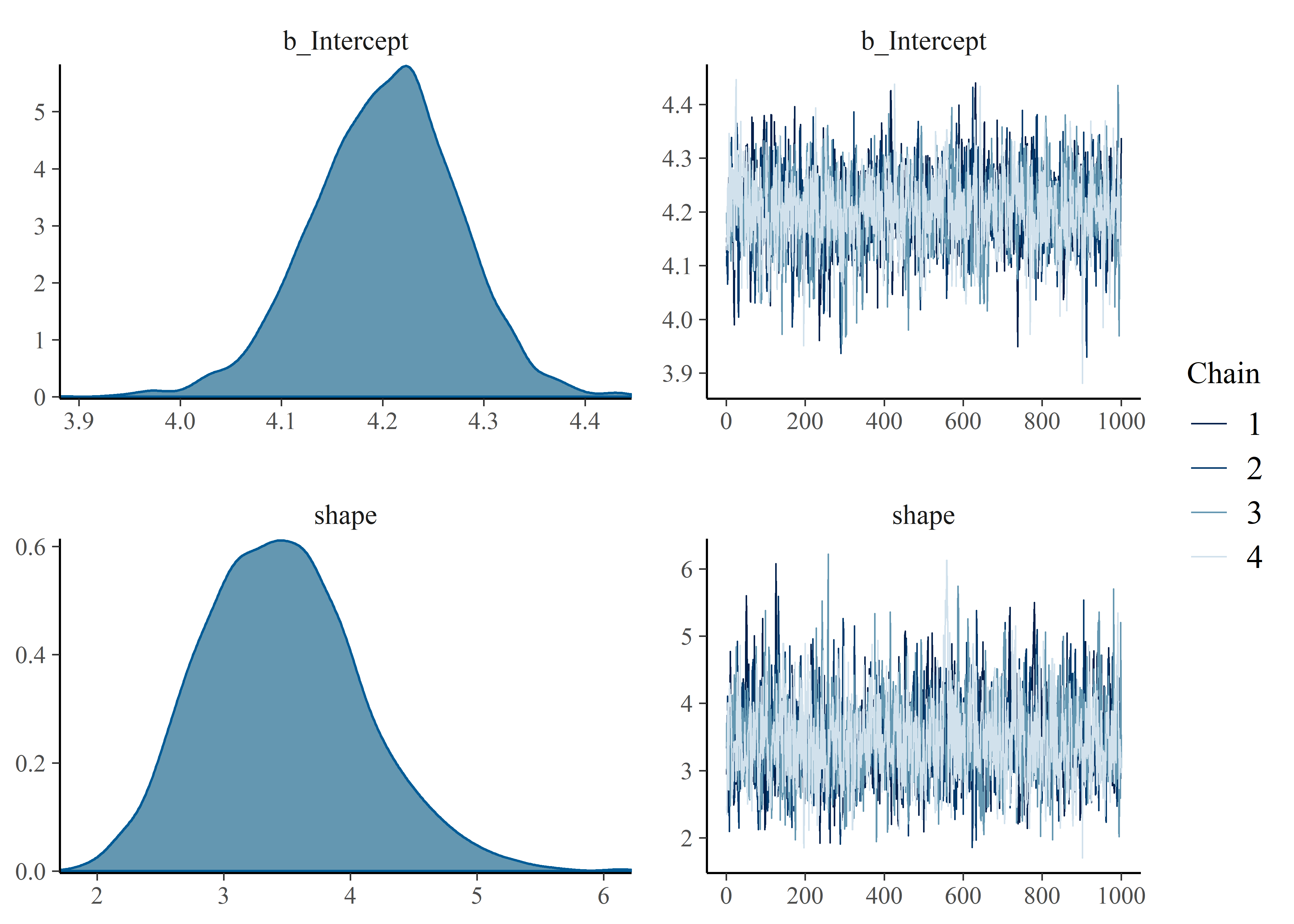
Create tibble of posterior draws from partially censored, un-censored, and censor-omitted models with identifier column.
cens_model_post_draws <- posterior_samples(mtf_weib_fit) %>%
  mutate(scale = exp(b_Intercept) / (gamma(1 + 1 / shape))) %>%
  select(shape, scale) %>%
  mutate(model = "Weibull with Censoring")

uncens_model_post_draws <- posterior_samples(mtf_weib_nocens_fit) %>%
  mutate(scale = exp(b_Intercept) / (gamma(1 + 1 / shape))) %>%
  select(shape, scale) %>%
  mutate(model = "Weibull (Treat Last Timepoint as Failure)")

omit_model_post_draws <- posterior_samples(mtf_weib_omit_fit) %>%
  mutate(scale = exp(b_Intercept) / (gamma(1 + 1 / shape))) %>%
  select(shape, scale) %>%
  mutate(model = "Weibull Omitting Censored Data")

combined_weib_tbl <- cens_model_post_draws %>%
  bind_rows(uncens_model_post_draws) %>%
  bind_rows(omit_model_post_draws) %>%
  mutate(model = as_factor(model))

combined_weib_tbl %>%
  head(5) %>%
kable(align = rep("c", 3), digits = 2)| shape | scale | model |
|---|---|---|
| 3.44 | 87.78 | Weibull with Censoring |
| 3.07 | 91.80 | Weibull with Censoring |
| 2.49 | 93.35 | Weibull with Censoring |
| 2.28 | 93.43 | Weibull with Censoring |
| 2.10 | 86.42 | Weibull with Censoring |
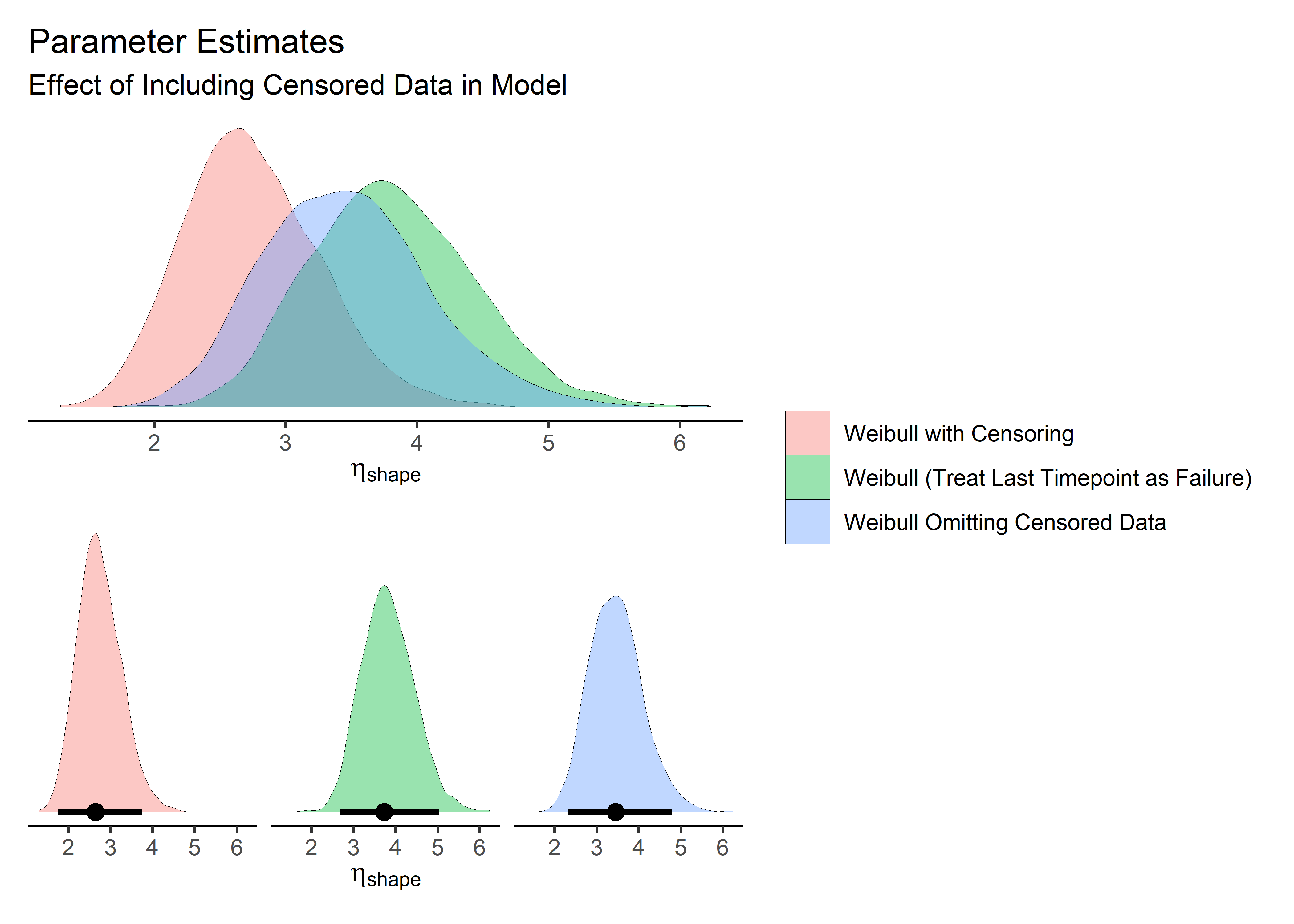
Here we compare the effect of the different treatments of censored data on the parameter estimates. Intervals are 95% HDI.
d_shp_1 <- combined_weib_tbl %>% ggplot(aes(x = shape)) +
  geom_density(aes(fill = model), size = 0, alpha = 0.4) +
  scale_y_continuous(NULL, breaks = NULL) +
  labs(x = expression(eta["shape"])) +
  stat_pointintervalh(aes(y = 0),
    point_interval = mode_hdi, .width = .95, show.legend = FALSE
  ) +
  facet_wrap(~model) +
  theme_classic() +
  theme(
    legend.position = "none",
    axis.line.y = element_blank(),
    strip.background = element_blank(),
    strip.text.x = element_blank(),
    legend.title = element_blank()
  )


d_shp_2 <- combined_weib_tbl %>% ggplot(aes(x = shape)) +
  geom_density(aes(fill = model), size = 0, alpha = 0.4) +
  scale_y_continuous(NULL, breaks = NULL) +
  labs(
    x = expression(eta["shape"]),
    title = "Parameter Estimates",
    subtitle = "Effect of Including Censored Data in Model"
  ) +
  theme_classic() +
  theme(
    axis.line.y = element_blank(),
    strip.background = element_blank(),
    strip.text.x = element_blank(),
    legend.title = element_blank()
  )

d_scale_1 <- combined_weib_tbl %>% ggplot(aes(x = scale, fill = model)) +
  geom_density(size = 0, alpha = 0.4) +
  scale_y_continuous(NULL, breaks = NULL) +
  labs(x = expression(beta["scale"])) +
  stat_pointintervalh(aes(y = 0),
    point_interval = mode_hdi, .width = .95, show.legend = FALSE
  ) +
  facet_wrap(~model) +
  theme_classic() +
  theme(
    legend.position = "none",
    axis.line.y = element_blank(),
    strip.background = element_blank(),
    strip.text.x = element_blank(),
    legend.title = element_blank()
  )

d_scale_2 <- combined_weib_tbl %>% ggplot(aes(x = scale)) +
  geom_density(aes(fill = model), size = 0, alpha = 0.4) +
  scale_y_continuous(NULL, breaks = NULL) +
  labs(
    x = expression(beta["scale"]),
    title = "Parameter Estimates",
    subtitle = "Effect of Including Censored Data in Model"
  ) +
  theme_classic() +
  theme(
    axis.line.y = element_blank(),
    strip.background = element_blank(),
    strip.text.x = element_blank(),
    legend.title = element_blank()
  )

d_shp_2 + d_shp_1 + plot_layout(
  ncol = 1,
  guides = "collect"
)
d_scale_2 + d_scale_1 + plot_layout(
  ncol = 1,
  guides = "collect"
)
When we omit the censored data or treat it as a failure, the shape parameter shifts up and the scale parameter shifts down. In both cases, it moves farther away from true. This should give is confidence that we are treating the censored points appropriately and have specified them correctly in the brm() syntax.
Plotting the joint distributions for the three groups:
combined_weib_plt <- combined_weib_tbl %>%
ggplot(aes(x = shape, y = scale)) +
geom_point(aes(color = model, fill = model), size = 2, alpha = 0.08) +
geom_hline(aes(yintercept = 100), size = .5, alpha = .3) +
geom_vline(aes(xintercept = 3), size = .5, alpha = .3) +
scale_color_manual(values = c("#453781FF", "#EA4F88", "#FDE725FF")) +
guides(colour = guide_legend(override.aes = list(alpha = 1))) + # force legend icons to be alpha = 1 instead of .08
labs(
title = "Credible Parameters for Shape and Scale",
subtitle = "Effect of Treating Censored Data Points in Different Ways",
x = expression(eta ["shape"]),
y = expression(beta ["scale"])
) +
theme(
legend.position = "bottom",
legend.title = element_blank()
)
cens_marg_plot <- ggMarginal(combined_weib_plt,
groupColour = TRUE,
groupFill = TRUE,
type = "density",
alpha = 0.7
)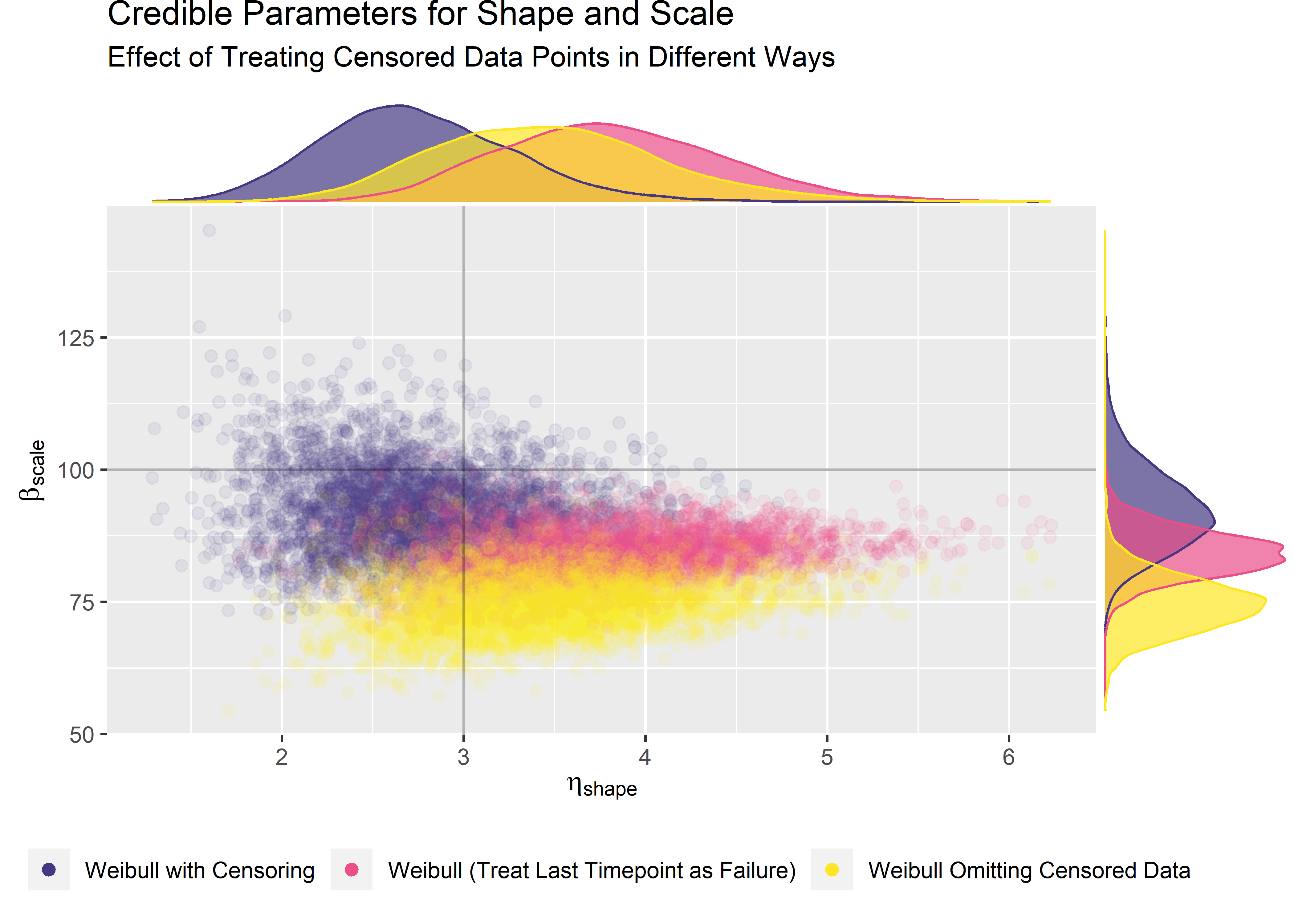 Our censored data set (purple) is closest to true. But we still don’t know why the highest density region of our posterior isn’t centered on the true value.
Evaluation of priors
We haven’t looked closely at our priors yet (shame on me) so let’s do that now. The default priors are viewed with prior_summary().
# get default priors
prior_summary(mtf_weib_fit) %>%
  select(prior, class) %>%
kable(align = rep("c", 2))| prior | class |
|---|---|
| student_t(3, 4, 10) | Intercept |
| gamma(0.01, 0.01) | shape |
I was taught to visualize what the model thinks before seeing the data via prior predictive simulation. I made a good-faith effort to do that, but the results are funky for brms default priors. I an not an expert here, but I believe this is because very vague default Gamma priors aren’t good for prior predictive simulations but quickly adapt to the first few data points they see.8. The prior must be placed on the intercept when must be then propagated to the scale which further muddies things. All in all there isn’t much to see. A lot of the weight is at zero but there are long tails for the defaults. I have all the code for this simulation for the defaults in the Appendix.
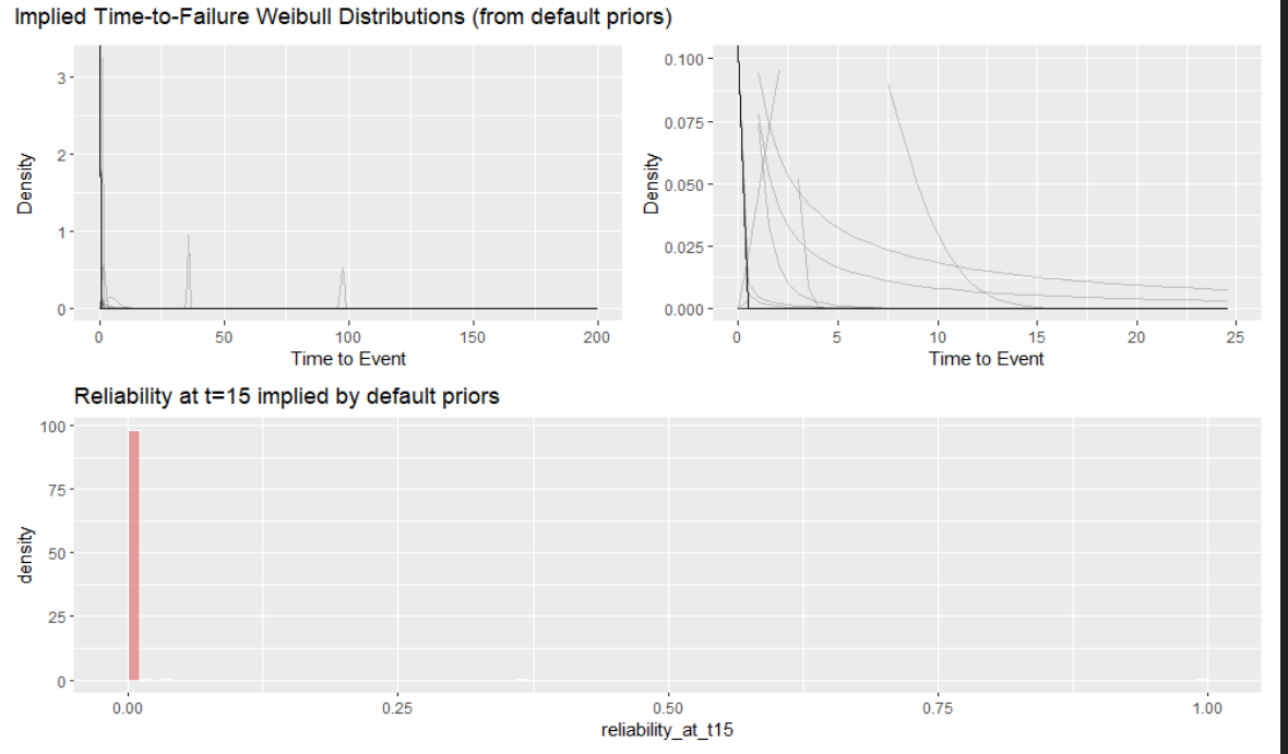
If you take this at face value, the model thinks the reliability is always zero before seeing the model. Again, I think this is a special case for vague gamma priors but it doesn’t give us much confidence that we are setting things up correctly.
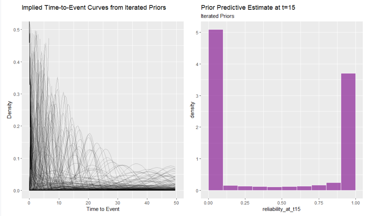
After viewing the default predictions, I did my best to iterate on the priors to generate something more realistic. My process was manual and my general plan was to force some crdibility over higher values of shape using a uniform distribution. The intercept values were more diffcult to iterate. Here are the revised priors I tried:
tibble(prior = c("student_t(3, 5, 5)", "uniform(0, 10)"),
class = c("Intercept", "shape")) %>% kable(align = rep("c", 2))| prior | class |
|---|---|
| student_t(3, 5, 5) | Intercept |
| uniform(0, 10) | shape |
As can be seen, the revised priors were able to spread some credibility up across the middle reliability values but ended up a lot of mass on either end, which wasn’t to goal.
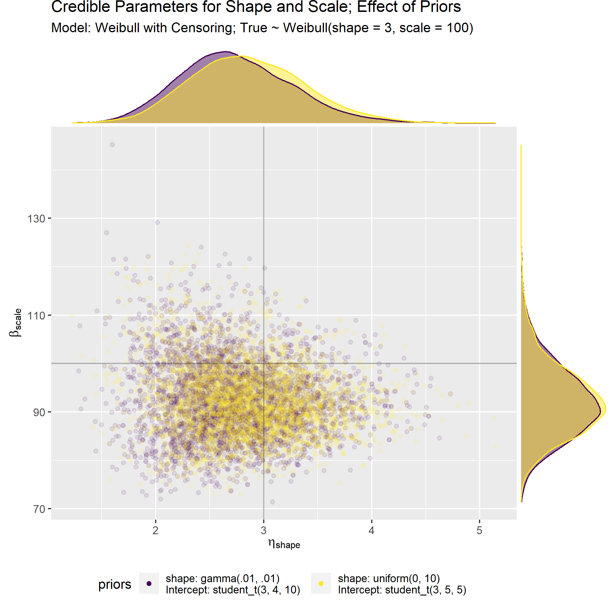
Regardless, I refit the model with the (potentially) improved more realistic (but still not great) priors and found minimal difference in the model fit as shown below.
Note: all models throughout the remainder of this post use the “better” priors (even though there is minimal difference in the model fits relative to brms default).
The above analysis, while not comprehensive, was enough to convince me that the default brms priors are not the problem with initial model fit (recall above where the mode of the posterior was not centered at the true data generating process and we wondered why). I do need to get better at doing these prior predictive simulations but it’s a deep, dark rabbit hole to go down on an already long post. Given the low model sensitivity across the range of priors I tried, I’m comfortable moving on to investigate sample size.
The original model was fit from n=30. We need a simulation that lets us adjust n.
Evaluate sensitivity of posterior to sample size
Here we write a function to generate censored data of different shape, scale, and sample size. The syntax of the censoring column is brms (1 = censored).
rweibull_cens_gen_fcn <- function(n, shape, scale) {
  raw_times <- rweibull(n, shape = shape, scale = scale)
  tibble(failure_time_raw = raw_times) %>%
    mutate(time = case_when(
      failure_time_raw < 100 ~ failure_time_raw,
      TRUE ~ 100
    )) %>%
    mutate(censor = case_when(
      time == 100 ~ 1,
      TRUE ~ 0
    )) %>%
    select(-failure_time_raw)
}
Now the function above is used to create simulated data sets for different sample sizes (all have shape 3, scale = 100)
set.seed(3980)

fit_weib_45_tbl <- rweibull_cens_gen_fcn(45, 3, 100)
fit_weib_60_tbl <- rweibull_cens_gen_fcn(60, 3, 100)
fit_weib_100_tbl <- rweibull_cens_gen_fcn(100, 3, 100)
fit_weib_200_tbl <- rweibull_cens_gen_fcn(200, 3, 100)
fit_weib_300_tbl <- rweibull_cens_gen_fcn(300, 3, 100)
fit_weib_400_tbl <- rweibull_cens_gen_fcn(400, 3, 100)
fit_weib_500_tbl <- rweibull_cens_gen_fcn(500, 3, 100)
fit_weib_600_tbl <- rweibull_cens_gen_fcn(600, 3, 100)
fit_weib_700_tbl <- rweibull_cens_gen_fcn(700, 3, 100)
fit_weib_800_tbl <- rweibull_cens_gen_fcn(800, 3, 100)
Fit and save a model to each of the above data sets.
# mtf_700_weib_fit <- brm(time | cens(censor) ~ 1,
# data = fit_weib_700_tbl, family = weibull(),
#    prior = c(
#     prior(student_t(3, 5, 5), class = Intercept),
#     prior(uniform(0, 10), class = shape)
#    ),
#    iter = 41000, warmup = 40000, chains = 4, cores = 4,
#    seed = 4
#  )
Draw from the posterior of each model and combine into one tibble along with the original fit from n=30.
mtf_30_weib_fit_post_draws <- post_mwnp_samples # this is original data fit to milely informed priors, see Appendix
mtf_60_weib_fit_post_draws <- posterior_samples(mtf_60_weib_fit)
mtf_100_weib_fit_post_draws <- posterior_samples(mtf_100_weib_fit)
mtf_200_weib_fit_post_draws <- posterior_samples(mtf_200_weib_fit)
mtf_300_weib_fit_post_draws <- posterior_samples(mtf_300_weib_fit)
mtf_400_weib_fit_post_draws <- posterior_samples(mtf_400_weib_fit)
mtf_500_weib_fit_post_draws <- posterior_samples(mtf_500_weib_fit)
mtf_600_weib_fit_post_draws <- posterior_samples(mtf_600_weib_fit)
mtf_700_weib_fit_post_draws <- posterior_samples(mtf_700_weib_fit)
mtf_800_weib_fit_post_draws <- posterior_samples(mtf_800_weib_fit)


combined_n_tbl <- bind_rows(
  "60"  = mtf_60_weib_fit_post_draws,
  "100" = mtf_100_weib_fit_post_draws,
  "200" = mtf_200_weib_fit_post_draws,
  "300" = mtf_300_weib_fit_post_draws,
  "400" = mtf_400_weib_fit_post_draws,
  "500" = mtf_500_weib_fit_post_draws,
  "600" = mtf_600_weib_fit_post_draws,
  "700" = mtf_700_weib_fit_post_draws,
  "800" = mtf_800_weib_fit_post_draws,
  .id = "model"
) %>%
  mutate(model = as_factor(model)) %>%
  mutate(scale = exp(b_Intercept) / (gamma(1 + 1 / shape))) %>%
  select(shape, scale, model)

# have to add in the n=30 set seperately since it is already converted from Intercept to shape
combined_n_tbl <- mtf_30_weib_fit_post_draws %>%
  mutate(model = "30") %>%
  bind_rows(combined_n_tbl) %>%
  mutate(model = as_factor(model))
Finally we can visualize the effect of sample size on precision of posterior estimates.
combined_n_plt <- combined_n_tbl %>%
ggplot(aes(x = shape, y = scale)) +
geom_point(aes(color = model, fill = model), size = 2, alpha = 0.01) +
scale_color_viridis_d() +
guides(colour = guide_legend(override.aes = list(alpha = 1))) + # force legend icons to be alpha = 1 instead of .05
geom_hline(yintercept = 100, colour = "black", alpha = 0.3, size = .5) +
geom_vline(xintercept = 3, colour = "black", alpha = 0.3, size = .5) +
labs(
title = "Effect of Sample Size on Parameter Estimation",
subtitle = "Model: Weibull with Censoring; True ~ Weibull(shape = 3, scale = 100)",
x = expression(eta ["shape"]),
y = expression(beta ["scale"])
) +
theme(
legend.position = "bottom",
legend.title = element_blank()
)
cens_marg_2_plot <- ggMarginal(combined_n_plt,
groupColour = TRUE,
groupFill = TRUE,
type = "density",
alpha = 0.7
)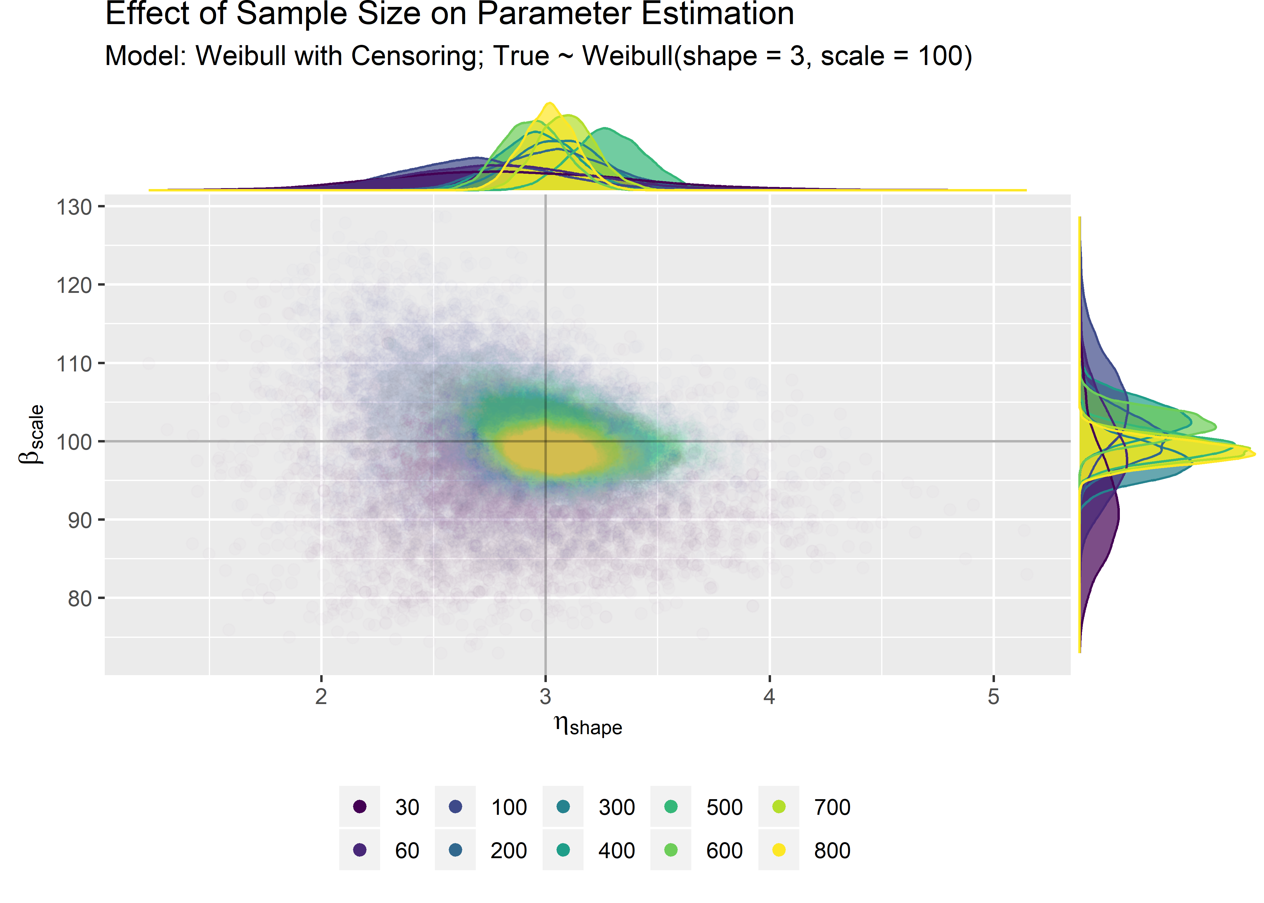 This figure tells a lot. We simply needed more data points to zero in on the true data generating process. At n=30, there’s just a lot of uncertainty due to the randomness of sampling.
This plot looks really cool, but the marginal distributions are bit cluttered. This is a perfect use case for ggridges which will let us see the same type of figure but without overlap.
cn1 <- combined_n_tbl %>%
  gather(key = "key", value = "value", -model) %>%
  mutate(true_p = case_when(
    key == "scale" ~ 100,
    TRUE ~ 3
  )) %>%
  ggplot(aes(x = value, y = model, group = model, fill = model)) +
  geom_density_ridges(size = 1 / 3, rel_min_height = .005, alpha = .65) +
  geom_vline(aes(xintercept = true_p), color = "#711a6eff") +
  stat_pointintervalh(
    point_interval = mode_hdi,
    .width = .95,
    show.legend = FALSE
  ) +
  coord_flip() +
  scale_fill_viridis_d() +
  facet_wrap(~key, scales = "free_y") +
  labs(
    x = "Parameter Value",
    y = "Number of Data Points Used to Fit Model",
    title = "Model Fitting Variability due to Random Sampling [New Draw Each Fit]",
    subtitle = "True Distribution ~ Weibull(3, 100)"
  ) +
  theme(legend.position = "")

cn1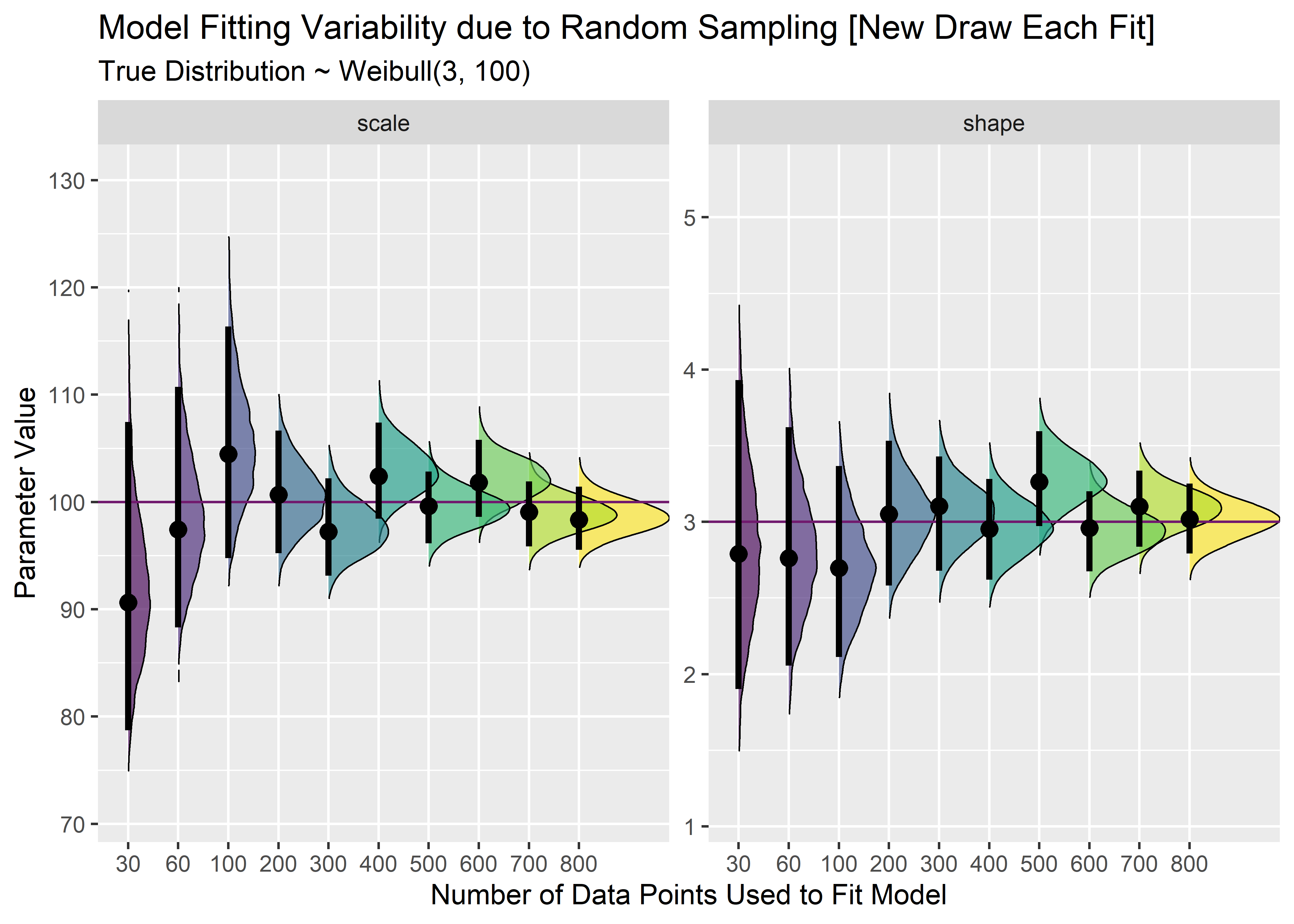
Set of 800 to demonstrate Bayesian updating.
set.seed(125)
fit_weib_800_bu_tbl <- rweibull_cens_gen_fcn(800, 3, 100)

fit_weib_30_bu_tbl <- fit_weib_800_bu_tbl[1:30, ]
fit_weib_60_bu_tbl <- fit_weib_800_bu_tbl[1:60, ]
fit_weib_100_bu_tbl <- fit_weib_800_bu_tbl[1:100, ]
fit_weib_200_bu_tbl <- fit_weib_800_bu_tbl[1:200, ]
fit_weib_300_bu_tbl <- fit_weib_800_bu_tbl[1:300, ]
fit_weib_400_bu_tbl <- fit_weib_800_bu_tbl[1:400, ]
fit_weib_500_bu_tbl <- fit_weib_800_bu_tbl[1:500, ]
fit_weib_600_bu_tbl <- fit_weib_800_bu_tbl[1:600, ]
fit_weib_700_bu_tbl <- fit_weib_800_bu_tbl[1:700, ]
fit_weib_800_bu_tbl <- fit_weib_800_bu_tbl[1:800, ]
Fit a model the first set of n=30
# mtf_30_bu_weib_fit <- brm(time | cens(censor) ~ 1,
# data = fit_weib_30_bu_tbl, family = weibull(),
#    prior = c(
#     prior(student_t(3, 5, 5), class = Intercept),
#     prior(uniform(0, 10), class = shape)
#    ),
#    iter = 41000, warmup = 40000, chains = 4, cores = 4,
#    seed = 4
#  )
We use the update() function in brms to update and save each model with additional data.
# mtf_60_bu_weib_fit <- update(mtf_30_bu_weib_fit, newdata = fit_weib_60_bu_tbl)
# mtf_100_bu_weib_fit <- update(mtf_60_bu_weib_fit, newdata = fit_weib_100_bu_tbl)
# mtf_200_bu_weib_fit <- update(mtf_100_bu_weib_fit, newdata = fit_weib_200_bu_tbl)
# mtf_300_bu_weib_fit <- update(mtf_200_bu_weib_fit, newdata = fit_weib_300_bu_tbl)
# mtf_400_bu_weib_fit <- update(mtf_300_bu_weib_fit, newdata = fit_weib_400_bu_tbl)
# mtf_500_bu_weib_fit <- update(mtf_400_bu_weib_fit, newdata = fit_weib_500_bu_tbl)
# mtf_600_bu_weib_fit <- update(mtf_500_bu_weib_fit, newdata = fit_weib_600_bu_tbl)
# mtf_700_bu_weib_fit <- update(mtf_600_bu_weib_fit, newdata = fit_weib_700_bu_tbl)
# mtf_800_bu_weib_fit <- update(mtf_700_bu_weib_fit, newdata = fit_weib_800_bu_tbl)

# save each one
# saveRDS(mtf_800_bu_weib_fit, file = "mtf_800_bu_weib_fit.rds")

mtf_800_bu_weib_fit <- readRDS(file = "mtf_800_bu_weib_fit.rds")
mtf_700_bu_weib_fit <- readRDS(file = "mtf_700_bu_weib_fit.rds")
mtf_600_bu_weib_fit <- readRDS(file = "mtf_600_bu_weib_fit.rds")
mtf_500_bu_weib_fit <- readRDS(file = "mtf_500_bu_weib_fit.rds")
mtf_400_bu_weib_fit <- readRDS(file = "mtf_400_bu_weib_fit.rds")
mtf_300_bu_weib_fit <- readRDS(file = "mtf_300_bu_weib_fit.rds")
mtf_200_bu_weib_fit <- readRDS(file = "mtf_200_bu_weib_fit.rds")
mtf_100_bu_weib_fit <- readRDS(file = "mtf_100_bu_weib_fit.rds")
mtf_60_bu_weib_fit <- readRDS(file = "mtf_60_bu_weib_fit.rds")
mtf_30_bu_weib_fit <- readRDS(file = "mtf_30_bu_weib_fit.rds")
Extract posterior draws for each one.
mtf_30_bu_weib_fit_post_draws <- posterior_samples(mtf_30_bu_weib_fit)
mtf_60_bu_weib_fit_post_draws <- posterior_samples(mtf_60_bu_weib_fit)
mtf_100_bu_weib_fit_post_draws <- posterior_samples(mtf_100_bu_weib_fit)
mtf_200_bu_weib_fit_post_draws <- posterior_samples(mtf_200_bu_weib_fit)
mtf_300_bu_weib_fit_post_draws <- posterior_samples(mtf_300_bu_weib_fit)
mtf_400_bu_weib_fit_post_draws <- posterior_samples(mtf_400_bu_weib_fit)
mtf_500_bu_weib_fit_post_draws <- posterior_samples(mtf_500_bu_weib_fit)
mtf_600_bu_weib_fit_post_draws <- posterior_samples(mtf_600_bu_weib_fit)
mtf_700_bu_weib_fit_post_draws <- posterior_samples(mtf_700_bu_weib_fit)
mtf_800_bu_weib_fit_post_draws <- posterior_samples(mtf_800_bu_weib_fit)
Combine into single tibble and convert intercept to scale. Some data wrangling is in anticipation for ggplot().
combined_nbu_tbl <- bind_rows(
  "30"  = mtf_30_bu_weib_fit_post_draws, # note: this one is the original dataset
  "60"  = mtf_60_bu_weib_fit_post_draws,
  "100" = mtf_100_bu_weib_fit_post_draws,
  "200" = mtf_200_bu_weib_fit_post_draws,
  "300" = mtf_300_bu_weib_fit_post_draws,
  "400" = mtf_400_bu_weib_fit_post_draws,
  "500" = mtf_500_bu_weib_fit_post_draws,
  "600" = mtf_600_bu_weib_fit_post_draws,
  "700" = mtf_700_bu_weib_fit_post_draws,
  "800" = mtf_800_bu_weib_fit_post_draws,
  .id = "model"
) %>%
  mutate(model = as_factor(model)) %>%
  mutate(scale = exp(b_Intercept) / (gamma(1 + 1 / shape))) %>%
  select(shape, scale, model)

cn2 <- combined_nbu_tbl %>%
  gather(key = "key", value = "value", -model) %>%
  mutate(true_p = case_when(
    key == "scale" ~ 100,
    TRUE ~ 3
  )) %>%
  ggplot(aes(x = value, y = model, group = model, fill = model)) +
  geom_density_ridges(size = 1 / 3, rel_min_height = .005, alpha = .65) +
  geom_vline(aes(xintercept = true_p), color = "#711a6eff") +
  stat_pointintervalh(
    point_interval = mode_hdi,
    .width = .95,
    show.legend = FALSE
  ) +
  coord_flip() +
  scale_fill_viridis_d() +
  facet_wrap(~key, scales = "free_y") +
  labs(
    x = "Parameter Value",
    y = "Number of Data Points Used to Fit Model",
    title = "Model Fitting Variability due to Random Sampling [Updated Model Each Fit]",
    subtitle = "True Distribution ~ Weibull(3, 100)"
  ) +
  theme(legend.position = "")

cn1
#cn2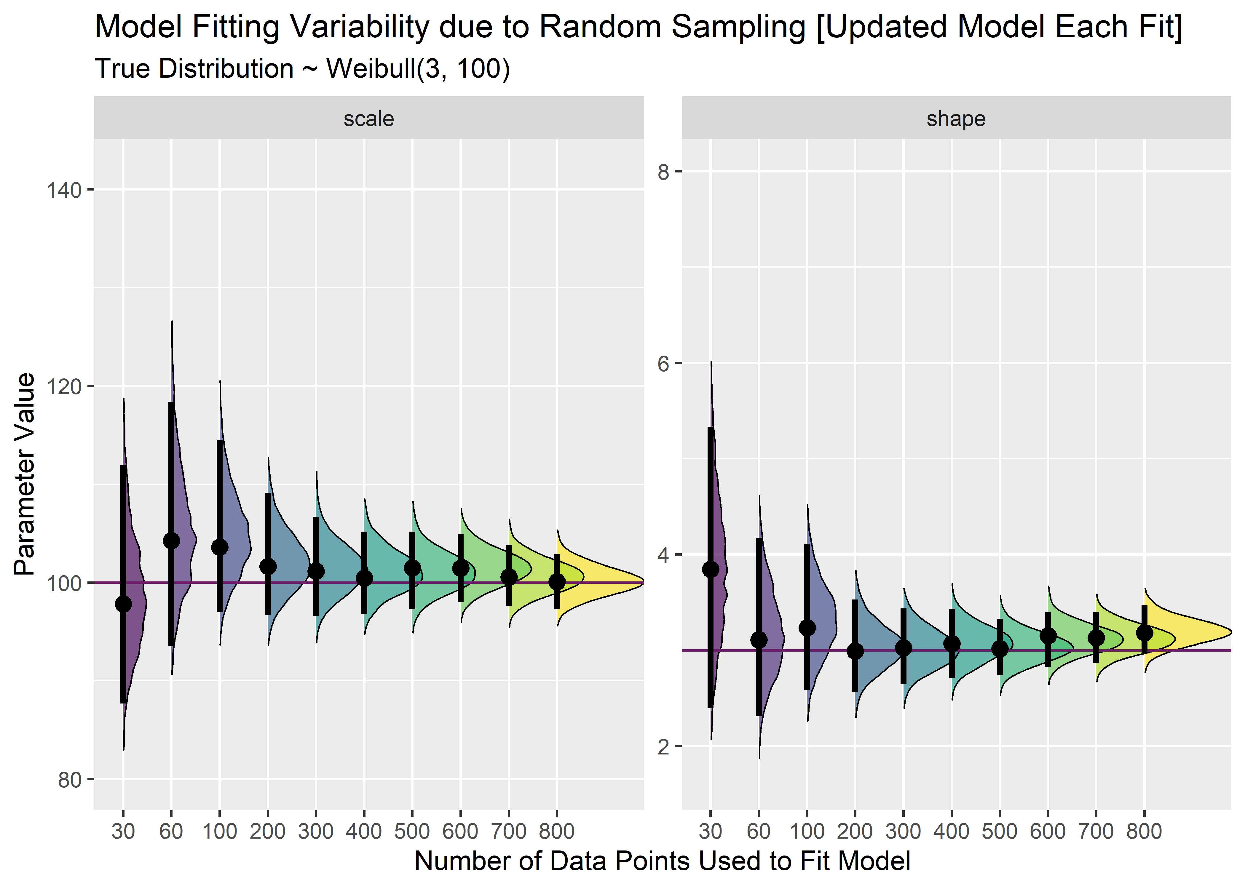
The precision increase here is more smooth since supplemental data is added to the original set instead of just drawing completely randomly for each sample size. This is Bayesian updating.
Evaluate Sensitivity of Reliability Estimate to Sample Size.
To wrap things up, we should should translate the above figures into a reliability metric because that is the prediction we care about at the end of the day. I chose an arbitrary time point of t=40 to evaluate the reliability.
combined_nbu_rr_tbl <- combined_nbu_tbl %>% mutate(reliability_at_t40 = exp(-(40 / scale)**(shape)))

rq05_tbl <- combined_nbu_rr_tbl %>% group_by(model) %>%
  summarize(rel_q05 = quantile(reliability_at_t40, .05)) %>%
  mutate(model = as.numeric(model)) %>%
  ungroup()

reliability_ridge_plt <- combined_nbu_rr_tbl %>%
  gather(key = "key", value = "value", -c(model, reliability_at_t40)) %>%
  ggplot(aes(x = reliability_at_t40, y = model, group = model, fill = model)) +
  geom_density_ridges(size = 1 / 3, rel_min_height = .005, alpha = .8) +
  stat_pointintervalh(
    point_interval = mode_hdi,
    .width = .95,
    show.legend = FALSE
  ) +
  coord_flip() +
  scale_fill_viridis_d() +
  labs(
    x = "Reliability at t=40",
    y = "Number of Data Points Used to Fit Model",
    title = "Uncertainty in Reliability Posterior",
    subtitle = "Reliability Assessed at t = 40"
  ) +
  theme(legend.position = "") +
  xlim(c(.85, 1))


reliability_ridge_plt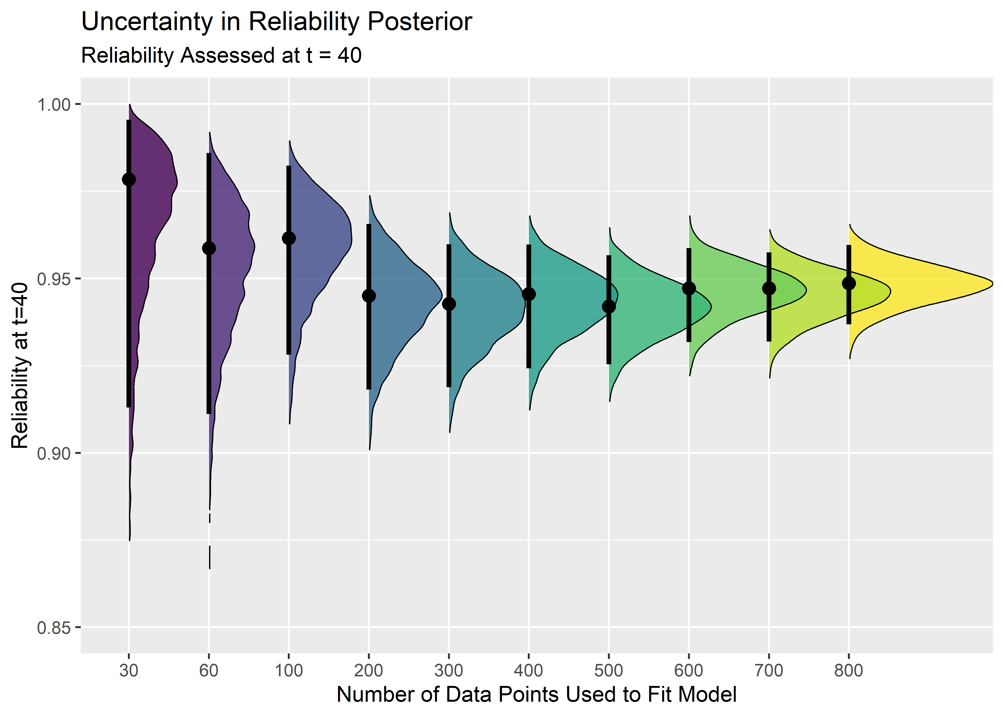
Wrap-up
Here is a summary of where we ended up going in the post:
- Fit some models using fitdistr plus using data that was not censored. Calculated reliability at time of interest.
- Fit the same models using a Bayesian approach with grid approximation. Visualized what happens if we incorrectly omit the censored data or treat it as if it failed at the last observed time point.
- Explored fitting censored data using the survival package. Evaluated sensitivity to sample size.
- Used brms to fit Bayesian models with censored data. Assessed sensitivity of priors and tried to improve our priors over the default. Evaluated effect of sample size and explored the different between updating an existing data set vs. drawing new samples.
If you made it this far - I appreciate your patience with this long and rambling post. Thank you for reading!
APPENDIX - Prior Predictive Simulation - BEWARE it’s ugly in here
# evaluate default priors
default_shape_prior <- rgamma(10000, .01, .01)
default_shape_prior_tbl <- default_shape_prior %>% as_tibble()
default_shape_prior_tbl %>% ggplot(aes(x = default_shape_prior)) +
  geom_histogram(aes(y = ..density..), binwidth = 3, boundary = 0, fill = "#2c3e50", color = "white", alpha = .6) + geom_density(color = "#cf4c74ff") +
  labs(title = "Default Prior for Shape Parameter")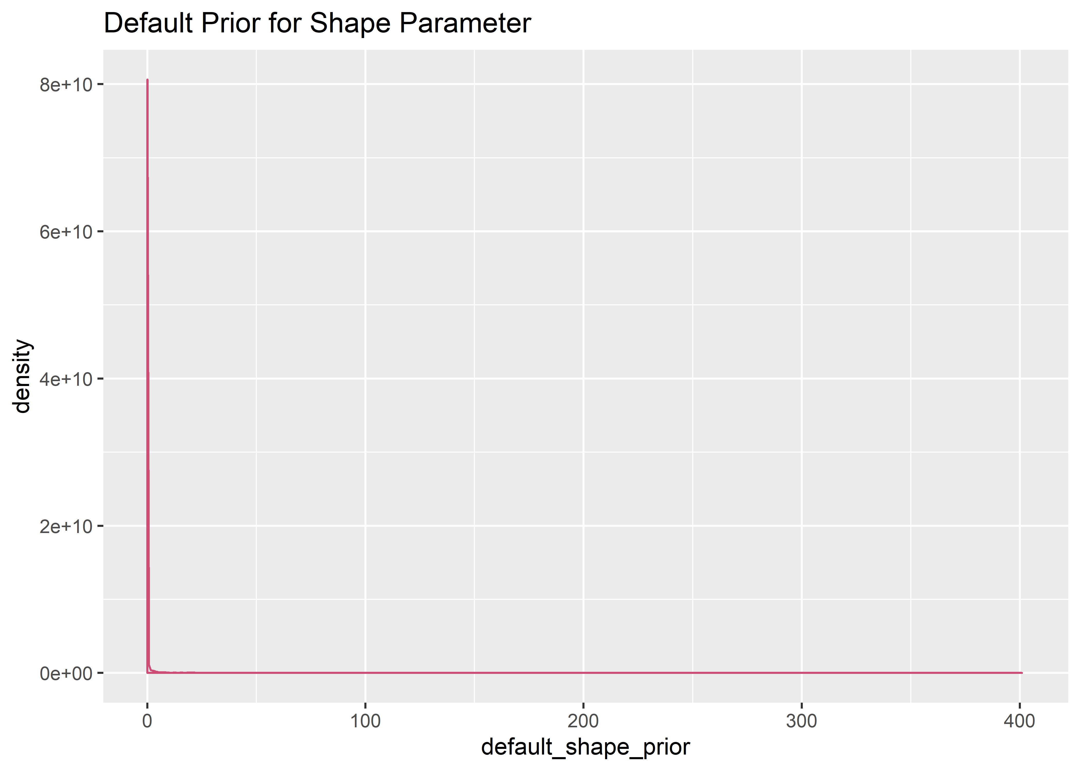
#   ylim(c(0, 1e-3))

default_intercept_prior <- rstudent_t(10000, 3, 4, 10)

default_priors_tbl <- default_intercept_prior %>%
  as_tibble() %>%
  bind_cols(default_shape_prior_tbl) %>%
  rename(intercept = value, shape = value1) %>%
  mutate(scale_prior = exp(intercept) / (gamma(1 + 1 / shape))) %>%
  filter(scale_prior < 1000) %>%
  select(-intercept)

default_priors_tbl %>% ggplot(aes(x = scale_prior)) +
  geom_histogram(aes(y = ..density..), binwidth = 5, boundary = 100, fill = "#2c3e50", color = "white", alpha = .8) +
  geom_density(color = "#cf4c74ff") +
  labs(title = "Default Prior for Scale Parameter")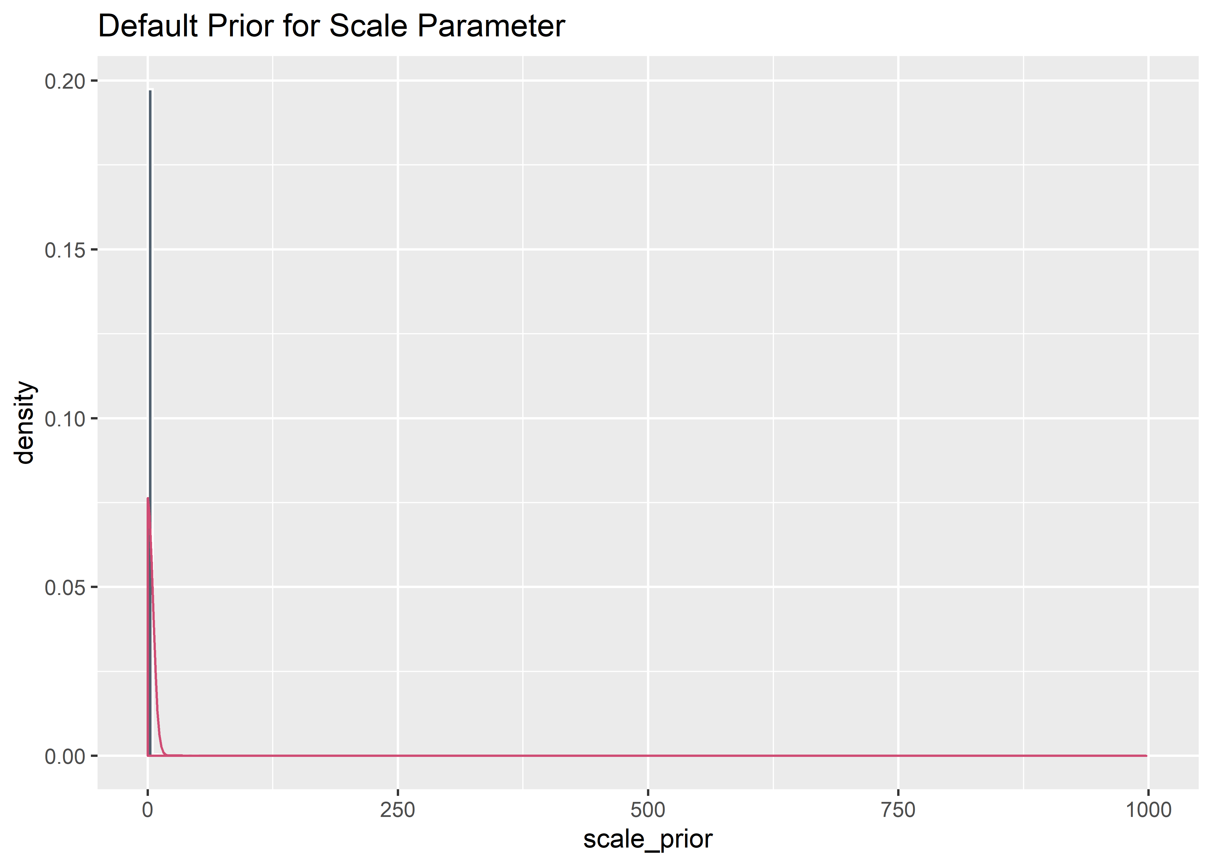
# ylim(c(0, .001))Prior Predictive Simulation - Default Priors
d1 <- default_priors_tbl[1:350, ] %>%
mutate(plotted_y_data = map2(
shape, scale_prior,
~ tibble(
x = seq(0, 200, length.out = 400),
y = dweibull(x, .x, .y)
)
)) %>%
unnest(plotted_y_data) %>%
ggplot(aes(x, y)) +
geom_line(aes(group = shape), alpha = .2) +
labs(
x = "Time to Event",
y = "Density"
)
d2 <- d1 +
xlim(c(0, 25)) +
ylim(c(0, .1))
d1 + d2 + plot_layout(
nrow = 1,
guides = "collect"
) +
plot_annotation(title = "Implied Time-to-Failure Weibull Distributions (from default priors)")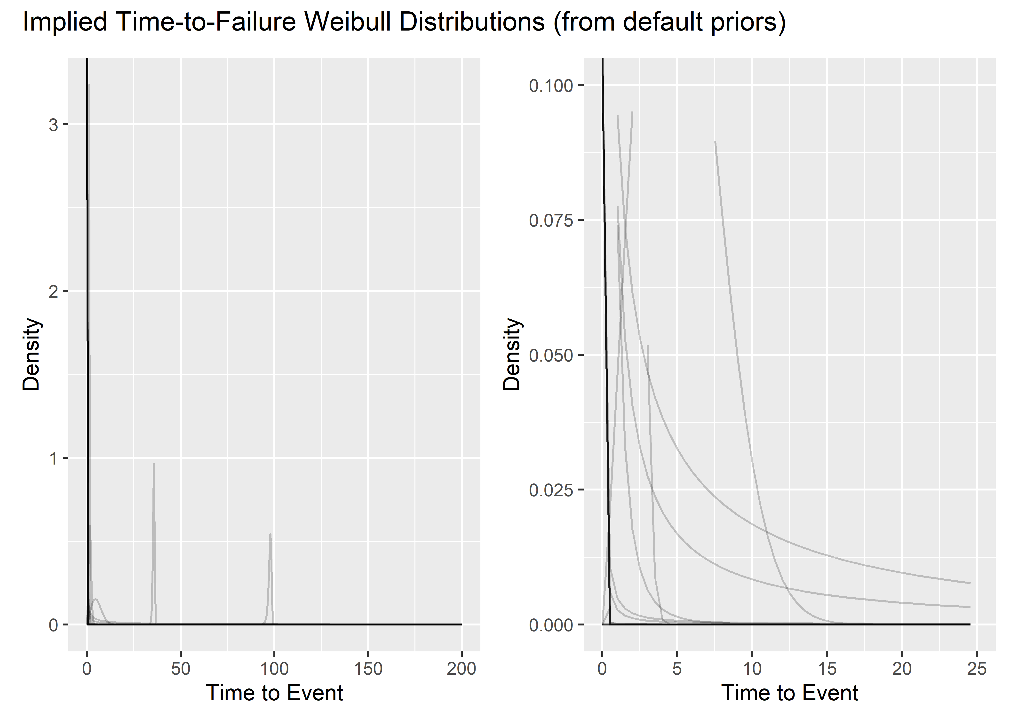 Here are the reliabilities at t=15 implied by the default priors.
r15_pp_default_tbl <- default_priors_tbl %>% mutate(reliability_at_t15 = exp(-(15 / scale_prior)**(shape)))

r1 <- r15_pp_default_tbl %>% ggplot(aes(x = reliability_at_t15)) +
  geom_histogram(aes(y = ..density..), binwidth = .01, boundary = 1, fill = "#de6065ff", color = "white", alpha = .6) +
  labs(title = "Reliability at t=15 implied by default priors")

def_plt <- (d1 + d2) / r1 + plot_layout(guides = "collect") +
  plot_annotation(title = "Implied Time-to-Failure Weibull Distributions (from default priors)")
Not too useful. In the following section I try to tweak the priors such that the simulations indicate some spread of reliability from 0 to 1 before seeing the data. Again, it’s tough because we have to work through the Intercept and the annoying gamma function.
# Evaluate Mildly Informed Priors
shape_prior <- runif(100000, 0, 10)
shape_prior_tbl <- shape_prior %>% as_tibble()
shaaaape <- shape_prior_tbl %>% ggplot(aes(x = shape_prior)) +
geom_histogram(aes(y = ..density..), binwidth = 1, boundary = 10, fill = "#2c3e50", color = "white", alpha = .6)
intercept_prior <- rstudent_t(100000, 3, 5, 5)
priors_tbl <- intercept_prior %>%
as_tibble() %>%
bind_cols(shape_prior_tbl) %>%
rename(intercept = value, shape = value1) %>%
mutate(scale_prior = exp(intercept) / (gamma(1 + 1 / shape))) %>%
filter(scale_prior < 1000) %>%
select(-intercept)
scaaaale <- priors_tbl %>% ggplot(aes(x = scale_prior)) +
geom_histogram(aes(y = ..density..), binwidth = 10, boundary = 100, fill = "#2c3e50", color = "white", alpha = .8) +
ylim(c(0, .005))
shaaaape + scaaaale + plot_annotation(title = "Prior Predicitve Simulations for Shape and Scale")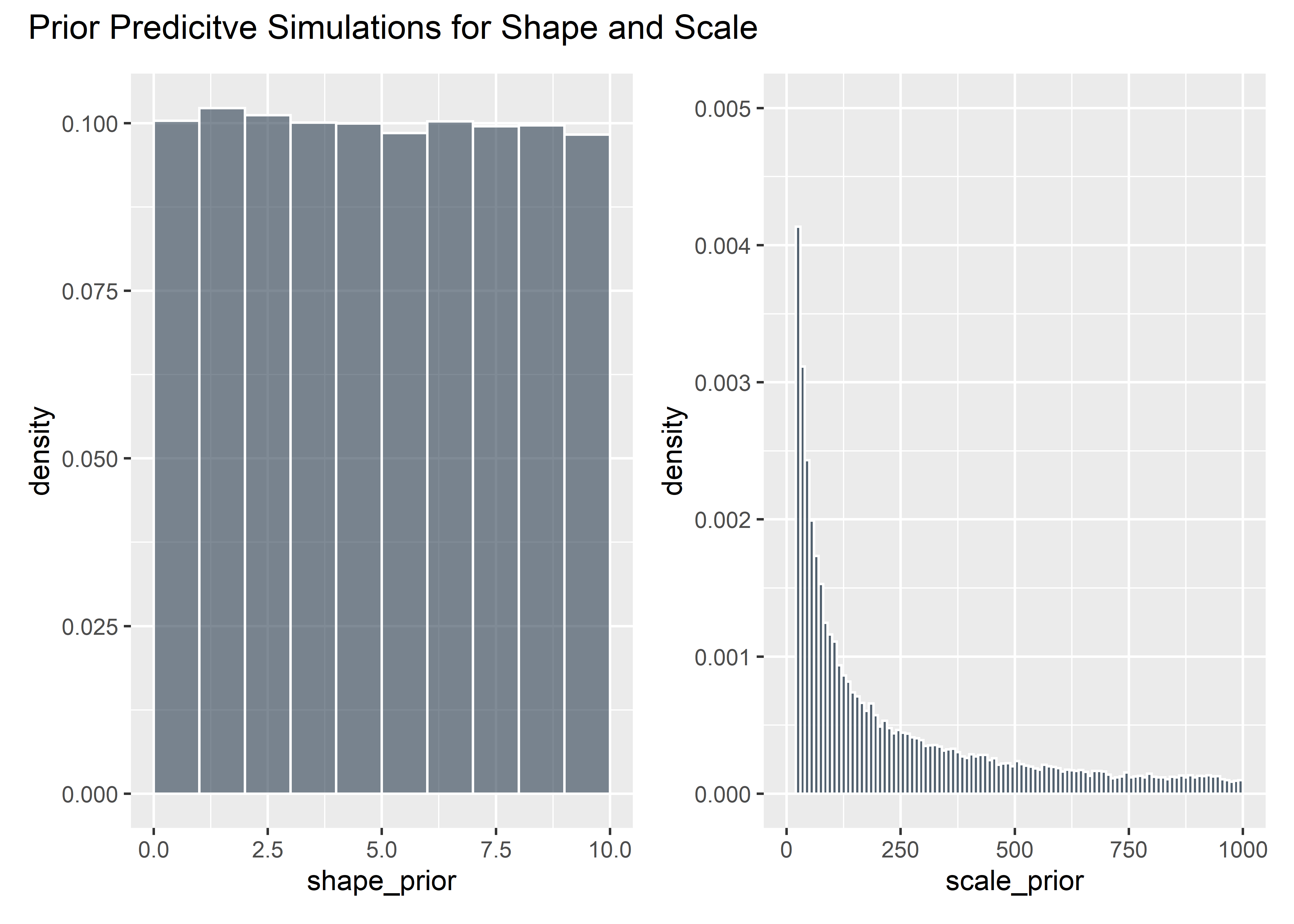 Implied time-to-event curves:
p1 <- priors_tbl[1:500, ] %>%
mutate(plotted_y_data = map2(
shape, scale_prior,
~ tibble(
x = seq(0, 200, length.out = 400),
y = dweibull(x, .x, .y)
)
)) %>%
unnest(plotted_y_data) %>%
ggplot(aes(x, y)) +
geom_line(aes(group = shape), alpha = .2) +
xlim(c(0, 50)) +
ylim(c(0, .5)) +
labs(
x = "Time to Event",
y = "Density",
title = "Implied Time-to-Event Curves from Iterated Priors"
)
p1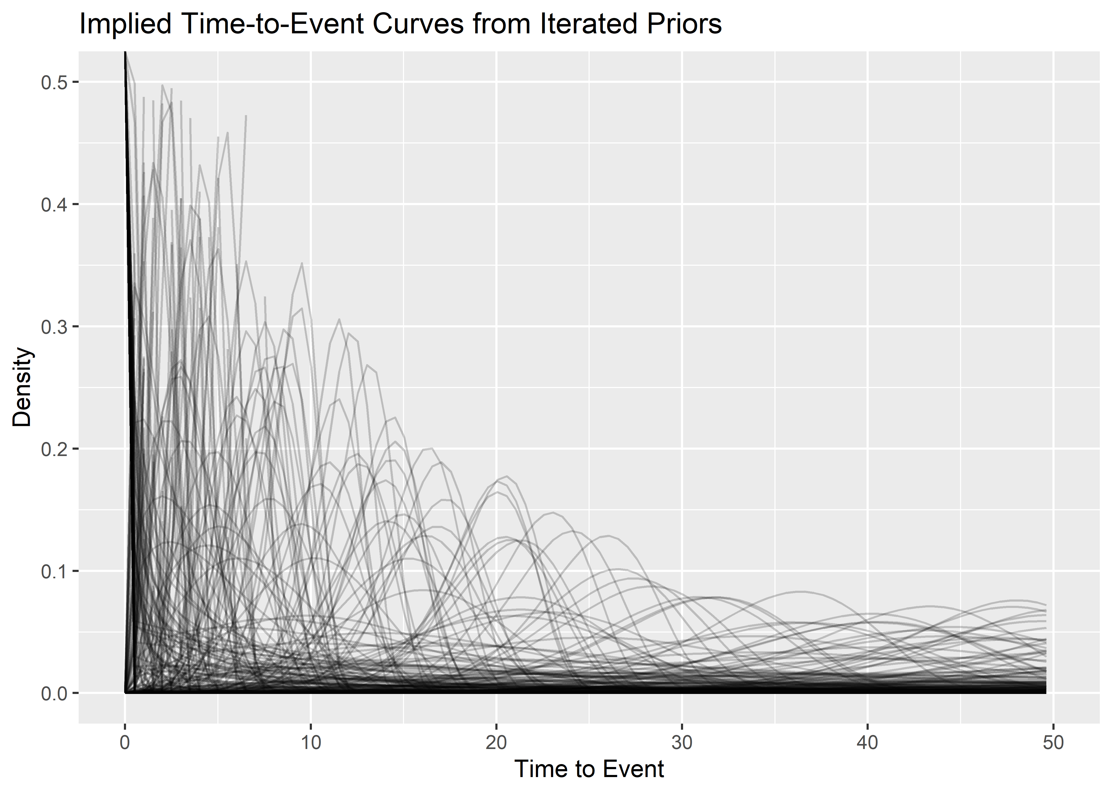 And the implied prior predictive reliability at t=15:
r15_pp_mi_tbl <- priors_tbl %>% mutate(reliability_at_t15 = exp(-(15 / scale_prior)**(shape)))
pz <- r15_pp_mi_tbl %>% ggplot(aes(x = reliability_at_t15)) +
geom_histogram(aes(y = ..density..), binwidth = .1, boundary = 1, fill = "#7b0288ff", color = "white", alpha = .6) +
labs(
title = "Prior Predictive Estimate at t=15",
subtitle = "Iterated Priors"
)
p1 + pz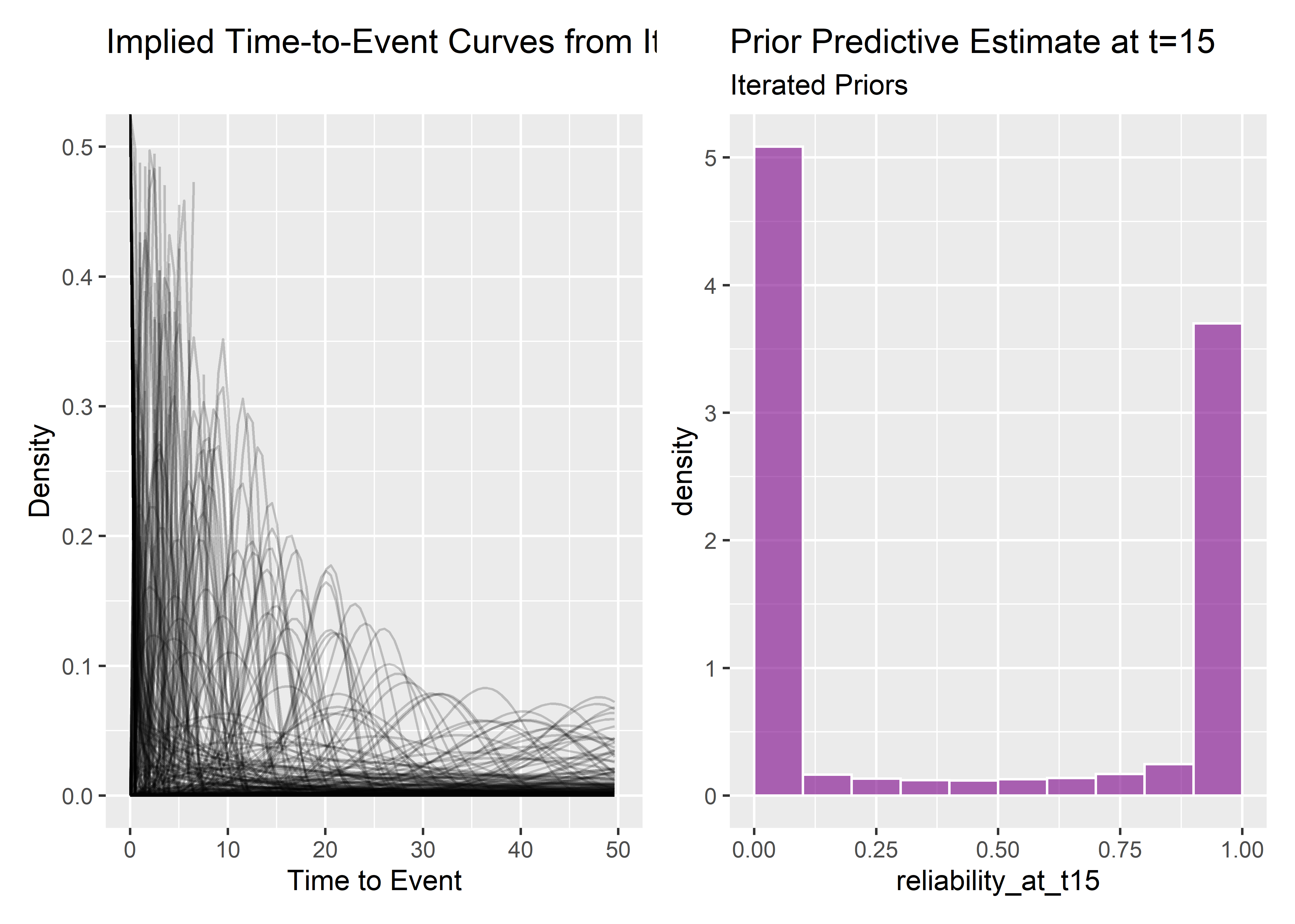 This still isn’t great - now I’ve stacked most of the weight at 0 and 1 always fail or never fail. This is hard and I do know I need to get better at it. But since I’m already down a rabbit hole let’s just check to see how the different priors impact the estimates.
Fit the model with iterated priors: student_t(3, 5, 5) for Intercept and uniform(0, 10) for shape.
# fit model with better priors (original n=30 data point)
# mtf_weib_new_priors_fit <-
#  brm(
#    data = months_to_failure_tbl_4.3.3, family = weibull(),
#    time | cens(censored) ~ 1,
#    prior = c(
#      prior(student_t(3, 5, 5), class = Intercept),
#     prior(uniform(0, 10), class = shape)
#    ),
#    iter = 41000, warmup = 40000, chains = 4, cores = 4,
#   seed = 4
#  )
Evaluate chains and convert to shape and scale
plot(mtf_weib_new_priors_fit)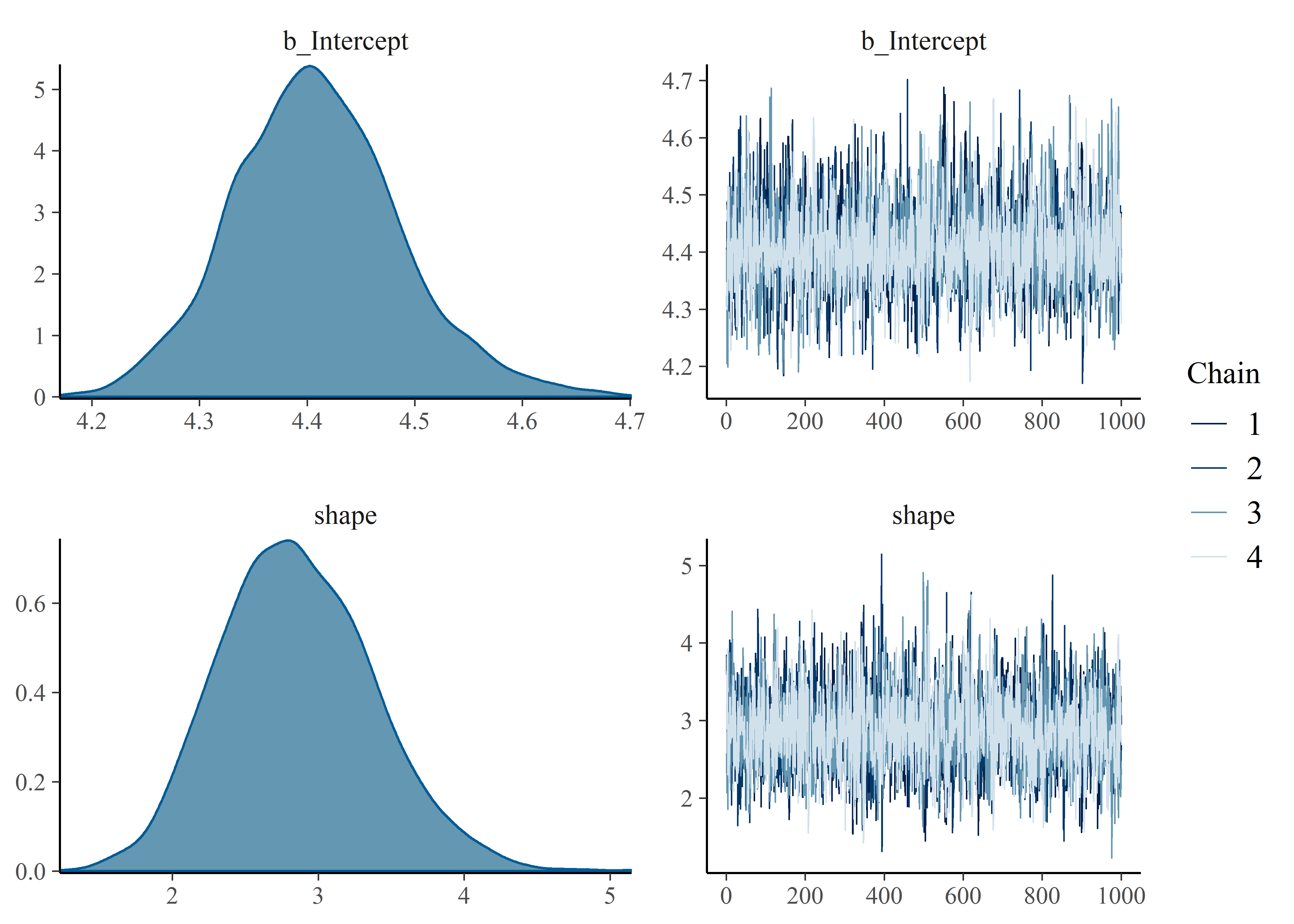
post_mwnp_samples <- posterior_samples(mtf_weib_new_priors_fit) %>%
  mutate(scale = exp(b_Intercept) / (gamma(1 + 1 / shape))) %>%
  select(shape, scale)

post_mwnp_samples %>%
  head(10) %>%
kable(align = rep("c", 2), digits = 2)| shape | scale |
|---|---|
| 3.66 | 98.52 |
| 3.66 | 98.52 |
| 2.39 | 98.48 |
| 2.82 | 95.86 |
| 3.02 | 92.85 |
| 3.05 | 90.54 |
| 2.38 | 97.18 |
| 2.50 | 97.05 |
| 2.48 | 92.92 |
| 3.25 | 87.81 |
Evaluate the effect of the different priors (default vs. iterated) on the model fit for original n=30 censored data points.
baseline_30_default_prior_tbl <- post_mtf_weib_samples %>% mutate(priors = "shape: gamma(.01, .01) \nIntercept: student_t(3, 4, 10)")

baseline_30_mi_prior_tbl <- post_mwnp_samples %>% mutate(priors = "shape: uniform(0, 10) \nIntercept: student_t(3, 5, 5)")

baseline_30_prior_compare_tbl <- bind_rows(
  baseline_30_default_prior_tbl,
  baseline_30_mi_prior_tbl
)

b_30_prior_plt <- baseline_30_prior_compare_tbl %>% ggplot(aes(x = shape, y = scale)) +
  geom_point(aes(color = priors), alpha = .1) +
  geom_hline(aes(yintercept = 100), size = .5, alpha = .3) +
  geom_vline(aes(xintercept = 3), size = .5, alpha = .3) +
  scale_color_viridis_d() +
  guides(colour = guide_legend(override.aes = list(alpha = 1))) + # force legend icons to be alpha = 1 instead of .05
  labs(
    title = "Credible Parameters for Shape and Scale; Effect of Priors",
    subtitle = "Model: Weibull with Censoring; True ~ Weibull(shape = 3, scale = 100)",
    x = expression(eta ["shape"]),
    y = expression(beta ["scale"])
  ) +
  theme(legend.position = "bottom")


b_30_prior_marg_plot <- ggMarginal(b_30_prior_plt,
  groupColour = TRUE,
  groupFill = TRUE,
  type = "density",
  alpha = 0.5
)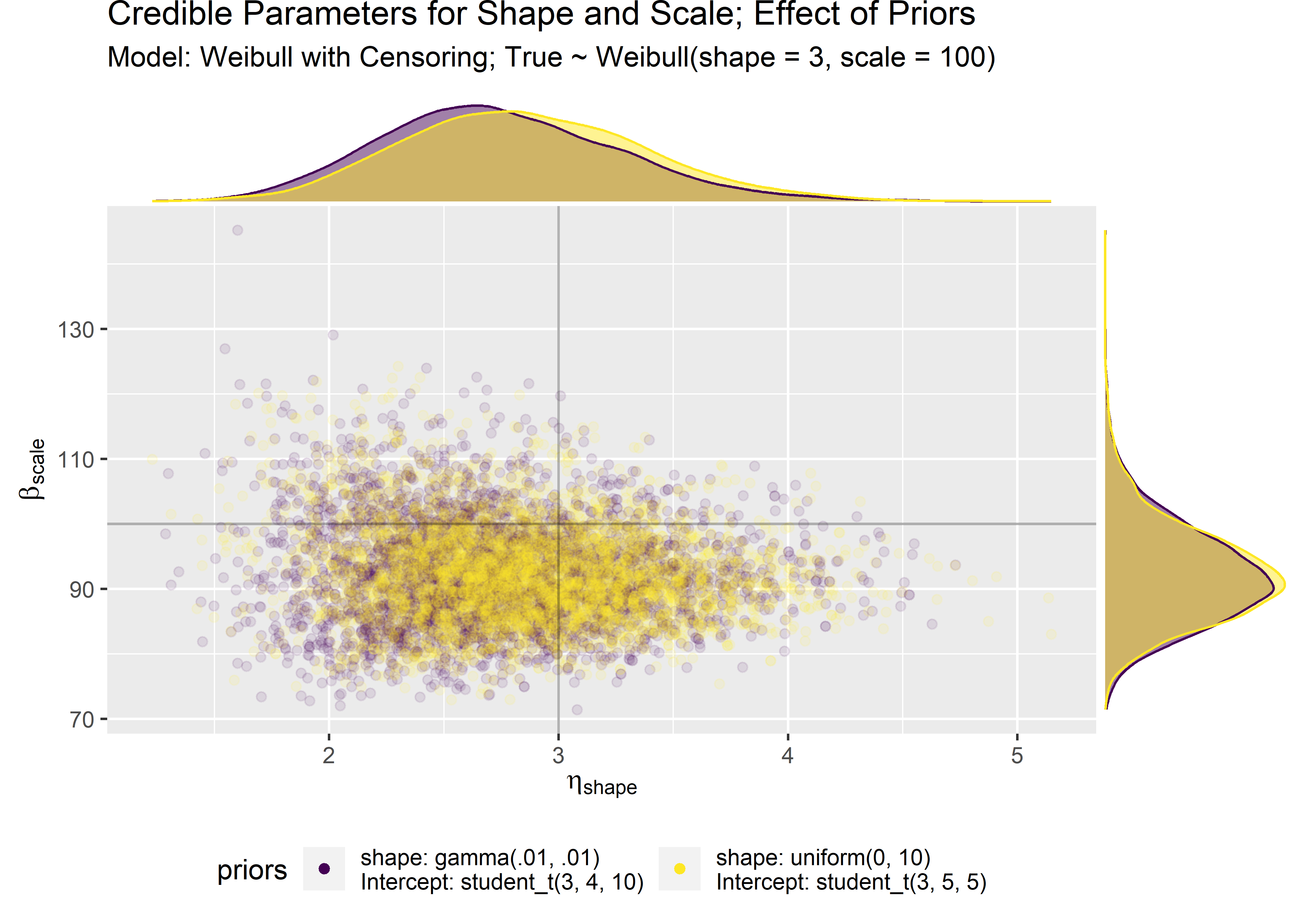
At the end of the day, both the default and the iterated priors result in similar model fits and parameter estimates after seeing just n=30 data points. This is sort of cheating but I’m still new to this so I’m cutting myself some slack.
Stent fatigue testing https://www.youtube.com/watch?v=YhUluh5V8uM↩
Data taken from Practical Applications of Bayesian Reliability by Abeyratne and Liu, 2019↩
Note: the reliability function is sometimes called the survival function in reference to patient outcomes and survival analysis↩
grid_function borrowed from Kurz, https://bookdown.org/ajkurz/Statistical_Rethinking_recoded/↩
Survival package documentation, https://stat.ethz.ch/R-manual/R-devel/library/survival/html/survreg.html↩
We would want to de-risk this appoach by makng sure we have a bit of historical data on file indicating our device fails at times that follow a Weibull(3, 100) or similar↩
See the “Survival Model” section of this document: https://cran.r-project.org/web/packages/brms/vignettes/brms_families.html#survival-models↩
Thread about vague gamma priors https://math.stackexchange.com/questions/449234/vague-gamma-prior↩