Measurements taken from patient anatomy are often correlated. For example, larger blood vessels might tend to have less curvature. Additionally, data are rarely Gaussian, favoring skewed shapes with some very large values and a lower bound of zero. These properties can make simulation and inference hard. In this post I will walk through a workflow for an engineering problem that might be presented in my industry. It involves simulating a population of patients and identifying a subset of interest.
Imagine we have been assigned the task of identifying boundary conditions for a benchtop durability test of an implantable, artificial heart valve. In other words, we need to identify credible parameters for a physical test such that our test engineers can challenge the device under severe but realistic geometries and loads. To facilitate this task our clinical team has analyzed images and extracted measurements for the features of interest in a subset of n=300 patients. There are two main challenges when working with these data:
- How do we use our sample to simulate the full population?
- How do we use the simulated, full population to identify groups of interest and recommend boundary conditions for the test
The rest of this post explores what we should do with these data to resolve these challenges and identify appropriate and realistic test conditions.
The Data
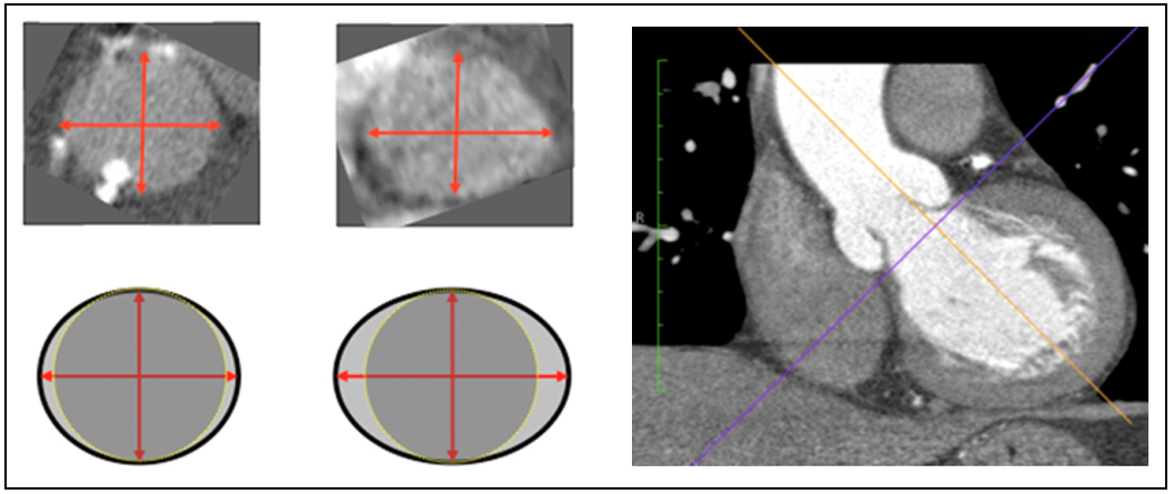
Suppose the three parameters our team cares about are the ellipticity of the vessel cross section, curvature of the vessel in the vessel region of interest, and the blood pressure. Features such as these are important because they influence both the equilibrium geometry and the magnitude of forces acting on the implantable valve (in other words: the boundary conditions). The image below shows a schematic/example of ellipticity and vessel curvature in the LVOT and aortic valve annulus as observed in CT imaging.1
I enjoy the tidyverse toolset for exploring and working with data so let’s get that loaded up along with some other packages that will help in the analysis to come.
library(readxl)
library(knitr)
library(DiagrammeR)
library(fitdistrplus)
library(MASS)
library(ggrepel)
library(readxl)
library(ks)
library(broom)
library(ggExtra)
library(GGally)
library(car)
library(rgl)
library(anySim)
library(tidyverse)
library(plotly)- The Data
- Correlations in the Original Dataset
- AnySim - Generate Simulated Population of Correlated Patient Data
- Kernel Density Estimation - Map Density Contours to Data
- Naive Method - Apply Default KDE to Lognormal Data
- Fit KDE to normal data transform later
- Filter extreme points and assess points on 95-5 contour
- Appendix A - simulating a multivariate distribution with mass mvnorm
- Step 1 - Fit Distributions to Each Variable
- Step 2 - Transform all variables to normal
- Step 3 - Fit normal distributions to each transformed variable
- Step 4 - Draw joint distribution using mvrnorm() or equivalent function
- Step 5 - Back-transform simulated data to original distribution
- Step 6 - Evaluate parameters and marginal distributions of the back-transfomed data
- Compare Original Data to Simulated Data
- Appendix B - 2d kde plot with probability traces
Start by reading in the data and taking a look at the format.
sample_data <- readRDS(file = "sim_anatomy_data.rds")
sample_data
## # A tibble: 300 x 3
## ellip curv pressure
## <dbl> <dbl> <dbl>
## 1 1.26 4.51 92.7
## 2 1.28 5.02 183.
## 3 1.29 4.03 154.
## 4 1.23 2.14 109.
## 5 1.13 3.67 124.
## 6 1.22 2.37 114.
## 7 1.10 3.06 113.
## 8 1.04 2.31 105.
## 9 1.11 5.31 115.
## 10 1.09 2.04 109.
## # ... with 290 more rowsAs expected, 300 rows with our 3 features of interest.
It might seem tempting at this point to extract the maximum value from each group (or maybe something like the 95th percentile) and report those values together as a conservative worst-case. The problem with this approach is that each row of data is from a specific patient, so the variables are likely to be correlated. It could be that those severe values for each variable never occur together in the same patient. If we choose them all, we could over-test the device and over-design the device, potentially setting the program way behind. A more sophisticated approach is to consider the variables as a joint distribution and respect any correlation that may be present.
Here is some code to visualize the marginal distributions.
ellip_curv_plt <- sample_data %>%
  ggplot(aes(x = ellip, y = curv)) +
  geom_point(alpha = .5) +
  labs(
    title = "Patient Data From n=300 Scans",
    subtitle = "Vessel Ellipticity and Vessel Curvature Joint Distribution",
    x = "Ellipticity",
    y = "Curvature (mm)"
  )

ellip_pressure_plt <- sample_data %>%
  ggplot(aes(x = ellip, y = pressure)) +
  geom_point(alpha = .5, color = "firebrick") +
  labs(
    title = "Patient Data From n=300 Scans",
    subtitle = "Vessel Ellipticity and Blood Pressure Joint Distribution",
    x = "Ellipticity",
    y = "Pressure (mm Hg)"
  )

curv_pressure_plt <- sample_data %>%
  ggplot(aes(x = curv, y = pressure)) +
  geom_point(alpha = .5, color = "limegreen") +
  labs(
    title = "Patient Data From n=300 Scans",
    subtitle = "Vessel Curvature and Blood Pressure Joint Distribution",
    x = "Curvature (mm)",
    y = "Pressure (mm Hg"
  )

ellip_curv_mplt <- ggExtra::ggMarginal(ellip_curv_plt, type = "density", fill = "#2c3e50", alpha = .5)
ellip_pressure_mplt <- ggExtra::ggMarginal(ellip_pressure_plt, type = "density", fill = "firebrick", alpha = .5)
curv_pressure_mplt <- ggExtra::ggMarginal(curv_pressure_plt, type = "density", fill = "limegreen", alpha = .5)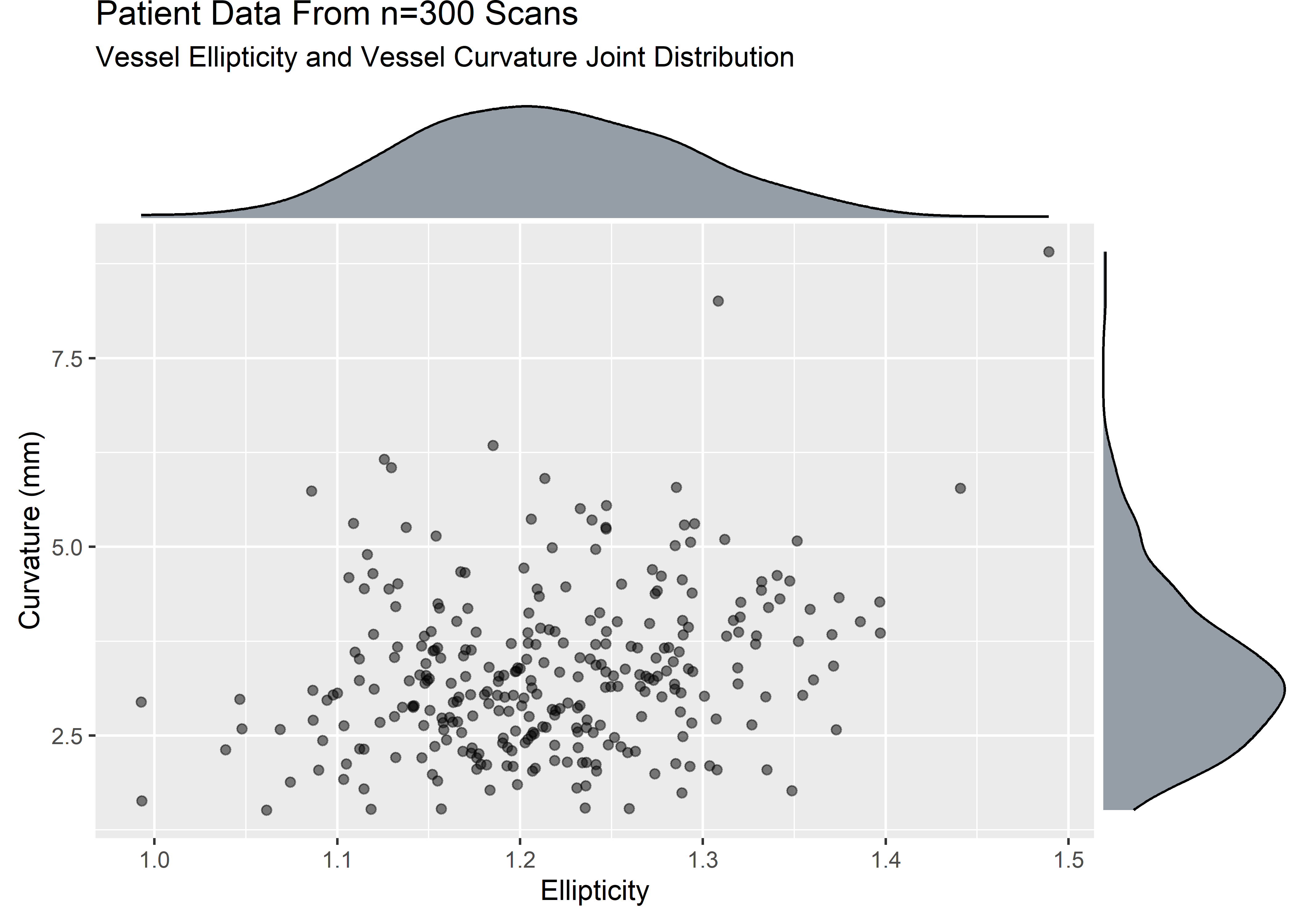
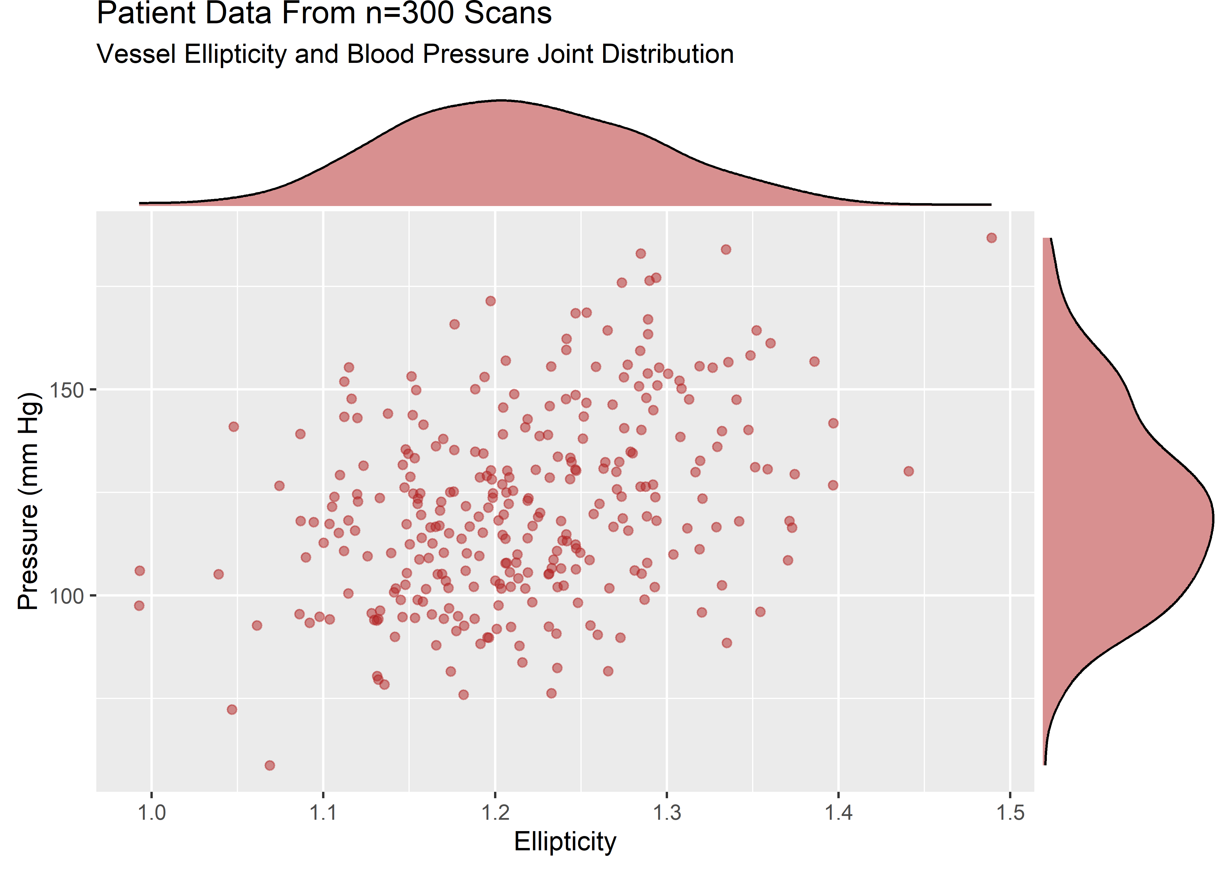
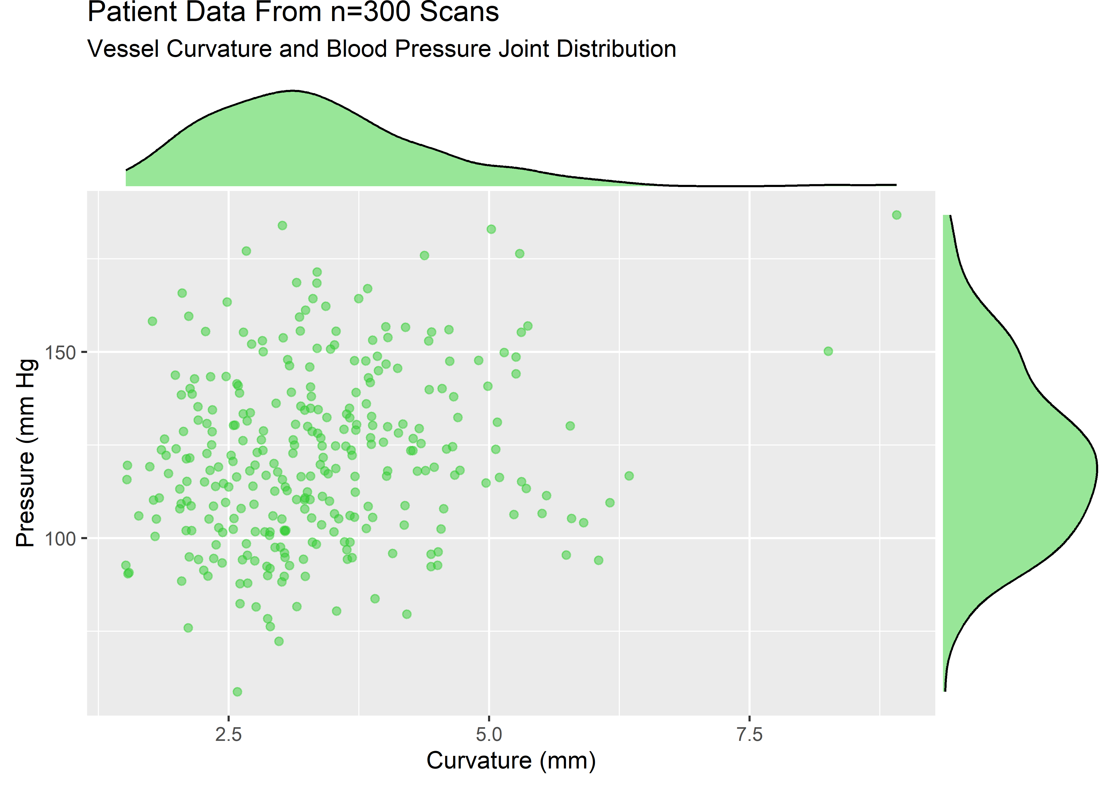
The variables are strictly positive and show some skew. Let’s assume that from domain knowledge we know these variables to be well described by a lognormal. The visuals would be consistent with this assumption.
Correlations in the Original Dataset
ggcorr() from the GGally package is very convenient for visualizing correlations.
sample_data %>% ggcorr(
  high = "#20a486ff",
  low = "#fde725ff",
  label = TRUE,
  hjust = .75,
  size = 3,
  label_size = 3,
  label_round = 3,
  nbreaks = 3
) +
  labs(
    title = "Correlation Matrix - n=300 Patient Set",
    subtitle = "Pearson Method Using Pairwise Observations"
  )
We see that there are some positive correlations in this dataset.
To build out the sample into a simulated population we will fit a MLE estimate and use the model to push out a lot of predictions.2 If the variables were not correlated, we could just execute a few rlnorm()’s and bind them together. The job is more challenging when the variables are correlated because they must be simulated all at once.
I know of 2 convenient engines in R to generate an arbitrary number of random values from a correlated, multivariate distribution:
AnySim::SimCorrRVs : For this method you specify the parameters of the marginal distributions and correlation matrix.3
mass::mvnorm() : For this method you transform each distribution to normal and supply the mean and sd of each variable along with the covariance matrix.
My personal preference is for the AnySim method which I’ll show below. The code for executing a similar simulation with mass::mvnorm() is shown in Appendix A.
AnySim - Generate Simulated Population of Correlated Patient Data
The AnySim workflow:
First: fit distributions to the original data and calculate correlations.
ellip_fit <- fitdist(sample_data$ellip, "lnorm")
curv_fit <- fitdist(sample_data$curv, "lnorm")
pressure_fit <- fitdist(sample_data$pressure, "lnorm")

# store lognormal parameters of original data
ellip_meanlog <- ellip_fit$estimate[["meanlog"]]
ellip_sdlog <- ellip_fit$estimate[["sdlog"]]
curv_meanlog <- curv_fit$estimate[["meanlog"]]
curv_sdlog <- curv_fit$estimate[["sdlog"]]
pressure_meanlog <- pressure_fit$estimate[["meanlog"]]
pressure_sdlog <- pressure_fit$estimate[["sdlog"]]

# store correlations in original data
cor_ec <- cor(x = sample_data$ellip, y = sample_data$curv)
cor_ep <- cor(x = sample_data$ellip, y = sample_data$pressure)
cor_cp <- cor(x = sample_data$curv, y = sample_data$pressure)
Apply the AnySim workflow. Note that this too goes through an auxiliary normal intermediate step.
set.seed(1234)

# Define the target distribution functions (ICDFs) of each random variable.

ellip_dist <- "qlnorm"
curv_dist <- "qlnorm"
pressure_dist <- "qlnorm"

# store the 3 ICDFs in a vector
dist_vec <- c(ellip_dist, curv_dist, pressure_dist)

# Define the parameters of the target distribution functions - store them in a list
ellip_params <- list(meanlog = ellip_meanlog, sdlog = ellip_sdlog)
curv_params <- list(meanlog = curv_meanlog, sdlog = curv_sdlog)
pressure_params <- list(meanlog = pressure_meanlog, sdlog = pressure_sdlog)

# this is a weird way to do it but I'm following along with an example from AnySim vignette :)
params_list <- list(NULL)
params_list[[1]] <- ellip_params
params_list[[2]] <- curv_params
params_list[[3]] <- pressure_params

# Define the target correlation matrix.
corr_matrix <- matrix(c(
  1, 0.268, 0.369,
  0.268, 1, .213,
  0.369, 0.213, 1
),
ncol = 3,
nrow = 3,
byrow = T
)
# Estimate the parameters of the auxiliary Gaussian model.
aux_gaussion_param_tbl <- EstCorrRVs(
  R = corr_matrix, dist = dist_vec, params = params_list,
  NatafIntMethod = "GH", NoEval = 9, polydeg = 8
)


# Generate 10000 synthetic realizations of the 3 correlated RVs.
correlated_ln_draws_tbl <- as_tibble(SimCorrRVs(n = 10000, paramsRVs = aux_gaussion_param_tbl)) %>%
  rename(
    ellip = V1,
    curv = V2,
    pressure = V3
  )

correlated_ln_draws_tbl %>%
  head(10) %>%
kable(align = "c")| ellip | curv | pressure |
|---|---|---|
| 1.123496 | 1.674471 | 78.14516 |
| 1.234755 | 3.927320 | 104.53631 |
| 1.299794 | 4.071074 | 116.55043 |
| 1.045001 | 2.721336 | 106.23896 |
| 1.246727 | 5.091741 | 102.83055 |
| 1.252843 | 2.869394 | 93.24030 |
| 1.169606 | 1.613312 | 125.12784 |
| 1.171699 | 2.921069 | 156.06701 |
| 1.170371 | 2.672507 | 145.82545 |
| 1.146382 | 3.030319 | 89.91766 |
Evaluate recovered marginal distributions with some helper functions:
extract_params_sim_fcn <- function(var, fit_to) {
  tidy(fitdistr(correlated_ln_draws_tbl %>% pull(var), fit_to)) %>%
    mutate(
      var = {
        var
      },
      dataset = "sim_draws"
    )
}

extract_params_pat_fcn <- function(var, fit_to) {
  tidy(fitdistr(sample_data %>% pull(var), fit_to)) %>%
    mutate(
      var = {
        var
      },
      dataset = "patient_set"
    )
}

sim_results_tbl <- tibble(
  var = c("ellip", "curv", "pressure"),
  fit_to = rep("lognormal", 3)
) %>%
  mutate(params = map2(.x = var, .y = fit_to, .f = extract_params_sim_fcn)) %>%
  unnest() %>%
  dplyr::select(-var1)

pat_results_tbl <- tibble(
  var = c("ellip", "curv", "pressure"),
  fit_to = rep("lognormal", 3)
) %>%
  mutate(params = map2(.x = var, .y = fit_to, .f = extract_params_pat_fcn)) %>%
  unnest() %>%
  dplyr::select(-var1)

sim_results_tbl %>%
  bind_rows(pat_results_tbl) %>%
  select(-std.error) %>%
  pivot_wider(id_cols = everything(), names_from = "dataset", values_from = "estimate") %>%
kable(align = "c")| var | fit_to | term | sim_draws | patient_set |
|---|---|---|---|---|
| ellip | lognormal | meanlog | 0.1936145 | 0.1932254 |
| ellip | lognormal | sdlog | 0.0628128 | 0.0636092 |
| curv | lognormal | meanlog | 1.1561942 | 1.1579793 |
| curv | lognormal | sdlog | 0.3114360 | 0.3091606 |
| pressure | lognormal | meanlog | 4.7841496 | 4.7831767 |
| pressure | lognormal | sdlog | 0.1896585 | 0.1910081 |
Evaluate recovered correlations:
correlated_ln_draws_tbl %>% ggcorr(
  high = "#20a486ff",
  low = "#fde725ff",
  label = TRUE,
  hjust = .75,
  size = 3,
  label_size = 3,
  label_round = 3,
  nbreaks = 3
) +
  labs(
    title = "Correlation Matrix - n=10000 Simulation Set",
    subtitle = "Pearson Method Using Pairwise Observations"
  )
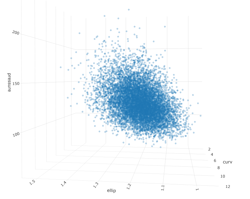
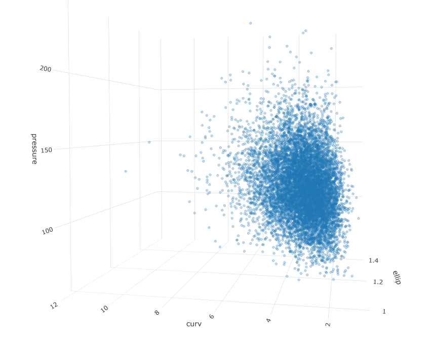
Let’s take a look at the simulated population:
fig <- plotly::plot_ly()

fig <- fig %>% add_trace(x = correlated_ln_draws_tbl$ellip, y = correlated_ln_draws_tbl$curv, z = correlated_ln_draws_tbl$pressure, type = "scatter3d", opacity = .4, hoverinfo = "none", size = .1)

fig <- fig %>%
  layout(scene = list(
    xaxis = list(title = "ellip"),
    yaxis = list(title = "curv"),
    zaxis = list(title = "pressure")
  )) %>%
  layout(scene = list(
    xaxis = list(showspikes = FALSE),
    yaxis = list(showspikes = FALSE),
    zaxis = list(showspikes = FALSE)
  ))

# fig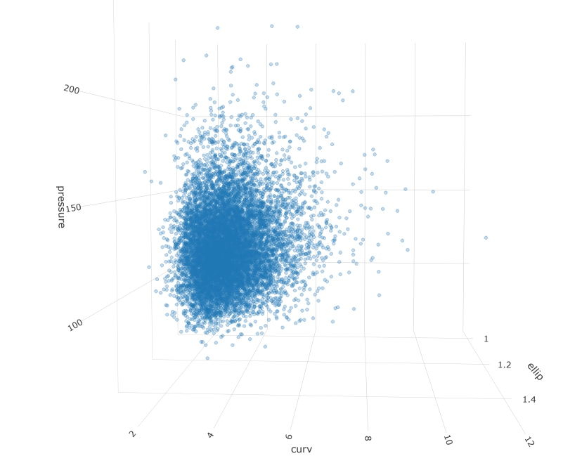
Kernel Density Estimation - Map Density Contours to Data
The above tables and figures confirm the simulated population maintains the correlation structure and marginal distributions from the original sample as intended. The next step will be to build out some density estimates using a non-parametric, kernel density estimator. The reason we would want to do this is to understand the regions where data points are likely to fall and we can use the reference contours to identify the most extreme patients relative to the mode or to some region of interest.
Important Watch-Out : The exact workflow for generating and applying the kernel density estimate may vary depending on the data type. The default kde procedures may assign probabilities to regions outside the rigid boundaries when data does not have infinite support. This will occur for our dataset, since all of our variables are lognormal and should therefore never be negative. Methods for addressing this behavior include variable bandwidth estimators, transformations of estimators, and boundary estimators. To illustrate this problem and provide an example of resolution, I will show 2 parallel workflows below:
- In the first, I apply the default global bandwidth kde to the simulated data
- In the second, I transform the data from lognormal to normal, apply the kde, then backtransform to lognormal
Towards that end, I’ll add some more variables for transformed, normal version of each variable:
corr_draws_tbl <- correlated_ln_draws_tbl %>%
  mutate(
    ellip_n = log(ellip),
    curv_n = log(curv),
    pressure_n = log(pressure)
  ) %>%
  select(ellip_n, curv_n, pressure_n)

corr_draws_tbl %>%
  head(5) %>%
kable(aalign = "c")| ellip_n | curv_n | pressure_n |
|---|---|---|
| 0.1164450 | 0.5154974 | 4.358568 |
| 0.2108725 | 1.3679574 | 4.649534 |
| 0.2622058 | 1.4039068 | 4.758324 |
| 0.0440175 | 1.0011228 | 4.665691 |
| 0.2205217 | 1.6276199 | 4.633083 |
Quick visual check to verify the transformed properly:
corr_draws_tbl %>%
  pivot_longer(cols = everything()) %>%
  ggplot(aes(x = value)) +
  geom_density() +
  facet_wrap(~name, scales = "free")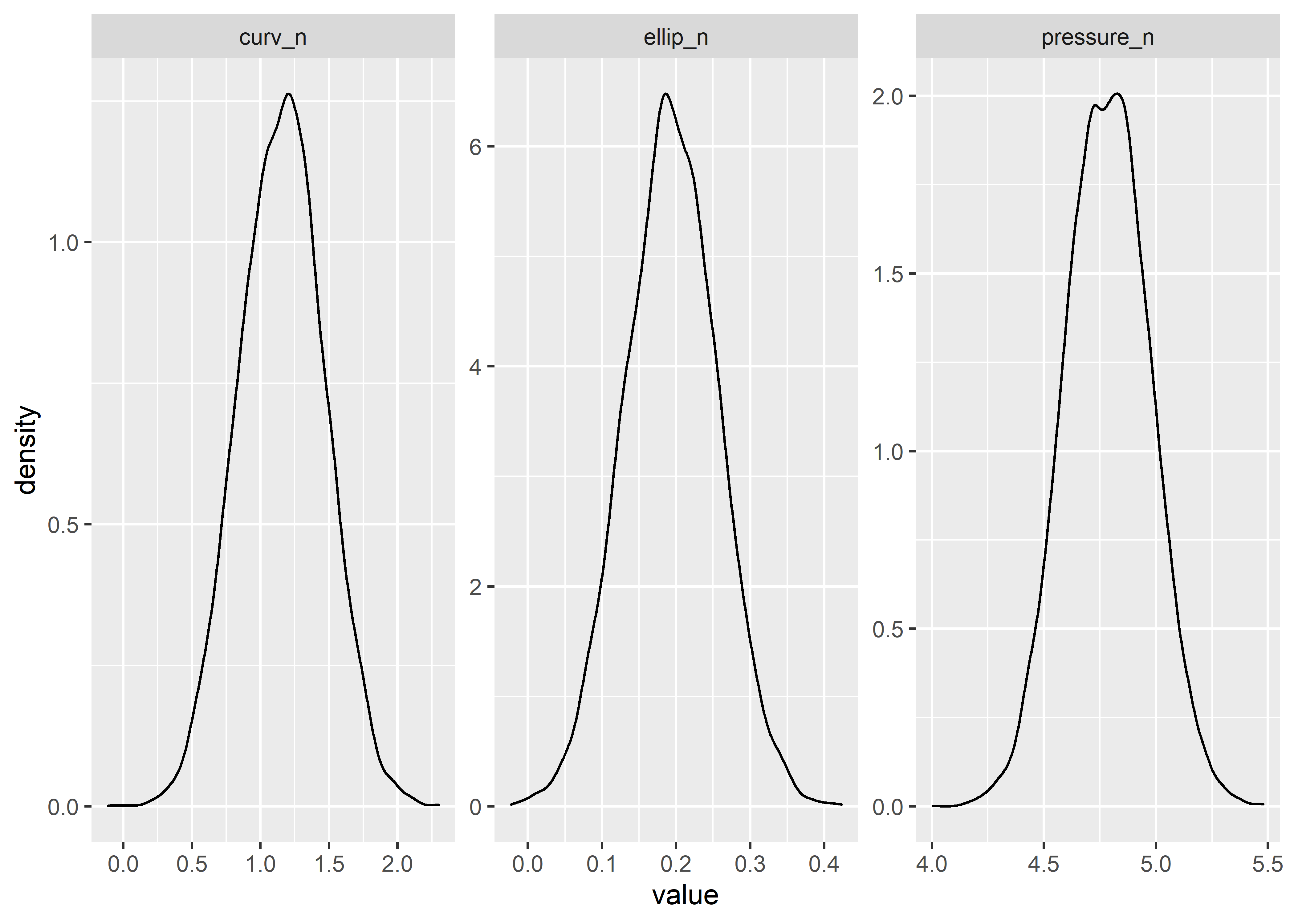
Naive Method - Apply Default KDE to Lognormal Data
Estimate kde
The kde is constructed as follows:4
This first chunk converts the data and generates the kde. The bandwidth parameters controls the “smoothness” or granularity of the estimate and can be hard to specify in multiple dimensions. Hscv() provides a method of determining a reasonable bandwidth through cross-validation; see documentation in footnotes for more information if interested.
# convert simulated data tibble to matrix
d3m <- correlated_ln_draws_tbl %>%
  as.matrix()

# cross-validated bandwidth for kd (takes a while to calculate)
# hscv1 <- Hscv(correlated_ln_draws_tbl)
# hscv1 %>% write_rds(here::here("hscv1.rds"))

hscv1 <- read_rds(here::here("hscv1.rds"))

# generate kernel density estimate from simulated population
kd_d3m <- ks::kde(d3m, H = hscv1, compute.cont = TRUE)
Density proportions from kde estimate
# see the kde's calculated density thresholds for specified proportions
cont_vals_tbl <- tidy(kd_d3m$cont) %>%
  mutate(n_row = row_number()) %>%
  mutate(probs = 100 - n_row) %>%
  select(probs, x)

reference_grid_probs_tbl <- cont_vals_tbl %>%
  rename(estimate = x)

reference_grid_probs_tbl %>%
  head(10) %>%
kable(align = rep("c"))| probs | estimate |
|---|---|
| 99 | 0.0342569 |
| 98 | 0.0333578 |
| 97 | 0.0326260 |
| 96 | 0.0318672 |
| 95 | 0.0312299 |
| 94 | 0.0305985 |
| 93 | 0.0300632 |
| 92 | 0.0293781 |
| 91 | 0.0289256 |
| 90 | 0.0283849 |
KDE estimates in the range of the variables
By default the KDE provides density estimates for a grid of points that covers the space of the variables.
kd_grid_estimates <- kd_d3mIf we want to know the value at each point in the simulated population we use the eval.points argument.
mc_estimates <- ks::kde(
  x = d3m, H = hscv1,
  compute.cont = TRUE,
  eval.points = correlated_ln_draws_tbl %>% as.matrix()
)
Here are a couple different ways to convert the kde object features into a tibble:
mc_est_tbl_10000 <- tibble(estimate = mc_estimates$estimate) %>%
  bind_cols(correlated_ln_draws_tbl)
kd_grid_est_tbl_29k <- broom:::tidy.kde(kd_grid_estimates) %>%
pivot_wider(names_from = variable, values_from = value) %>%
rename(ellip = x1, curv = x2, pressure = x3) %>%
select(-obs)Each data point in our population has a estimate. Each data point on the grid that covers the space of interest has an estimate.
mc_est_tbl_10000 %>%
  head(10) %>%
kable(align = "c")| estimate | ellip | curv | pressure |
|---|---|---|---|
| 0.0032540 | 1.123496 | 1.674471 | 78.14516 |
| 0.0167218 | 1.234755 | 3.927320 | 104.53631 |
| 0.0114561 | 1.299794 | 4.071074 | 116.55043 |
| 0.0042927 | 1.045001 | 2.721336 | 106.23896 |
| 0.0050883 | 1.246727 | 5.091741 | 102.83055 |
| 0.0123645 | 1.252843 | 2.869394 | 93.24030 |
| 0.0073055 | 1.169606 | 1.613312 | 125.12784 |
| 0.0061654 | 1.171699 | 2.921069 | 156.06701 |
| 0.0103851 | 1.170371 | 2.672507 | 145.82545 |
| 0.0158417 | 1.146382 | 3.030319 | 89.91766 |
kd_grid_est_tbl_29k %>%
  head(10) %>%
kable(align = "c")| estimate | ellip | curv | pressure |
|---|---|---|---|
| 0 | 0.8949674 | -0.0080549 | 30.51151 |
| 0 | 0.9187883 | -0.0080549 | 30.51151 |
| 0 | 0.9426092 | -0.0080549 | 30.51151 |
| 0 | 0.9664302 | -0.0080549 | 30.51151 |
| 0 | 0.9902511 | -0.0080549 | 30.51151 |
| 0 | 1.0140720 | -0.0080549 | 30.51151 |
| 0 | 1.0378929 | -0.0080549 | 30.51151 |
| 0 | 1.0617138 | -0.0080549 | 30.51151 |
| 0 | 1.0855347 | -0.0080549 | 30.51151 |
| 0 | 1.1093556 | -0.0080549 | 30.51151 |
The ks package automatically stores the quantiles of the estimate variable when calculating the kde. We can access those probability boundaries by sub-setting the kd object.
# 5% contour line from kd grid based on 10k MC data
percentile_5 <- kd_d3m[["cont"]]["5%"]
Verify that 5% (500/10,000) values fall below the threshold:
mc_est_tbl_10000 %>% filter(estimate <= percentile_5)## # A tibble: 500 x 4
## estimate ellip curv pressure
## <dbl> <dbl> <dbl> <dbl>
## 1 0.000418 1.41 4.68 184.
## 2 0.000377 1.30 7.27 144.
## 3 0.000951 1.06 3.32 72.1
## 4 0.000704 1.28 7.10 125.
## 5 0.000719 1.17 2.59 62.1
## 6 0.000114 1.47 3.18 189.
## 7 0.000905 1.01 3.21 102.
## 8 0.000182 1.06 5.85 103.
## 9 0.000521 1.36 4.04 200.
## 10 0.000742 1.40 3.58 97.4
## # ... with 490 more rows500 / 10,000 is the correct coverage for the 5/95 boundary.
If we wanted to know the nearest probability contour line for every point we could make a function to do so.
get_probs_fcn <- function(value) {
  t <- reference_grid_probs_tbl %>%
    mutate(value = value) %>%
    mutate(dif = abs(estimate - value)) %>%
    filter(dif == min(dif))

  t[[1, 1]]
}
Map the function over each value in the dataset.
# mc_1_to_99_tbl <- mc_est_tbl_10000 %>%
#   mutate(nearest_prob = map_dbl(estimate, get_probs_fcn))

# mc_1_to_99_tbl %>% write_rds(here::here("mc_1_to_99_tbl.rds"))
mc_1_to_99_tbl <- read_rds(here::here("mc_1_to_99_tbl.rds"))

mc_1_to_99_tbl
## # A tibble: 10,000 x 5
## estimate ellip curv pressure nearest_prob
## <dbl> <dbl> <dbl> <dbl> <dbl>
## 1 0.0140 1.27 2.16 133. 59
## 2 0.0119 1.20 4.44 127. 52
## 3 0.00265 1.38 2.65 160. 14
## 4 0.0194 1.24 3.62 142. 75
## 5 0.0122 1.32 2.54 129. 53
## 6 0.0168 1.26 3.24 147. 68
## 7 0.00555 1.33 3.39 168. 28
## 8 0.0112 1.24 4.25 146. 50
## 9 0.00826 1.19 1.85 87.7 39
## 10 0.00197 1.32 4.14 90.5 11
## # ... with 9,990 more rowsNow the data, kde estimate, and nearest probability contour region boundary are stored in one tibble.
Density Plot with Probability Contours in 3d
Honestly, this part is pretty easy thanks to a built in plot.kde method. Just use the cont argument to specify with probability contours you want.
#plot(x = kd_d3m, cont = c(45, 70, 95), drawpoints = FALSE, col.pt = 1)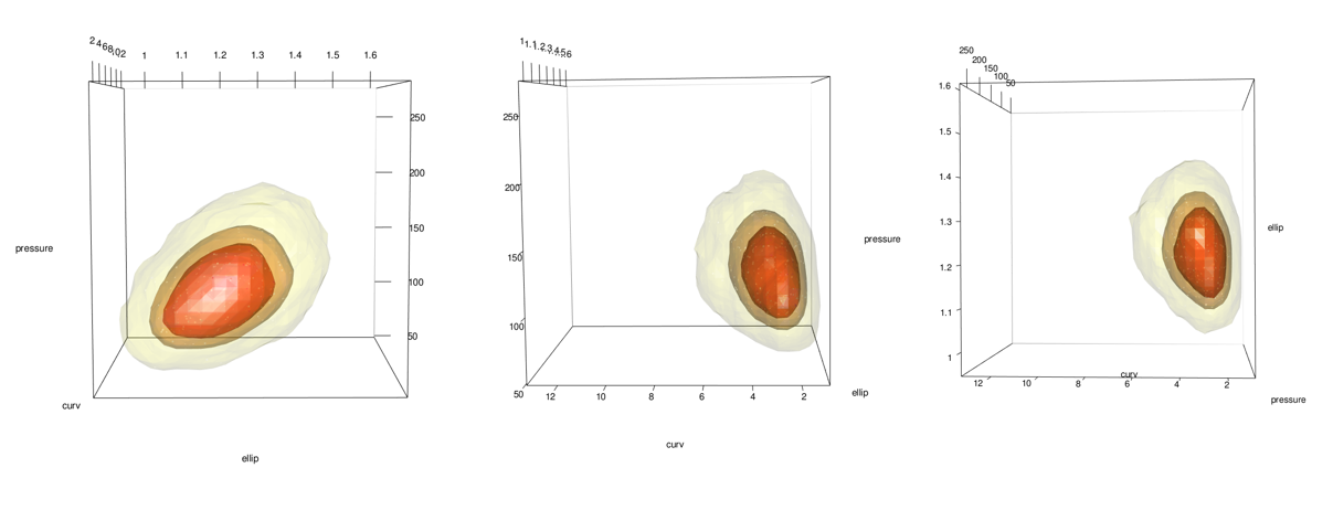
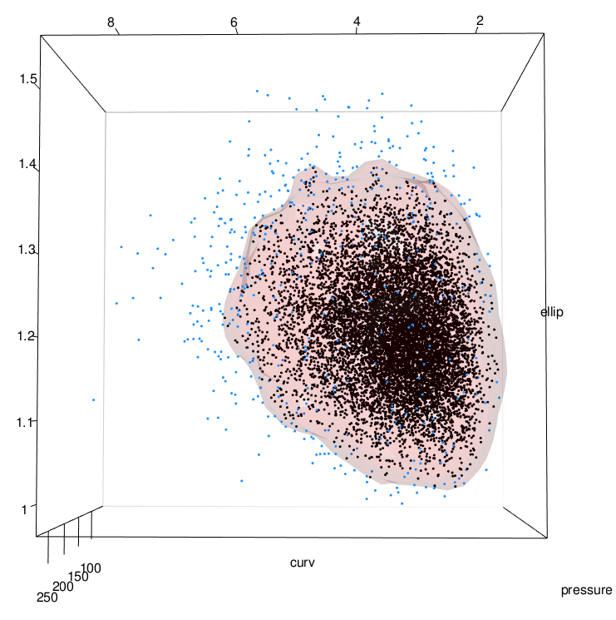
Add points using the points3d function. In this case I add 2 sets, 1 for the 5% most extreme and 1 for the 95% most common.
# plot(x = kd_d3m, cont = c(95) ,drawpoints = FALSE, col.pt = 1)
mc_lowest_5_tbl <- mc_1_to_99_tbl %>% filter(estimate < percentile_5)
mc_6_to_100_tbl <- mc_1_to_99_tbl %>% filter(estimate >= percentile_5)

# points3d(x = mc_lowest_5_tbl$ellip, y = mc_lowest_5_tbl$curv, z = mc_lowest_5_tbl$pressure, color = "dodgerblue",  size = 3, alpha = 1)

# points3d(x = mc_6_to_100_tbl$ellip, y = mc_6_to_100_tbl$curv, z = mc_6_to_100_tbl$pressure, color = "black",  size = 3, alpha = 1)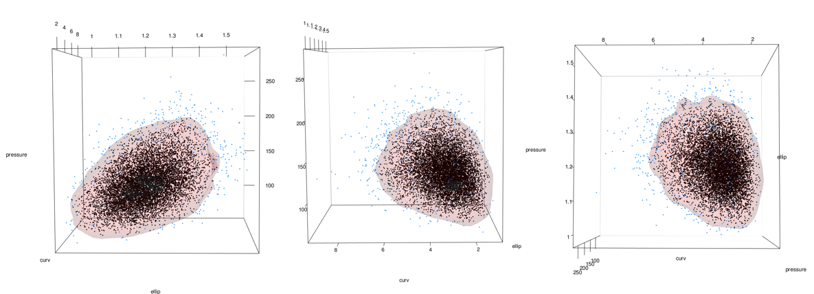
See the problem here? In the areas on the lower right of the middle and right-most images, the data stops but the surface keeps going. This is because the data has a boundary there due to being log-normal but the kde doesn’t know. See closeup below.
As previously mentioned, this can be addressed by using the normal dataset to fit the kde and then back-transforming both the data and the surface:
Fit KDE to normal data transform later
# convert simulated data tibble to matrix
d3m_n <- corr_draws_tbl %>%
  as.matrix()

# cross-validated bandwidth for kd (takes a while to calculate)
# hscv1_n <- Hscv(corr_draws_tbl)
# hscv1_n %>% write_rds(here::here("hscv1_n.rds"))

hscv1_n <- read_rds(here::here("hscv1_n.rds"))

# generate kernel density estimate from simulated population
kd_d3m_n <- ks::kde(d3m_n, H = hscv1_n, compute.cont = TRUE)
Density proportions from kde estimate
# see the kde's calculated density thresholds for specified proportions
cont_vals_tbl_n <- tidy(kd_d3m_n$cont) %>%
  mutate(n_row = row_number()) %>%
  mutate(probs = 100 - n_row) %>%
  select(probs, x)

reference_grid_probs_tbl_n <- cont_vals_tbl_n %>%
  rename(estimate = x)

reference_grid_probs_tbl_n %>%
  head(10) %>%
kable(align = rep("c"))| probs | estimate |
|---|---|
| 99 | 15.39736 |
| 98 | 14.90526 |
| 97 | 14.53676 |
| 96 | 14.16539 |
| 95 | 13.86481 |
| 94 | 13.56653 |
| 93 | 13.26884 |
| 92 | 12.98302 |
| 91 | 12.72985 |
| 90 | 12.51655 |
KDE estimates in the range of the variables
By default the KDE provides density estimates for a grid of points that covers the space of the variables.
kd_grid_estimates_n <- kd_d3m_nIf we want to know the value at each point in the simulated population we use the eval.points argument.
mc_estimates_n <- ks::kde(
  x = d3m_n, H = hscv1_n,
  compute.cont = TRUE,
  eval.points = corr_draws_tbl %>% as.matrix()
)
Here are a couple different ways to convert the kde object features into a tibble:
mc_est_tbl_10000_n <- tibble(estimate = mc_estimates_n$estimate) %>%
  bind_cols(corr_draws_tbl)
kd_grid_est_tbl_29k_n <- broom:::tidy.kde(kd_grid_estimates_n) %>%
pivot_wider(names_from = variable, values_from = value) %>%
rename(ellip_n = x1, curv_n = x2, pressure_n = x3) %>%
select(-obs)Each data point in our population has a estimate. Each data point on the grid that covers the space of interest has an estimate.
mc_est_tbl_10000_n %>%
  head(10) %>%
kable(align = "c")| estimate | ellip_n | curv_n | pressure_n |
|---|---|---|---|
| 0.5480641 | 0.1164450 | 0.5154974 | 4.358568 |
| 8.5263883 | 0.2108725 | 1.3679574 | 4.649534 |
| 6.8647221 | 0.2622058 | 1.4039068 | 4.758324 |
| 1.2686865 | 0.0440175 | 1.0011228 | 4.665691 |
| 3.4062801 | 0.2205217 | 1.6276199 | 4.633083 |
| 4.3754649 | 0.2254152 | 1.0541010 | 4.535180 |
| 1.5083333 | 0.1566667 | 0.4782892 | 4.829336 |
| 3.3766180 | 0.1584546 | 1.0719497 | 5.050286 |
| 5.0036132 | 0.1573211 | 0.9830169 | 4.982410 |
| 4.9614118 | 0.1366109 | 1.1086680 | 4.498894 |
kd_grid_est_tbl_29k_n %>%
  head(10) %>%
kable(align = "c")| estimate | ellip_n | curv_n | pressure_n |
|---|---|---|---|
| 0 | -0.0877414 | -0.4268598 | 3.811282 |
| 0 | -0.0685395 | -0.4268598 | 3.811282 |
| 0 | -0.0493375 | -0.4268598 | 3.811282 |
| 0 | -0.0301356 | -0.4268598 | 3.811282 |
| 0 | -0.0109337 | -0.4268598 | 3.811282 |
| 0 | 0.0082682 | -0.4268598 | 3.811282 |
| 0 | 0.0274701 | -0.4268598 | 3.811282 |
| 0 | 0.0466721 | -0.4268598 | 3.811282 |
| 0 | 0.0658740 | -0.4268598 | 3.811282 |
| 0 | 0.0850759 | -0.4268598 | 3.811282 |
# 5% contour line from kd grid based on 10k MC data
percentile_5_n <- kd_d3m_n[["cont"]]["5%"]
Verify that 5% (500/10,000) values fall below the threshold:
mc_est_tbl_10000_n %>% filter(estimate <= percentile_5_n)## # A tibble: 500 x 4
## estimate ellip_n curv_n pressure_n
## <dbl> <dbl> <dbl> <dbl>
## 1 0.437 0.347 1.54 5.21
## 2 0.218 0.0546 1.20 4.28
## 3 0.346 0.114 0.375 4.43
## 4 0.340 0.121 0.382 4.96
## 5 0.0880 0.153 0.951 4.13
## 6 0.0860 0.387 1.16 5.24
## 7 0.268 0.0116 1.17 4.62
## 8 0.0957 0.0610 1.77 4.63
## 9 0.513 0.310 1.40 5.30
## 10 0.300 0.195 0.260 4.75
## # ... with 490 more rows500 / 10,000 is the correct coverage for the 5/95 boundary.
get_probs_fcn_n <- function(value) {
  t <- reference_grid_probs_tbl_n %>%
    mutate(value = value) %>%
    mutate(dif = abs(estimate - value)) %>%
    filter(dif == min(dif))

  t[[1, 1]]
}
Map the function over each value in the dataset and then the grid.
# mc_1_to_99_tbl_n <- mc_est_tbl_10000_n %>%
#   mutate(nearest_prob = map_dbl(estimate, get_probs_fcn_n))
# #
# mc_1_to_99_tbl_n %>% write_rds(here::here("mc_1_to_99_tbl_n.rds"))
mc_1_to_99_tbl_n <- read_rds(here::here("mc_1_to_99_tbl_n.rds"))

mc_1_to_99_tbl_n
## # A tibble: 10,000 x 5
## estimate ellip_n curv_n pressure_n nearest_prob
## <dbl> <dbl> <dbl> <dbl> <dbl>
## 1 0.548 0.116 0.515 4.36 5
## 2 8.53 0.211 1.37 4.65 70
## 3 6.86 0.262 1.40 4.76 58
## 4 1.27 0.0440 1.00 4.67 12
## 5 3.41 0.221 1.63 4.63 32
## 6 4.38 0.225 1.05 4.54 39
## 7 1.51 0.157 0.478 4.83 14
## 8 3.38 0.158 1.07 5.05 31
## 9 5.00 0.157 0.983 4.98 44
## 10 4.96 0.137 1.11 4.50 44
## # ... with 9,990 more rowsgrid_probs_tbl_n <- kd_grid_est_tbl_29k_n %>%
mutate(nearest_prob = map_dbl(estimate, get_probs_fcn_n))
grid_probs_tbl_n %>% write_rds(here::here("grid_probs_tbl_n.rds"))
grid_probs_tbl_n <- read_rds(here::here("grid_probs_tbl_n.rds"))
grid_probs_95_n <- grid_probs_tbl_n %>%
filter(nearest_prob == 95)
grid_probs_95_n %>% arrange(desc(nearest_prob))## # A tibble: 4 x 5
## estimate ellip_n curv_n pressure_n nearest_prob
## <dbl> <dbl> <dbl> <dbl> <dbl>
## 1 13.8 0.162 1.09 4.68 95
## 2 13.8 0.200 1.20 4.68 95
## 3 13.8 0.219 1.20 4.74 95
## 4 13.8 0.219 1.09 4.80 95grid_probs_95_n %>%
head(5) %>%
kable(align = "c")| estimate | ellip_n | curv_n | pressure_n | nearest_prob |
|---|---|---|---|---|
| 13.84582 | 0.1618836 | 1.094335 | 4.679386 | 95 |
| 13.75222 | 0.2002874 | 1.195748 | 4.679386 | 95 |
| 13.83862 | 0.2194893 | 1.195748 | 4.741394 | 95 |
| 13.83317 | 0.2194893 | 1.094335 | 4.803401 | 95 |
Density Plot with Probability Contours in 3d
Honestly, this part is pretty easy thanks to a built in plot.kde method. Just use the cont argument to specify with probability contours you want.
plot(x = kd_d3m_n, cont = c(45, 70, 95), drawpoints = FALSE, col.pt = 1)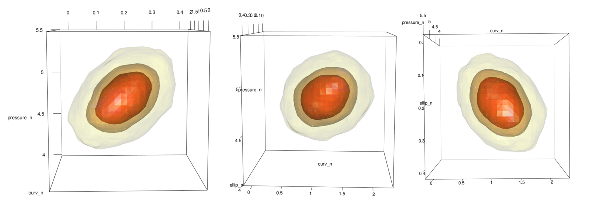
and with points
mc_lowest_5_tbl_n <- mc_1_to_99_tbl_n %>% filter(estimate < percentile_5_n)
mc_6_to_100_tbl_n <- mc_1_to_99_tbl_n %>% filter(estimate >= percentile_5_n)

plot(x = kd_d3m_n, cont = c(95), drawpoints = FALSE, col.pt = 1)


points3d(x = mc_lowest_5_tbl_n$ellip_n, y = mc_lowest_5_tbl_n$curv_n, z = mc_lowest_5_tbl_n$pressure_n, color = "dodgerblue", size = 3, alpha = 1)

points3d(x = mc_6_to_100_tbl_n$ellip_n, y = mc_6_to_100_tbl_n$curv_n, z = mc_6_to_100_tbl_n$pressure_n, color = "black", size = 3, alpha = 1)

points3d(x = grid_probs_tbl_n$ellip_n, y = grid_probs_tbl_n$curv_n, z = grid_probs_tbl_n$pressure_n, color = "firebrick", size = 2, alpha = 1)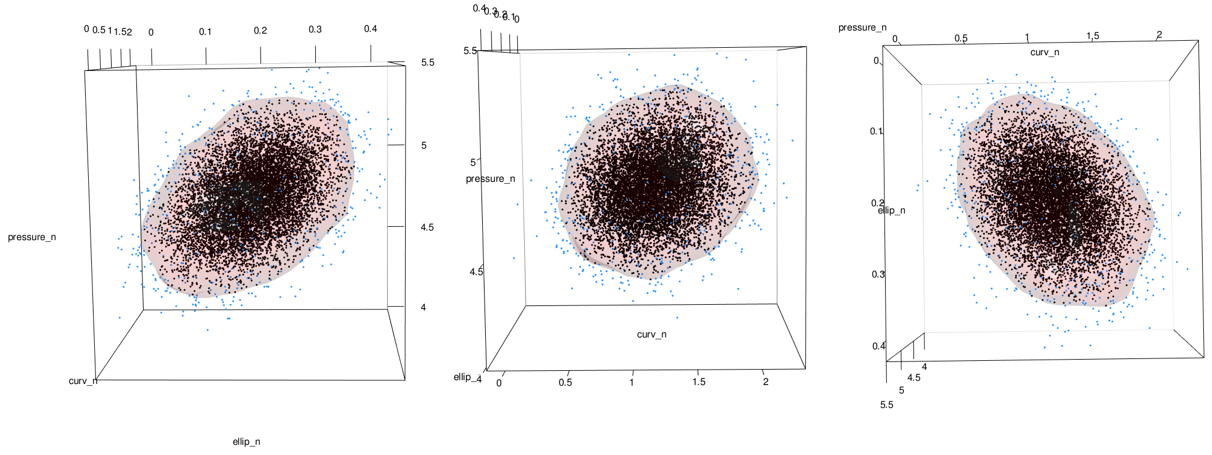
Transform data and kde contour to original scale
mc_lowest_5_tbl_nbt <- mc_lowest_5_tbl_n %>% mutate(
  ellip_bt = exp(ellip_n),
  curv_bt = exp(curv_n),
  pressure_bt = exp(pressure_n)
)
mc_6_to_100_tbl_nbt <- mc_6_to_100_tbl_n %>% mutate(
  ellip_bt = exp(ellip_n),
  curv_bt = exp(curv_n),
  pressure_bt = exp(pressure_n)
)

full_mc_bt_tbl <- mc_lowest_5_tbl_nbt %>%
  bind_rows(mc_6_to_100_tbl_nbt)

grid_probs_95_bt <- grid_probs_tbl_n %>%
  filter(nearest_prob == 05) %>%
  mutate(
    ellip_bt = exp(ellip_n),
    curv_bt = exp(curv_n),
    pressure_bt = exp(pressure_n)
  )
Plot Back-Transformed Data with Plotly
fig <- plotly::plot_ly()

fig <- fig %>% add_trace(x = grid_probs_95_bt$ellip_bt, y = grid_probs_95_bt$curv_bt, z = grid_probs_95_bt$pressure_bt, type = "mesh3d", alphahull = 0, opacity = .5, hoverinfo = "none")


fig <- fig %>% add_trace(x = mc_lowest_5_tbl_nbt$ellip_bt, y = mc_lowest_5_tbl_nbt$curv_bt, z = mc_lowest_5_tbl_nbt$pressure_bt, type = "scatter3d", size = 30)

fig <- fig %>% add_trace(x = mc_6_to_100_tbl_nbt$ellip_bt, y = mc_6_to_100_tbl_nbt$curv_bt, z = mc_6_to_100_tbl_nbt$pressure_bt, type = "scatter3d", size = 30)

fig <- fig %>%
  layout(scene = list(
    xaxis = list(title = "ellip"),
    yaxis = list(title = "curv"),
    zaxis = list(title = "pressure")
  )) %>%
  layout(scene = list(
    xaxis = list(showspikes = FALSE),
    yaxis = list(showspikes = FALSE),
    zaxis = list(showspikes = FALSE)
  ))

# fig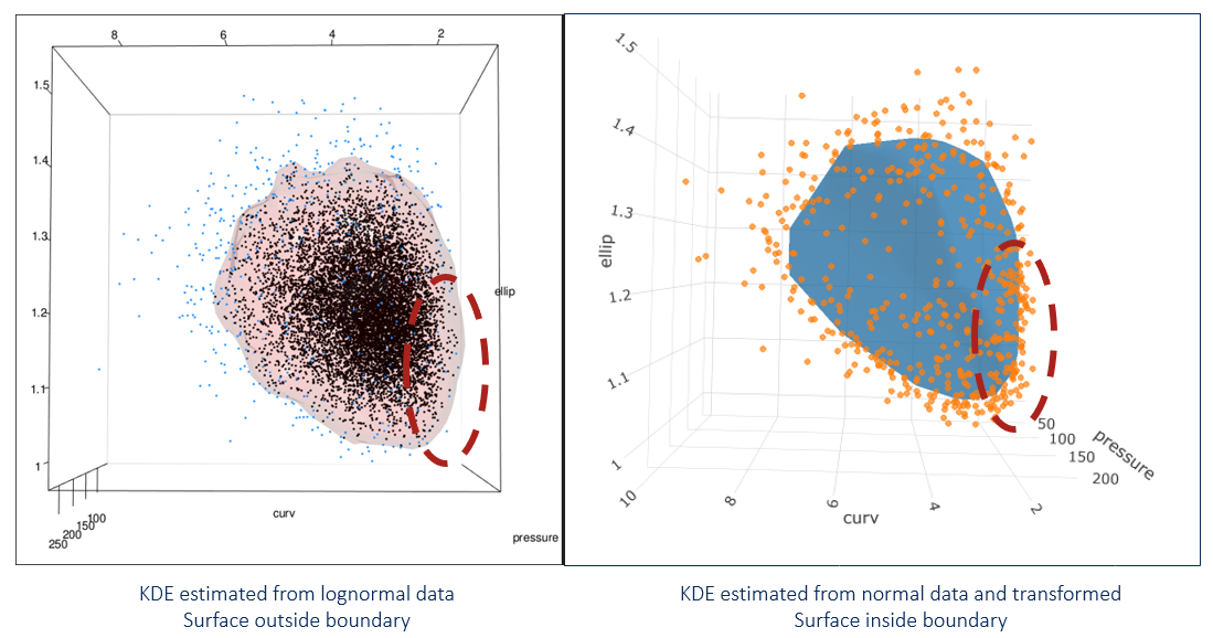
The new image (shown on right) looks different near the boundary. Because we transformed everything from normal, no portion of the contour goes beyond the point cloud. This is what we want!
Filter extreme points and assess points on 95-5 contour
Now that our kde contour is set up to properly segregate the extreme points relative to the mode, we can filter them away and assess the remaining points which lie on the contour. We do this by pulling the grid points that make up the 95/5 surface and evaluating them as percentiles.
First, the ecdfs to get the percentiles from each variable
e1f <- ecdf(full_mc_bt_tbl$ellip_bt)
e2f <- ecdf(full_mc_bt_tbl$curv_bt)
e3f <- ecdf(full_mc_bt_tbl$pressure_bt)
Map ecdfs over the variables and then use the sum of the percentiles as a way to identify the largest values.
full_probs_95_tbl <- grid_probs_95_bt %>%
  rowwise() %>%
  mutate(
    percentile_e = map_dbl(ellip_bt, e1f),
    percentile_c = map_dbl(curv_bt, e2f),
    percentile_p = map_dbl(pressure_bt, e3f)
  ) %>%
  rowwise() %>%
  mutate(pct_sum = sum(c(percentile_e, percentile_c, percentile_p))) %>%
  ungroup() %>%
  arrange(desc(pct_sum)) %>%
  mutate(pct_sum_rank = row_number()) %>%
  select(ellip_bt, curv_bt, pressure_bt, percentile_e, percentile_c, percentile_p, pct_sum)

full_probs_95_tbl %>%
  head(10) %>%
kable(align = "c", digits = 2)| ellip_bt | curv_bt | pressure_bt | percentile_e | percentile_c | percentile_p | pct_sum |
|---|---|---|---|---|---|---|
| 1.40 | 5.49 | 176.88 | 0.99 | 0.96 | 0.98 | 2.93 |
| 1.37 | 5.49 | 188.19 | 0.97 | 0.96 | 0.99 | 2.92 |
| 1.37 | 6.08 | 166.24 | 0.97 | 0.98 | 0.96 | 2.92 |
| 1.34 | 5.49 | 188.19 | 0.95 | 0.96 | 0.99 | 2.90 |
| 1.37 | 4.96 | 188.19 | 0.97 | 0.92 | 0.99 | 2.89 |
| 1.42 | 4.96 | 166.24 | 1.00 | 0.92 | 0.96 | 2.88 |
| 1.32 | 6.08 | 176.88 | 0.91 | 0.98 | 0.98 | 2.87 |
| 1.32 | 5.49 | 188.19 | 0.91 | 0.96 | 0.99 | 2.86 |
| 1.40 | 4.48 | 188.19 | 0.99 | 0.86 | 0.99 | 2.84 |
| 1.42 | 4.48 | 176.88 | 1.00 | 0.86 | 0.98 | 2.84 |
Finally, we can show a few of the points with large percentiles on the 95/5 surface:
top_10 <- full_probs_95_tbl %>%
  head(10)

fig <- fig %>% add_trace(x = top_10$ellip_bt, y = top_10$curv_bt, z = top_10$pressure_bt, type = "scatter3d", size = 30)

# fig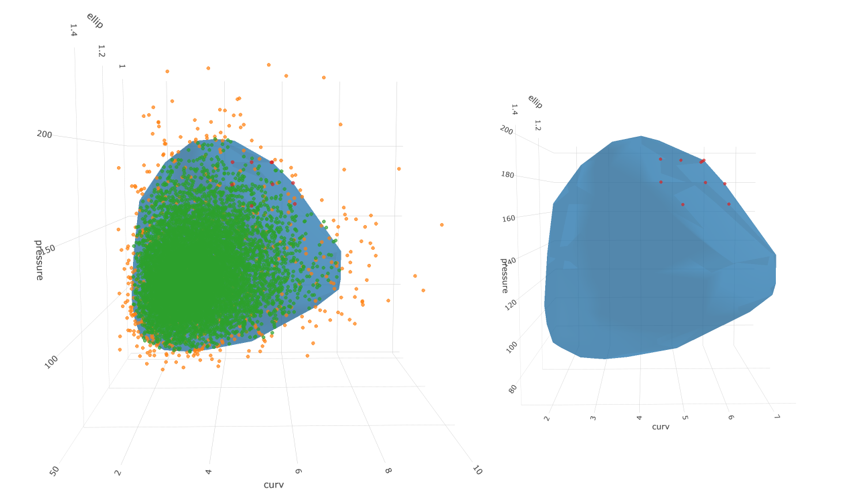

And there we have it! 10 candidate points representing credible points on the edge of the 5% probability region for 3 correlated lognormal variables with proper treatment of the boundary.
If you’ve made it this far, I thank you. Here are a couple appendices as a reward!
Appendix A - simulating a multivariate distribution with mass mvnorm
Workflow:
Step 1 - Fit Distributions to Each Variable
ellip_fit <- fitdist(sample_data$ellip, "lnorm")
curv_fit <- fitdist(sample_data$curv, "lnorm")
pressure_fit <- fitdist(sample_data$pressure, "lnorm")

# store lognormal parameters of original data
ellip_meanlog <- ellip_fit$estimate[["meanlog"]]
ellip_sdlog <- ellip_fit$estimate[["sdlog"]]
curv_meanlog <- curv_fit$estimate[["meanlog"]]
curv_sdlog <- curv_fit$estimate[["sdlog"]]
pressure_meanlog <- pressure_fit$estimate[["meanlog"]]
pressure_sdlog <- pressure_fit$estimate[["sdlog"]]

# store correlations in original data
cor_ec <- cor(x = sample_data$ellip, y = sample_data$curv)
cor_ep <- cor(x = sample_data$ellip, y = sample_data$pressure)
cor_cp <- cor(x = sample_data$curv, y = sample_data$pressure)

# store covariances in original data
cov_ellip_curv <- cov(x = sample_data$ellip, y = sample_data$curv)
cov_ellip_ellip <- cov(x = sample_data$ellip, y = sample_data$ellip)
cov_curv_curv <- cov(x = sample_data$curv, y = sample_data$curv)
cov_ellip_pressure <- cov(x = sample_data$ellip, y = sample_data$pressure)
cov_pressure_pressure <- cov(x = sample_data$pressure, y = sample_data$pressure)
cov_curv_pressure <- cov(x = sample_data$curv, y = sample_data$pressure)

# summarize the parameters and reshape a bit
original_data_param_tbl <- tibble(
  ellip_meanlog = ellip_meanlog,
  ellip_sdlog = ellip_sdlog,
  curv_meanlog = curv_meanlog,
  curv_sdlog = curv_sdlog,
  pressure_meanlog = pressure_meanlog,
  pressure_sdlog = pressure_sdlog,
  ellip_curv_correlation = cor_ec,
  ellip_pressure_correlation = cor_ep,
  curv_pressure_correlation = cor_cp,
  ellip_ellip_covariance = cov_ellip_ellip,
  ellip_curv_covariance = cov_ellip_curv,
  curv_curv_covariance = cov_curv_curv,
  ellip_pressure_covariance = cov_ellip_pressure,
  pressure_pressure_covariance = cov_pressure_pressure,
  curv_pressure_covariance = cov_curv_pressure
) %>%
  pivot_longer(cols = everything(), names_to = "feature", values_to = "value") %>%
  mutate(dataset = "original_data") %>%
  mutate_if(is.character, as_factor)

# View summary table of original data
original_data_param_tbl %>%
kable(align = "c", digits = 3)| feature | value | dataset |
|---|---|---|
| ellip_meanlog | 0.193 | original_data |
| ellip_sdlog | 0.064 | original_data |
| curv_meanlog | 1.158 | original_data |
| curv_sdlog | 0.309 | original_data |
| pressure_meanlog | 4.783 | original_data |
| pressure_sdlog | 0.191 | original_data |
| ellip_curv_correlation | 0.268 | original_data |
| ellip_pressure_correlation | 0.369 | original_data |
| curv_pressure_correlation | 0.213 | original_data |
| ellip_ellip_covariance | 0.006 | original_data |
| ellip_curv_covariance | 0.022 | original_data |
| curv_curv_covariance | 1.157 | original_data |
| ellip_pressure_covariance | 0.659 | original_data |
| pressure_pressure_covariance | 530.683 | original_data |
| curv_pressure_covariance | 5.285 | original_data |
Step 2 - Transform all variables to normal
A simple log operation brings the lognormal variable to normal.
# transform original, lognormal data to normal
normal_sample_data <- sample_data %>%
  mutate(
    n_ellip = log(ellip),
    n_curv = log(curv),
    n_pressure = log(pressure)
  )

normal_sample_data %>%
  head() %>%
kable(align = "c", digits = 3)| ellip | curv | pressure | n_ellip | n_curv | n_pressure |
|---|---|---|---|---|---|
| 1.255 | 4.506 | 92.739 | 0.228 | 1.505 | 4.530 |
| 1.285 | 5.019 | 182.970 | 0.251 | 1.613 | 5.209 |
| 1.289 | 4.027 | 153.858 | 0.254 | 1.393 | 5.036 |
| 1.234 | 2.139 | 108.669 | 0.210 | 0.760 | 4.688 |
| 1.133 | 3.673 | 123.633 | 0.125 | 1.301 | 4.817 |
| 1.219 | 2.373 | 113.944 | 0.198 | 0.864 | 4.736 |
Step 3 - Fit normal distributions to each transformed variable
We don’t actually have to formally fit normal distributions since it is convenient to obtain the mean and standard deviation at any time using the mean() or sd() functions. But we will extract and store correlations and covariances for the simulation to come.
# get correlations of transformed, normal data
ncor_ec <- cor(
  x = normal_sample_data$n_ellip,
  normal_sample_data$n_curv
)
ncor_ep <- cor(
  x = normal_sample_data$n_ellip,
  normal_sample_data$n_pressure
)
ncor_cp <- cor(
  x = normal_sample_data$n_curv,
  normal_sample_data$n_pressure
)

# get covariance of transformed, normal data
n_cov_ellip_curv <- cov(
  x = normal_sample_data$n_ellip,
  y = normal_sample_data$n_curv
)
n_cov_ellip_ellip <- cov(
  x = normal_sample_data$n_ellip,
  y = normal_sample_data$n_ellip
)
n_cov_curv_curv <- cov(
  x = normal_sample_data$n_curv,
  y = normal_sample_data$n_curv
)

n_cov_ellip_pressure <- cov(
  x = normal_sample_data$n_ellip,
  y = normal_sample_data$n_pressure
)
n_cov_pressure_pressure <- cov(
  x = normal_sample_data$n_pressure,
  y = normal_sample_data$n_pressure
)
n_cov_curv_pressure <- cov(
  x = normal_sample_data$n_curv,
  y = normal_sample_data$n_pressure
)
Step 4 - Draw joint distribution using mvrnorm() or equivalent function
Time to actually draw the correlated values. I store them here in an object called mult_norm.
# draw from multivariate normal with parameters from transformed normal distributions and correlation
set.seed(0118)

mult_norm <- as_tibble(MASS::mvrnorm(
  10000, c(
    mean(normal_sample_data$n_ellip),
    mean(normal_sample_data$n_curv),
    mean(normal_sample_data$n_pressure)
  ),
  matrix(c(
    n_cov_ellip_ellip,
    n_cov_ellip_curv,
    n_cov_ellip_pressure,
    n_cov_ellip_curv,
    n_cov_curv_curv,
    n_cov_curv_pressure,
    n_cov_ellip_pressure,
    n_cov_curv_pressure,
    n_cov_pressure_pressure
  ), 3, 3)
)) %>%
  rename(
    n_ellip_sim = V1,
    n_curv_sim = V2,
    n_pressure_sim = V3
  )
Step 5 - Back-transform simulated data to original distribution
Exponentiating the data brings it back to lognormal.
# convert back to lognormal
log_norm <- mult_norm %>%
  mutate(
    ellip_sim = exp(n_ellip_sim),
    curv_sim = exp(n_curv_sim),
    pressure_sim = exp(n_pressure_sim)
  )

log_norm %>%
  head() %>%
kable(align = "c", digits = 3)| n_ellip_sim | n_curv_sim | n_pressure_sim | ellip_sim | curv_sim | pressure_sim |
|---|---|---|---|---|---|
| 0.254 | 1.600 | 5.248 | 1.290 | 4.952 | 190.266 |
| 0.233 | 1.038 | 5.107 | 1.262 | 2.823 | 165.178 |
| 0.236 | 1.152 | 4.812 | 1.266 | 3.165 | 123.018 |
| 0.313 | 1.003 | 5.048 | 1.368 | 2.727 | 155.636 |
| 0.224 | 1.622 | 5.192 | 1.251 | 5.066 | 179.912 |
| 0.197 | 1.486 | 4.822 | 1.218 | 4.422 | 124.185 |
Step 6 - Evaluate parameters and marginal distributions of the back-transfomed data
# evaluate the marginal distributions of the simulated data
ellip_sim_fit <- fitdistrplus::fitdist(log_norm$ellip_sim, "lnorm")
curv_sim_fit <- fitdistrplus::fitdist(log_norm$curv_sim, "lnorm")
pressure_sim_fit <- fitdistrplus::fitdist(log_norm$pressure_sim, "lnorm")
Obtain and store the correlation, covariances, and parameters of simulated set:
# get correlation and covariances of simulated data
sim_cor_ec <- cor(x = log_norm$ellip_sim, log_norm$curv_sim)
sim_cor_ep <- cor(x = log_norm$ellip_sim, log_norm$pressure_sim)
sim_cor_cp <- cor(x = log_norm$curv_sim, log_norm$pressure_sim)

sim_cov_ellip_curv <- cov(x = log_norm$ellip_sim, y = log_norm$curv_sim)
sim_cov_ellip_ellip <- cov(x = log_norm$ellip_sim, y = log_norm$ellip_sim)
sim_cov_curv_curv <- cov(x = log_norm$curv_sim, y = log_norm$curv_sim)

sim_cov_ellip_pressure <- cov(x = log_norm$ellip_sim, y = log_norm$pressure_sim)
sim_cov_pressure_pressure <- cov(x = log_norm$pressure_sim, y = log_norm$pressure_sim)
sim_cov_curv_pressure <- cov(x = log_norm$curv_sim, y = log_norm$pressure_sim)

# store parameters of simulated data
ellip_sim_meanlog <- ellip_sim_fit$estimate[["meanlog"]]
ellip_sim_sdlog <- ellip_sim_fit$estimate[["sdlog"]]
curv_sim_meanlog <- curv_sim_fit$estimate[["meanlog"]]
curv_sim_sdlog <- curv_sim_fit$estimate[["sdlog"]]
pressure_sim_meanlog <- pressure_sim_fit$estimate[["meanlog"]]
pressure_sim_sdlog <- pressure_sim_fit$estimate[["sdlog"]]

# collect parameters from simulated data
sim_data_param_tbl <- tibble(
  ellip_meanlog = ellip_sim_meanlog,
  ellip_sdlog = ellip_sim_sdlog,
  curv_meanlog = curv_sim_meanlog,
  curv_sdlog = curv_sim_sdlog,
  pressure_meanlog = pressure_sim_meanlog,
  pressure_sdlog = pressure_sim_sdlog,

  ellip_curv_correlation = sim_cor_ec,
  ellip_pressure_correlation = sim_cor_ep,
  curv_pressure_correlation = sim_cor_cp,

  ellip_curv_covariance = sim_cov_ellip_curv,
  ellip_ellip_covariance = sim_cov_ellip_ellip,
  curv_curv_covariance = sim_cov_curv_curv,

  ellip_pressure_covariance = sim_cov_ellip_pressure,
  pressure_pressure_covariance = sim_cov_pressure_pressure,
  curv_pressure_covariance = sim_cov_curv_pressure
) %>%
  pivot_longer(cols = everything(), names_to = "feature", values_to = "value") %>%
  mutate(dataset = "simulated_data") %>%
  mutate_if(is.character, as_factor)

sim_data_param_tbl %>%
kable(align = "c")| feature | value | dataset |
|---|---|---|
| ellip_meanlog | 0.1932042 | simulated_data |
| ellip_sdlog | 0.0630117 | simulated_data |
| curv_meanlog | 1.1626798 | simulated_data |
| curv_sdlog | 0.3092643 | simulated_data |
| pressure_meanlog | 4.7878497 | simulated_data |
| pressure_sdlog | 0.1900026 | simulated_data |
| ellip_curv_correlation | 0.2505145 | simulated_data |
| ellip_pressure_correlation | 0.3644292 | simulated_data |
| curv_pressure_correlation | 0.1956149 | simulated_data |
| ellip_curv_covariance | 0.0203344 | simulated_data |
| ellip_ellip_covariance | 0.0058779 | simulated_data |
| curv_curv_covariance | 1.1209300 | simulated_data |
| ellip_pressure_covariance | 0.6534943 | simulated_data |
| pressure_pressure_covariance | 547.0647415 | simulated_data |
| curv_pressure_covariance | 4.8440727 | simulated_data |
Compare Original Data to Simulated Data
A bit more wrangling let’s us compare the feature of the original dataset to the new, simulated population to see if they agree.
compare_tbl <- bind_rows(original_data_param_tbl, sim_data_param_tbl) %>%
  pivot_wider(id_cols = everything(), names_from = dataset)

compare_tbl %>%
kable(align = "c", digits = 3)| feature | original_data | simulated_data |
|---|---|---|
| ellip_meanlog | 0.193 | 0.193 |
| ellip_sdlog | 0.064 | 0.063 |
| curv_meanlog | 1.158 | 1.163 |
| curv_sdlog | 0.309 | 0.309 |
| pressure_meanlog | 4.783 | 4.788 |
| pressure_sdlog | 0.191 | 0.190 |
| ellip_curv_correlation | 0.268 | 0.251 |
| ellip_pressure_correlation | 0.369 | 0.364 |
| curv_pressure_correlation | 0.213 | 0.196 |
| ellip_ellip_covariance | 0.006 | 0.006 |
| ellip_curv_covariance | 0.022 | 0.020 |
| curv_curv_covariance | 1.157 | 1.121 |
| ellip_pressure_covariance | 0.659 | 0.653 |
| pressure_pressure_covariance | 530.683 | 547.065 |
| curv_pressure_covariance | 5.285 | 4.844 |
Appendix B - 2d kde plot with probability traces
First, select the 2 variables of interest.
d <- correlated_ln_draws_tbl %>% select(ellip, curv)

## density function
kd <- ks::kde(d, compute.cont = TRUE, h = 0.05)
Here’s ellipticity vs. curvature (these lines are not probability region boundaries, but they are related)
cp_plt <- correlated_ln_draws_tbl %>%
  ggplot(aes(x = ellip, y = curv)) +
  geom_point(alpha = .3, size = .5) +
  geom_density2d(size = 1.3) +
  theme_classic() +
  xlim(c(.9, 1.6)) +
  ylim(c(1, 7.5)) +
  labs(
    title = "Joint Distribution of Vessel Ellipticity and Curvature",
    subtitle = "Density Contours at Default Settings",
    x = "Ellipticity (unitless)",
    y = "Radius of Curvature (mm)"
  )

cp_plt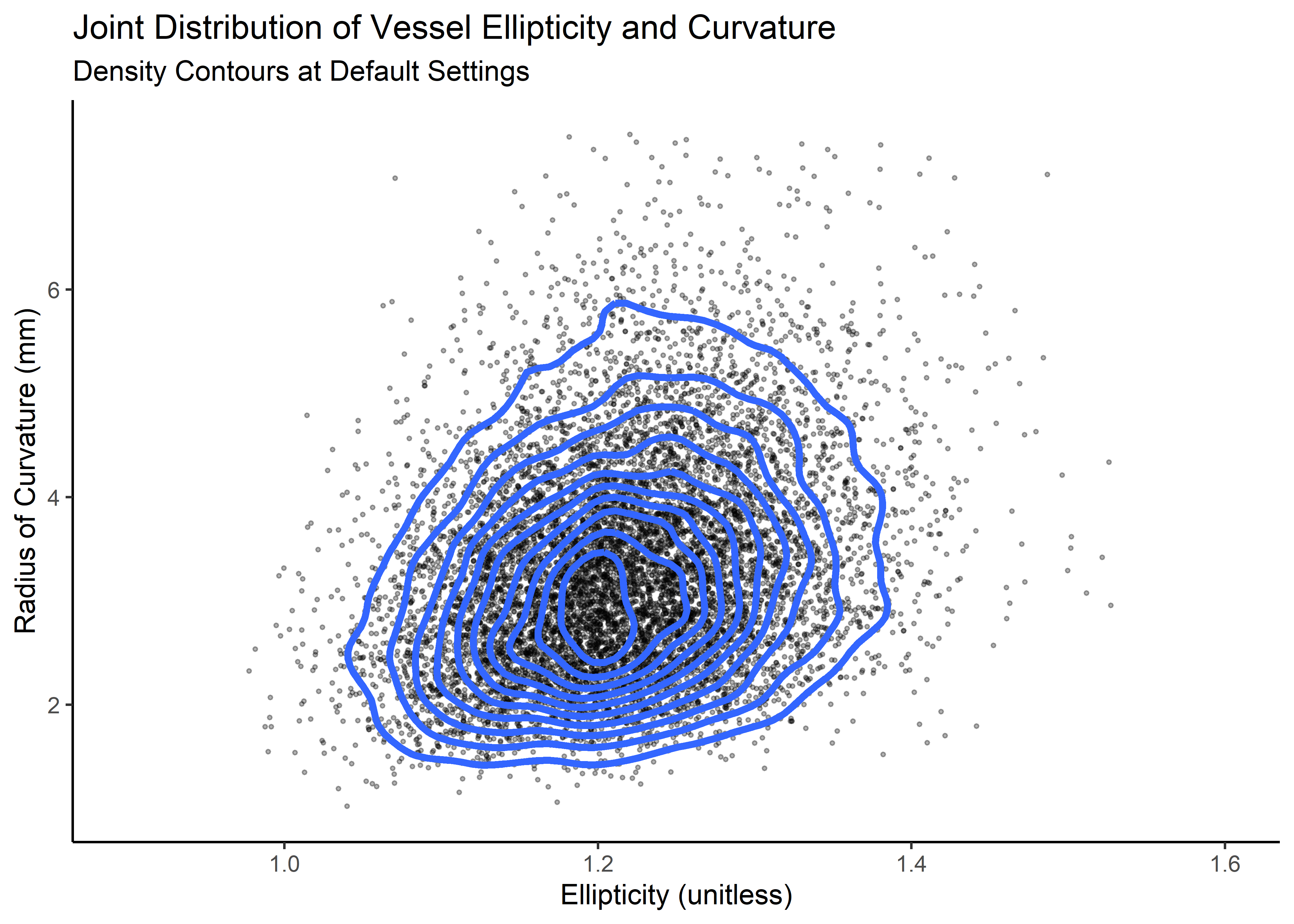
Now a a function to extract the points of the contour line from the kde:
get_contour <- function(kd_out = kd, prob = "5%") {
  contour_95 <- with(kd_out, contourLines(
    x = eval.points[[1]], y = eval.points[[2]],
    z = estimate, levels = cont[prob]
  )[[1]])
  as_tibble(contour_95) %>%
    mutate(prob = prob)
}
Map it over the kd object.
dat_out <- map_dfr(c("5%", "20%", "40%", "60%", "80%", "95%"), ~ get_contour(kd, .)) %>%
  group_by(prob) %>%
  mutate(n_val = 1:n()) %>%
  ungroup()

dat_out %>%
  head(10) %>%
kable(align = "c")| level | x | y | prob | n_val |
|---|---|---|---|---|
| 0.1144314 | 1.027589 | 2.246533 | 5% | 1 |
| 0.1144314 | 1.027172 | 2.265195 | 5% | 2 |
| 0.1144314 | 1.025855 | 2.335547 | 5% | 3 |
| 0.1144314 | 1.025083 | 2.405899 | 5% | 4 |
| 0.1144314 | 1.025079 | 2.476250 | 5% | 5 |
| 0.1144314 | 1.025998 | 2.546603 | 5% | 6 |
| 0.1144314 | 1.027589 | 2.606175 | 5% | 7 |
| 0.1144314 | 1.027847 | 2.616954 | 5% | 8 |
| 0.1144314 | 1.030135 | 2.687306 | 5% | 9 |
| 0.1144314 | 1.032082 | 2.738850 | 5% | 10 |
Clean kde output
kd_df <- expand_grid(x = kd$eval.points[[1]], y = kd$eval.points[[2]]) %>%
  mutate(z = c(kd$estimate %>% t()))
Now visualize again, this time with probability contours at specified values and the 5% curve labeled with geom_label_repel().
label_tbl <- dat_out %>%
  filter(
    prob == "5%",
    n_val == 100
  )

# visualize
ellip_curv_2plt <- ggplot(data = kd_df, aes(x, y)) +
  geom_tile(aes(fill = z)) +
  geom_point(data = d, aes(x = ellip, y = curv), alpha = .4, size = .4, colour = "white") +
  geom_path(aes(x, y, group = prob),
    data = dat_out %>% filter(prob %in% c("5%", "20%", "40%", "60%", "80%", "95%")), colour = "white", size = 1.2, alpha = .8
  ) +
  #  geom_text(aes(label = prob), data =
  #              filter(dat_out, (prob %in% c("5%") & n_val==1)), # | (prob %in% c("90%") & n_val==20)),
  #            colour = "yellow", size = 5)+
  geom_label_repel(
    data = label_tbl, aes(x, y),
    label = label_tbl$prob[1],
    fill = "yellow",
    color = "black",
    segment.color = "yellow",
    #    segment.size = 1,
    min.segment.length = unit(1, "lines"),
    nudge_y = .5,
    nudge_x = -.025
  ) +
  xlim(c(.95, 1.5)) +
  ylim(c(0, 7.5)) +
  labs(
    title = "Joint Distribution [Ellipticity and Radius of Curvature]",
    subtitle = "Simulated Data",
    caption = "Density Contours shown at 5%, 20%, 40%, 60%, 80%, 95%"
  ) +
  scale_fill_viridis_c(end = .9) +
  theme_bw() +
  theme(legend.position = "none") +
  labs(x = "Ellipticity (unitless)", y = "Radius of Curvature (mm)")
ggExtra::ggMarginal(ellip_curv_2plt, type = "density", fill = "#403891ff", alpha = .7)
Hamdan et. al. Journal of the American College of Cardiology, Volume 59, Issue 2, 2012, Pages 119-127↩︎
This method would be analogous to creating prediction intervals and are conditional on the model in the sense that the only parameters considered are the maximum likelihood estimates. Alternate, more conservative ways to simulate the population could involve tolerance intervals or bayesian methods with a simulated posterior distribution to push out predictions.↩︎
see Water 2020, 12, 1645; doi:10.3390/w12061645↩︎
Adapted from this Stack Overflow response: https://stackoverflow.com/questions/23437000/how-to-plot-a-contour-line-showing-where-95-of-values-fall-within-in-r-and-in↩︎