This post is my good-faith effort to create a simple linear model using the Bayesian framework and workflow described by Richard McElreath in his Statistical Rethinking book.1 As always - please view this post through the lens of the eager student and not the learned master. I did my best to check my work, but it’s entirely possible that something was missed. Please let me know - I won’t take it personally. As McElreath notes in his lectures - “if you’re confused, it’s because you’re paying attention”. And sometimes I get confused - this a lot harder than my old workflow which consisted of clicking “add a trendline” in Excel. Thinking Bayesian is still relatively new to me. Disclaimer over - let’s get to it.
I’m playing around with a bunch of fun libraries in this one.
library(tidyverse)
library(styler)
library(ggExtra)
library(knitr)
library(brms)
library(cowplot)
library(gridExtra)
library(skimr)
library(DiagrammeR)
library(rayshader)
library(av)
library(rgl)
I made up this data set. It represents hypothetical values of ablation time and tissue impedance as measured by sensors embedded in a RF ablation catheter. This type of device is designed to apply RF or thermal energy to the vessel wall. The result is a lesion that can aid in improve arrhythmia, reduce hypertension, or provide some other desired outcome.
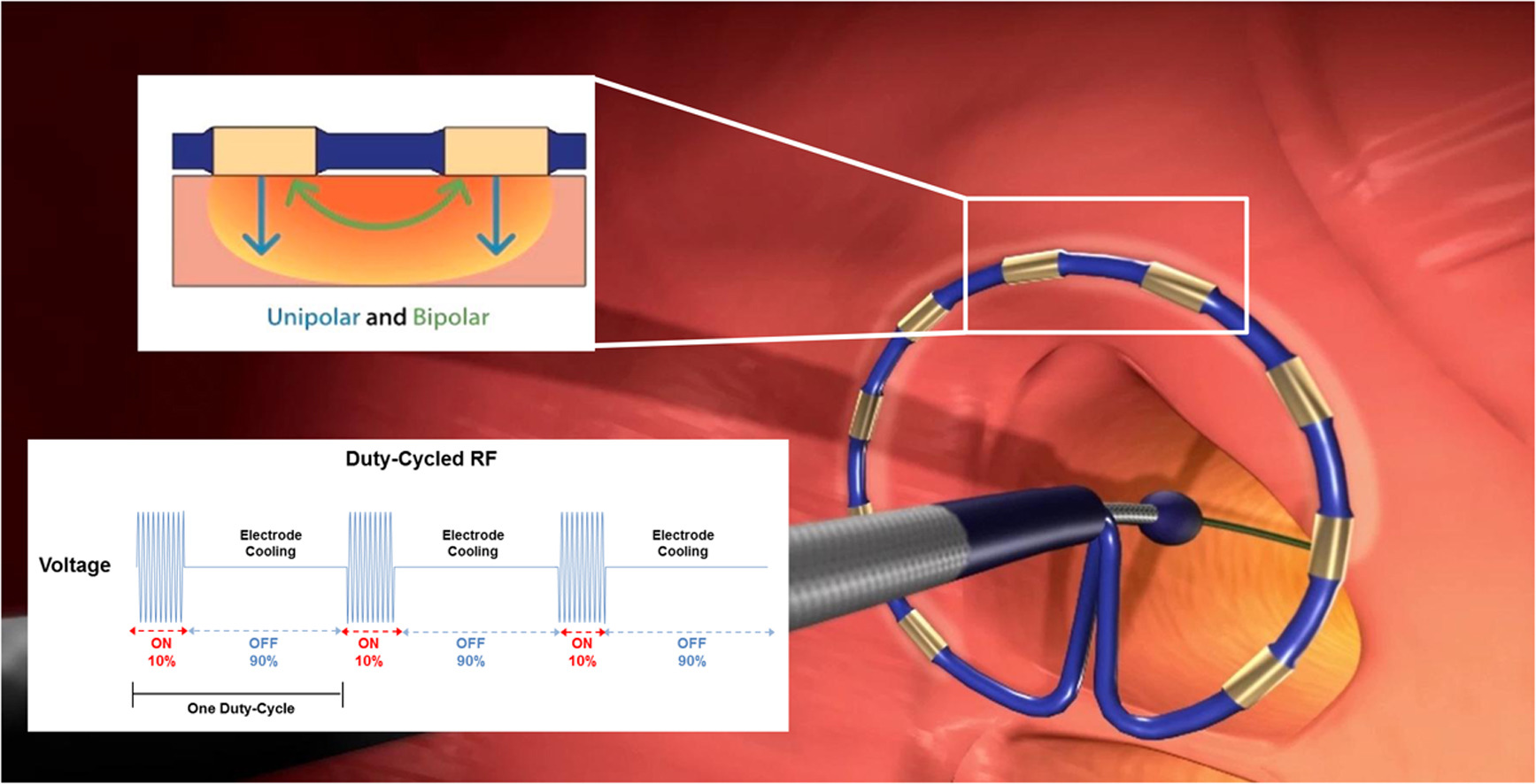
In RF ablations, the tissue heats up over the course of the RF cycle, resulting in a drop in impedance that varies over time. As described above, the goal will be to see how much of the variation in impedance is described by time (over some limited range) and then communicate the uncertainty in the predictions visually. None of this detail is terribly important other than I like to frame my examples from within my industry and McElreath emphasizes grounding our modeling in real world science and domain knowledge. This is what an ablation catheter system looks like:2
To get things started, load the data and give it a look with skim(). There are no missing values.
ablation_dta_tbl <- read.csv(file = "abl_data_2.csv")
ablation_dta_tbl <- ablation_dta_tbl %>% select(temp, time)
ablation_dta_tbl %>% skim()
## Skim summary statistics
## n obs: 331
## n variables: 2
##
## -- Variable type:numeric ------------------------------------------------------------------------------------------------------------
## variable missing complete n mean sd p0 p25 p50 p75 p100
## temp 0 331 331 77.37 3.9 68.26 74.61 77.15 80.33 89.53
## time 0 331 331 22.57 3.22 15.83 20.22 22.54 24.69 31.5
## hist
## <U+2581><U+2585><U+2587><U+2586><U+2586><U+2583><U+2581><U+2581>
## <U+2582><U+2586><U+2587><U+2587><U+2587><U+2583><U+2582><U+2581>Let’s start with a simple visualization. The code below builds out a scatterplot with marginal histograms which I think is a nice, clean way to evaluate scatter data.3 These data seem plausible since the impedance will typically drop as the tissue heats up during the procedure. In reality the impedance goes asymptotic but we’ll work over a limited range of time where the behavior might reasonably be linear.
scatter_1_fig <- ablation_dta_tbl %>% ggplot(aes(x = time, y = temp)) +
  geom_point(
    colour = "#2c3e50",
    fill = "#2c3e50",
    size = 2,
    alpha = 0.4
  ) +
  labs(
    x = "Ablation Time (seconds)",
    y = "Tissue Temperature (deg C)",
    title = "Ablation Time vs. Tissue Temperature",
    subtitle = "Simulated Catheter RF Ablation"
  )

scatter_hist_1_fig <- ggMarginal(scatter_1_fig,
  type = "histogram",
  color = "white",
  alpha = 0.7,
  fill = "#2c3e50",
  xparams = list(binwidth = 1),
  yparams = list(binwidth = 2.5)
)
# ggExtra needs these explit calls to display in Markdown docs *shrug*
grid::grid.newpage()
grid::grid.draw(scatter_hist_1_fig)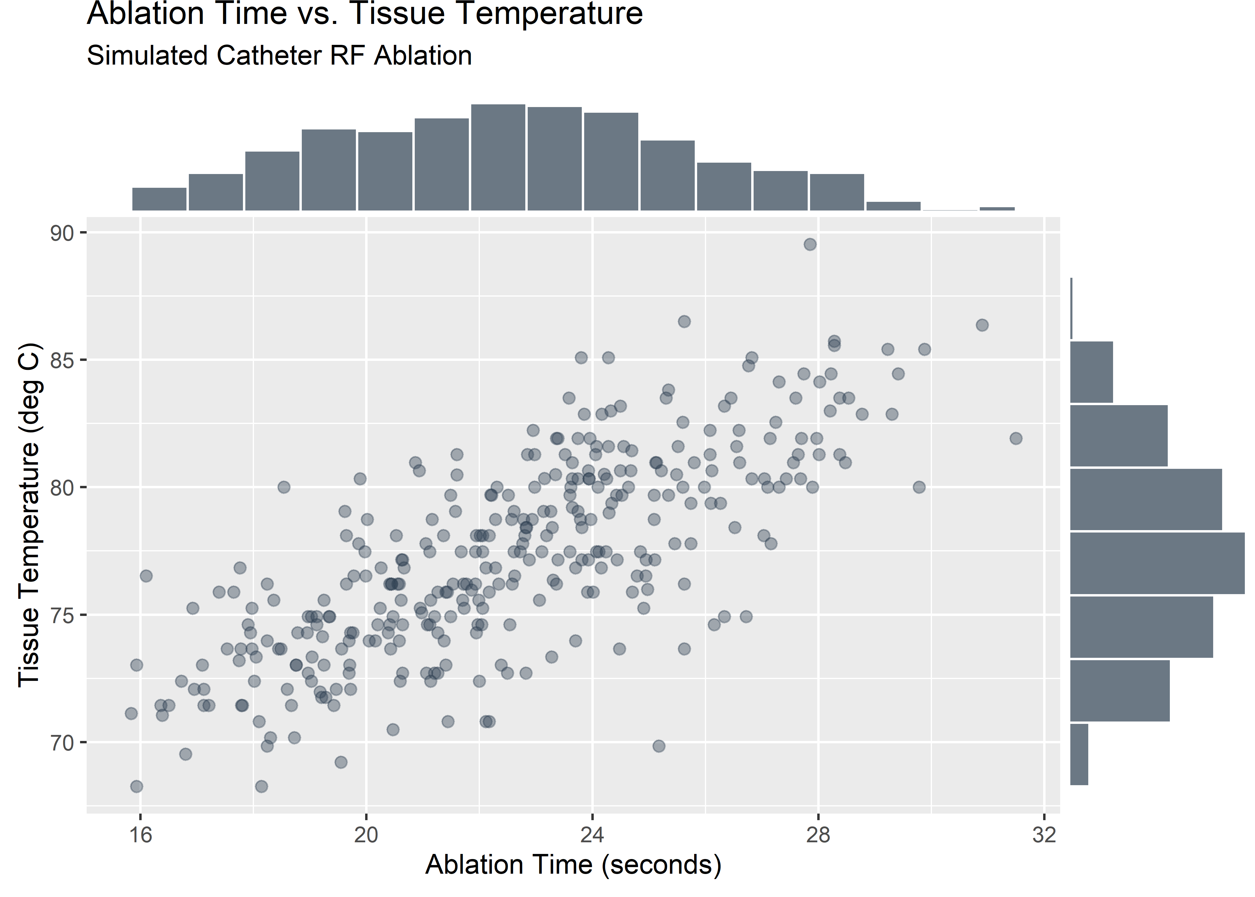
It helps to have a plan. If I can create a posterior distribution that captures reasonable values for the model parameters and confirm that the model makes reasonable predictions then I will be happy. Here’s the workflow that hopefully will get me there.
grViz("digraph flowchart {
      # node definitions with substituted label text
      node [fontname = Helvetica, shape = rectangle, fillcolor = yellow]
      tab1 [label = 'Step 1: Propose a distribution for the response variable \n Choose a maximum entropy distribution given the constraints you understand']
      tab2 [label = 'Step 2: Parameterize the mean \n The mean of the response distribution will vary linearly across the range of predictor values']
      tab3 [label = 'Step 3: Set priors \n Simulate what the model knows before seeing the data.  Use domain knowledge as constraints.']
      tab4 [label = 'Step 4: Define the model \n Create the model using the observed data, the likelihood function, and the priors']
      tab5 [label = 'Step 5: Draw from the posterior \n Plot plausible lines using parameters visited by the Markov chains']
      tab6 [label = 'Step 6: Push the parameters back through the model \n Simulate real data from plausible combinations of mean and sigma']
      # edge definitions with the node IDs
      tab1 -> tab2 -> tab3 -> tab4 -> tab5 -> tab6;
      }
      ")
Step 1: Propose a distribution for the response variable
A Gaussian model is reasonable for the outcome variable Temperature as we know it is a measured from the thermocouples on the distal end of the catheter. According to McElreath (pg 75):
Measurement errors, variations in growth, and the velocities of molecules all tend towards Gaussian distributions. These processes do this because at their heart, these processes add together fluctuations. And repeatedly adding finite fluctuations results in a distribution of sums that have shed all information about the underlying process, aside from mean and spread.
Here’s us formally asserting Temperature as a normal distribution with mean mu and standard deviation sigma. These two parameters are all that is needed to completely describe the distribution and also pin down the likelihood function.
\(T_i \sim \text{Normal}(\mu_i, \sigma)\)
Step 2: Parameterize the mean
If we further parameterize the mean we can do some neat things like move it around with the predictor variable. This is a pretty key concept - you move the mean of the outcome variable around by parameterizing it. If we make it a line then it will move linearly with the predictor variable. The real data will still have a spread once the sigma term is folded back in, but we can think of the whole distribution shifting up and down based on the properties of the line.
Here’s us asserting we want mu to move linearly with changes in the predictor variable (time). Subtracting the mean from each value of the predictor variable “centers” the data which McElreath recommends in most cases. I will explore the differences between centered and un-centered later on.
\(\mu_i = \alpha + \beta (x_i - \bar{x})\)
Step 3: Set priors
We know some things about these data and we should use it to help regularize to model through the priors.
Temperature is a continuous variable so we want a continuous distribution. We also know from the nature of the treatment that there isn’t really any physical mechanism within the device that would be expected to cool down the tissue below normal body temperature. Since only heating is expected, the slope should be positive or zero.
McElreath emphasizes simulating from the priors to visualize “what the model knows before it sees the data”. Here are some priors to consider. Let’s evaluate.
# Set seed for repeatability
set.seed(1999)

# number of sims
n <- 150

# random draws from the specified prior distributions
# lognormal distribution is used to constrain slopes to positive values
a <- rnorm(n, 75, 15)

b <- rnorm(n, 0, 1)
b_ <- rlnorm(n, 0, 0.8)

# calc mean of time and temp for later use
mean_temp <- mean(ablation_dta_tbl$temp)
mean_time <- mean(ablation_dta_tbl$time)

# dummy tibble to feed ggplot()
empty_tbl <- tibble(x = 0)

# y = b(x - mean(var_1)) + a is equivalent to:
# y = bx + (a - b * mean(var_1))

# in this fig we use the uninformed prior that generates some unrealistic values
prior_fig_1 <- empty_tbl %>% ggplot() +
  geom_abline(
    intercept = a - b * mean_time,
    slope = b,
    color = "#2c3e50",
    alpha = 0.3,
    size = 1
  ) +
  ylim(c(0, 150)) +
  xlim(c(0, 150)) +
  labs(
    x = "time (sec)",
    y = "Temp (C)",
    title = "Prior Predictive Simulations",
    subtitle = "Uninformed Prior"
  )

# in this fig we confine the slopes to broad ranges informed by what we know about the domain
prior_fig_2 <- empty_tbl %>% ggplot() +
  geom_abline(
    intercept = a - b_ * mean_time,
    slope = b_,
    color = "#2c3e50",
    alpha = 0.3,
    size = 1
  ) +
  ylim(c(0, 150)) +
  xlim(c(0, 150)) +
  labs(
    x = "time (sec)",
    y = "Temp (C)",
    title = "Prior Predictive Simulations",
    subtitle = "Mildly Informed Prior"
  )

plot_grid(prior_fig_1, prior_fig_2)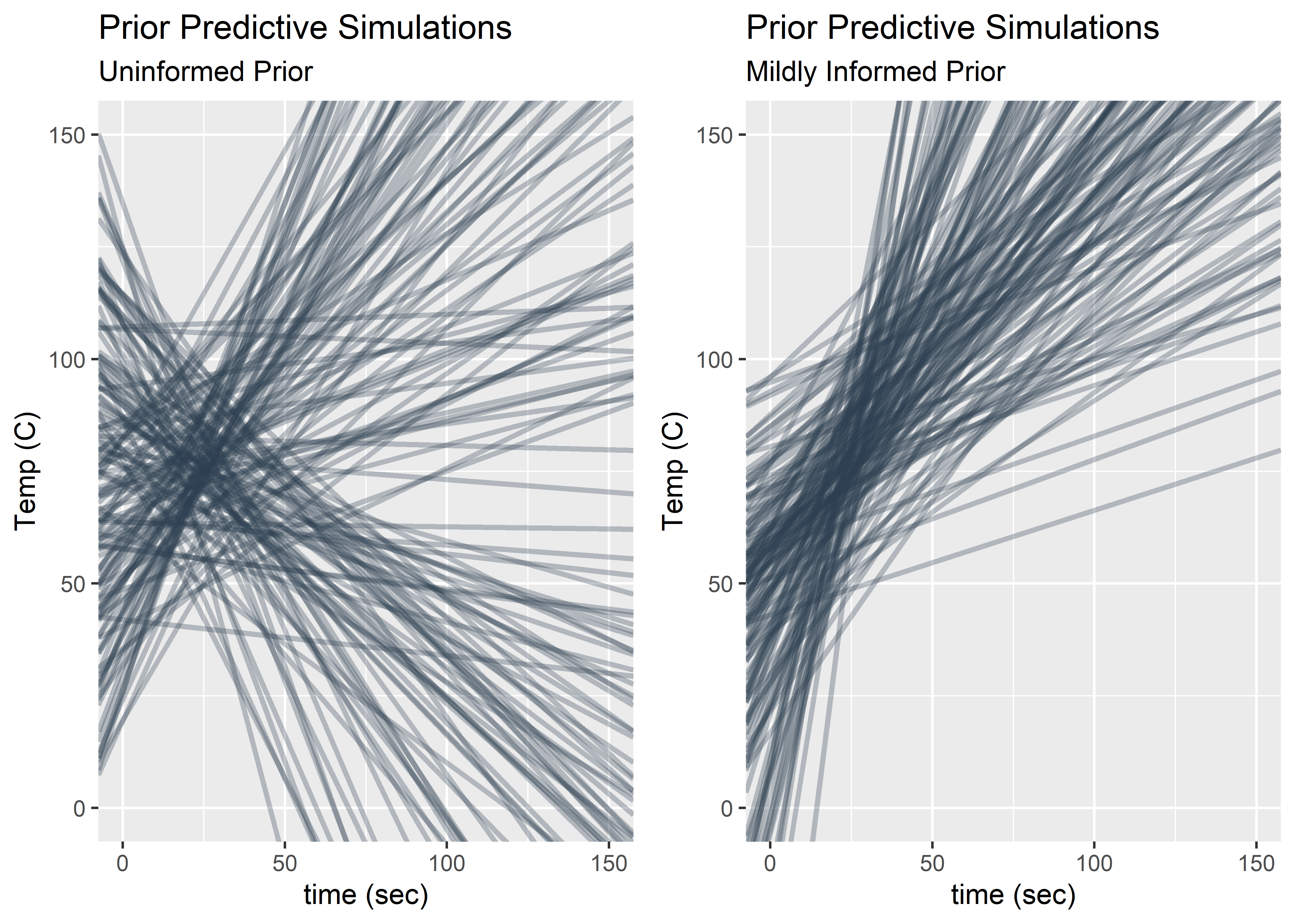
The plots above show what the model thinks before seeing the data for two different sets of priors. In both cases, I have centered the data by subtracting the mean of the time from each individual value of time. This means the intercept has the meaning of the expected temperature at the mean of time. The family of lines on the right seem a lot more realistic despite having some slopes that predict strange values out of sample (blood coagulates at ~90C). Choosing a log normal distribution for time ensures positives slopes. You could probably go even tighter on these priors but for this exercise I’m feeling good about proceeding.
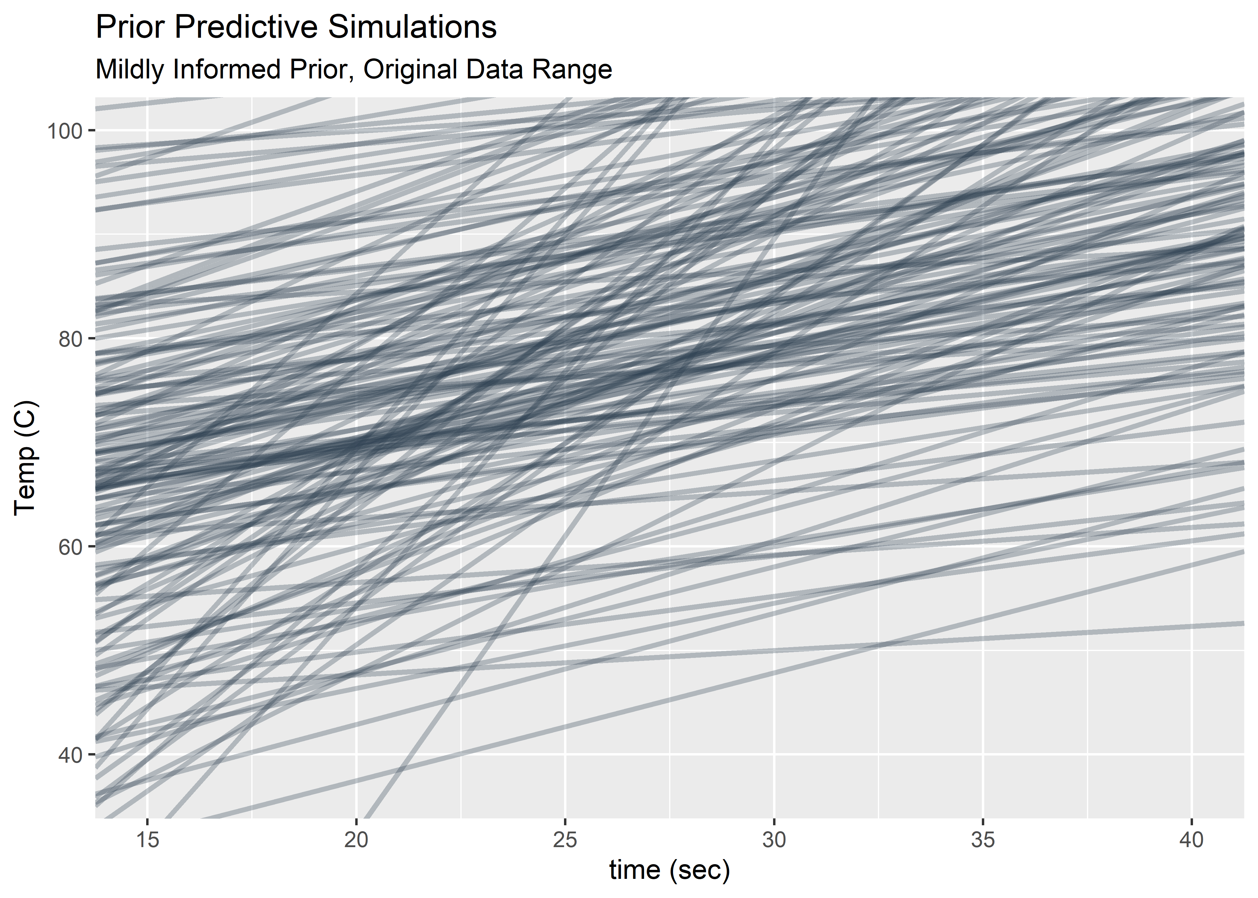
Looking only at the time window of the original observations and the Temp window bounded by body temperature (lower bound) and water boiling (upper bound).
empty_tbl %>% ggplot() +
  geom_abline(
    intercept = a - b_ * mean_time,
    slope = b_,
    color = "#2c3e50",
    alpha = 0.3,
    size = 1
  ) +
  ylim(c(37, 100)) +
  xlim(c(15, 40)) +
  labs(
    x = "time (sec)",
    y = "Temp (C)",
    title = "Prior Predictive Simulations",
    subtitle = "Mildly Informed Prior, Original Data Range"
  )
Here are the prior distributions selected to go forward.
\(\alpha \sim \text{Normal}(75, 15)\)
\(\beta \sim \text{LogNormal}(0, .8)\)
\(\sigma \sim \text{Uniform}(0, 30)\)
Step 4: Define the model
Here I use the brm() function in brms to build what I’m creatively calling: “model_1”. This one uses the un-centered data for time. This function uses Markov Chain Monte Carlo to survey the parameter space. After the warm up cycles, the relative amount of time the chains spend at each parameter value is a good approximation of the true posterior distribution. I’m using a lot of warm up cycles because I’ve heard chains for the uniform priors on sigma can take a long time to converge. This model still takes a bit of time to chug through the parameter space on my modest laptop.
#model_1 <-
#  brm(
#    data = ablation_dta_tbl, family = gaussian,
#    temp ~ 1 + time,
#    prior = c(
#      prior(normal(75, 15), class = Intercept),
#      prior(lognormal(0, .8), class = b),
#      prior(uniform(0, 30), class = sigma)
#    ),
#    iter = 41000, warmup = 40000, chains = 4, cores = 4,
#    seed = 4
#  )
Step 5: Draw from the posterior
The fruits of all my labor! The posterior holds credible combinations for sigma and the slope and intercept (which together describe the mean of the outcome variable we care about). Let’s take a look.
post_samplesM1_tbl <-
  posterior_samples(model_1) %>%
  select(-lp__) %>%
  round(digits = 3)

post_samplesM1_tbl %>%
  head(10) %>%
kable(align = rep("c", 3))| b_Intercept | b_time | sigma |
|---|---|---|
| 58.509 | 0.841 | 2.682 |
| 55.983 | 0.949 | 2.648 |
| 56.195 | 0.937 | 2.540 |
| 56.661 | 0.919 | 2.474 |
| 55.143 | 0.978 | 2.593 |
| 55.170 | 0.977 | 2.667 |
| 54.908 | 0.996 | 2.621 |
| 58.453 | 0.836 | 2.534 |
| 54.134 | 1.031 | 2.647 |
| 58.713 | 0.828 | 2.707 |
The plotting function in brms is pretty sweet. I’m not expert in MCMC diagnostics but I do know the “fuzzy caterpillar” look of the trace plots is desirable.
plot(model_1)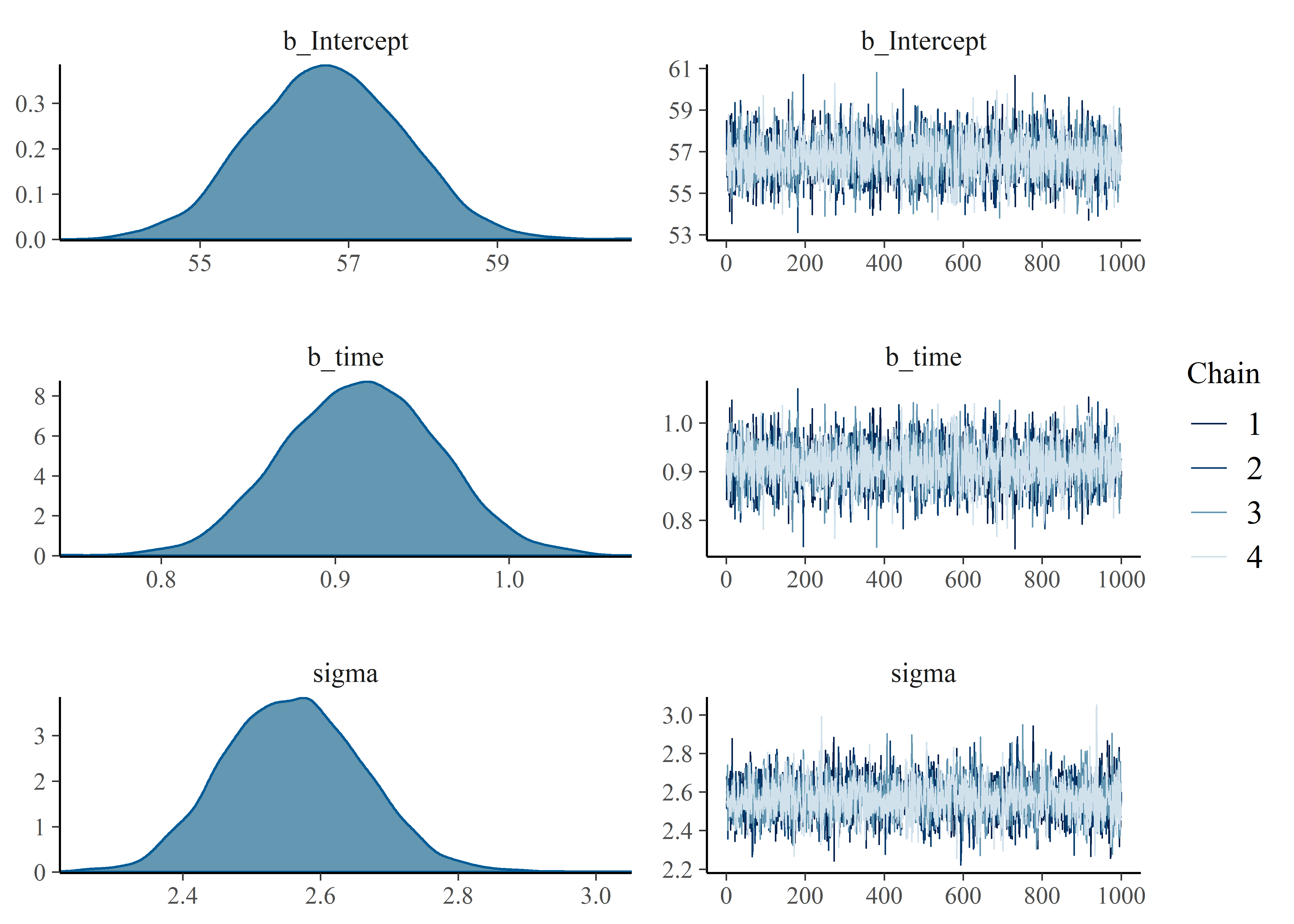
Posterior_summary() can grab the model results in table form.
mod_1_summary_tbl <-
  posterior_summary(model_1) %>%
  as.data.frame() %>%
  rownames_to_column() %>%
  as_tibble() %>%
  mutate_if(is.numeric, funs(as.character(signif(., 2)))) %>%
  mutate_at(.vars = c(2:5), funs(as.numeric(.)))

mod_1_summary_tbl %>%
kable(align = rep("c", 5))| rowname | Estimate | Est.Error | Q2.5 | Q97.5 |
|---|---|---|---|---|
| b_Intercept | 57.00 | 1.000 | 55.00 | 59.0 |
| b_time | 0.91 | 0.045 | 0.83 | 1.0 |
| sigma | 2.60 | 0.100 | 2.40 | 2.8 |
| lp__ | -790.00 | 1.300 | -790.00 | -790.0 |
Now let’s see what changes if the time data is centered. Everything is the same here in model_2 except the time_c data which is transformed by subtracting the mean from each value.
ablation_dta_tbl <- ablation_dta_tbl %>% mutate(time_c = time - mean(time))#model_2 <-
# brm(
# data = ablation_dta_tbl, family = gaussian,
# temp ~ 1 + time_c,
# prior = c(
# prior(normal(75, 15), class = Intercept),
# prior(lognormal(0, .8), class = b),
# prior(uniform(0, 30), class = sigma)
# ),
# iter = 41000, warmup = 40000, chains = 4, cores = 4,
# seed = 4
# )Plotting model_2 to compare with the output of model_1 above.
plot_mod_2_fig <- plot(model_2)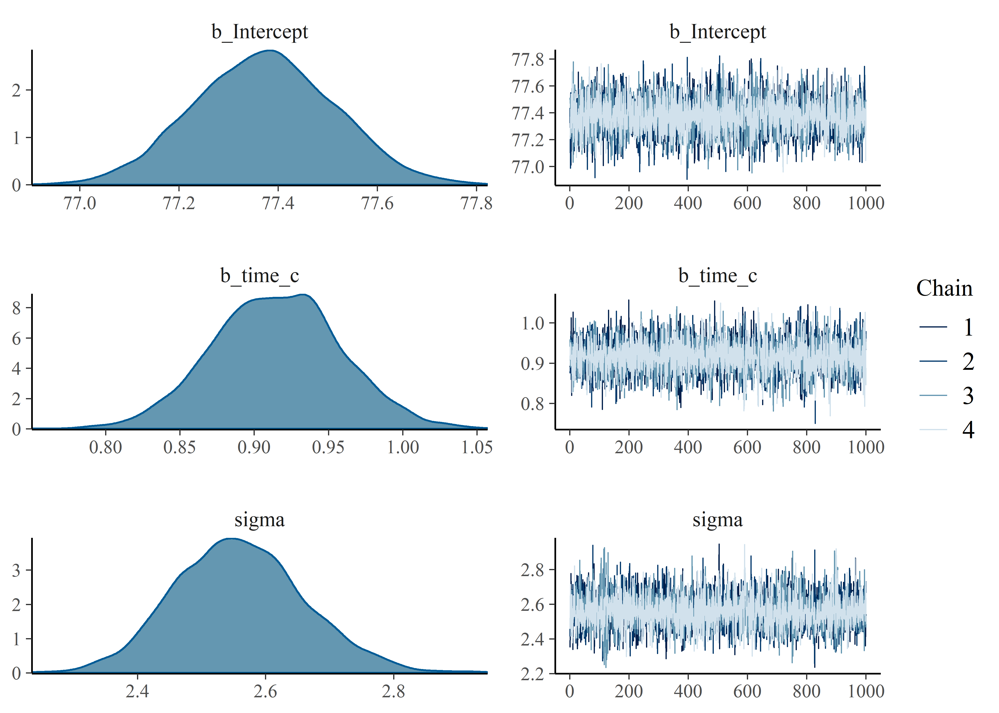
The slope B and sigma are very similar. The intercept is the only difference with model_1 ranging from low to high 50’s. Model 2 is tight around 77. We should visualize the lines proposed by the parameters in the posteriors of our models to understand the uncertainty associated with the mean and also understand why the intercepts are different between models. First, store the posterior samples as a tibble in anticipation for ggplot.
post_samplesM2_tbl <-
  posterior_samples(model_2) %>%
  select(-lp__) %>%
  round(digits = 3)

post_samplesM2_tbl %>%
  head(10) %>%
kable(align = rep("c", 3))| b_Intercept | b_time_c | sigma |
|---|---|---|
| 77.323 | 0.894 | 2.350 |
| 77.430 | 0.881 | 2.516 |
| 77.335 | 0.957 | 2.571 |
| 77.011 | 0.947 | 2.776 |
| 77.209 | 1.013 | 2.691 |
| 77.517 | 0.820 | 2.488 |
| 77.335 | 0.881 | 2.682 |
| 77.313 | 0.857 | 2.538 |
| 77.423 | 0.873 | 2.569 |
| 77.302 | 0.926 | 2.340 |
Visualize the original data (centered and un-centered versions) along with plausible values for regression line of the mean:
mean_regressionM1_fig <-
  ablation_dta_tbl %>%
  ggplot(aes(x = time, y = temp)) +
  geom_point(
    colour = "#481567FF",
    size = 2,
    alpha = 0.6
  ) +
  geom_abline(aes(intercept = b_Intercept, slope = b_time),
    data = post_samplesM1_tbl,
    alpha = 0.1, color = "gray50"
  ) +
  geom_abline(
    slope = mean(post_samplesM1_tbl$b_time),
    intercept = mean(post_samplesM1_tbl$b_Intercept),
    color = "blue", size = 1
  ) +
  labs(
    title = "Regression Line Representing Mean of Slope",
    subtitle = "Data is As-Observed (No Centering of Predictor)",
    x = "Time (s)",
    y = "Temperature (C)"
  )

mean_regressionM2_fig <-
  ablation_dta_tbl %>%
  ggplot(aes(x = time_c, y = temp)) +
  geom_point(
    color = "#55C667FF",
    size = 2,
    alpha = 0.6
  ) +
  geom_abline(aes(intercept = b_Intercept, slope = b_time_c),
    data = post_samplesM2_tbl,
    alpha = 0.1, color = "gray50"
  ) +
  geom_abline(
    slope = mean(post_samplesM2_tbl$b_time_c),
    intercept = mean(post_samplesM2_tbl$b_Intercept),
    color = "blue", size = 1
  ) +
  labs(
    title = "Regression Line Representing Mean of Slope",
    subtitle = "Predictor Data (Time) is Centered",
    x = "Time (Difference from Mean Time in seconds)",
    y = "Temperature (C)"
  )


combined_mean_fig <-
  ablation_dta_tbl %>%
  ggplot(aes(x = time, y = temp)) +
  geom_point(
    colour = "#481567FF",
    size = 2,
    alpha = 0.6
  ) +
  geom_point(
    data = ablation_dta_tbl, aes(x = time_c, y = temp),
    colour = "#55C667FF",
    size = 2,
    alpha = 0.6
  ) +
  geom_abline(aes(intercept = b_Intercept, slope = b_time),
    data = post_samplesM1_tbl,
    alpha = 0.1, color = "gray50"
  ) +
  geom_abline(
    slope = mean(post_samplesM1_tbl$b_time),
    intercept = mean(post_samplesM1_tbl$b_Intercept),
    color = "blue", size = 1
  ) +
  geom_abline(aes(intercept = b_Intercept, slope = b_time_c),
    data = post_samplesM2_tbl,
    alpha = 0.1, color = "gray50"
  ) +
  geom_abline(
    slope = mean(post_samplesM2_tbl$b_time_c),
    intercept = mean(post_samplesM2_tbl$b_Intercept),
    color = "blue", size = 1
  ) +
  labs(
    title = "Regression Line Representing Mean of Slope",
    subtitle = "Centered and Un-Centered Predictor Data",
    x = "Time (s)",
    y = "Temperature (C)"
  )
combined_predicts_fig <- combined_mean_fig +
ylim(c(56,90)) +
labs(title = "Points Represent Observed Data (Green is Centered)",
subtitle = "Regression Line Represents Rate of Change of Mean (Grey Bands are Uncertainty)")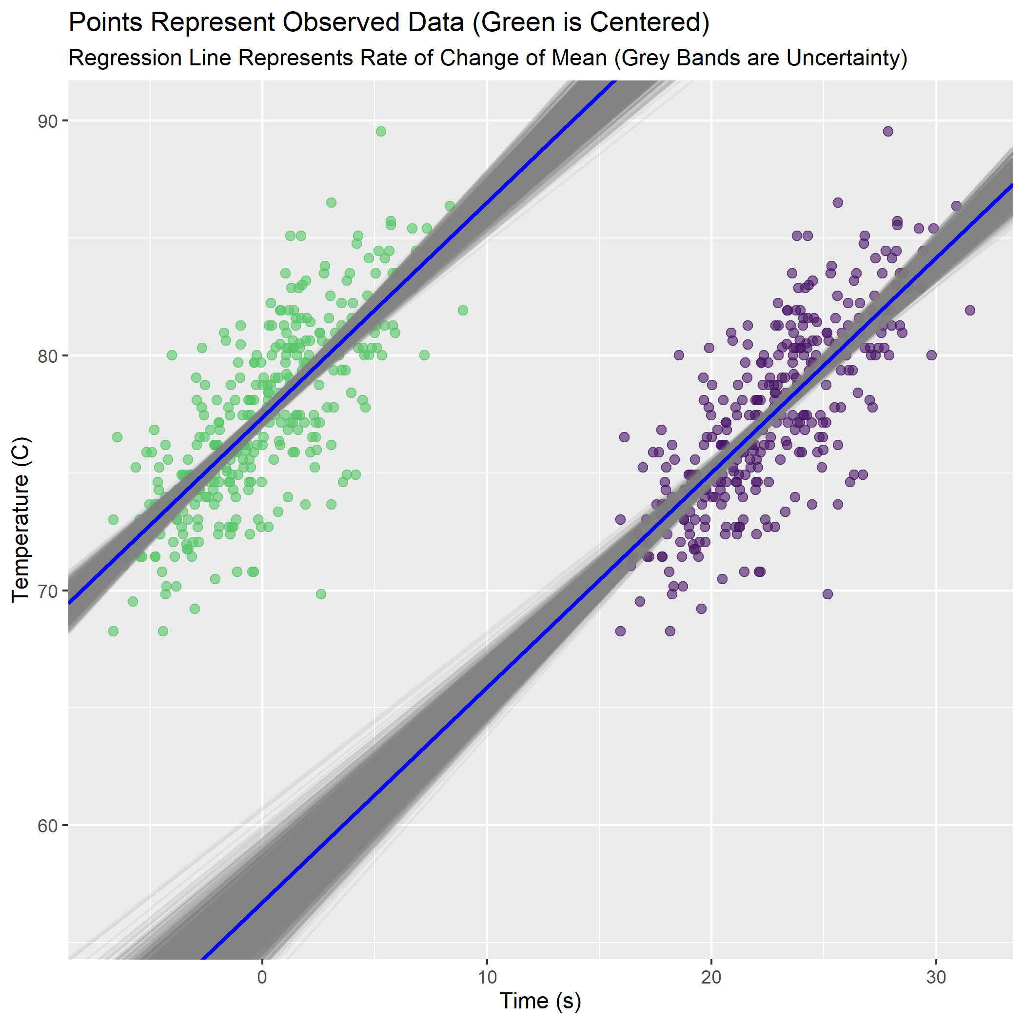
Now everything is clear. The slopes are exactly the same (as we saw in the density plots between model_1 and model_2 in summary()). The intercepts are different because in the centered data (green) the intercept occurs when the predictor equals 0 (its new mean). The outcome variable temp must therefore also be at its mean value in the “knot” of the bow-tie.
For the un-centered data (purple), the intercept is the value of Temperature when the un-adjusted time is at 0. The range of possible intercepts is much more uncertain here.
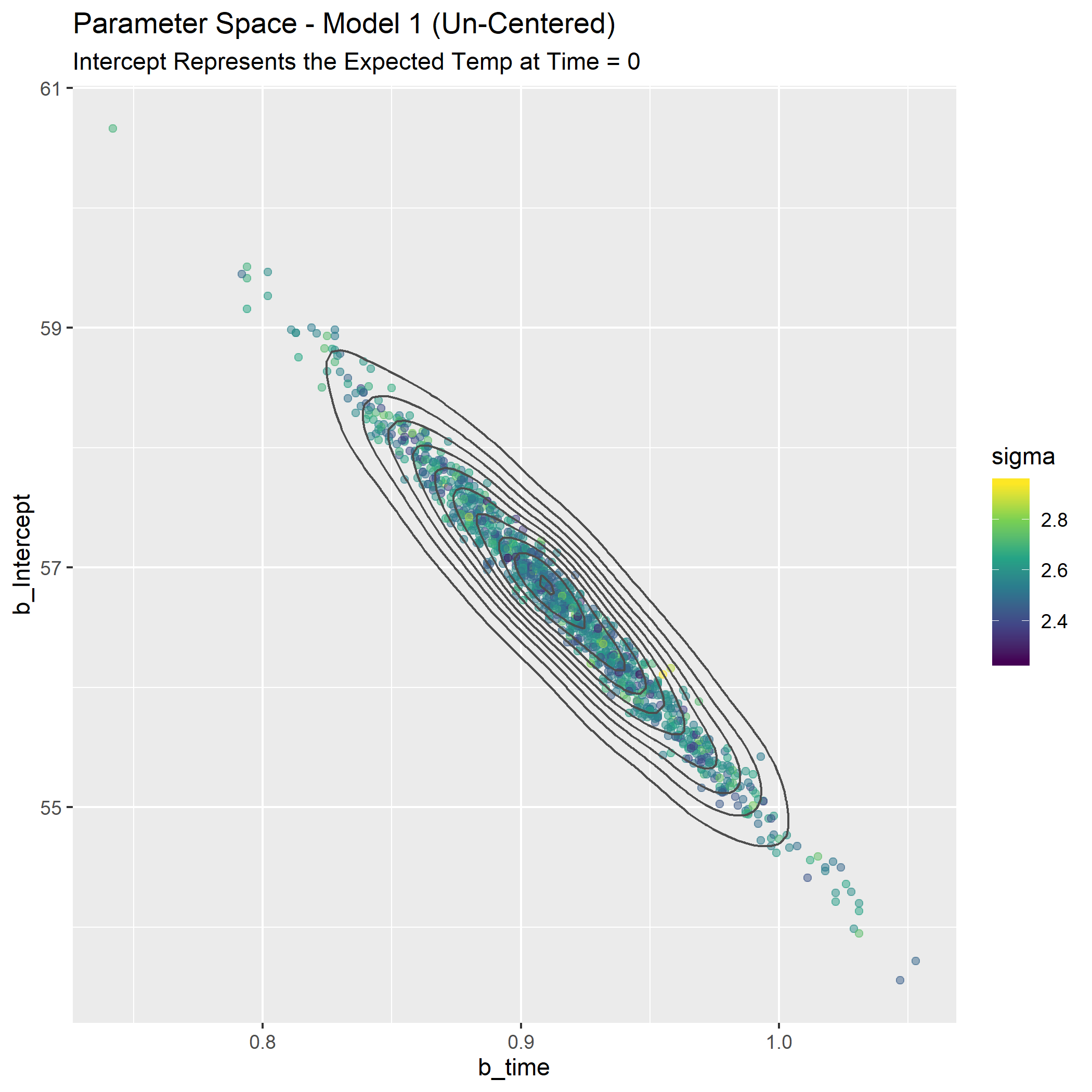
Another way to look at the differences is as a map of the plausible parameter space. We need a plot that can represent 3 parameters: intercept, slope, and sigma. Each point will be a credible combination of the three parameters as observed in 1 row of the posterior distribution tibble(s).
First, the un-centered model.
p_spaceM1_fig <-
  post_samplesM1_tbl[1:1000, ] %>%
  ggplot(aes(x = b_time, y = b_Intercept, color = sigma)) +
  geom_point(alpha = 0.5) +
  geom_density2d(color = "gray30") +
  scale_color_viridis_c() +
  labs(
    title = "Parameter Space - Model 1 (Un-Centered)",
    subtitle = "Intercept Represents the Expected Temp at Time = 0"
  )
Now the centered version:
p_spaceM2_fig <-
  post_samplesM2_tbl[1:1000, ] %>%
  ggplot(aes(x = b_time_c, y = b_Intercept, color = sigma)) +
  geom_point(alpha = 0.5) +
  geom_density2d(color = "gray30") +
  scale_color_viridis_c() +
  labs(
    title = "Parameter Space - Model 2 (Centered)",
    subtitle = "Intercept Represents the Expected Temp at Mean Time"
  )

#p_spaceM2_fig
#ggsave(filename = "p_spaceM2_fig.png")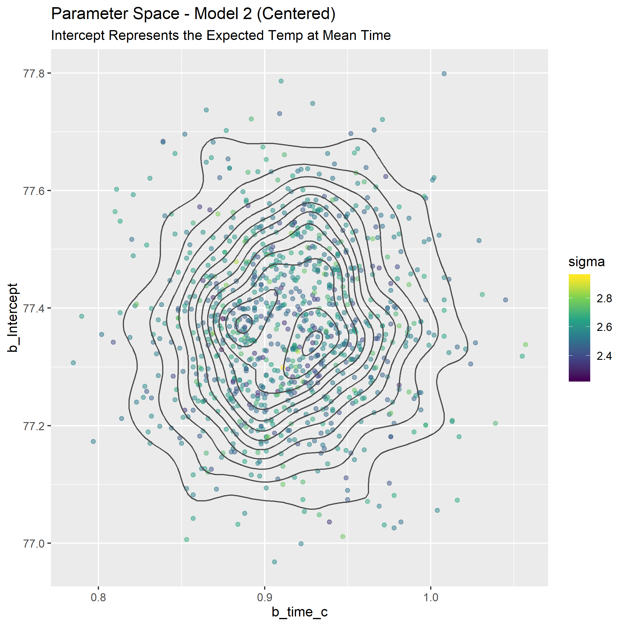
These look way different, but part of it is an illusion of the scaling on the y-axis. Remember how the credible values of the intercept were much tighter for the centered model? If we plot them both on the same canvas we can understand better, and it’s pretty (to my eye at least).
p_spaceC_tbl <-
  post_samplesM2_tbl[1:1000, ] %>%
  ggplot(aes(x = b_time_c, y = b_Intercept, color = sigma)) +
  geom_point(alpha = 0.5) +
  geom_point(data = post_samplesM1_tbl, aes(x = b_time, y = b_Intercept, color = sigma), alpha = 0.5) +
  scale_color_viridis_c() +
  labs(
    title = "Credible Parameter Values for Models 1 and 2",
    subtitle = "Model 1 is Un-Centered, Model 2 is Centered",
    x = expression(beta["time"]),
    y = expression(alpha["Intercept"])) +
  ylim(c(54, 80))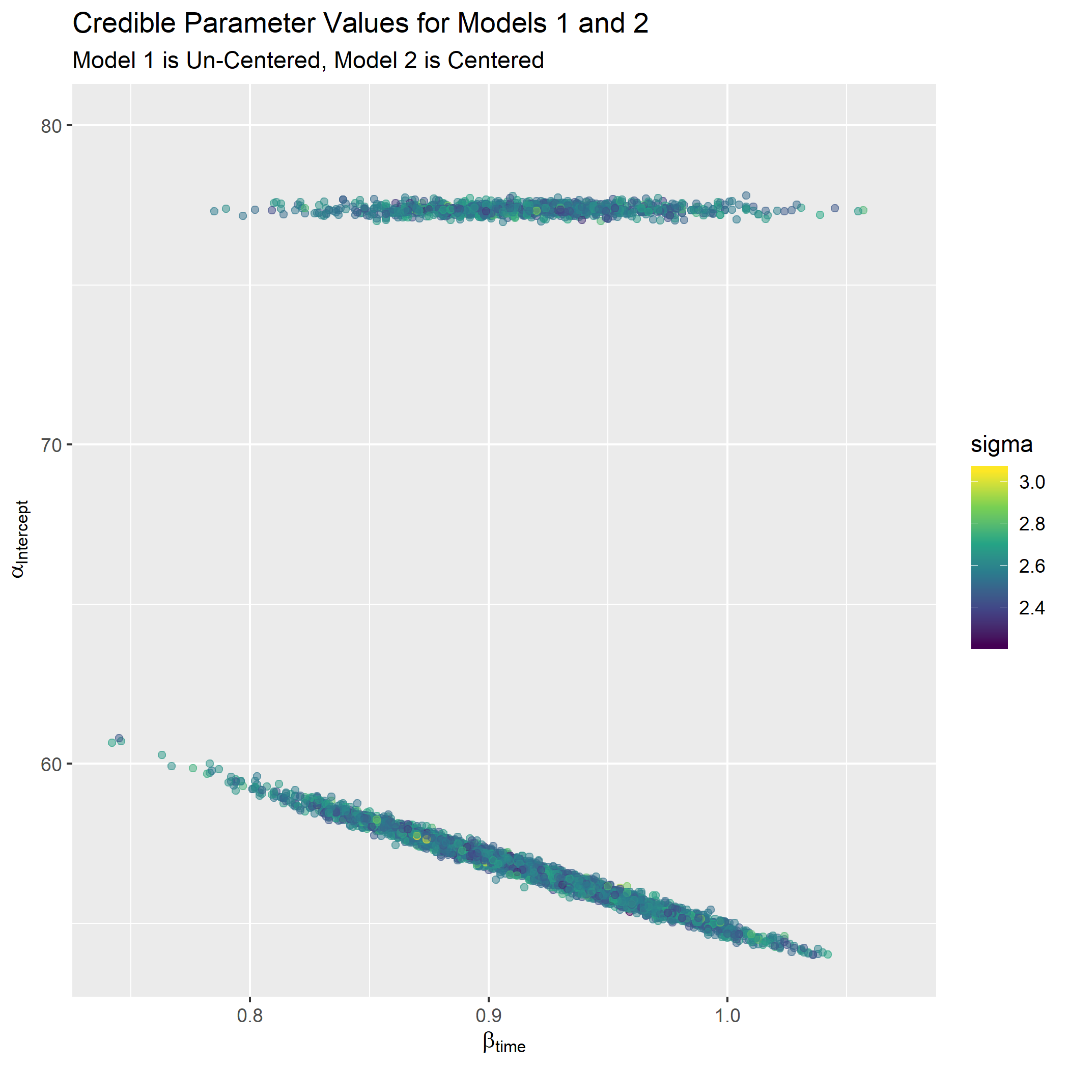
Now we see they aren’t as different as they first seemed. They cover very similar ranges for the slope and the un-centered model covers a wider range of plausible intercepts.
I’ve been looking for a good time to fire up the rayshader package and I’m not throwing away my shot here. Plotting with rayshader feels like a superpower that I shouldn’t be allowed to have. It’s silly how easy it is to make these ridiculous visuals. First, a fancy 3d plot providing some perspective on the relative “heights” of theta.
#par(mfrow = c(1, 1))
#plot_gg(p_spaceC_tbl, width = 5, height = 4, scale = 300, multicore = TRUE, windowsize = c(1200, 960),
#        fov = 70, zoom = 0.45, theta = 330, phi = 40)

#Sys.sleep(0.2)
#render_depth(focus = 0.7, focallength = 200)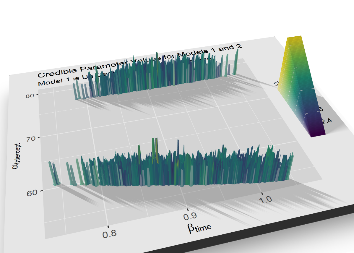
If you want more, this code below renders a video guaranteed to impress small children and executives. I borrowed this code from Joey Stanley who borrowed it from Morgan Wall.4
#install.packages("av")
#library(av)

# Set up the camera position and angle
#phivechalf = 30 + 60 * 1/(1 + exp(seq(-7, 20, length.out = 180)/2))
#phivecfull = c(phivechalf, rev(phivechalf))
#thetavec = 0 + 60 * sin(seq(0,359,length.out = 360) * pi/180)
#zoomvec = 0.45 + 0.2 * 1/(1 + exp(seq(-5, 20, length.out = 180)))
#zoomvecfull = c(zoomvec, rev(zoomvec))

# Actually render the video.
#render_movie(filename = "hex_plot_fancy_2", type = "custom",
#            frames = 360,  phi = phivecfull, zoom = zoomvecfull, theta = thetavec)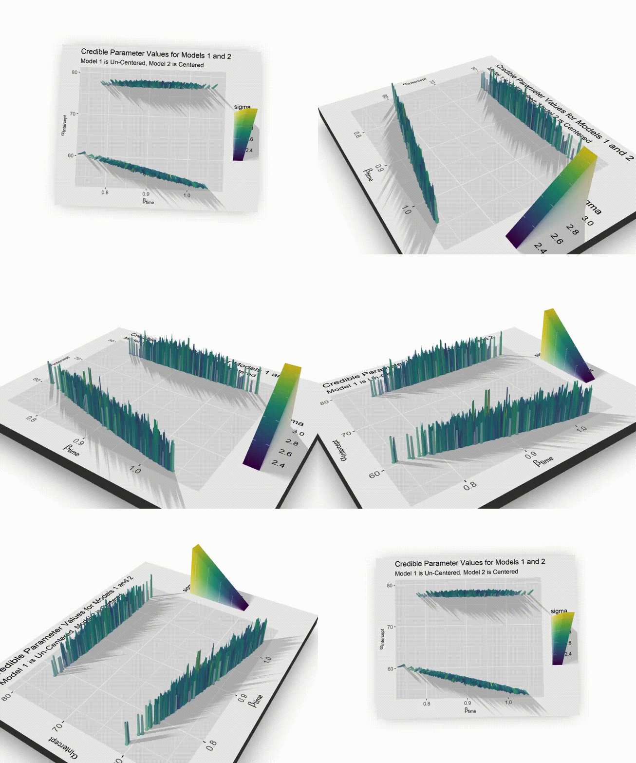
Step 6: Push the parameters back through the model
After a lot of work we have finally identified the credible values for our model parameters. We now want to see what sort of predictions our posterior makes. Again, I’ll work with both the centered and un-centered data to try to understand the difference between the approaches. The first step in both cases is to create a sequence of time data to predict off of. For some reason I couldn’t get the predict() function in brms to cooperate so I wrote my own function to predict values. You enter a time value and the function makes a temperature prediction for every combination of mean and standard deviation derived from the parameters in the posterior distribution. Our goal will be to map this function over the sequence of predictor values we just set up.
#sequence of time data to predict off of.  Could use the same for both models but I created 2 for clarity
time_seq_tbl   <- tibble(pred_time   = seq(from = -15, to = 60, by = 1))
time_seq_tbl_2 <- tibble(pred_time_2 = seq(from = -15, to = 60, by = 1))

#function that takes a time value and makes a prediction using model_1 (un-centered)
rk_predict <-
function(time_to_sim){
  rnorm(n = nrow(post_samplesM1_tbl),
        mean = post_samplesM1_tbl$b_Intercept + post_samplesM1_tbl$b_time*time_to_sim,
        sd = post_samplesM1_tbl$sigma
  )
}

#function that takes a time value and makes a prediction using model_2 (centered)
rk_predict2 <-
function(time_to_sim){
  rnorm(n = nrow(post_samplesM2_tbl),
        mean = post_samplesM2_tbl$b_Intercept + post_samplesM2_tbl$b_time_c*time_to_sim,
        sd = post_samplesM2_tbl$sigma
  )
}

#map the first prediction function over all values in the time sequence
#then calculate the .025 and .975 quantiles in anticipation of 95% prediction intervals
predicts_m1_tbl <- time_seq_tbl %>%
  mutate(preds_for_this_time = map(pred_time, rk_predict)) %>%
  mutate(percentile_2.5  = map_dbl(preds_for_this_time, ~quantile(., .025))) %>%
  mutate(percentile_97.5 = map_dbl(preds_for_this_time, ~quantile(., .975)))

#same for the 2nd prediction function
predicts_m2_tbl <- time_seq_tbl_2 %>%
  mutate(preds_for_this_time = map(pred_time_2, rk_predict2)) %>%
  mutate(percentile_2.5  = map_dbl(preds_for_this_time, ~quantile(., .025))) %>%
  mutate(percentile_97.5 = map_dbl(preds_for_this_time, ~quantile(., .975)))

#visualize what is stored in the nested prediction cells (sanity check)
test_array <- predicts_m2_tbl[1, 2] %>% unnest(cols = c(preds_for_this_time))
test_array %>%
  round(digits = 2) %>%
  head(5) %>%
kable(align = rep("c", 1))| preds_for_this_time |
|---|
| 68.13 |
| 61.67 |
| 65.55 |
| 62.12 |
| 64.05 |
And now the grand finale - overlay the 95% prediction intervals on the original data along with the credible values of mean. We see there is no difference between the predictions made from centered data vs. un-centered.
big_enchilada <-
  tibble(h=0) %>%
  ggplot() +
  geom_point(
    data = ablation_dta_tbl, aes(x = time, y = temp),
    colour = "#481567FF",
    size = 2,
    alpha = 0.6
  ) +
  geom_point(
    data = ablation_dta_tbl, aes(x = time_c, y = temp),
    colour = "#55C667FF",
    size = 2,
    alpha = 0.6
  ) +
  geom_abline(aes(intercept = b_Intercept, slope = b_time),
    data = post_samplesM1_tbl,
    alpha = 0.1, color = "gray50"
  ) +
  geom_abline(
    slope = mean(post_samplesM1_tbl$b_time),
    intercept = mean(post_samplesM1_tbl$b_Intercept),
    color = "blue", size = 1
  ) +
  geom_abline(aes(intercept = b_Intercept, slope = b_time_c),
    data = post_samplesM2_tbl,
    alpha = 0.1, color = "gray50"
  ) +
  geom_abline(
    slope = mean(post_samplesM2_tbl$b_time_c),
    intercept = mean(post_samplesM2_tbl$b_Intercept),
    color = "blue", size = 1
  ) +
  geom_ribbon(
  data = predicts_m1_tbl, aes(x = predicts_m1_tbl$pred_time, ymin = predicts_m1_tbl$percentile_2.5, ymax = predicts_m1_tbl$percentile_97.5), alpha = 0.25, fill = "pink", color = "black", size = .3
) +
  geom_ribbon(
  data = predicts_m2_tbl, aes(x = predicts_m2_tbl$pred_time_2, ymin = predicts_m2_tbl$percentile_2.5, ymax = predicts_m2_tbl$percentile_97.5), alpha = 0.4, fill = "pink", color = "black", size = .3
) +
  labs(
    title = "Regression Line Representing Mean of Slope",
    subtitle = "Centered and Un-Centered Predictor Data",
    x = "Time (s)",
    y = "Temperature (C)"
  ) +
  scale_x_continuous(limits = c(-10, 37), expand = c(0, 0)) +
  scale_y_continuous(limits = c(40, 120), expand = c(0, 0))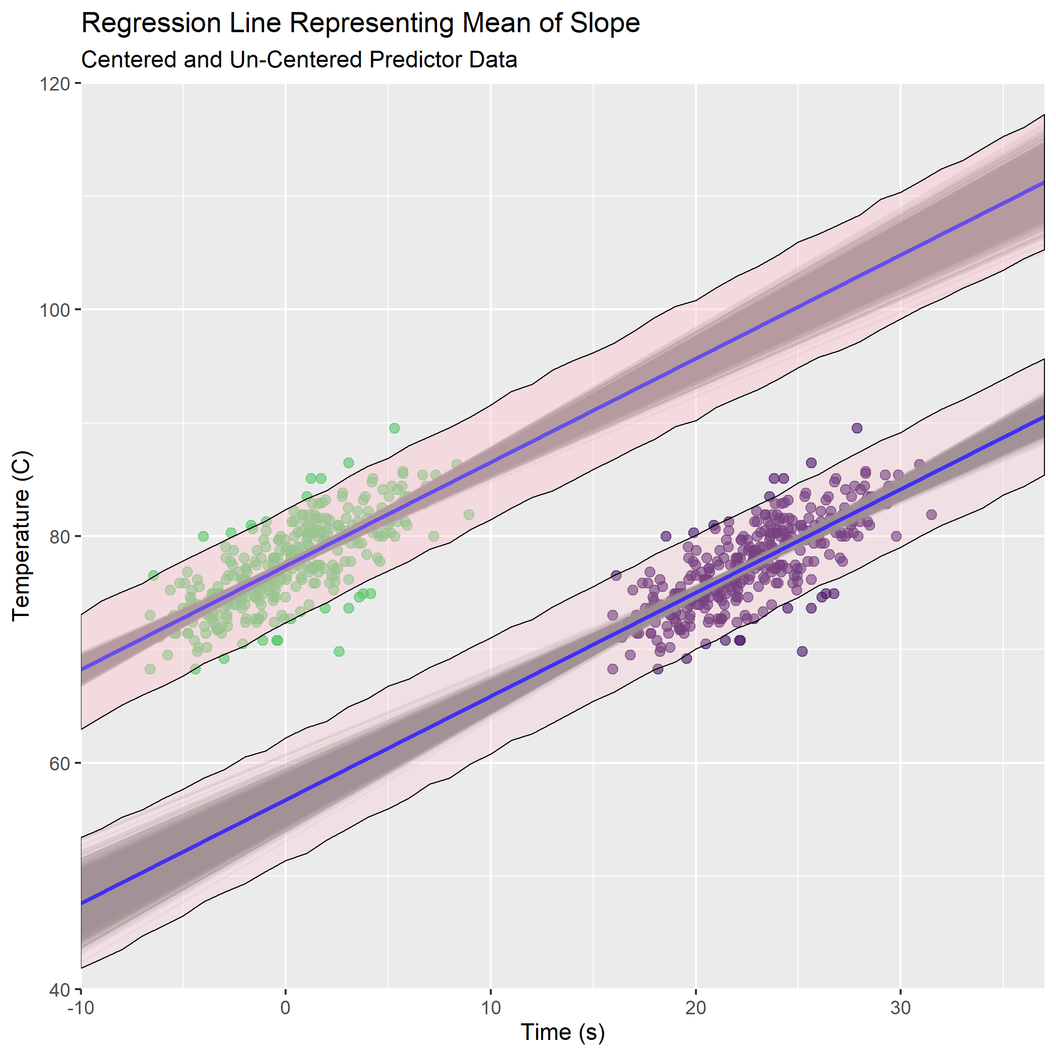
What a ride! This seemingly simple problem really stretched my brain. There are still a lot of question I want to go deeper on - diagnostics for the MCMC, impact of the regularizing priors, different between this workflow and frequentist at various sample sizes and priors, etc… but that will have to wait for another day.
For those looking for more interpretations of McElreath’s workflows using Tidyverse tools, Solomon Kurz has a brilliant collection here.5
Thank you for reading.
Statistical Rethinking, https://github.com/rmcelreath/statrethinking_winter2019↩
https://www.sciencedirect.com/science/article/abs/pii/S1547527116001806↩
There’s a funky bug in ggExtra which makes you break this code into 2 chunks when working in Markdown, https://cran.r-project.org/web/packages/ggExtra/vignettes/ggExtra.html↩
3D Vowel Plots with Rayshader, http://joeystanley.com/blog/3d-vowel-plots-with-rayshader↩
Statistical Rethinking with brms, ggplot2, and the tidyverse, https://bookdown.org/ajkurz/Statistical_Rethinking_recoded/↩