A Google search for ‘Gaussian Process Regression’ returns some intimidating material for a non-statistician. After filtering away the obscure stuff I’ll never understand and digging around within the code that makes GPR happen, I’m proud to say that I feel I’ve gotten my arms around the basics of GPR. The only way to confirm if this is true or not is for me to try to explain it - so that’s what I plan to do in this post. For reference, the educational resource that resonated most with my style of learning is the wonderful text “Surrogates - Gaussian process modeling, design and optimization for the applied sciences” by Robert B. Gramacy.1 My thanks go out to the author for making his work freely available on bookdown.org. Much of this post is a Tidyverse-centric re-framing and expansion of ideas presented in Chapter 5 of Surrogates.
But this isn’t just a whimsical exploration of a random algorithm - GPR has an elegant use-case right here in the medical device development domain: fitting predictive models for designed experiments (DOE) in which Finite Element Analysis (FEA) is used to make predictions about an output of interest. Essentially, GPR can replace and improve upon the traditional regression techniques used in Response Surface Modeling (RSM).
Why would GPR be a good choice for modeling data produced by FEA? Well FEA is a deterministic modeling process - the prediction for any set of inputs (boundary conditions) is unique and repeatable. There is no noise or experimental error. This means a transfer function that passes through every point in the training data would be preferred. With a traditional regression model, the flexibility needed hit every data point would require many high order terms, sabotaging the model’s predictive ability on new data. But GPR has the amazing ability to swerve gently and fluidly between data points, meeting each one perfectly on its way to the next. This allows GPR to make perfect predictions on the training data while providing sound predictions in the areas in between the training points.
As if that wasn’t enough, GPR is consistent with a Bayesian framework whereby priors and are asserted (informed by domain knowledge where applicable) and a posterior distribution is generated after conditioning on the observed training data. And just like any Bayesian posterior, uncertainty intervals are easily available and their meaning is intuitive.
Please note - I won’t actually be working through an example of fitting FEA data from a DOE here today - I’ll get to that in a follow up post. Today it’s just the basics.
- Libraries
- Plan and Background
- Priors - Random Traces with a Few Built in Assumptions
- Conditioning and Predicting
- The Data Points
- Calculating the Necessary Distances and Covariance Matrices
- Calculate: Inverse of Covariance matrix between x values in vector of training data (observed datapoints):
- Calculate: Covariance matrix between x values in vector of desired test points (the x range of interest where the Gaussians are positioned):
- Calculate: Covariance matrix between x values in vector of training data (observed datapoints) and x values in vector of desired test points (the x range of interest where the Gaussians are positioned ):
- Combine Per the Conditioning Equations Above
- Draw from the Updated Gaussians
- Plot the Draws
- Function for Many Posterior Draws
- Generate Many Draws for Posterior Traces
- Visualize
- More Visualize
- Conclusion
- sessionInfo
Libraries
library(tidyverse)
library(here)
library(gt)
library(plgp) #to calculate distance between points
library(mvtnorm) #to draw from multivariate normal
library(tidybayes)
library(patchwork)

theme_set(theme_classic())
Plan and Background
The plan for setting up Gaussian Process Regression sounds pretty absurd until you actually see it work, so bear with me. In this example, we’ll consider the scenario where we have one input variable x and we wish to predict the output y.
Consider Many Possible Functions
Rather than assuming some parametric model and then fitting parameters to it, in GPR we start by considering many possible functions that could occupy the x-y space. In our case, we can think of the functions as squiggly traces on a 2d plot. Before seeing any data, our possible functions could take just about any course or path in the space. Our first goal in GPR is to find a way to construct a bunch of random squiggly functions across a range of interest for x and over an assumed scale of y.
From Randomly Drawn Points to Traces
One way to construct a trace from left to right in 2d space would be to partition the x range up in to discrete intervals, draw a random y value at each x interval, and then connect the resulting points with lines. This would provide traces across the 2d space, but if the random draws were from a grid of y values or a uniform distribution in y, each draw’s position in y would be random and our trace would swing wildly up and down, displaying none of the cohesion or “smoothness” that we think of in functions. It would look like random noise.
n_uniforms <- 50
x_tbl <- tibble(x = seq(from = 0, to = 10, length = n_uniforms))
This function draws y values from a uniform [-3, 3] distribution at any specified x location. We then plot and take a look.
centered_unif_draws_fcn <- function(x_loc, n_draws){
  temp <- tibble(x = x_loc, y = runif(n_draws, -3, 3))
  return(temp)
}

unif_tbl <- x_tbl %>%
  mutate(y_draws = map(.x = x, .f = centered_unif_draws_fcn, n_draws = 600)) %>%
  select(-x) %>%
  unnest()

single_set <- x_tbl %>%
  mutate(y_draws = map(.x = x, .f = centered_unif_draws_fcn, n_draws = 1)) %>%
  select(-x) %>%
  unnest()

unif_tbl %>%
  ggplot(aes(x = x, y = y)) +
  geom_jitter(size = .1, alpha = .4, width = .02, color = "#2c3e50") +
  geom_point(data = single_set, aes(x = x, y = y), size = 2, color = "firebrick") +
  geom_line(data = single_set, aes(x = x, y = y), size = 1.5, color = "firebrick", alpha = .8) +
  labs(title = "Draws from Uniform Distributions",
       subtitle = "Positioned at x intervals",
       caption = "red line represents trace created by connecting a single draw from each distribtion")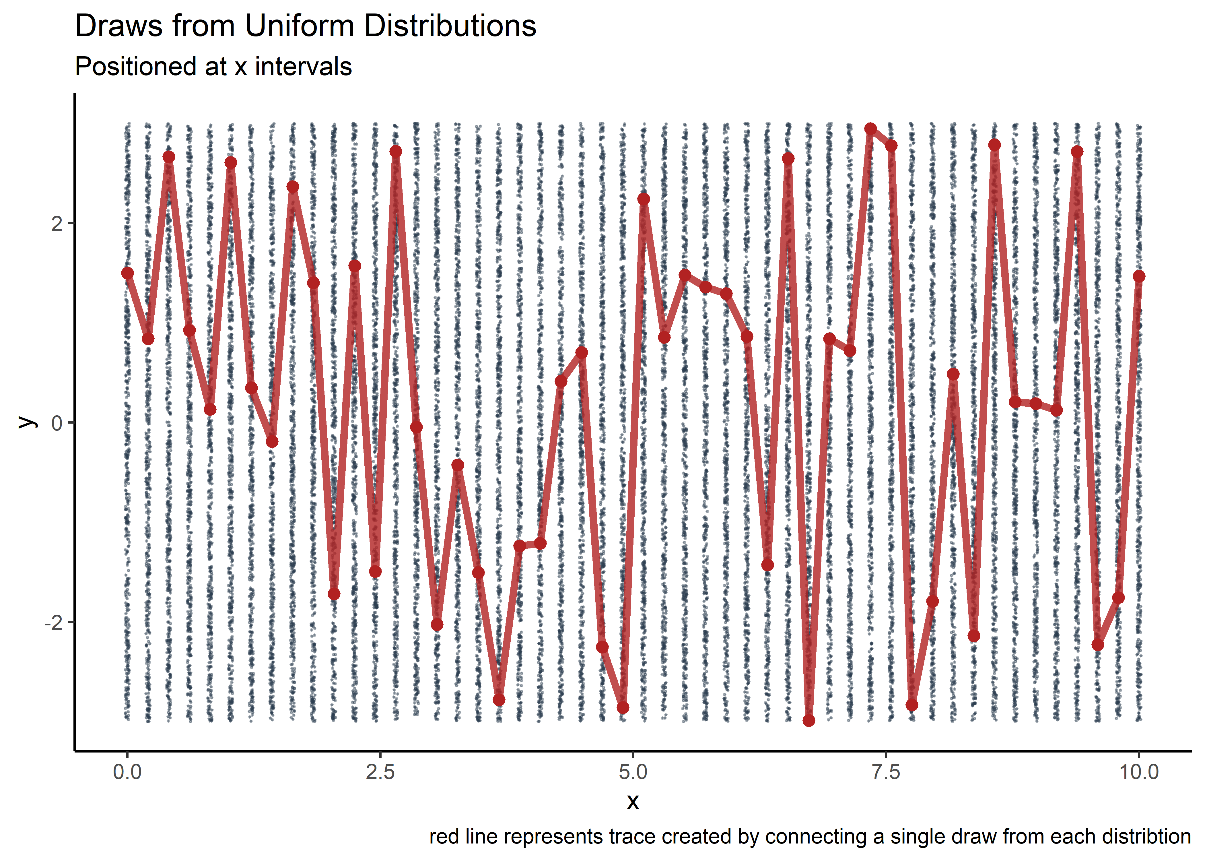
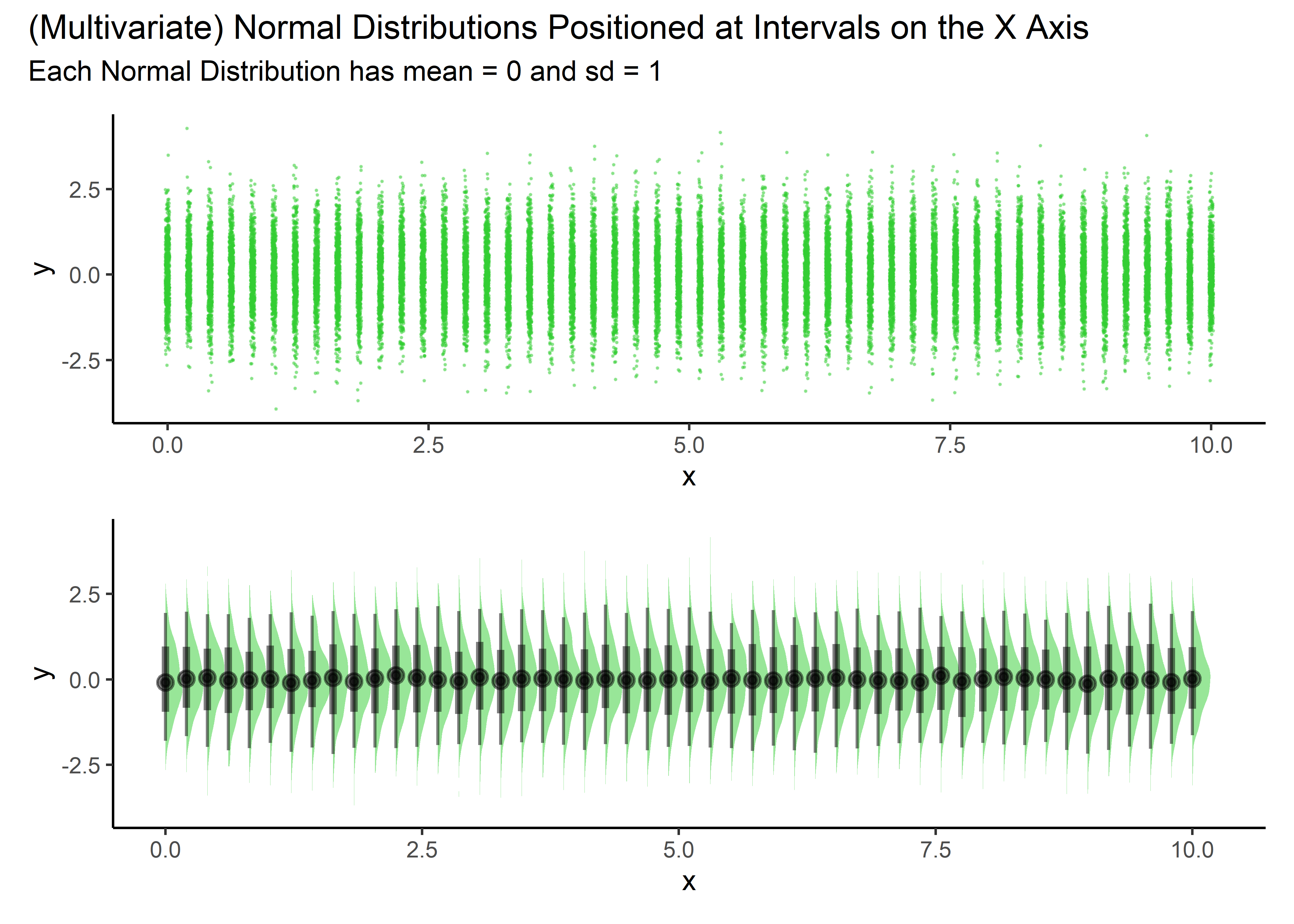
Now here’s the amazing part - suppose that instead of drawing the y values from uniform distributions and creating noise, we use a normal (Gaussian) distribution instead. If we then asserted the Gaussians were actually part of a multi-variate normal distribution with a shared covariance matrix, we could control the nature of the draws such that points nearby each other (on the x axis) were highly correlated but points far from each other (on the x axis) were not highly correlated. It turns out that random points drawn and connected under these conditions yield a smooth trace.
A 2nd draw from the MVN produces another set of points that connect to form a 2nd random trace with a different path but similar smoothness and scale to the first. In this way, the stacking of normal curves in the x dimension allows random draws to produce random curves of specified scale and smoothness. We tailor the covariance matrix to give us the scale and smoothness to produce a range of various possible curves that could plausibly be the function that we want. These are our priors.
Priors - Random Traces with a Few Built in Assumptions
We choose 50 Gaussians, 1 for each of the 50 desired partitions of the x range [0,10] that spans the region of interest.
n_gaussians <- 50Partition the x range of interest with the number of partitions equal to the number of specified Gaussians.
x_tbl <- tibble(x = seq(from = 0, to = 10, length = n_gaussians))
x_tbl %>%
gt_preview()| x | |
|---|---|
| 1 | 0.0000000 |
| 2 | 0.2040816 |
| 3 | 0.4081633 |
| 4 | 0.6122449 |
| 5 | 0.8163265 |
| 6..49 | |
| 50 | 10.0000000 |
Uniform to Gaussian
This function draws y values from a standard normal distribution at any specified x location. We then plot and take a look.
centered_norm_draws_fcn <- function(x_loc){
  temp <- tibble(x = x_loc, y = rnorm(600, 0, 1))
  return(temp)
}

pretty_norm_tbl <- x_tbl %>%
  mutate(y_draws = map(.x = x, .f = centered_norm_draws_fcn)) %>%
  select(-x) %>%
  unnest()

pp1 <- pretty_norm_tbl %>%
  ggplot(aes(x = x, y = y)) +
  geom_jitter(size = .1, alpha = .4, width = .02, color = "limegreen")

pp2 <- pretty_norm_tbl %>%
  ggplot(aes(x = x, y = y)) +
  stat_halfeye(fill = "limegreen", alpha = .5)

pp1 / pp2 + plot_annotation(
  title = '(Multivariate) Normal Distributions Positioned at Intervals on the X Axis',
  subtitle = 'Each Normal Distribution has mean = 0 and sd = 1'
)
Calculate Distance Between any combination of points
The key idea to creating functions from random draws of a MVN is that points nearby each other are highly correlated while points farther away are less so. The distance() function (plgp library) calculates the distance of the partitioned x-range points from each other and outputs a matrix.
d_mat <- distance(x_tbl)Interlude: A little nudge
We need to create a very small (negligible) numerical value to eventually add to the diagonal. This is a mathematical formality and things work fine without it in our simple case, but we add it here to be consistent with the reference materials. Don’t think too much about it.
diag_jitter <- sqrt(.Machine$double.eps)
diag_jitter
## [1] 1.490116e-08Get Covariance Matrix Sigma
We exponentiate the distances to give use the relationship between proximity of points to each other and their correlation. That’s all that is needed to make the covariance matrix!
sigma <- exp(-d_mat) + diag(diag_jitter, n_gaussians)Draw Y-Values
Draw 1 value each from a bunch of normal distributions linked by the covariance matrix described above.
y_tbl <- tibble(y_draws = as.vector(rmvnorm(n = 1, mean = rep(0, length = nrow(x_tbl)), sigma = sigma)))
y_tbl
## # A tibble: 50 x 1
## y_draws
## <dbl>
## 1 1.56
## 2 1.49
## 3 1.31
## 4 1.08
## 5 0.902
## 6 0.816
## 7 0.818
## 8 0.822
## 9 0.712
## 10 0.422
## # ... with 40 more rowsCombine the x’s and the y’s
Make a tibble to facilitate plotting.
gp_prior_tbl <- x_tbl %>%
  bind_cols(y_tbl)

gp_prior_tbl
## # A tibble: 50 x 2
## x y_draws
## <dbl> <dbl>
## 1 0 1.56
## 2 0.204 1.49
## 3 0.408 1.31
## 4 0.612 1.08
## 5 0.816 0.902
## 6 1.02 0.816
## 7 1.22 0.818
## 8 1.43 0.822
## 9 1.63 0.712
## 10 1.84 0.422
## # ... with 40 more rowsPlot 1 Realization
By overlaying our randomly drawn points on the underlying Gaussians and connecting the dots, we see how the correlation matrix, based on distance in x, ensures that the points form a smooth but bumpy curve. The diagonal of the covariance matrix is 1, corresponding to ~95% of the green y values being between -2 and +2.
gp_prior_tbl %>%
  ggplot(aes(x = x, y = y_draws)) +
  geom_jitter(data = pretty_norm_tbl, aes(x = x, y = y), size = .1, alpha = .4, width = .02, color = "limegreen") +
  geom_point(size = 1, color = "black", alpha = .7) +
  geom_line(color = "black")+
  theme_classic() +
  labs(title = "Single Random Curve",
        subtitle = "Created Using Random Draw From MVN Distribution")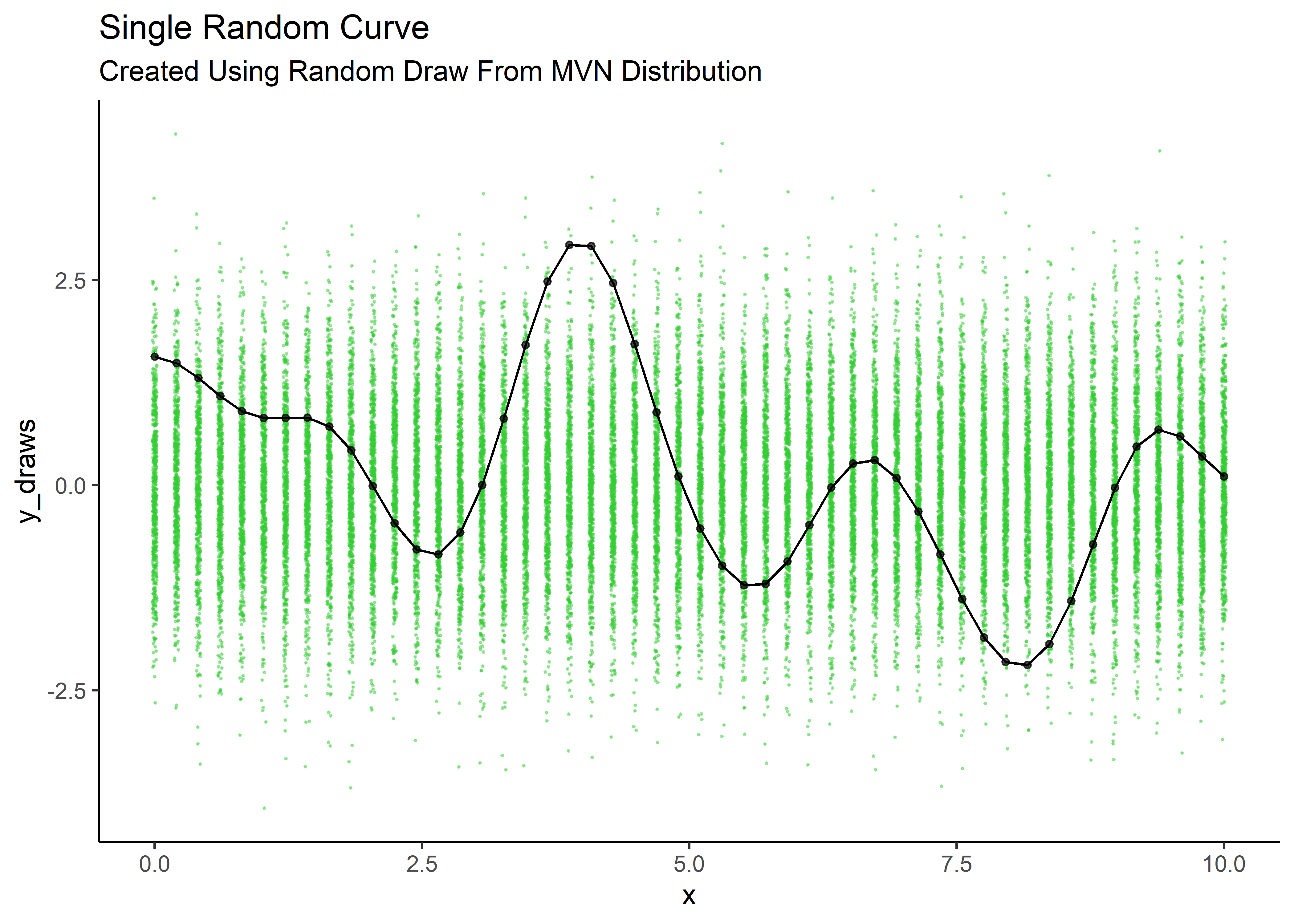
Define Function to Make a Random Trace
The above steps are converted to a function so that we can repeat our draws easily and create many traces.
generate_y_fcn <- function(sim_number){

x <- seq(from = 0, to = 10, length = n_gaussians)
d <- distance(x)
dj <- sqrt(.Machine$double.eps)
sig <- exp(-d) + diag(dj, n_gaussians)
y <- tibble(x = x,
            y_draws = as.vector(rmvnorm(n = 1, mean = rep(0, length = length(x)), sigma = sig)),
            sim_number = sim_number)
return(y)
}
Map the Function Over a Setup Tbl to Create Multiple Traces
Generate and plot 12 instances of random curves over the background of Gaussians.
n_sim_traces <- 12

multi_trace_prior_tbl <- tibble(trace_num = seq(from = 1, to = n_sim_traces, by = 1) %>% as_factor()) %>%
  mutate(dat = map(.x = trace_num, .f = generate_y_fcn)) %>%
  unnest()

multi_trace_prior_tbl %>%
  ggplot(aes(x = x, y = y_draws)) +
  geom_jitter(data = pretty_norm_tbl, aes(x = x, y = y), size = .1, alpha = .9, width = .02, color = "grey") +
  geom_line(aes(color = trace_num), size = 1.3, alpha = .7) +
  geom_point(size = 1) +
  theme_classic() +
  theme(legend.position = "none") +
  scale_color_viridis_d(option = "Plasma") +
  labs(title = "Multiple Curves Representing Prior Possibilities",
       subtitle = "Created Using Random Draw From MVN Distribution")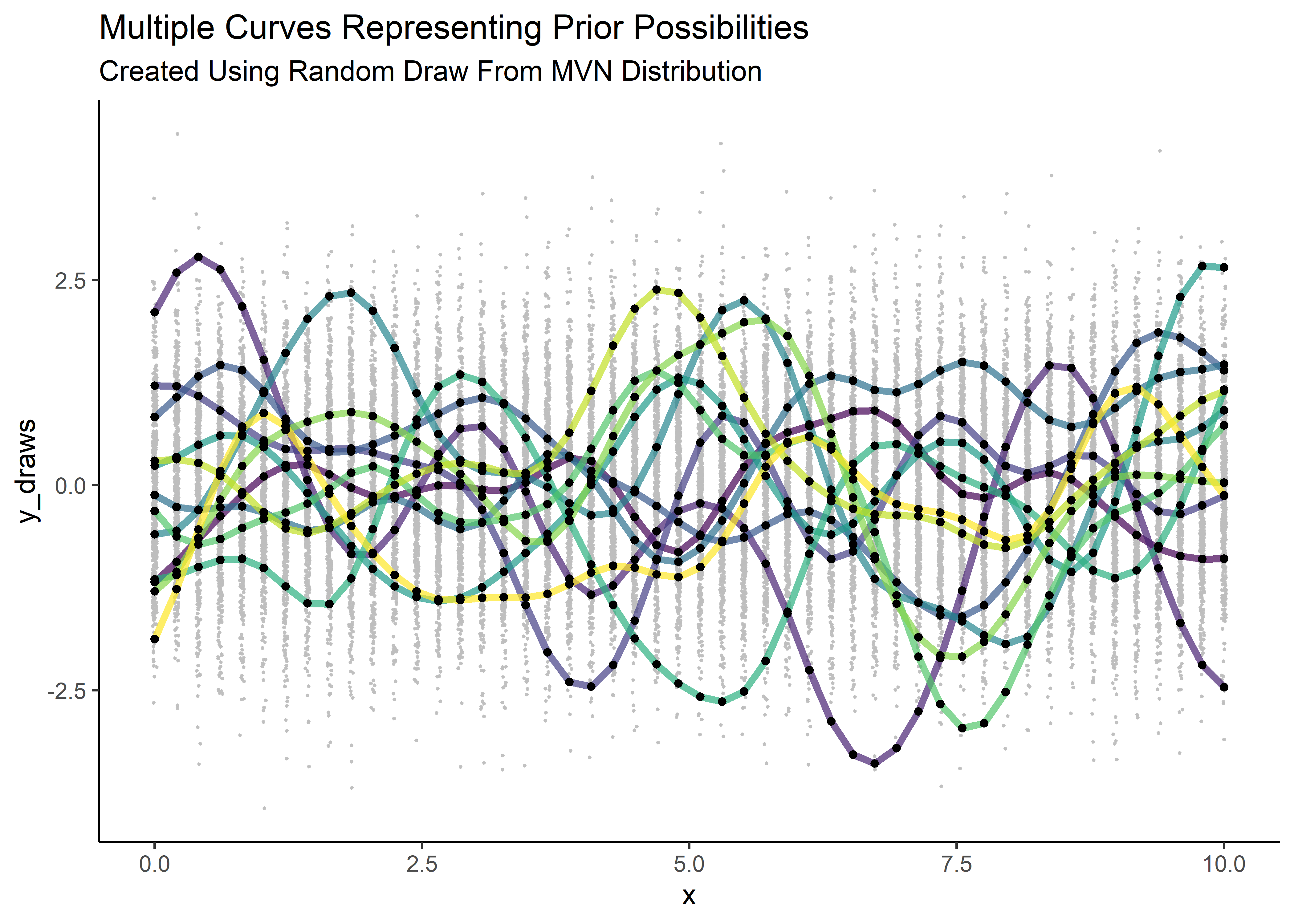
Cool! We explored a clever way to create random functions from multi-normal draws and we specified a covariance matrix the controls the bumpiness and y-scale. Our priors are in place.
Conditioning and Predicting
There’s one important aspect of drawing the random points this way that I haven’t yet discussed: by using a multivariate normal distribution, we make available a formal way of conditioning on the data and updating the parameters of our normal curves based on their location in x.
Put another way, the model has a way to learn from the data and modify the mean and variance of each normal distribution in the MVN. This does the job of reducing the range of credible curves that are consistent with the data. This process is consistent with the Bayesian workflow of starting with priors, conditioning on data, and producing a posterior of jointly credible possibilities.
The derivations for how this works are beyond the scope of this post (and I wouldn’t be a good candidate to explain them well), but they are available HERE. The TLDR is this: we need the following component parts to be able to update our estimates of the mean and variance of each Gaussian, which in turn decreases the dispersion of our randomly generated traces and thereby increases the precision of our predictions.
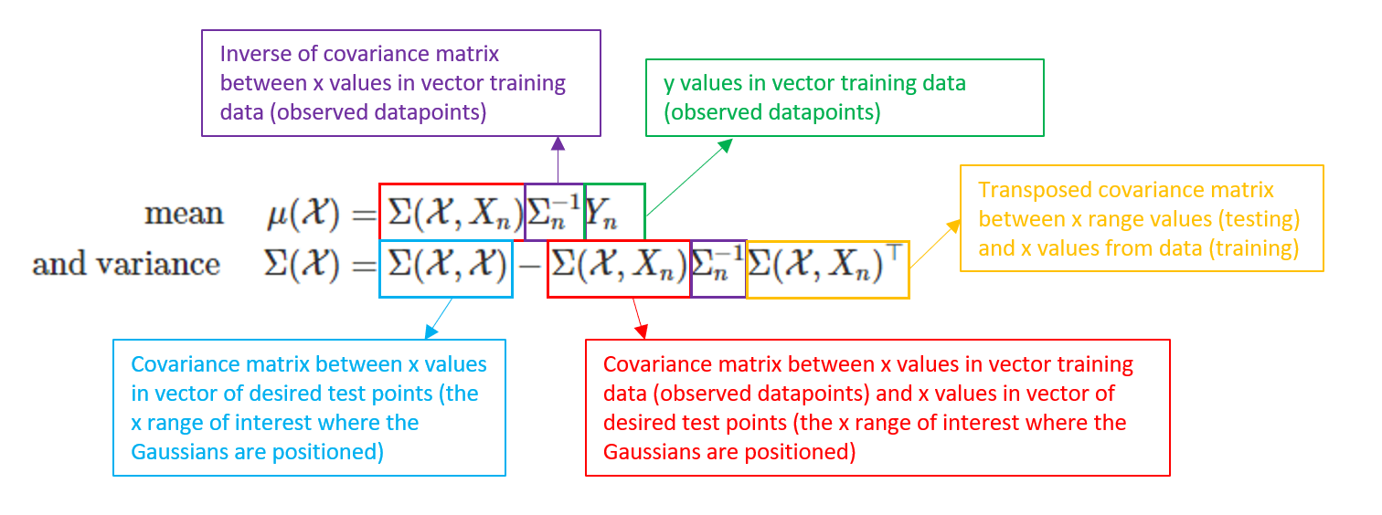
The code that follows goes about constructing each of the component parts in the above equations that will facilitate our predictions.
The Data Points
Generate a set of n=8 data point. In practice these would be supplied to us via an experiment or some other means.
n_dat <- 8
x_dat <- matrix(seq(0, 2*pi, length=n_dat), ncol=1)
y_dat <- sin(x_dat)

data_tbl <- tibble(x = x_dat,
                   y = y_dat)

data_tbl %>%
gt()| x | y |
|---|---|
| 0.0000000 | 0.000000e+00 |
| 0.8975979 | 7.818315e-01 |
| 1.7951958 | 9.749279e-01 |
| 2.6927937 | 4.338837e-01 |
| 3.5903916 | -4.338837e-01 |
| 4.4879895 | -9.749279e-01 |
| 5.3855874 | -7.818315e-01 |
| 6.2831853 | -2.449213e-16 |
Calculating the Necessary Distances and Covariance Matrices
Calculate: Inverse of Covariance matrix between x values in vector of training data (observed datapoints):
d_dat <- distance(x_dat)
sigma_dat <- exp(-d_dat) + diag(diag_jitter, ncol(d_dat))
inv_sigma_dat <- solve(sigma_dat) #solve() finds inverse
Calculate: Covariance matrix between x values in vector of desired test points (the x range of interest where the Gaussians are positioned):
x_pred_range <- matrix(seq(-0.5, 2*pi + 0.5, length=100), ncol=1)

d_x_pred_range <- distance(x_pred_range)
sigma_x_pred_range <- exp(-d_x_pred_range) + diag(diag_jitter, ncol(d_x_pred_range))
Calculate: Covariance matrix between x values in vector of training data (observed datapoints) and x values in vector of desired test points (the x range of interest where the Gaussians are positioned ):
d_x_dat <- distance(x_pred_range, x_dat)
sigma_x_dat <- exp(-d_x_dat)
Combine Per the Conditioning Equations Above
Bring it together by combining the above inputs into the predictive equations. The output will be trained means and (reduced) variances from which to draw new points to create new traces.
mu_pred <- sigma_x_dat %*% inv_sigma_dat %*% y_dat

sigma_pred <- sigma_x_pred_range - sigma_x_dat %*% inv_sigma_dat %*% t(sigma_x_dat)
Draw from the Updated Gaussians
y_draws <- rmvnorm(1, mu_pred, sigma_pred)

y_draws %>% as.vector()
## [1] -0.11135178 -0.13414543 -0.14125646 -0.13384335 -0.11310097 -0.08032221
## [7] -0.03869301 0.01008520 0.06426747 0.12167776 0.18125818 0.24235780
## [13] 0.30473905 0.36878655 0.43483034 0.50286496 0.57276290 0.64341048
## [19] 0.71394154 0.78186652 0.84577472 0.90297749 0.95168825 0.99017006
## [25] 1.01800993 1.03518813 1.04214564 1.04042284 1.03171212 1.01776905
## [31] 0.99957608 0.97924481 0.95714576 0.93327439 0.90739967 0.87885348
## [37] 0.84624283 0.80916023 0.76606525 0.71690098 0.66145810 0.59996973
## [43] 0.53349461 0.46304360 0.38937083 0.31415990 0.23807037 0.16243279
## [49] 0.08706189 0.01247238 -0.06049590 -0.13256227 -0.20299983 -0.27120336
## [55] -0.33690887 -0.39869342 -0.45653362 -0.50974602 -0.55842531 -0.60249705
## [61] -0.64369848 -0.68291472 -0.72150414 -0.76086850 -0.80247216 -0.84637868
## [67] -0.89223759 -0.93883876 -0.98369467 -1.02455925 -1.05798305 -1.08237703
## [73] -1.09435116 -1.09289825 -1.07770612 -1.04977391 -1.00965956 -0.96046396
## [79] -0.90481696 -0.84427854 -0.78205657 -0.71951229 -0.65718008 -0.59550566
## [85] -0.53379511 -0.47180457 -0.40834782 -0.34347059 -0.27688415 -0.20952401
## [91] -0.14200053 -0.07558342 -0.01236511 0.04618189 0.09857431 0.14360497
## [97] 0.18013374 0.20735434 0.22425309 0.23046425Plot the Draws
Plot the single trace drawn from posterior.
tibble(x = x_pred_range,
       y = as.vector(y_draws)) %>%
  ggplot(aes(x = x, y = y)) +
  geom_point(color = "purple") +
  geom_line(color = "purple") +
  labs(title = "Single Trace Generated from Draws of Posterior",
       subtitle = "Gaussians conditioned on n=8 data points")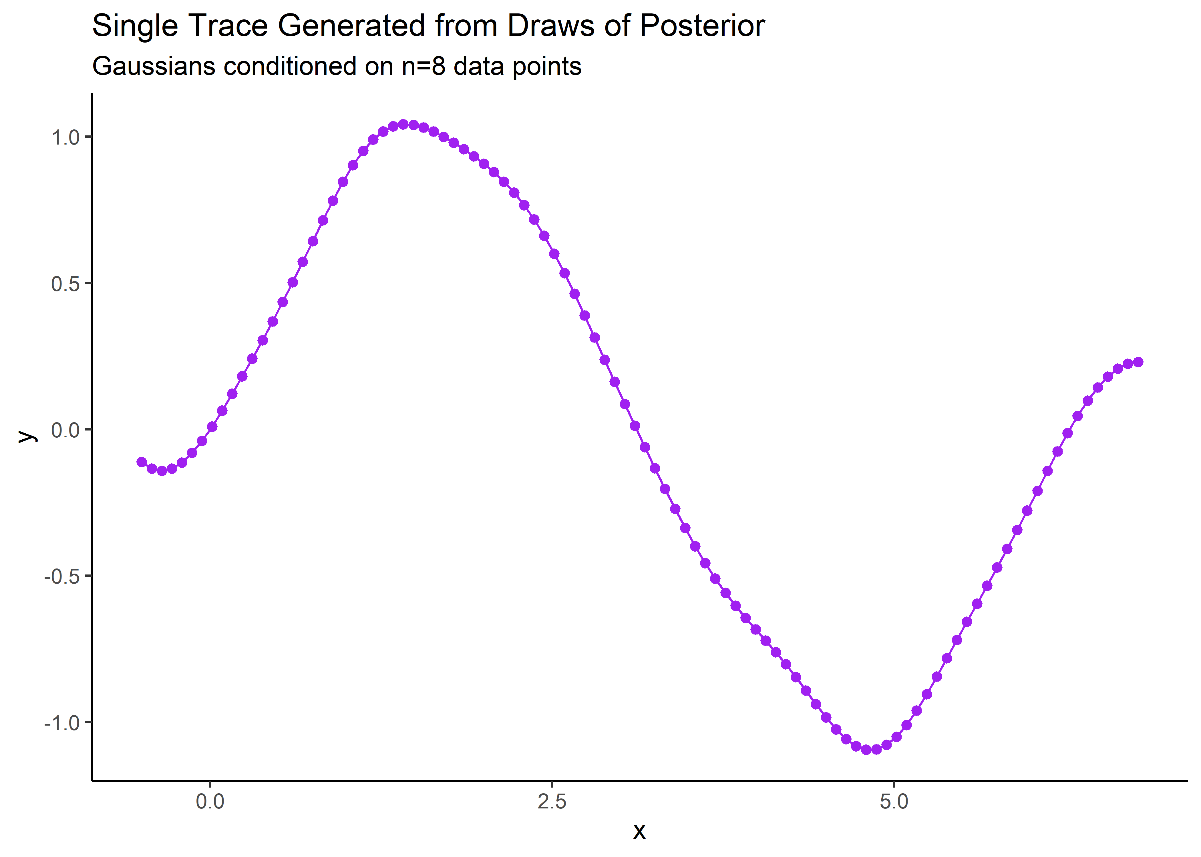
Function for Many Posterior Draws
Now that we’ve shown how to create a set of draws to construct a posterior trace, let’s make it a function so that we can plot many traces. The function below is just all the same steps of the last section but combined into a tibble as the last step. This let’s us map the function easily as we expand the simulation.
generate_ypred_fcn <- function(sim_number){

#distance and sigma
d_dat <- distance(x_dat)
sigma_dat <- exp(-d_dat) + diag(diag_jitter, ncol(d_dat))

#x range
x_pred_range <- matrix(seq(-0.5, 2*pi + 0.5, length=50), ncol=1)

#x point distance and sigma
d_x_pred_range <- distance(x_pred_range)
sigma_x_pred_range <- exp(-d_x_pred_range) + diag(diag_jitter, ncol(d_x_pred_range))

#distance and sigma between x points and x data points
d_x_dat <- distance(x_pred_range, x_dat)
sigma_x_dat <- exp(-d_x_dat)

#inverse sigma for distance between x data points
inv_sigma_dat <- solve(sigma_dat)

#mu and sigma pred
mu_pred <- sigma_x_dat %*% inv_sigma_dat %*% y_dat
sigma_pred <- sigma_x_pred_range - sigma_x_dat %*% inv_sigma_dat %*% t(sigma_x_dat)

#y preds at x pred range points
y_draws <- rmvnorm(1, mu_pred, sigma_pred)

y <- tibble(x = x_pred_range,
            mu_y_pred = as.vector(mu_pred),
            y_draws = as.vector(rmvnorm(n = 1, mean = mu_pred, sigma = sigma_pred)),
            sim_number = sim_number)
return(y)
}
Generate Many Draws for Posterior Traces
Simply specify the number of desired traces and use the newly created function to start drawing that many from the MVN.
n_sim_traces <- 500

multi_trace_post_tbl <- tibble(trace_num = seq(from = 1, to = n_sim_traces, by = 1) %>% as_factor()) %>%
  mutate(dat = map(.x = trace_num, .f = generate_ypred_fcn)) %>%
  unnest() %>%
  select(-sim_number)

multi_trace_post_tbl %>%
gt_preview()| trace_num | x | mu_y_pred | y_draws | |
|---|---|---|---|---|
| 1 | 1 | -0.50000000 | -0.15088553 | -0.41433594 |
| 2 | 1 | -0.35136357 | -0.13638869 | -0.23805775 |
| 3 | 1 | -0.20272713 | -0.09766208 | -0.10048631 |
| 4 | 1 | -0.05409070 | -0.03122685 | -0.01702983 |
| 5 | 1 | 0.09454574 | 0.06321976 | 0.01810016 |
| 6..24999 | ||||
| 25000 | 500 | 6.78318531 | 0.15088553 | 0.45732248 |
Visualize
Structuring the data this way allows for plotting many traces of the posterior draws. In the figure below, the black line represents predictions, the red points are the training data, and the “bubbles” represent uncertainty. Notice how the uncertainty collapses near the observed data - just like we would want for FEA!
multi_trace_post_tbl %>%
  ggplot(aes(x = x, y = y_draws)) +
  geom_line(aes(color = trace_num)) +
  geom_line(aes(x = x, y = mu_y_pred), size = 2) +
  geom_point(size = .5) +
  geom_point(dat = data_tbl, aes(x = x, y = y), size = 4, color = "firebrick") +
  theme(legend.position = "none") +
  scale_color_viridis_d() +
  labs(title = "Credible Posterior Traces",
       subtitle = "Gaussians trained on n=8 data points",
       caption = "Red points are observed data\nBlack line is predictions")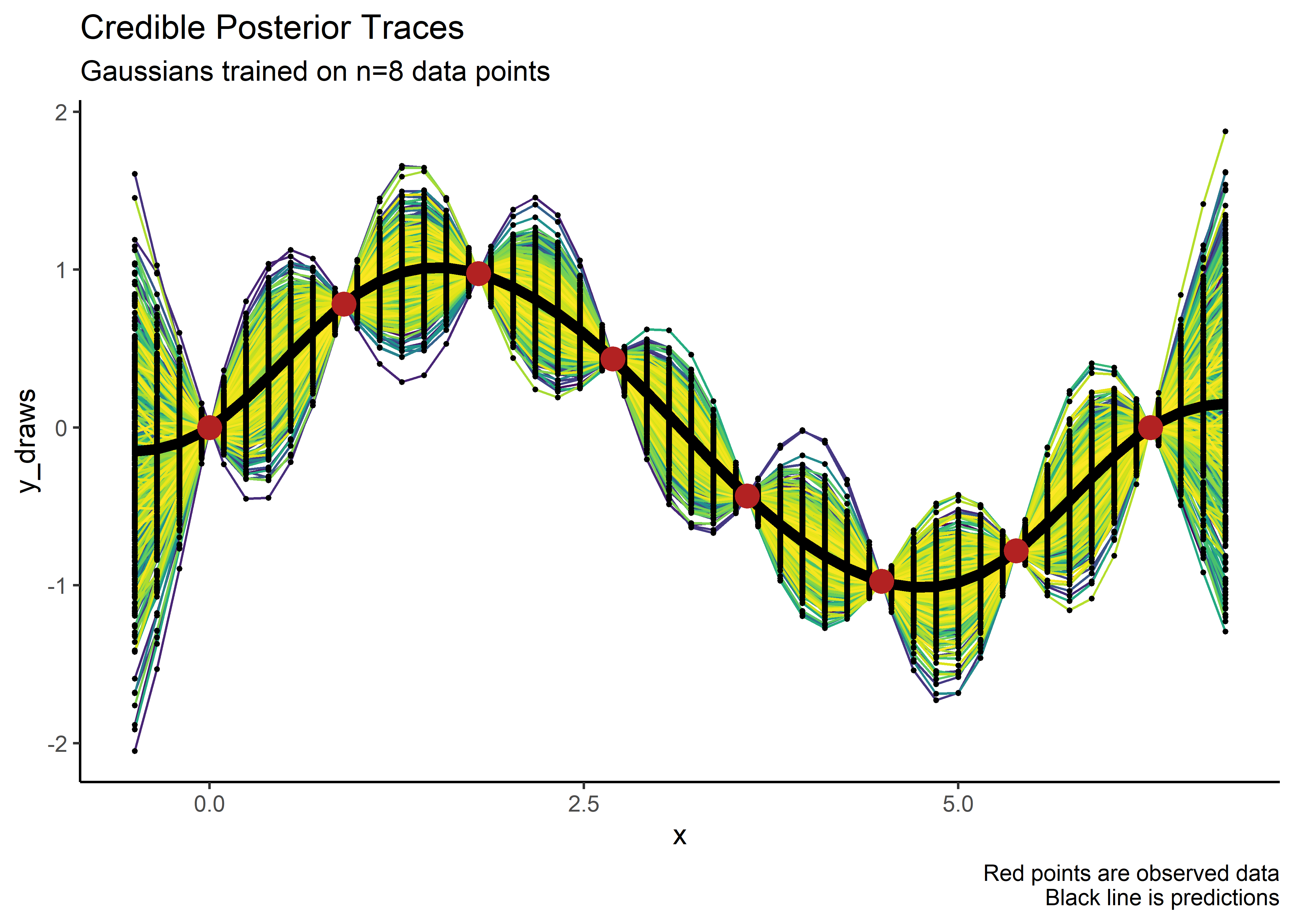
More Visualize
Just for fun, let’s just observe how the Gaussians collapse from prior to posterior, based on the data:
x_pred_range_new <- matrix(seq(-0.5, 2*pi + 0.5, length=50), ncol=1)

pretty_norm_tbl_2 <- tibble(x = x_pred_range_new) %>%
  mutate(y_draws = map(.x = x, .f = centered_norm_draws_fcn)) %>%
  select(-x) %>%
  unnest()

prior_gaussians <- pretty_norm_tbl_2 %>%
  ggplot(aes(x = x, y = y)) +
  geom_jitter(size = .1, alpha = .4, width = .01, color = "limegreen")


post_gaussians <- multi_trace_post_tbl %>%
  ggplot(aes(x = x, y = y_draws)) +
  geom_jitter(size = .1, alpha = .4, width = .01, color = "firebrick") +
  geom_point(dat = data_tbl, aes(x = x, y = y), size = 2, color = "black")

prior_gaussians / post_gaussians +
  plot_annotation(title = "Gaussian Process Regression",
                  subtitle = "Image represents stacking of multivariate normal dimensions across an X-range of interest",
                  caption = "Upper Panel: Prior\nLower Panel: Posterior")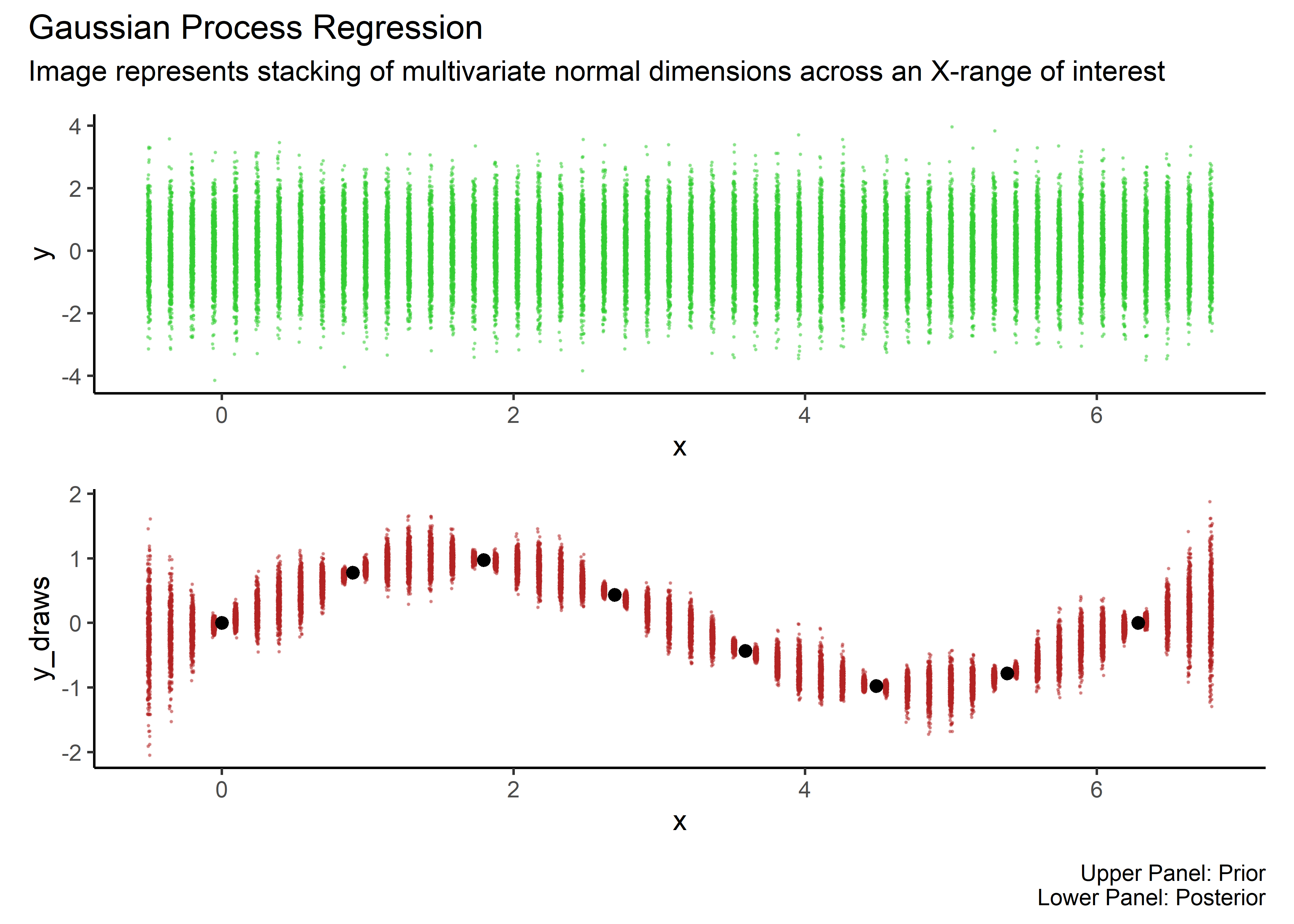
Conclusion
In this walk through we built up a Gaussian Process Regression model from scratch and showed how to train it and use it for predictions. I hope I was able to communicate the unique features of this model type: specifying priors over a range of many different functions, building and training a large multi-variate normal distribution to create credible functions across a range of interest, and representing uncertainty while still collapsing on the observed data. In a future post I promise we’ll circle back to the unique use-case that was the motivation for my learning in the first place: fitting a GPR to FEA generated DOE data. If you’ve made it this far, thank you for your attention.
sessionInfo
sessionInfo()## R version 4.0.3 (2020-10-10)
## Platform: x86_64-w64-mingw32/x64 (64-bit)
## Running under: Windows 10 x64 (build 18363)
##
## Matrix products: default
##
## locale:
## [1] LC_COLLATE=English_United States.1252
## [2] LC_CTYPE=English_United States.1252
## [3] LC_MONETARY=English_United States.1252
## [4] LC_NUMERIC=C
## [5] LC_TIME=English_United States.1252
##
## attached base packages:
## [1] stats graphics grDevices utils datasets methods base
##
## other attached packages:
## [1] patchwork_1.1.1 tidybayes_3.0.2 plgp_1.1-10 tgp_2.4-18
## [5] mvtnorm_1.1-3 gt_0.3.1 here_1.0.1 forcats_0.5.1
## [9] stringr_1.4.0 dplyr_1.0.7 purrr_0.3.4 readr_2.1.1
## [13] tidyr_1.1.4 tibble_3.1.6 ggplot2_3.3.5 tidyverse_1.3.1
##
## loaded via a namespace (and not attached):
## [1] fs_1.5.2 lubridate_1.8.0 httr_1.4.2
## [4] rprojroot_2.0.2 tensorA_0.36.2 tools_4.0.3
## [7] backports_1.4.1 bslib_0.3.1 utf8_1.2.2
## [10] R6_2.5.1 rpart_4.1-15 DBI_1.1.2
## [13] colorspace_2.0-2 ggdist_3.0.1 withr_2.4.3
## [16] tidyselect_1.1.1 compiler_4.0.3 cli_3.1.0
## [19] rvest_1.0.2 arrayhelpers_1.1-0 xml2_1.3.3
## [22] labeling_0.4.2 bookdown_0.21 posterior_1.2.0
## [25] sass_0.4.0 scales_1.1.1 checkmate_2.0.0
## [28] digest_0.6.28 rmarkdown_2.11 pkgconfig_2.0.3
## [31] htmltools_0.5.2 highr_0.9 dbplyr_2.1.1
## [34] fastmap_1.1.0 rlang_0.4.11 readxl_1.3.1
## [37] rstudioapi_0.13 jquerylib_0.1.4 farver_2.1.0
## [40] generics_0.1.1 svUnit_1.0.6 jsonlite_1.7.2
## [43] distributional_0.3.0 magrittr_2.0.1 Rcpp_1.0.7
## [46] munsell_0.5.0 fansi_0.5.0 maptree_1.4-8
## [49] abind_1.4-5 lifecycle_1.0.1 stringi_1.7.4
## [52] yaml_2.2.1 grid_4.0.3 crayon_1.4.2
## [55] lattice_0.20-45 haven_2.4.3 hms_1.1.1
## [58] knitr_1.34 pillar_1.6.4 reprex_2.0.1
## [61] glue_1.6.0 evaluate_0.14 blogdown_0.15
## [64] modelr_0.1.8 vctrs_0.3.8 tzdb_0.2.0
## [67] cellranger_1.1.0 gtable_0.3.0 assertthat_0.2.1
## [70] xfun_0.29 broom_0.7.11 coda_0.19-4
## [73] viridisLite_0.4.0 cluster_2.1.2 ellipsis_0.3.2