In this post I’ll be attempting to leverage the parsnip package in R to run through some straightforward predictive analytics/machine learning. Parsnip provides a flexible and consistent interface to apply common regression and classification algorithms in R. I’ll be working with the Cleveland Clinic Heart Disease dataset which contains 13 variables related to patient diagnostics and one outcome variable indicating the presence or absence of heart disease.1 The data was accessed from the UCI Machine Learning Repository in September 2019.2. The goal is to be able to accurately classify as having or not having heart disease based on diagnostic test data.

Load the libraries to be used.
#Load libraries
library(tidyverse)
library(kableExtra)
library(rsample)
library(recipes)
library(parsnip)
library(yardstick)
library(viridisLite)
library(GGally)
The first part of the analysis is to read in the data set and clean the column names up a bit.
#Read in data
heart_disease_dataset <- read.csv(file = "processed.cleveland.data", header = F)

#Prepare column names
names <- c("Age",
           "Sex",
           "Chest_Pain_Type",
           "Resting_Blood_Pressure",
           "Serum_Cholesterol",
           "Fasting_Blood_Sugar",
           "Resting_ECG",
           "Max_Heart_Rate_Achieved",
           "Exercise_Induced_Angina",
           "ST_Depression_Exercise",
           "Peak_Exercise_ST_Segment",
           "Num_Major_Vessels_Flouro",
           "Thalassemia",
           "Diagnosis_Heart_Disease")

#Apply column names to the dataframe
colnames(heart_disease_dataset) <- names

#Glimpse data to verify new column names are in place
heart_disease_dataset %>% glimpse()
## Observations: 303
## Variables: 14
## $ Age <dbl> 63, 67, 67, 37, 41, 56, 62, 57, 63, 5...
## $ Sex <dbl> 1, 1, 1, 1, 0, 1, 0, 0, 1, 1, 1, 0, 1...
## $ Chest_Pain_Type <dbl> 1, 4, 4, 3, 2, 2, 4, 4, 4, 4, 4, 2, 3...
## $ Resting_Blood_Pressure <dbl> 145, 160, 120, 130, 130, 120, 140, 12...
## $ Serum_Cholesterol <dbl> 233, 286, 229, 250, 204, 236, 268, 35...
## $ Fasting_Blood_Sugar <dbl> 1, 0, 0, 0, 0, 0, 0, 0, 0, 1, 0, 0, 1...
## $ Resting_ECG <dbl> 2, 2, 2, 0, 2, 0, 2, 0, 2, 2, 0, 2, 2...
## $ Max_Heart_Rate_Achieved <dbl> 150, 108, 129, 187, 172, 178, 160, 16...
## $ Exercise_Induced_Angina <dbl> 0, 1, 1, 0, 0, 0, 0, 1, 0, 1, 0, 0, 1...
## $ ST_Depression_Exercise <dbl> 2.3, 1.5, 2.6, 3.5, 1.4, 0.8, 3.6, 0....
## $ Peak_Exercise_ST_Segment <dbl> 3, 2, 2, 3, 1, 1, 3, 1, 2, 3, 2, 2, 2...
## $ Num_Major_Vessels_Flouro <fct> 0.0, 3.0, 2.0, 0.0, 0.0, 0.0, 2.0, 0....
## $ Thalassemia <fct> 6.0, 3.0, 7.0, 3.0, 3.0, 3.0, 3.0, 3....
## $ Diagnosis_Heart_Disease <int> 0, 2, 1, 0, 0, 0, 3, 0, 2, 1, 0, 0, 2...There are 14 variables provided in the data set and the last one is the dependent variable that we want to be able to predict. Here is a summary of what the other variables mean:
Age: Age of subject
Sex: Gender of subject:
0 = female 1 = maleChest-pain type: Type of chest-pain experienced by the individual:
1 = typical angina
2 = atypical angina
3 = non-angina pain
4 = asymptomatic anginaResting Blood Pressure: Resting blood pressure in mm Hg
Serum Cholesterol: Serum cholesterol in mg/dl
Fasting Blood Sugar: Fasting blood sugar level relative to 120 mg/dl: 0 = fasting blood sugar <= 120 mg/dl
1 = fasting blood sugar > 120 mg/dlResting ECG: Resting electrocardiographic results
0 = normal
1 = ST-T wave abnormality
2 = left ventricle hyperthrophyMax Heart Rate Achieved: Max heart rate of subject
Exercise Induced Angina:
0 = no 1 = yesST Depression Induced by Exercise Relative to Rest: ST Depression of subject
Peak Exercise ST Segment:
1 = Up-sloaping
2 = Flat
3 = Down-sloapingNumber of Major Vessels (0-3) Visible on Flouroscopy: Number of visible vessels under flouro
Thal: Form of thalassemia: 3
3 = normal
6 = fixed defect
7 = reversible defectDiagnosis of Heart Disease: Indicates whether subject is suffering from heart disease or not:
0 = absence
1, 2, 3, 4 = heart disease present
A closer look at the data identifies some NA and “?” values that will need to be addressed in the cleaning step. We also want to know the number of observations in the dependent variable column to understand if the dataset is relatively balanced.
#Determine the number of values in each level of dependent variable
heart_disease_dataset %>%
  drop_na() %>%
  group_by(Diagnosis_Heart_Disease) %>%
  count() %>%
  ungroup() %>%
kable(align = rep("c", 2)) %>% kable_styling("full_width" = F)| Diagnosis_Heart_Disease | n |
|---|---|
| 0 | 164 |
| 1 | 55 |
| 2 | 36 |
| 3 | 35 |
| 4 | 13 |
#Identify the different levels of Thalassemia
heart_disease_dataset %>%
  drop_na() %>%
  group_by(Thalassemia) %>%
  count() %>%
  ungroup() %>%
kable(align = rep("c", 2)) %>% kable_styling("full_width" = F)| Thalassemia | n |
|---|---|
| ? | 2 |
| 3.0 | 166 |
| 6.0 | 18 |
| 7.0 | 117 |
Since any value above 0 in ‘Diagnosis_Heart_Disease’ (column 14) indicates the presence of heart disease, we can lump all levels > 0 together so the classification predictions are binary - Yes or No (1 or 0). The total count of positive heart disease results is less than the number of negative results so the fct_lump() call with default arguments will convert that variable from 4 levels to 2.
The data cleaning pipeline below deals with NA values, converts some variables to factors, lumps the dependent variable into two buckets, removes the rows that had “?” for observations, and reorders the variables within the dataframe:
#Drop NA's, convert to factors, lump target variable to 2 levels, remove "?", reorder variables
heart_dataset_clean_tbl <- heart_disease_dataset %>%
    drop_na() %>%
    mutate_at(c("Resting_ECG",
                "Fasting_Blood_Sugar",
                "Sex",
                "Diagnosis_Heart_Disease",
                "Exercise_Induced_Angina",
                "Peak_Exercise_ST_Segment",
                "Chest_Pain_Type"), as_factor) %>%
    mutate(Num_Major_Vessels_Flouro = as.numeric(Num_Major_Vessels_Flouro)) %>%
    mutate(Diagnosis_Heart_Disease = fct_lump(Diagnosis_Heart_Disease, other_level = "1")) %>%
    filter(Thalassemia != "?") %>%
    select(Age,
           Resting_Blood_Pressure,
           Serum_Cholesterol,
           Max_Heart_Rate_Achieved,
           ST_Depression_Exercise,
           Num_Major_Vessels_Flouro,
           everything())

#Glimpse data
heart_dataset_clean_tbl %>%
  glimpse()
## Observations: 301
## Variables: 14
## $ Age <dbl> 63, 67, 67, 37, 41, 56, 62, 57, 63, 5...
## $ Resting_Blood_Pressure <dbl> 145, 160, 120, 130, 130, 120, 140, 12...
## $ Serum_Cholesterol <dbl> 233, 286, 229, 250, 204, 236, 268, 35...
## $ Max_Heart_Rate_Achieved <dbl> 150, 108, 129, 187, 172, 178, 160, 16...
## $ ST_Depression_Exercise <dbl> 2.3, 1.5, 2.6, 3.5, 1.4, 0.8, 3.6, 0....
## $ Num_Major_Vessels_Flouro <dbl> 2, 5, 4, 2, 2, 2, 4, 2, 3, 2, 2, 2, 3...
## $ Sex <fct> 1, 1, 1, 1, 0, 1, 0, 0, 1, 1, 1, 0, 1...
## $ Chest_Pain_Type <fct> 1, 4, 4, 3, 2, 2, 4, 4, 4, 4, 4, 2, 3...
## $ Fasting_Blood_Sugar <fct> 1, 0, 0, 0, 0, 0, 0, 0, 0, 1, 0, 0, 1...
## $ Resting_ECG <fct> 2, 2, 2, 0, 2, 0, 2, 0, 2, 2, 0, 2, 2...
## $ Exercise_Induced_Angina <fct> 0, 1, 1, 0, 0, 0, 0, 1, 0, 1, 0, 0, 1...
## $ Peak_Exercise_ST_Segment <fct> 3, 2, 2, 3, 1, 1, 3, 1, 2, 3, 2, 2, 2...
## $ Thalassemia <fct> 6.0, 3.0, 7.0, 3.0, 3.0, 3.0, 3.0, 3....
## $ Diagnosis_Heart_Disease <fct> 0, 1, 1, 0, 0, 0, 1, 0, 1, 1, 0, 0, 1...Time for some basic exploratory data analysis. The workflow below breaks out the categorical variables and visualizes them on a faceted bar plot. I’m recoding the factors levels from numeric back to text-based so the labels are easy to interpret on the plots and stripping the y-axis labels since the relative differences are what matters.
#Select categorical vars, recode them to their character values, convert to long format
hd_long_fact_tbl <- heart_dataset_clean_tbl  %>%
  select(Sex,
         Chest_Pain_Type,
         Fasting_Blood_Sugar,
         Resting_ECG,
         Exercise_Induced_Angina,
         Peak_Exercise_ST_Segment,
         Thalassemia,
         Diagnosis_Heart_Disease) %>%
  mutate(Sex = recode_factor(Sex, `0` = "female",
                                  `1` = "male" ),
         Chest_Pain_Type = recode_factor(Chest_Pain_Type, `1` = "typical",
                                                          `2` = "atypical",
                                                          `3` = "non-angina",
                                                          `4` = "asymptomatic"),
         Fasting_Blood_Sugar = recode_factor(Fasting_Blood_Sugar, `0` = "<= 120 mg/dl",
                                                                  `1` = "> 120 mg/dl"),
         Resting_ECG = recode_factor(Resting_ECG, `0` = "normal",
                                                  `1` = "ST-T abnormality",
                                                  `2` = "LV hypertrophy"),
         Exercise_Induced_Angina = recode_factor(Exercise_Induced_Angina, `0` = "no",
                                                                          `1` = "yes"),
         Peak_Exercise_ST_Segment = recode_factor(Peak_Exercise_ST_Segment, `1` = "up-sloaping",
                                                                            `2` = "flat",
                                                                            `3` = "down-sloaping"),
         Thalassemia = recode_factor(Thalassemia, `3` = "normal",
                                                  `6` = "fixed defect",
                                                  `7` = "reversible defect")) %>%
  gather(key = "key", value = "value", -Diagnosis_Heart_Disease)

#Visualize with bar plot
hd_long_fact_tbl %>%
  ggplot(aes(value)) +
    geom_bar(aes(x        = value,
                 fill     = Diagnosis_Heart_Disease),
                 alpha    = .6,
                 position = "dodge",
                 color    = "black",
                 width    = .8
             ) +
    labs(x = "",
         y = "",
         title = "Scaled Effect of Categorical Variables") +
    theme(
         axis.text.y  = element_blank(),
         axis.ticks.y = element_blank()) +
    facet_wrap(~ key, scales = "free", nrow = 4) +
    scale_fill_manual(
         values = c("#fde725ff", "#20a486ff"),
         name   = "Heart\nDisease",
         labels = c("No HD", "Yes HD"))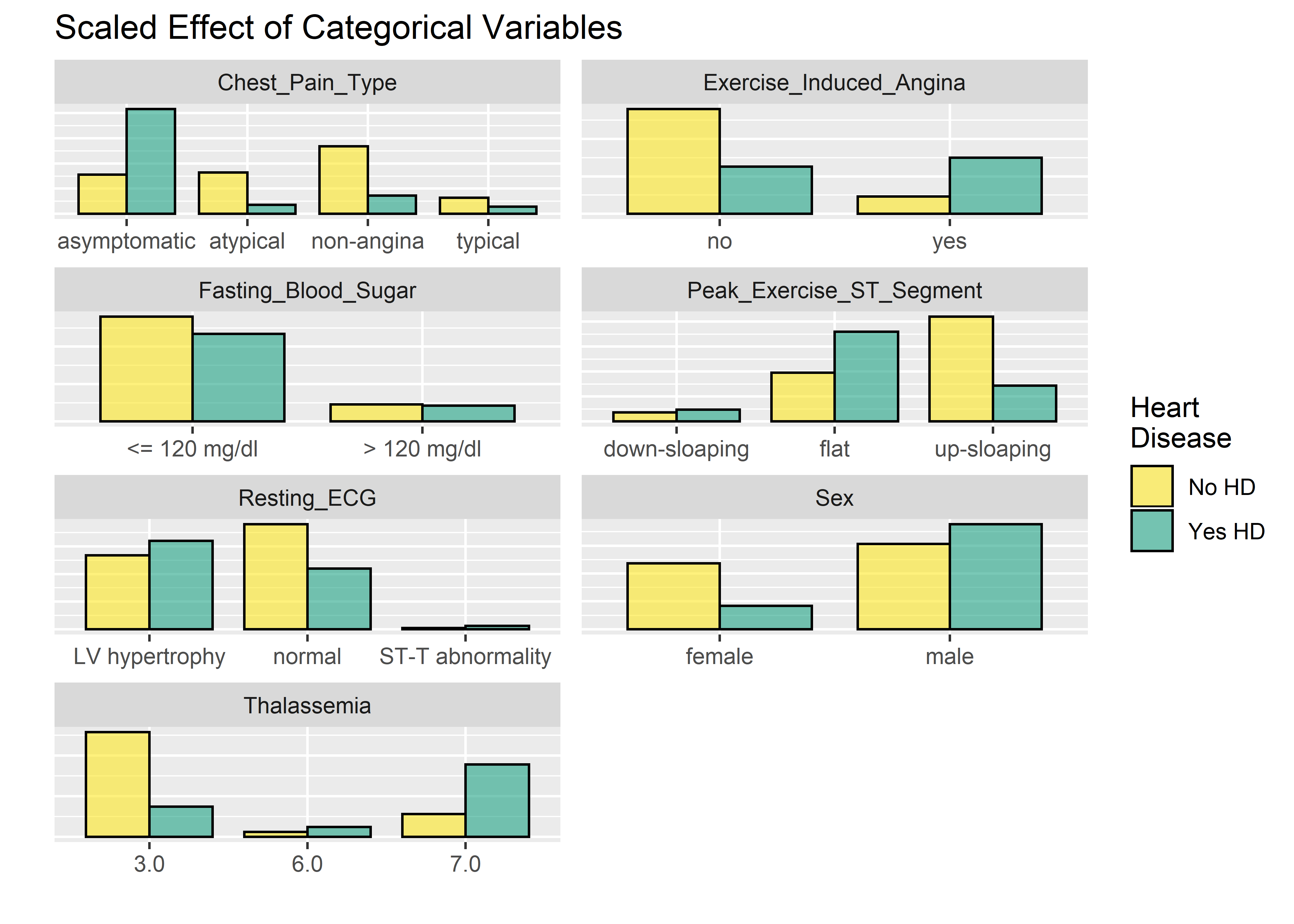
I prefer boxplots for evaluating the numeric variables.
#Must gather() data first in order to facet wrap by key
#(default gather call puts all var names into new key col)
hd_long_cont_tbl <- heart_dataset_clean_tbl %>%
select(Age,
Resting_Blood_Pressure,
Serum_Cholesterol,
Max_Heart_Rate_Achieved,
ST_Depression_Exercise,
Num_Major_Vessels_Flouro,
Diagnosis_Heart_Disease) %>%
gather(key = "key",
value = "value",
-Diagnosis_Heart_Disease)
#Visualize numeric variables as boxplots
hd_long_cont_tbl %>%
ggplot(aes(y = value)) +
geom_boxplot(aes(fill = Diagnosis_Heart_Disease),
alpha = .6,
fatten = .7) +
labs(x = "",
y = "",
title = "Boxplots for Numeric Variables") +
scale_fill_manual(
values = c("#fde725ff", "#20a486ff"),
name = "Heart\nDisease",
labels = c("No HD", "Yes HD")) +
theme(
axis.text.x = element_blank(),
axis.ticks.x = element_blank()) +
facet_wrap(~ key,
scales = "free",
ncol = 2) 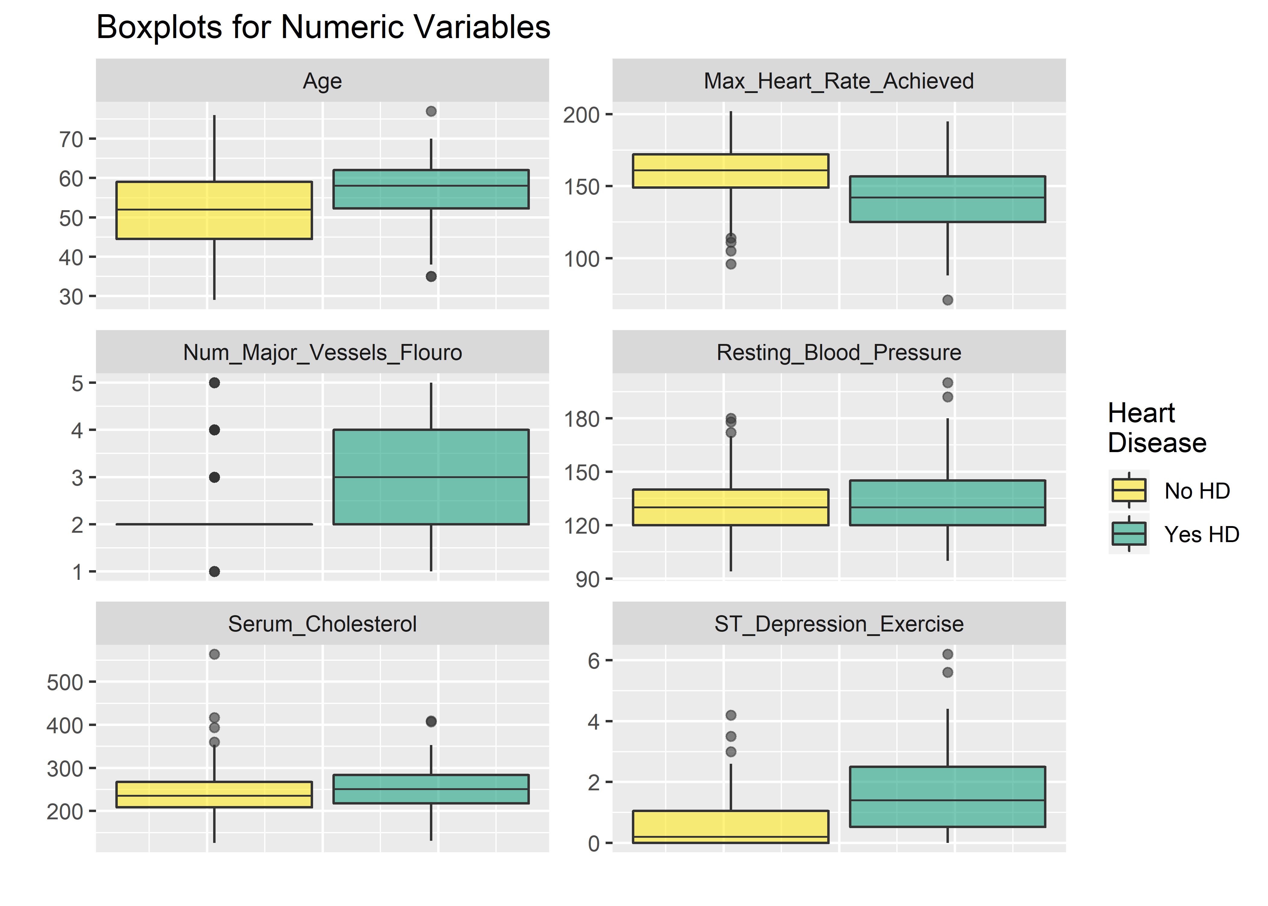 The faceted plots for categorical and numeric variables suggest the following conditions are associated with increased prevalence of heart disease (note: this does not mean the relationship is causal).
- Asymptomatic angina chest pain (relative to typical angina chest pain, atypical angina pain, or non-angina pain)
- Presence of exercise induced angina
- Lower fasting blood sugar
- Flat or down-sloaping peak exercise ST segment
- Presence of left ventricle hypertrophy
- Male
- Higher thelassemia score
- Higher age
- Lower max heart rate achieved
- Higher resting blood pressure
- Higher cholesterol
- Higher ST depression induced by exercise relative to rest
We can’t all be cardiologists but these do seem to pass the eye check. Particularly: age, blood pressure, cholesterol, and sex all point in the right direction based on what we generally know about the world around us. This provides a nice phase gate to let us proceed with the analysis.
Highly correlated variables can lead to overly complicated models or wonky predictions. The ggcorr() function from GGally package provides a nice, clean correlation matrix of the numeric variables. The default method is Pearson which I use here first. Pearson isn’t ideal if the data is skewed or has a lot of outliers so I’ll check using the rank-based Kendall method as well.4
#Correlation matrix using Pearson method, default method is Pearson
heart_dataset_clean_tbl %>% ggcorr(high       = "#20a486ff",
                                   low        = "#fde725ff",
                                   label      = TRUE,
                                   hjust      = .75,
                                   size       = 3,
                                   label_size = 3,
                                   nbreaks    = 5
                                              ) +
  labs(title = "Correlation Matrix",
  subtitle = "Pearson Method Using Pairwise Obervations")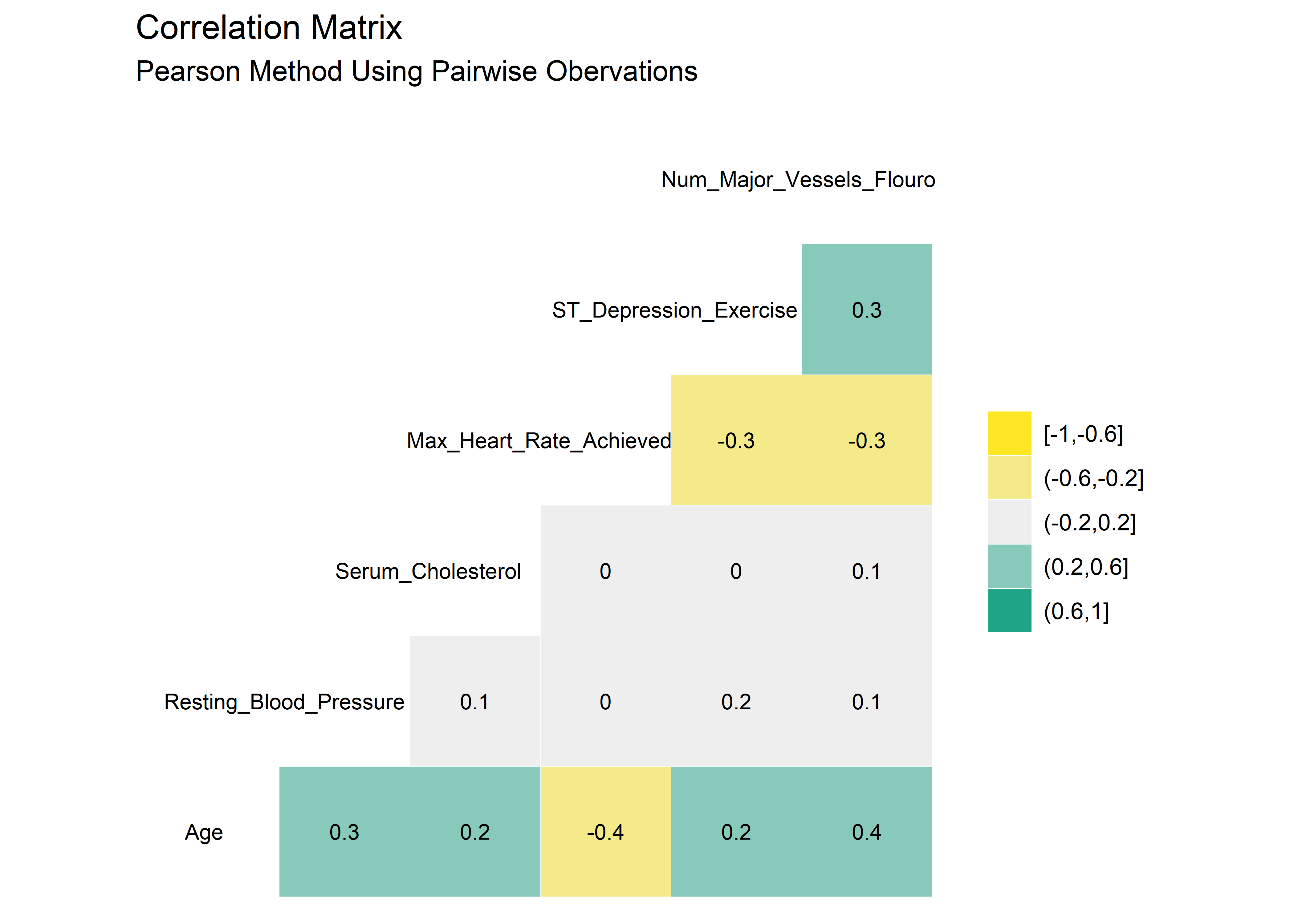
#Correlation matrix using Kendall method
heart_dataset_clean_tbl %>% ggcorr(method     = c("pairwise", "kendall"),
                                   high       = "#20a486ff",
                                   low        = "#fde725ff",
                                   label      = TRUE,
                                   hjust      = .75,
                                   size       = 3,
                                   label_size = 3,
                                   nbreaks    = 5
                                   ) +
  labs(title = "Correlation Matrix",
  subtitle = "Kendall Method Using Pairwise Observations")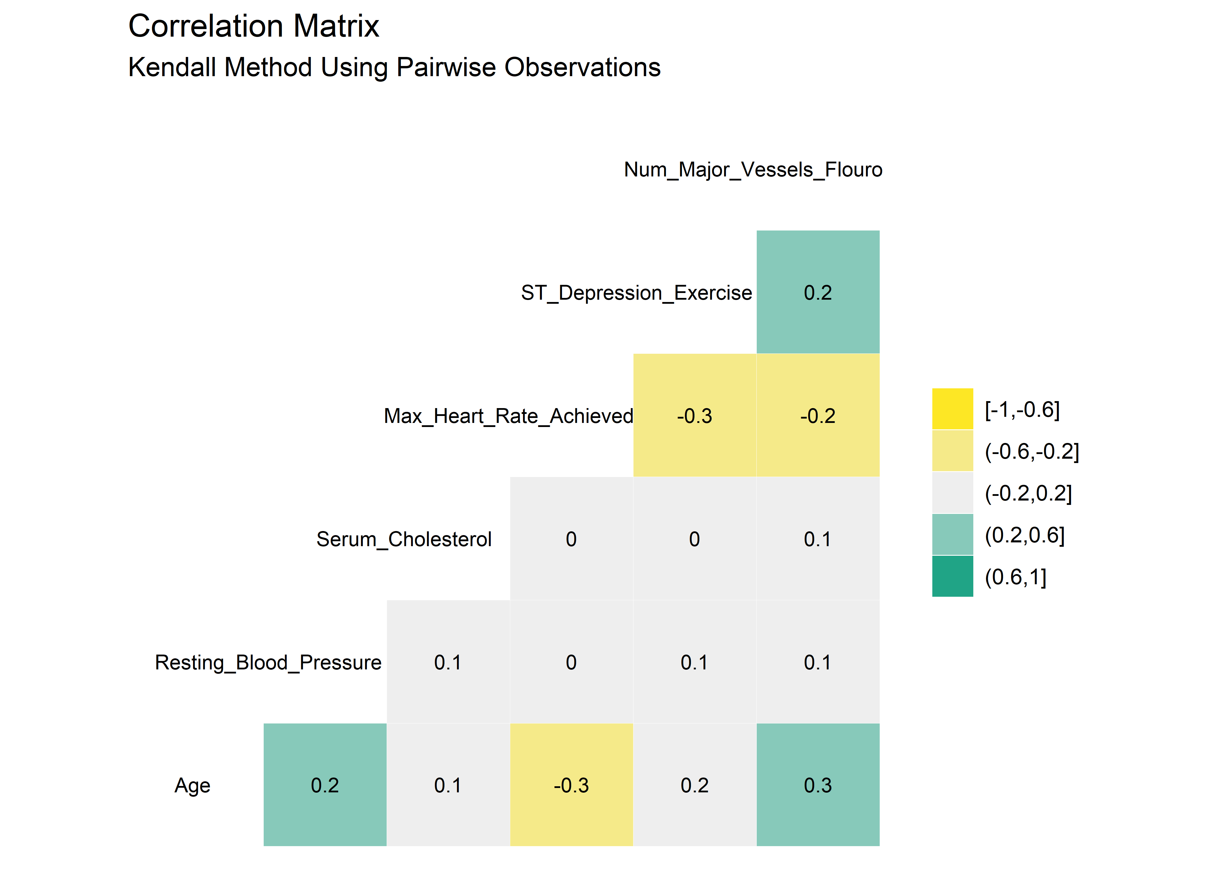
There are very minor differences between the Pearson and Kendall results. No variables appear to be highly correlated. As such, it seems reasonable to stay with the original 14 variables as we proceed into the modeling section.
The plan is to split up the original data set to form a training group and testing group. The training group will be used to fit the model while the testing group will be used to evaluate predictions. The initial_split() function creates a split object which is just an efficient way to store both the training and testing sets. The training() and testing() functions are used to extract the appropriate dataframes out of the split object when needed.
#set seed for repeatability
set.seed(1333)

#create split object
train_test_split <- heart_dataset_clean_tbl %>% initial_split(prop = .8, strata = "Diagnosis_Heart_Disease")

#pipe split obj to training() fcn to create training set
train_tbl <- train_test_split %>% training()

#pipe split obj to testing() fcn to create test set
test_tbl <- train_test_split %>% testing()
We chose to do our data preparation early on during the cleaning phase. For more complicated modeling operations it may be desirable to set up a recipe to do the pre-processing in a repeatable and reversible fashion and I chose here to leave some placeholder lines commented out and available for future work. The recipe is the spot to transform, scale, or binarize the data. We have to tell the recipe() function what we want to model: Diagnosis_Heart_Disease as a function of all the other variables (not needed here since we took care of the necessary conversions). The training data should be used exclusively to train the recipe to avoid data leakage. After giving the model syntax to the recipe, the data is piped into the prep() function which will extract all the processing parameters (if we had implemented processing steps here). The trained recipe is stored as an object and bake function is used to apply the trained recipe to a new (test) data set.
Juice() is a shortcut to extract the finalized training set which is already embedded in the recipe by default. Calling the bake() function and providing the recipe and a new data set will apply the processing steps to that dataframe.
#Set up recipe (use training data here to avoid leakage)
the_recipe <- recipe(Diagnosis_Heart_Disease ~ . , data = train_tbl) %>%
              #[Processing Step 1]
              #[Processing Step 2]
              prep(train_tbl, retain = TRUE)

#Apply recipe to training data to create processed training_data_obj (already populated in the recipe object)
train_processed_data <- juice(the_recipe)

#Apply recipe to test data to create processed test_data_obj
test_processed_data <- bake(the_recipe, new_data = test_tbl)
Once the training and testing data have been processed and stored, the logistic regression model can be set up using the parsnip workflow. Parsnip uses a 3-step process:
- specify the model and its arguments
- set the engine (how the model is created)
- fit the model to the processed training data
Logistic regression is a convenient first model to work with since it is relatively easy to implement and yields results that have intuitive meaning. It can be easily interpreted when the odds ratio is calculated from the model structure. 5
#Set up and train the model using processed training_data_obj
set.seed(100)
log_regr_hd_model <- logistic_reg(mode = "classification") %>%
                     set_engine("glm") %>%
                     fit(Diagnosis_Heart_Disease ~ ., data = train_processed_data)

#Take a look at model coefficients and add odds ratio for interpretability
broom::tidy(log_regr_hd_model$fit) %>%
  arrange(desc(estimate)) %>%
  mutate(odds_ratio = exp(estimate)) %>%
kable(align = rep("c", 5), digits = 3)| term | estimate | std.error | statistic | p.value | odds_ratio |
|---|---|---|---|---|---|
| Thalassemia7.0 | 1.932 | 0.519 | 3.726 | 0.000 | 6.906 |
| Chest_Pain_Type4 | 1.694 | 0.770 | 2.201 | 0.028 | 5.443 |
| Sex1 | 1.473 | 0.648 | 2.274 | 0.023 | 4.364 |
| Num_Major_Vessels_Flouro | 1.264 | 0.307 | 4.119 | 0.000 | 3.538 |
| Chest_Pain_Type2 | 1.255 | 0.874 | 1.436 | 0.151 | 3.507 |
| Resting_ECG2 | 1.022 | 0.447 | 2.287 | 0.022 | 2.780 |
| Peak_Exercise_ST_Segment3 | 1.003 | 0.984 | 1.020 | 0.308 | 2.727 |
| Peak_Exercise_ST_Segment2 | 0.833 | 0.551 | 1.512 | 0.130 | 2.300 |
| Exercise_Induced_Angina1 | 0.704 | 0.526 | 1.339 | 0.181 | 2.023 |
| Resting_ECG1 | 0.675 | 3.314 | 0.204 | 0.839 | 1.965 |
| ST_Depression_Exercise | 0.340 | 0.268 | 1.267 | 0.205 | 1.405 |
| Thalassemia6.0 | 0.127 | 0.882 | 0.144 | 0.885 | 1.136 |
| Resting_Blood_Pressure | 0.036 | 0.014 | 2.535 | 0.011 | 1.037 |
| Serum_Cholesterol | 0.003 | 0.005 | 0.644 | 0.520 | 1.003 |
| Max_Heart_Rate_Achieved | -0.032 | 0.014 | -2.271 | 0.023 | 0.969 |
| Age | -0.035 | 0.029 | -1.198 | 0.231 | 0.966 |
| Chest_Pain_Type3 | -0.282 | 0.770 | -0.366 | 0.714 | 0.755 |
| Fasting_Blood_Sugar1 | -0.684 | 0.718 | -0.953 | 0.341 | 0.504 |
| (Intercept) | -6.350 | 3.439 | -1.846 | 0.065 | 0.002 |
In the above code I’ve converted the estimate of the coefficient into the odds ratio. The odds ratio represents the odds that an outcome will occur given the presence of a specific predictor, compared to the odds of the outcome occurring in the absence of that predictor, assuming all other predictors remain constant. The odds ratio is calculated from the exponential function of the coefficient estimate based on a unit increase in the predictor. An example with a numeric variable: for 1 mm Hg increased in resting blood pressure rest_bp, the odds of having heart disease increases by a factor of 1.04.
Now let’s feed the model the testing data that we held out from the fitting process. It’s the first time the model will have seen these data so we should get a fair assessment (absent of over-fitting). The new_data argument in the predict() function is used to supply the test data to the model and have it output a vector of predictions, one for each observation in the testing data. The results vector can be added as a column into the original dataframe to append the predictions next to the true values.
#Make predictions using testing set
first_training_prediction <- predict(log_regr_hd_model,
                                     new_data = test_tbl,
                                     type     = "class")

#Add predictions as new column in heart data set
first_training_prediction_full_tbl <- test_processed_data %>%
  mutate(Predicted_Heart_Disease = first_training_prediction$.pred_class)

#Glimpse data
first_training_prediction_full_tbl %>% glimpse()
## Observations: 59
## Variables: 15
## $ Age <dbl> 56, 63, 56, 52, 54, 60, 64, 43, 65, 4...
## $ Resting_Blood_Pressure <dbl> 120, 130, 140, 172, 140, 117, 140, 12...
## $ Serum_Cholesterol <dbl> 236, 254, 294, 199, 239, 230, 335, 17...
## $ Max_Heart_Rate_Achieved <dbl> 178, 147, 153, 162, 160, 160, 158, 12...
## $ ST_Depression_Exercise <dbl> 0.8, 1.4, 1.3, 0.5, 1.2, 1.4, 0.0, 2....
## $ Num_Major_Vessels_Flouro <dbl> 2, 3, 2, 2, 2, 4, 2, 2, 5, 2, 2, 2, 2...
## $ Sex <fct> 1, 1, 0, 1, 1, 1, 1, 1, 0, 1, 0, 1, 1...
## $ Chest_Pain_Type <fct> 2, 4, 2, 3, 4, 4, 3, 4, 4, 1, 4, 3, 3...
## $ Fasting_Blood_Sugar <fct> 0, 0, 0, 1, 0, 1, 0, 0, 0, 0, 0, 0, 1...
## $ Resting_ECG <fct> 0, 2, 2, 0, 0, 0, 0, 2, 2, 0, 2, 0, 2...
## $ Exercise_Induced_Angina <fct> 0, 0, 0, 0, 0, 1, 0, 1, 0, 1, 0, 0, 0...
## $ Peak_Exercise_ST_Segment <fct> 1, 2, 2, 1, 1, 1, 1, 2, 2, 1, 1, 1, 3...
## $ Thalassemia <fct> 3.0, 7.0, 3.0, 7.0, 3.0, 7.0, 3.0, 7....
## $ Diagnosis_Heart_Disease <fct> 0, 1, 0, 0, 0, 1, 1, 1, 1, 0, 1, 0, 0...
## $ Predicted_Heart_Disease <fct> 0, 1, 0, 0, 0, 1, 0, 1, 1, 0, 0, 0, 0...A confusion matrix is a visual way to display the results of the model’s predictions. It’s not just the ability to predict the presence of heart disease that is of interest - we also want to know the number of times the model successfully predicts the absence of heart disease. Likewise, we want to know the number of false positives and false negatives. The confusion matrix captures all these metrics nicely.
#Use predictions col and truth col to make a confusion matrix object
conf_mat_obj <- first_training_prediction_full_tbl %>%
  conf_mat(truth    = Diagnosis_Heart_Disease,
           estimate = Predicted_Heart_Disease)

#Call conf_mat and supply columns for truth, prediction
#Pluck() to extract the conf_matrix data into cols and convert to tibble for plotting
conf_matrix_plt_obj <- first_training_prediction_full_tbl %>%
  conf_mat(truth    = Diagnosis_Heart_Disease,
           estimate = Predicted_Heart_Disease) %>%
  pluck(1) %>%
  as_tibble() %>%
  mutate("outcome" = c("true_negative",
                       "false_positive",
                       "false_negative",
                       "true_positive")) %>%
  mutate(Prediction = recode(Prediction, "0" = "No Heart Disease",
                                         "1" = "Heart Disease")) %>%
  mutate(Truth = recode(Truth,  "0" = "No Heart Disease",
                                "1" = "Heart Disease"))

#Convert to kable format
conf_matrix_plt_obj %>% kable(align = rep("c", 4))| Prediction | Truth | n | outcome |
|---|---|---|---|
| No Heart Disease | No Heart Disease | 29 | true_negative |
| Heart Disease | No Heart Disease | 3 | false_positive |
| No Heart Disease | Heart Disease | 6 | false_negative |
| Heart Disease | Heart Disease | 21 | true_positive |
#Plot confusion matrix
p1 <- conf_matrix_plt_obj %>% ggplot(aes(x = Truth, y = Prediction)) +
  geom_tile(aes(fill = n), alpha = .8) +
  geom_text(aes(label = n), color = "white") +
  scale_fill_viridis_c() +
  theme(legend.title = element_blank()) +
  labs(
    title    = "Confusion Matrix",
    subtitle = "Heart Disease Prediction Using Logistic Regression"
  )

p1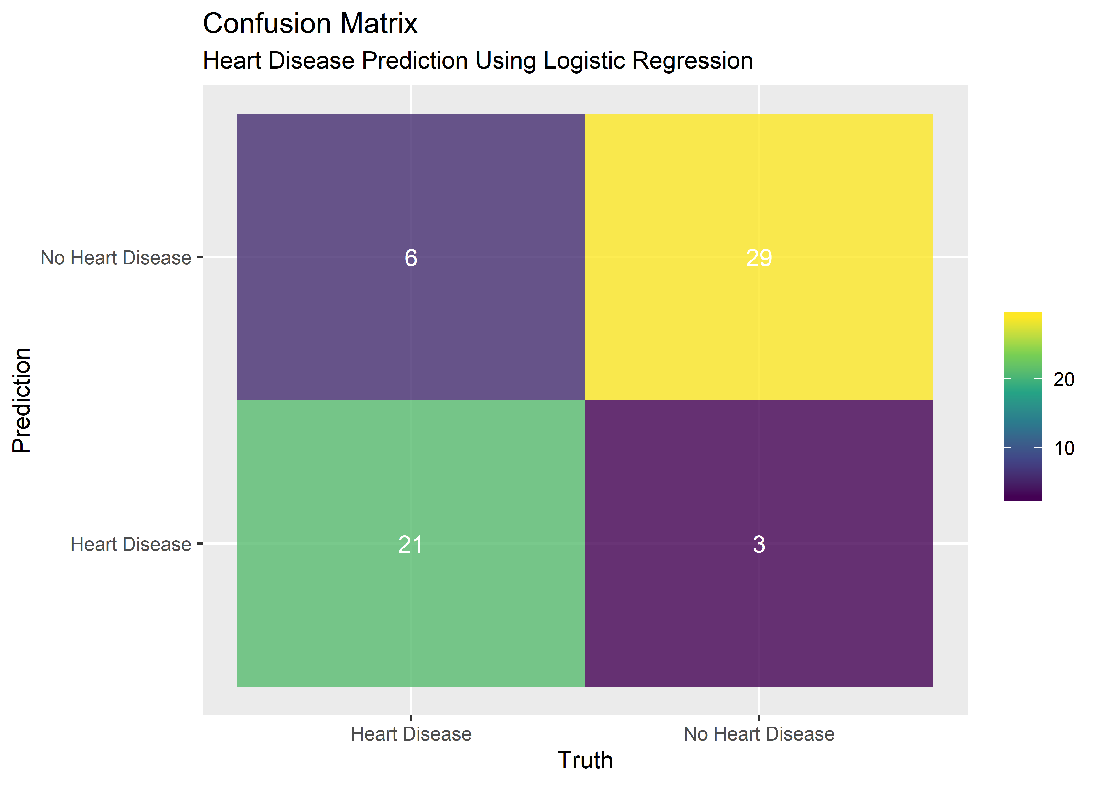
#Calling summary() on the confusion_matrix_obj gives all the performance measures
#Filter to the ones we care about
log_reg_performance_tbl <- summary(conf_mat_obj) %>% filter(
                                 .metric == "accuracy" |
                                 .metric == "sens" |
                                 .metric == "spec" |
                                 .metric == "ppv"  |
                                 .metric == "npv"  |
                                 .metric == "f_meas") %>%
  select(-.estimator) %>%
  rename("metric" = .metric,
         "estimate" = .estimate) %>%
  mutate("estimate" = estimate %>% signif(digits = 3)) %>%
  mutate(metric = recode(metric, "sens" = "sensitivity"),
         metric = recode(metric, "spec" = "specificity"),
         metric = recode(metric, "ppv"  = "positive predictive value"),
         metric = recode(metric, "npv"  = "negative predictive value")) %>%
  kable(align = rep("c", 3))

#Display perfomance summary as kable
log_reg_performance_tbl | metric | estimate |
|---|---|
| accuracy | 0.847 |
| sensitivity | 0.906 |
| specificity | 0.778 |
| positive predictive value | 0.829 |
| negative predictive value | 0.875 |
| f_meas | 0.866 |
Other common performance metrics are summarized above. Accuracy represents the percentage of correct predictions. Descriptions for each can be found at this link.6
The initial split of the data set into training/testing was done randomly so a replicate of the procedure would yield slightly different results. V-fold cross validation is a resampling technique that allows for repeating the process of splitting the data, training the model, and assessing the results many times from the same data set. Each stop in the CV process is annotated in the comments within the code below.
#create multiple split objects w/ vfold cross-validation resampling
set.seed(925)
hd_cv_split_objects <- heart_dataset_clean_tbl %>% vfold_cv(strata = Diagnosis_Heart_Disease)
hd_cv_split_objects
## # 10-fold cross-validation using stratification
## # A tibble: 10 x 2
## splits id
## <named list> <chr>
## 1 <split [270/31]> Fold01
## 2 <split [270/31]> Fold02
## 3 <split [270/31]> Fold03
## 4 <split [271/30]> Fold04
## 5 <split [271/30]> Fold05
## 6 <split [271/30]> Fold06
## 7 <split [271/30]> Fold07
## 8 <split [271/30]> Fold08
## 9 <split [272/29]> Fold09
## 10 <split [272/29]> Fold10#I want a big function that takes a split object and an id
make_cv_predictions_fcn <- function(split, id){
#extract data for analysis set from split obj
#prep(train) the recipe and return updated recipe
#bake(apply) trained recipe to new data
analysis_tbl <- analysis(split)
trained_analysis_recipe <- prep(the_recipe ,training = analysis_tbl)
baked_analysis_data_tbl <- bake(trained_analysis_recipe, new_data = analysis_tbl)
#define model in parsnip syntax
model <- logistic_reg(mode = "classification") %>%
set_engine("glm") %>%
fit(Diagnosis_Heart_Disease ~ ., data = baked_analysis_data_tbl)
#same as above but for assessment set (like the test set but for resamples)
assessment_tbl <- assessment(split)
trained_assessment_recipe <- prep(the_recipe, training = assessment_tbl)
baked_assessment_data_tbl <- bake(trained_assessment_recipe, new_data = assessment_tbl)
#make a tibble with the results
tibble("id" = id,
"truth" = baked_assessment_data_tbl$Diagnosis_Heart_Disease,
"prediction" = unlist(predict(model, new_data = baked_assessment_data_tbl))
)
}
#map the big function to every split obj / id in the initial cv split tbl
cv_predictions_tbl <- map2_df(.x = hd_cv_split_objects$splits,
.y = hd_cv_split_objects$id,
~make_cv_predictions_fcn(split = .x, id = .y))
#see results
cv_predictions_tbl %>% head(10) %>% kable(align = rep("c", 3))| id | truth | prediction |
|---|---|---|
| Fold01 | 0 | 0 |
| Fold01 | 0 | 0 |
| Fold01 | 0 | 0 |
| Fold01 | 1 | 1 |
| Fold01 | 0 | 0 |
| Fold01 | 0 | 1 |
| Fold01 | 0 | 0 |
| Fold01 | 0 | 0 |
| Fold01 | 0 | 0 |
| Fold01 | 1 | 1 |
#define desired metrics
desired_metrics <- metric_set(accuracy,
                              sens,
                              spec,
                              ppv,
                              npv,
                              f_meas)

#group by fold and use get desired metrics [metric_set fcn is from yardstick]
cv_metrics_long_tbl <- cv_predictions_tbl %>%
                       group_by(id) %>%
                       desired_metrics(truth = truth, estimate = prediction)

#see results
cv_metrics_long_tbl %>% head(10) %>% kable(align = rep("c", 4))| id | .metric | .estimator | .estimate |
|---|---|---|---|
| Fold01 | accuracy | binary | 0.8709677 |
| Fold02 | accuracy | binary | 0.9354839 |
| Fold03 | accuracy | binary | 0.8387097 |
| Fold04 | accuracy | binary | 0.7666667 |
| Fold05 | accuracy | binary | 0.9000000 |
| Fold06 | accuracy | binary | 0.8000000 |
| Fold07 | accuracy | binary | 0.8000000 |
| Fold08 | accuracy | binary | 0.7333333 |
| Fold09 | accuracy | binary | 0.7931034 |
| Fold10 | accuracy | binary | 0.9310345 |
#visualize results
cv_metrics_long_tbl %>% ggplot(aes(x = .metric, y = .estimate)) +
  geom_boxplot(aes(fill = .metric),
               alpha = .6,
               fatten = .7) +
  geom_jitter(alpha = 0.2, width = .05) +
  labs(x = "",
       y = "",
       title = "Boxplots for Logistic Regression",
       subtitle = "Model Metrics, 10-Fold Cross Validation") +
  scale_fill_viridis_d() +
  scale_y_continuous(labels = scales::percent_format(accuracy = 1) ) +
  theme(legend.title = element_blank(),
        axis.text.x  = element_blank(),
axis.ticks.x = element_blank()) 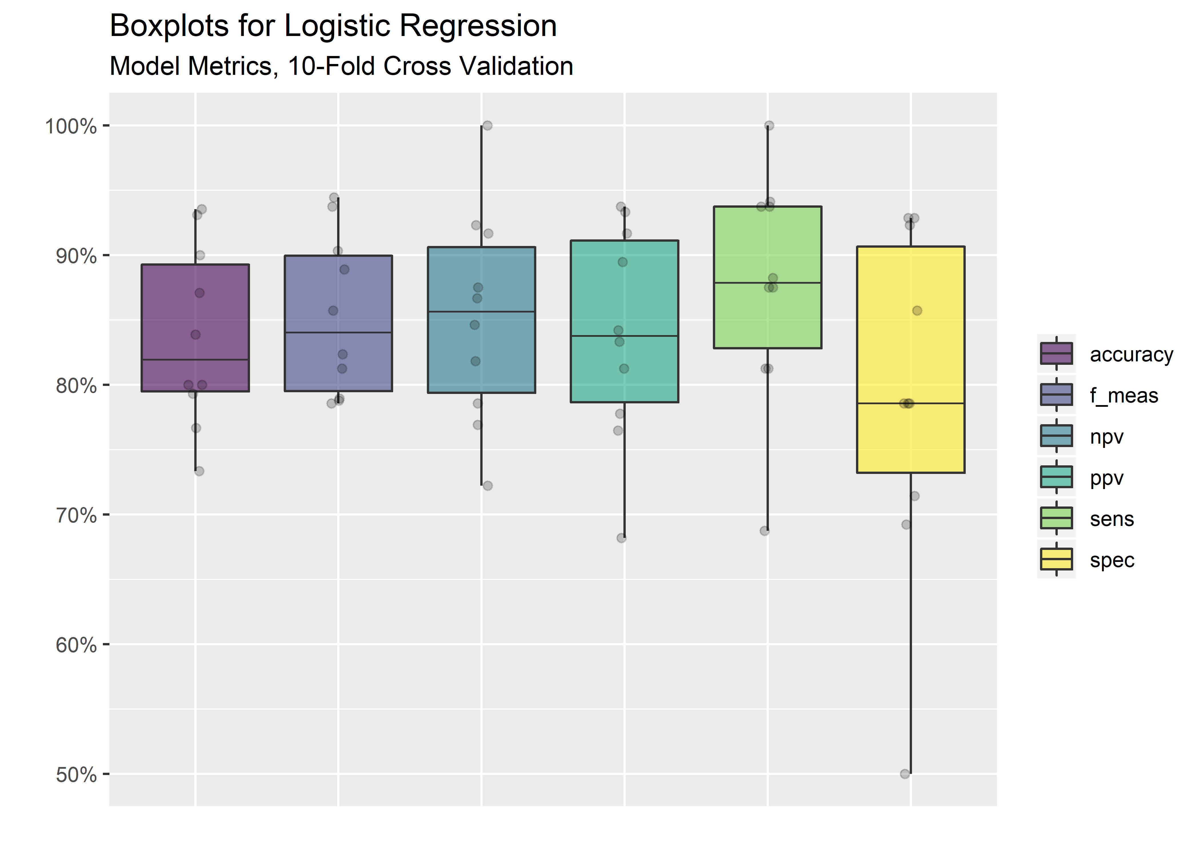
#calculate the mean from all the folds for each metric
cv_mean_metrics_tbl <- cv_metrics_long_tbl %>%
                       group_by(.metric) %>%
                       summarize("Avg" = mean(.estimate)) %>%
                       ungroup()

cv_mean_metrics_tbl %>%
  mutate(Average = Avg %>% signif(digits = 3)) %>%
  select(.metric,
         Average) %>%
kable(align = rep("c", 2))| .metric | Average |
|---|---|
| accuracy | 0.837 |
| f_meas | 0.853 |
| npv | 0.852 |
| ppv | 0.839 |
| sens | 0.876 |
| spec | 0.790 |
Got there! Average of .837 accuracy after 10-fold cross-validation. Not bad for a basic logistic regression. It is certainly possible that .837 is not sufficient for our purposes given that we are in the domain of health care where false classifications have dire consequences. Evaluating other algorithms would be a logical next step for improving the accuracy and reducing patient risk.
Thanks for reading.
Image Credit: Shutterstock/Crevis↩
UCI Machine Learning Repository, https://archive.ics.uci.edu/ml/datasets/Heart+Disease↩
Nuclear stress testing requires the injection of a tracer, commonly technicium 99M (Myoview or Cardiolyte), which is then taken up by healthy, viable myocardial cells. A camera (detector) is used afterwards to image the heart and compare segments. A coronary stenosis is detected when a myocardial segment takes up the nuclear tracer at rest, but not during cardiac stress. This is called a “reversible defect.” Scarred myocardium from prior infarct will not take up tracer at all and is referred to as a “fixed defect.”↩
https://stats.stackexchange.com/questions/3730/pearsons-or-spearmans-correlation-with-non-normal-data↩
https://notast.netlify.com/post/explaining-predictions-interpretable-models-logistic-regression/↩
https://www.analyticsvidhya.com/blog/2019/08/11-important-model-evaluation-error-metrics/↩