I’ve never really worked much with Poisson data and wanted to get my hands dirty. I thought that for this project I might combine a Poisson data set with the simple Bayesian methods that I’ve explored before since it turns out the Poisson rate parameter lambda also has a nice conjugate prior (more on that later). Poisson distributed data are counts per unit time or space - they are events that arrive at random intervals but that have a characteristic rate parameter which also equals the variance. This rate parameter is usually denoted as lambda. No-hitters in baseball are often modeled as Poisson data, as are certain types of processing defects in electronics and medical devices. A particularly relevant application is in particulate testing for implantable devices. Particulate shed is an unassuming but potentially costly and dangerous phenomenon.
Particulate can be shed from the surface of medical devices even when the manufacturing environment is diligently controlled. The source of the particulate can vary: light particulate is attracted to the surface of sheaths and luers due to static charge; hydrophilic coatings may delaminate from the surface during delivery; therapeutic coating on the implant’s surface may degrade over time in the presence of blood.
The clinical harms that the patient may face due to particulate shed include neurological events if the particulate migrates cranially or embolism it migrates caudally. The occurrence and severity of symptoms are understood to be functions of both size and quantity of particulate. In recent years, FDA and friends have been more stringent in requiring manufacturers to quantify and understand the nature of the particulate burden associated with their devices. In the analysis below, I’m going to simulate an experiment in which particulate data are collected for 20 devices.
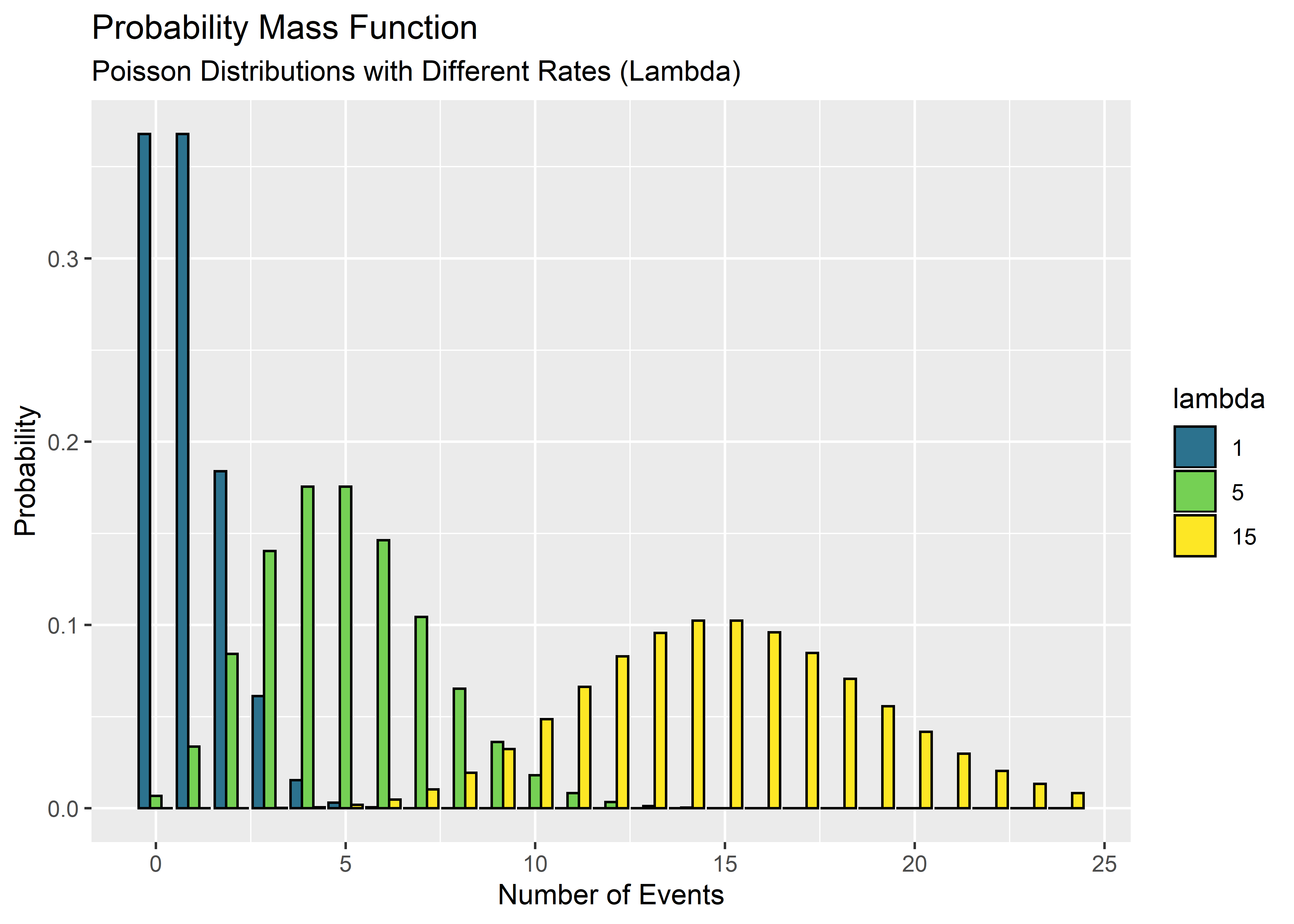
Before I get there, I want to remind myself of what Poisson data look like for different rate parameters. I set up a function to make a Poisson pdf based on number of events n and rate parameter lambda. The function then converts the information to a tibble for use with ggplot.
#Load libraries
library(tidyverse)
library(knitr)
library(kableExtra)
library(tolerance)
library(ggrepel)
#Sequence from 0 to 24 by 1 (x-axis of plot)
number_of_events <- seq(0, 24, by = 1)
#Function to make a Poisson density vector from n and lambda, convert into tibble
pois_fcn <- function(lambda){
pois_vector <- dpois(x = number_of_events, lambda = lambda, log = FALSE)
pois_tbl <- tibble("num_of_events" = number_of_events,
"prob" = pois_vector,
"lambda" = lambda)
}
#Objects to hold tibbles for different Poisson rates
pois_dist_1_tbl <- pois_fcn(lambda = 1)
pois_dist_5_tbl <- pois_fcn(lambda = 5)
pois_dist_15_tbl <- pois_fcn(lambda = 15)
#Combine in one df
pois_total_tbl <- bind_rows(pois_dist_1_tbl,
pois_dist_5_tbl,
pois_dist_15_tbl)
#Convert lambda front int to factor so ggplot maps aesthetics as levels, not gradient
pois_total_int_tbl <- pois_total_tbl %>%
mutate(lambda = as_factor(lambda))
#Make and store ggplot obj
h1 <- pois_total_int_tbl %>% ggplot(aes(x = num_of_events, y = prob)) +
geom_col(aes(y = prob, fill = lambda), position = "dodge", color = "black") +
scale_fill_manual(values = c("#2C728EFF", "#75D054FF", "#FDE725FF")) +
labs(x = "Number of Events",
y = "Probability",
title = "Probability Mass Function",
subtitle = "Poisson Distributions with Different Rates (Lambda)")
h1
Cool - so when the rate is low it looks sort of like the discrete version of an exponential curve. It’s still not symmetric at lambda = 5 but by lambda = 15 it looks a lot like a binomial distribution.
The data I simulate below are intended to represent the fluid collected during bench-top simulated use testing in a clean “flow loop” or vascular deployment model. The fluid would generally be passed through light obscuration censors to quantify the size and counts of particulate relative to a control. Particulate requirements for many endovascular devices are borrowed from USP <788>. According to that standard, no more than 60 particles greater than 25 micron effective diameter are acceptable. I want to know the probability of passing the test but don’t know the rate parameter lambda. The end goal is to understand what the most credible values for lambda are based on the bench-top data from multiple devices. First I’ll try to quantify the uncertainty in the rate parameter lambda. Each lambda can then be used to estimate a reliability. The large number of simulated lamdas will make a large set of simulated reliabilities. From there I should be able to extract any information needed regarding the uncertainty of the device reliability as it relates to particulate shed. That’s the plan! Note: I’m trying out knitr::kable() which generates html tables nicely. I’m not too good at it yet so bare with me please.
Take a look at the data:
#Peek at some data
particulate_data %>% head(5) %>%
kable() %>% kable_styling("full_width" = F)| x |
|---|
| 46 |
| 58 |
| 38 |
| 50 |
| 62 |
I’m using a Bayesian approach again - partially because I need practice and partially because the Poisson parameter lambda has a convenient conjugate prior: the gamma distribution. This means that some simple math can get me from the prior to the posterior. I love simple math. Using the gamma distribution to describe the prior belief in lambda, the posterior distribution for lambda is:
\[\mbox{prior: lambda ~ Gamma}(a, b)\] As a reminder to myself, this is read as “lambda is distributed as a Gamma distribution with parameters a and b”.
\[\mbox{posterior: lambda ~ Gamma}(a + \sum_{i=1}^{n} x_i\ , b + n)\] It is reasonable to use an relatively uninformed prior for lambda since I don’t have much preliminary knowledge about particulate data for my device design. Setting the shape a to 1 and the rate b to 0.1 provides allocates the credibility across a wide range of lambdas to start. To go from prior to posterior we need only sum up all the particulate counts in the data set and add the total to the shape a, then add the total number of devices tested (sample size n) to the rate b.
#Set parameters and constants
a <- 1
b <- 0.1
n <- length(particulate_data)
total_particulate_count <- sum(particulate_data)
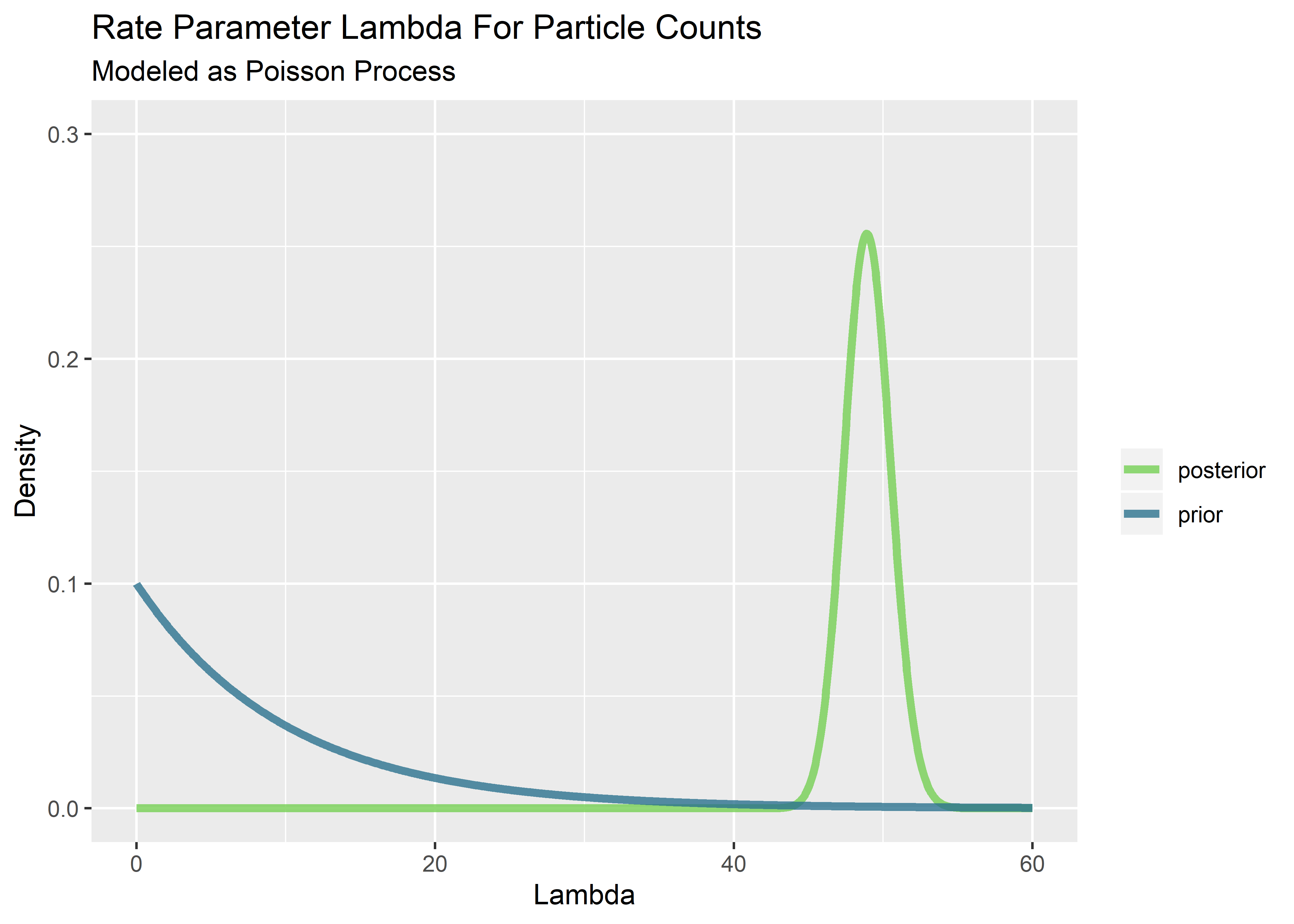
I like to peek at the prior and posterior distributions of lambda since they are easy to visualize via the relationships above. We are back into continuous distribution mode because the rate parameter lambda can be any positive value even though the particulate counts the come from the process are discrete.
#Set sequence of x values; generate prior using a,b; generate posterior
x_values  <- seq(0, 60, length.out = 1000)
prior     <- dgamma(x_values, shape = 1, rate = 0.1)
posterior <- dgamma(x_values, shape = a + total_particulate_count, rate = b + n)

#Prior in tibble format
prior_tbl <- tibble(
  "x_values" = x_values,
  "prob"     = prior,
  "config"   = "prior"
)

#Posterior in tibble format
posterior_tbl <- tibble(
  "x_values" = x_values,
  "prob"     = posterior,
  "config"   = "posterior"
)

#Combine prior and posterior in 1 tibble
prior_post_tbl <- bind_rows(prior_tbl, posterior_tbl)

#Visualize
prior_post_tbl %>% ggplot(aes(x = x_values, y = prob)) +
  geom_line(aes(color = config), size = 1.5, alpha = 0.8) +
  scale_y_continuous(name="Density", limits=c(0, 0.3)) +
  scale_color_manual(values = c("#75D054FF", "#2C728EFF")) +
  labs(
    title    = "Rate Parameter Lambda For Particle Counts",
    subtitle = "Modeled as Poisson Process",
    x        = "Lambda",
    color    = ""
  )
Having access to the posterior distribution of lambda enables simulation of possible values of lambda by drawing random values from the distributions. The probability of drawing any particular value of lambda is based on the density shown on the y-axis (although the probability of any particular point is zero; we must calculate over a span of x via integration). Each of the values randomly drawn from the posterior can be used to simulate a distribution of particulate counts for comparison with the spec. The workflow is essentially a series of questions:
What might the values of the rate parameter lambda be based on the data? -> Combine data with conjugate prior to generate the posterior distribution of credible lambdas. (Done and shown above)
If a random value of lambda is pulled from the posterior distribution , what would we expect regarding the uncertainty of the original experiment? -> Draw random values lambda and then evaluate what percentage of the cdf lies above the spec (could also run simulations for each random lambda and then count the number of simulated runs above the spec but this is time consuming (10,000 lambdas x 10,000 simulations to build out the particle count distribution for each one…)
Combine each of these tail areas into a new distribution. This new distribution represents the uncertainty in the reliability estimate based on uncertainty in lambda. How to estimate the reliability of the real device while taking uncertainty into account? -> Calculate the lower bound of the 95% credible interval by finding the .05 quantile from the set of simulated reliability values.
Let’s do this!
#Sample and store 10000 random lambda values from posterior
n_posterior_samples <- 10000
sampled_posterior_lambda <- rgamma(n_posterior_samples, shape = a + total_particulate_count, rate = b + n)

#Initialize empty vector to hold reliability data
reliability_vector <- rep(NA, n_posterior_samples)

#For each lambda value, calc cumulative probability of less than or equal to q particles shed from 1 sample?
for(i in 1:n_posterior_samples){
  reliability_vector[i] <- ppois(q = 60, lambda = sampled_posterior_lambda[i])
}

#Visualize
reliability_vector %>% head() %>%
kable(align=rep('c')) %>% kable_styling("full_width" = F)| x |
|---|
| 0.9147028 |
| 0.9506510 |
| 0.9431756 |
| 0.9700806 |
| 0.9546490 |
| 0.9540933 |
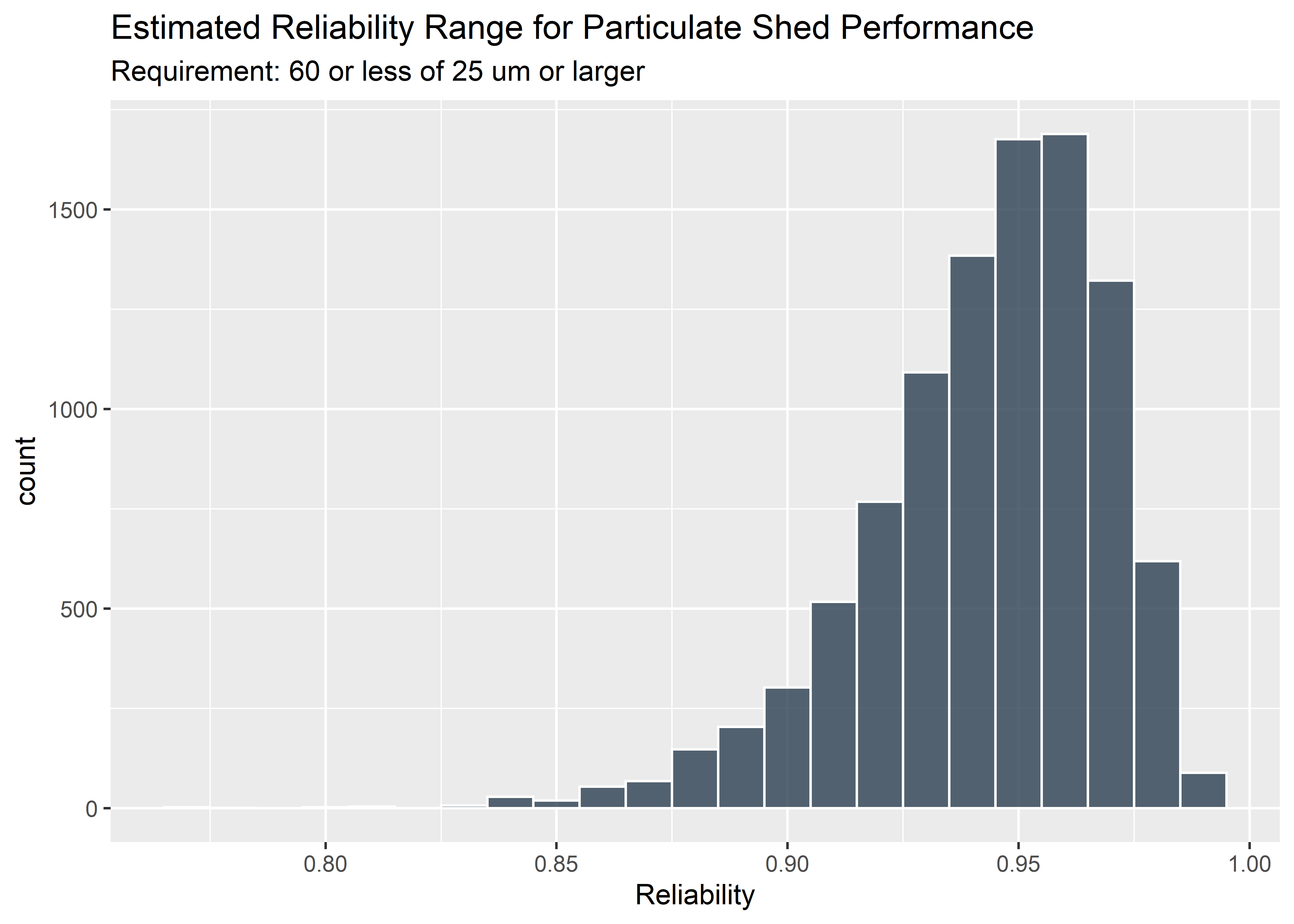
Checking what the simulated reliabilities are:
#Convert reliability vector to tibble
reliability_tbl <- reliability_vector %>%
  as_tibble() %>%
  mutate("reliability" = value) %>%
  select(reliability)

#Visualize with histogram
reliability_tbl %>% ggplot(aes(reliability)) +
  geom_histogram(fill = "#2c3e50", color = "white", binwidth = .01, alpha = 0.8) +
    labs(
        x        = "Reliability",
        title    = "Estimated Reliability Range for Particulate Shed Performance",
        subtitle = "Requirement: 60 or less of 25 um or larger"
    )
The 95% credible interval for the reliability (conformance rate) is the .05 quantile of this distribution since the spec is 1-sided:
#Calculate .05 quantile
reliability_tbl$reliability %>%
  quantile(probs = .05)     %>%
  signif(digits = 3)
## 5%
## 0.893Finally, the answer! The lowest reliability expected is 89.3 % based on a 95% credible interval. This would likely not meet the product requirements (assigned based on risk of the harms that come from this particular failure mode) and we would likely need to improve our design or processes to reduce particulate shed from the product.
This concludes the Bayesian inference of reliability in Poisson distributed particle counts. But hey, since we’re here… one of the things I love about R is the ability to easily check sensitivities, assumptions, and alternatives easily. What would this analysis look like using the conventional frequentist approach? I admit I’m not sure exactly but I assume we would extend the standard tolerance interval approach that is common in Class III medical device submissions. Tolerance intervals are easy to pull from tables or software but actually pretty tricky (for me at least) to derive. They involve uncertainty in both the mean and the variance. For simplicity (and because I’m not confident enough to derive the formula), I’ll use the tolerance package in R to calculate tolerance intervals for Poisson data. It turns out that there are 8 methods and I’ll use them all because I’m feeling a little wild and I want to see if they result in different results.
## 95%/95% 1-sided Poisson tolerance limits for future
## occurrences in a period of length 1 part. All eight methods
## are presented for comparison.
tl_tab <- poistol.int(x = sum_part_data, n = n, m = 1, alpha = 0.05, P = 0.95,
side = 1, method = "TAB") %>% mutate(method = "TAB") %>% as_tibble()

tl_ls <- poistol.int(x = sum_part_data, n = n, m = 1, alpha = 0.05, P = 0.95,
side = 1, method = "LS") %>% mutate(method = "LS") %>% as_tibble()

tl_sc <- poistol.int(x = sum_part_data, n = n, m = 1, alpha = 0.05, P = 0.95,
side = 1, method = "SC") %>% mutate(method = "SC") %>% as_tibble()

tl_cc <- poistol.int(x = sum_part_data, n = n, m = 1, alpha = 0.05, P = 0.95,
side = 1, method = "CC") %>% mutate(method = "CC") %>% as_tibble()

tl_vs <- poistol.int(x = sum_part_data, n = n, m = 1, alpha = 0.05, P = 0.95,
side = 1, method = "VS") %>% mutate(method = "VS") %>% as_tibble()

tl_rvs <- poistol.int(x = sum_part_data, n = n, m = 1, alpha = 0.05, P = 0.95,
side = 1, method = "RVS") %>% mutate(method = "RVS") %>% as_tibble()

tl_ft <- poistol.int(x = sum_part_data, n = n, m = 1, alpha = 0.05, P = 0.95,
side = 1, method = "FT") %>%mutate(method = "FT") %>% as_tibble()

tl_csc <- poistol.int(x = sum_part_data, n = n, m = 1, alpha = 0.05, P = 0.95,
side = 1, method = "CSC") %>% mutate(method = "CSC") %>% as_tibble()

tl_all_tbl <-  bind_rows(tl_tab,
                         tl_ls,
                         tl_sc,
                         tl_cc,
                         tl_vs,
                         tl_rvs,
                         tl_ft,
                         tl_csc)

tl_all_tbl %>% kable(align=rep('c', 5)) | alpha | P | lambda.hat | 1-sided.lower | 1-sided.upper | method |
|---|---|---|---|---|---|
| 0.05 | 0.95 | 49.15 | 36 | 64 | TAB |
| 0.05 | 0.95 | 49.15 | 36 | 64 | LS |
| 0.05 | 0.95 | 49.15 | 36 | 64 | SC |
| 0.05 | 0.95 | 49.15 | 36 | 64 | CC |
| 0.05 | 0.95 | 49.15 | 36 | 64 | VS |
| 0.05 | 0.95 | 49.15 | 36 | 64 | RVS |
| 0.05 | 0.95 | 49.15 | 36 | 64 | FT |
| 0.05 | 0.95 | 49.15 | 36 | 64 | CSC |
For this data set it can be seen that all 8 methods produce the same 1-sided 95/95 upper tolerance interval 64 counts per device. N=60 was the requirement - since the edge of our tolerance interval lies above the 1-sided spec we would fail this test. This conclusion is consistent with the Bayesian method that estimates the reliability below the 95% requirement.
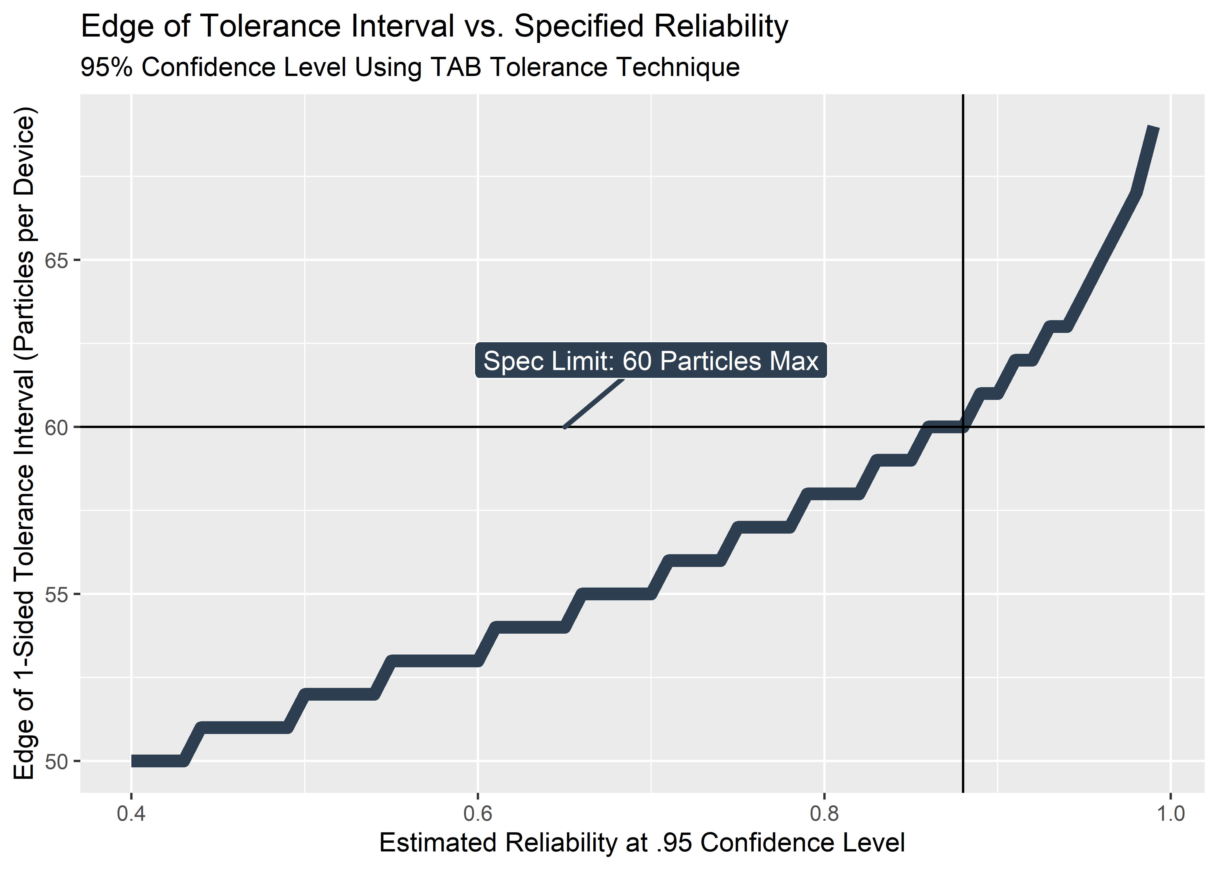
But what sort of reliability claim could our data support? For the Bayesian approach we concluded that the answer was 89.3% (lower bound of 1-sided 95% credible interval). For the frequentist method, we don’t have a posterior distribution to examine. We could try using the tolerance interval function above with various values of P to impute the value of P which coincides with the spec limit of 60.
#Sequence of reliability values for which to use as P
reliability_freq_tbl <- tibble(
  "proportion_covered_P" = seq(.40, .99, .01)
)

#Function that is just like poistol.int but extracts and reports only the upper limit
#of the tolerance interval
tol_interval_fcn <- function(data_vec = sum_part_data, n=20, m=1, alpha=.05, P=.95, side=1, method="TAB"){
  holder <- poistol.int(data_vec, n, m, alpha, P, side, method)
  holder_2 <- holder[1,5]
}

#Test the function
test_1 <- tol_interval_fcn(data_vec = sum_part_data, n=n, m=1, alpha = .05, P = .95, side = 1, method = "TAB")

#Test the function
test_2 <- tol_interval_fcn(P = .95)

#Map the function across a vector of proportions
#Note to future self: map() arguments are: the list of values map the fn over, the fn
#itself, then all the additional arguments of the fn that you aren't mapping over (odd syntax)
upper_tol_tbl <- reliability_freq_tbl %>% mutate(
  particles_per_part = map(proportion_covered_P, tol_interval_fcn, data_vec = sum_part_data, n=n, m=1, alpha = .05, side = 1, method = "TAB") %>% as.integer()
)

#View haead and tail of data
upper_tol_tbl %>% head(20) %>% kable(align=rep('c', 2))| proportion_covered_P | particles_per_part |
|---|---|
| 0.40 | 50 |
| 0.41 | 50 |
| 0.42 | 50 |
| 0.43 | 50 |
| 0.44 | 51 |
| 0.45 | 51 |
| 0.46 | 51 |
| 0.47 | 51 |
| 0.48 | 51 |
| 0.49 | 51 |
| 0.50 | 52 |
| 0.51 | 52 |
| 0.52 | 52 |
| 0.53 | 52 |
| 0.54 | 52 |
| 0.55 | 53 |
| 0.56 | 53 |
| 0.57 | 53 |
| 0.58 | 53 |
| 0.59 | 53 |
upper_tol_tbl %>% tail(20) %>% kable(align=rep('c', 2))| proportion_covered_P | particles_per_part |
|---|---|
| 0.80 | 58 |
| 0.81 | 58 |
| 0.82 | 58 |
| 0.83 | 59 |
| 0.84 | 59 |
| 0.85 | 59 |
| 0.86 | 60 |
| 0.87 | 60 |
| 0.88 | 60 |
| 0.89 | 61 |
| 0.90 | 61 |
| 0.91 | 62 |
| 0.92 | 62 |
| 0.93 | 63 |
| 0.94 | 63 |
| 0.95 | 64 |
| 0.96 | 65 |
| 0.97 | 66 |
| 0.98 | 67 |
| 0.99 | 69 |
#need this data to feed to gg_label_repel to tell it where to attach label
point_tbl <- tibble(x = .65, y = 60)

#visualize
upper_tol_tbl %>% ggplot(aes(x = proportion_covered_P, y = particles_per_part)) +
  geom_line(color = "#2c3e50",
            size = 2.5) +
    labs(x = "Estimated Reliability at .95 Confidence Level",
         y = "Edge of 1-Sided Tolerance Interval (Particles per Device)",
         title = "Edge of Tolerance Interval vs. Specified Reliability",
         subtitle = "95% Confidence Level Using TAB Tolerance Technique") +
  scale_y_continuous(breaks = seq(40, 70, 5)) +
  geom_vline(xintercept = .88) +
  geom_hline(yintercept = 60) +
  geom_point(x = .65, y = 60, size = 0, alpha = 0) +
  geom_label_repel(data = point_tbl, aes(x, y),
                   label = "Spec Limit: 60 Particles Max",
                   fill = "#2c3e50",
                   color = "white",
                   segment.color = "#2c3e50",
                   segment.size = 1,
                   min.segment.length = unit(1, "lines"),
                   nudge_y = 2,
                   nudge_x = .05)
Here’s a plot that I’ve never made or seen before. For given set of data (in this case: particulate_data from earlier with n=20 from a Poisson distribution, lambda = 50), the x-axis shows the estimated reliability and the y-axis represents the number of particles at the edge the calculated tolerance interval using the TAB method. That is to say: the standard approaches to calculate the edge of the relevant tolerance interval for a specified proportion at a specified confidence level. For example, we could state we want to know the estimate for the 95th percentile at 95% confidence level - the answer would be 64 particles per device. Since the requirement for clinical safety is set at 60 particles max, we would not pass the test because we could not state with high confidence that 95 or more (out of 100) would pass. Usually it’s just a binary pass/fail decision.
It’s obvious that the 95/95 edge of the tolerance interval is out of spec… but what would be the greatest reliability we could claim at 95% confidence? It ends up being .88 or 88% - very close to the predicted lower bound of the 95% credible interval calculated from the Bayesian method (which was 89.3%, from above)! In this case, the frequentist and Bayesian methods happen to be similar (even though they aren’t measuring the same thing). Interesting stuff!