As engineers, it is not uncommon to be asked to determine whether or not two different configurations of a product perform the same. Perhaps we are asked to compare the durability of a next-generation prototype to the current generation. Sometimes we are testing the flexibility of our device versus a competitor for marketing purposes. Maybe we identify a new vendor for a raw material but must first understand whether the resultant finished product will perform any differently than when built using material from the standard supplier. All of these situations call for a comparison between two groups culminating in a statistically supported recommendation.
There are a lot of interesting ways to do this: regions of practical equivalence, Bayes Factors, etc. The most common method is still null hypothesis significance testing (NHST) and that’s what I want to explore in this first post. Frequentist methods yield the least useful inferences but have the advantage of a long usage history. Most medical device professionals will be looking for a p-value, so a p-value we must provide.
In NHST, the plan is usually to calculate a test statistic from our data and use a table of reference values or a statistical program to tell us how surprising our derived statistic would be in a world where the null hypothesis was true. We generally do this by comparing our statistic to a reference distribution or table of tabulated values. Unfortunately, whenever our benchtop data violates an assumption of the reference model, we are no longer comparing apples-to-apples. We must make tweaks and adjustments to try to compensate. It is easy to get overwhelmed in a decision tree of test names and use cases.
A more robust and intuitive approach to NHST is to replace the off-the-shelf distributions and tables with a simulation built right from our dataset. The workflow any such test is shown below. 1
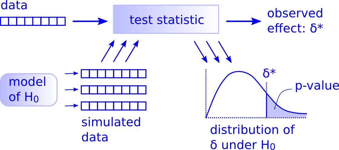
The main difference here is that we create the distribution of the data under the null hypothesis using simulation instead of relying on a reference distribution. It’s intuitive, powerful, and fun.
Imagine we have just designed a benchtop experiment in which we intend to measure the pressure (in mm Hg) at which a pair of overlapped stent grafts started to migrate or disconnect when deployed in a large thoracic aneurysm. 2
A common null hypothesis for comparing groups is that there is no difference between them. Under this model, we can treat all the experimental data as one big group instead of 2 different groups. We therefore pool the data from our completed experiment into one big group, shuffle it, and randomly assign data points into two groups of the original size. This is our generative model. After each round of permutation and assignment, we calculate and store the test statistic for the observed effect (difference in means between the two groups). Once many simulations have been completed, we’ll see where our true data falls relative to the virtual data.
One way to setup and execute a simulation-based NHST for comparing two groups in R is as follows (note: there are quicker shortcuts to executing this type of testing but the long version below allows for customization, visualization, and adjust-ability):
First, we read in the libraries and transcribe the benchtop data into R and evaluate sample size
library(tidyverse)
library(cowplot)
library(knitr)
library(kableExtra)
#Migration pressure for predicate device
predicate <- c(186, 188, 189, 189, 192, 193, 194, 194, 194, 195, 195, 196, 196, 197, 197, 198, 198, 199, 199, 201, 206, 207, 210, 213, 216, 218)
#Migration pressure for next_gen device
next_gen <- c(189, 190, 192, 193, 193, 196, 199, 199, 199, 202, 203, 204, 205, 206, 206, 207, 208, 208, 210, 210, 212, 214, 216, 216, 217, 218)| Sample Size of Predicate Device Data: 26 |
| Sample Size of Next-Gen Device Data: 26 |
So we have slightly uneven groups and relatively small sample sizes. No problem - assign each group to a variable and convert to tibble format:
#Assign variables for each group and convert to tibble
predicate_tbl <- tibble(Device = "Predicate",
                        Pressure = predicate)

next_gen_tbl <- tibble(Device = "Next_Gen",
                        Pressure = next_gen)
Combine predicate and next_gen data into a single, pooled group called results_tbl. Taking a look at the first few and last few rows in the pooled tibble confirm it was combined appropriately.
#Combine in tibble
results_tbl <- bind_rows(predicate_tbl, next_gen_tbl)
results_tbl %>%
  head() %>%
kable(align = rep("c",2))| Device | Pressure |
|---|---|
| Predicate | 186 |
| Predicate | 188 |
| Predicate | 189 |
| Predicate | 189 |
| Predicate | 192 |
| Predicate | 193 |
results_tbl %>% tail() %>%
  head() %>%
kable(align = rep("c",2))| Device | Pressure |
|---|---|
| Next_Gen | 212 |
| Next_Gen | 214 |
| Next_Gen | 216 |
| Next_Gen | 216 |
| Next_Gen | 217 |
| Next_Gen | 218 |
Now we do some exploratory data analysis to identify general shape and distribution.
# Visualize w/ basic boxplot
boxplot_eda <- results_tbl %>%
    ggplot(aes(x=Device, y=Pressure)) +
    geom_boxplot(
        alpha  = .6,
        width  = .4,
        size   = .8,
        fatten = .5,
        fill   = c("#FDE725FF","#20A486FF")) +
    labs(
        y        = "Pressure (mm Hg)",
        title    = "Predicate and Next-Gen Data",
        subtitle = "Modular Disconnect Pressure"
    )

boxplot_eda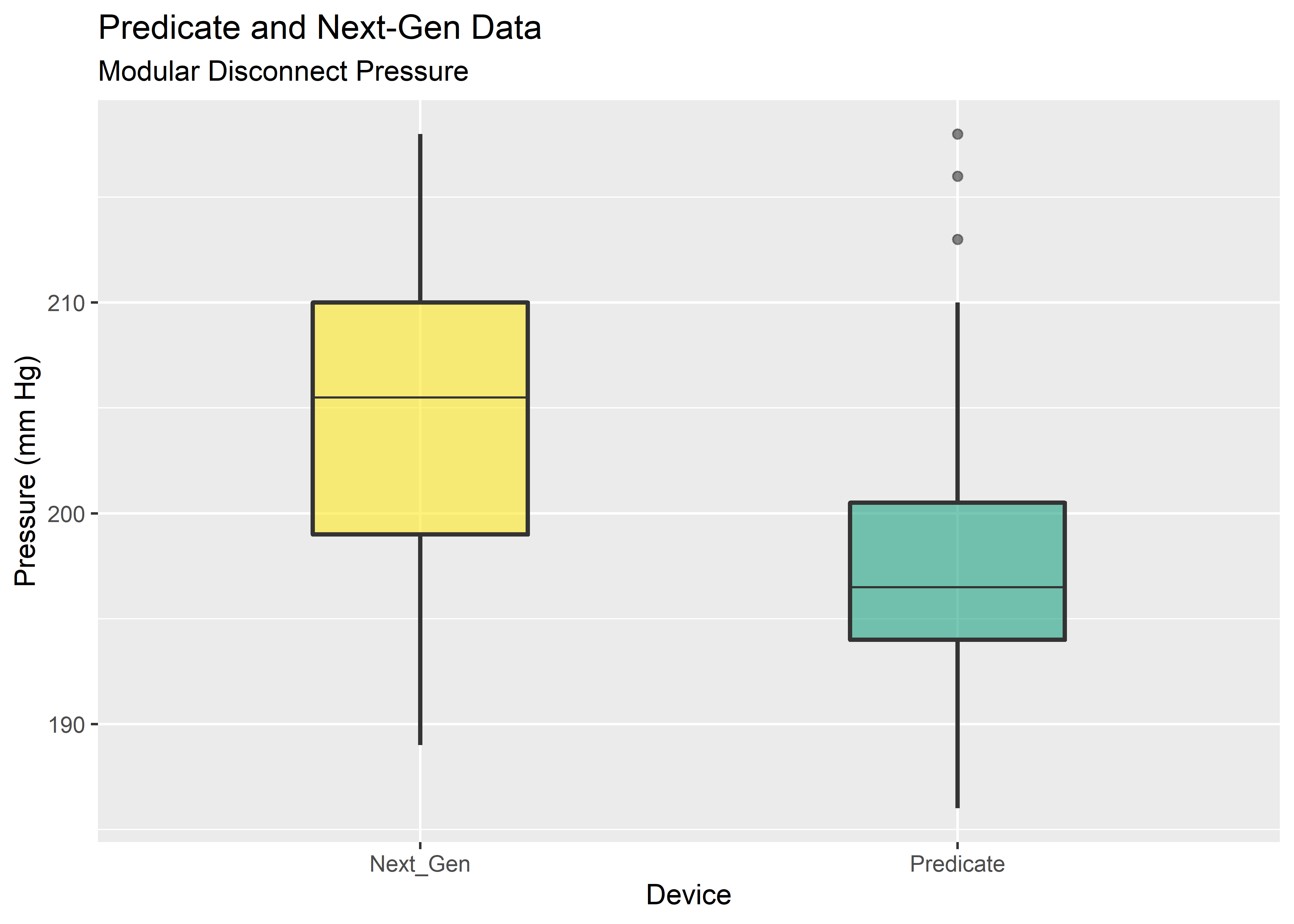
#Visualize with density plot
density_eda <- results_tbl %>%
    ggplot(aes(x = Pressure)) +
    geom_density(aes(fill = Device),
        color = "black",
        alpha = 0.6
        ) +
    scale_fill_manual(values = c("#FDE725FF","#20A486FF")) +
    labs(
        x        = "Pressure (mm Hg)",
        title    = "Predicate and Next-Gen Data",
        subtitle = "Modular Disconnect Pressure"
    )

density_eda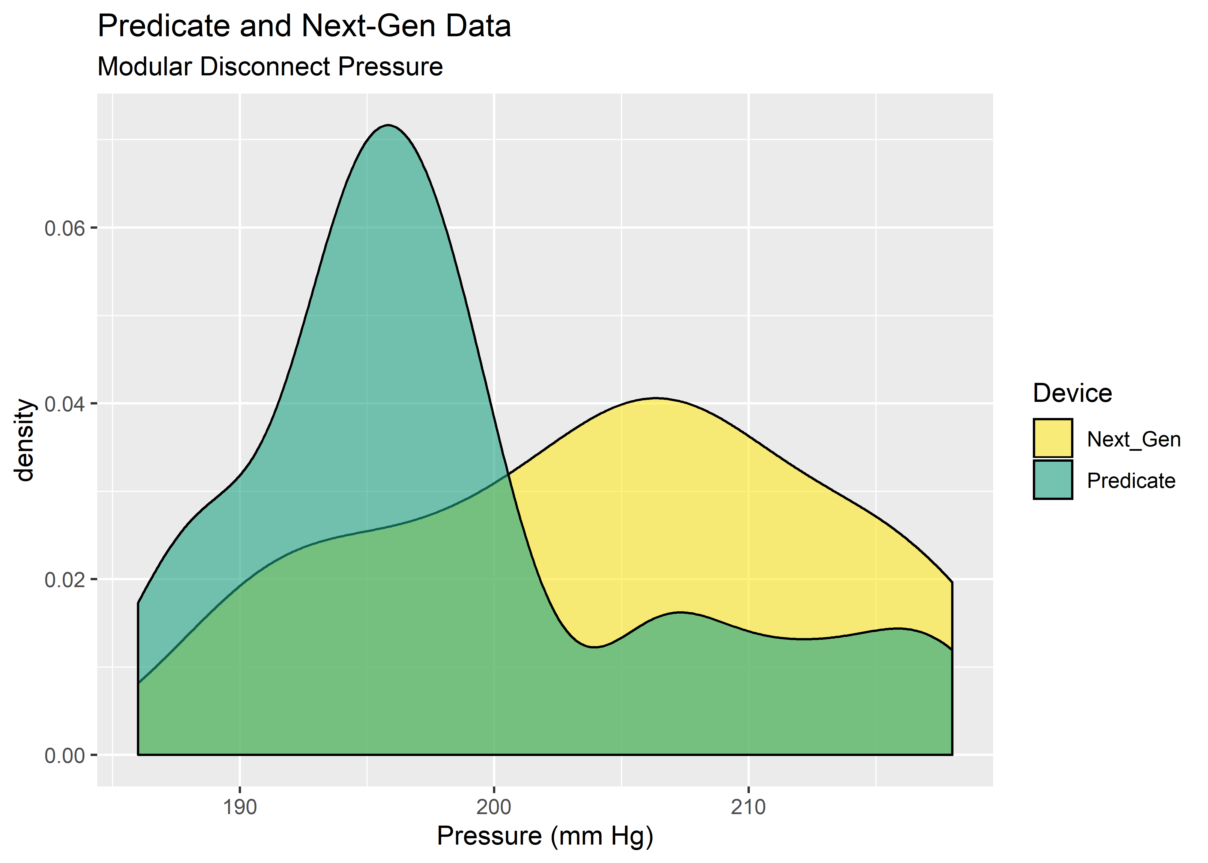
Yikes! These data do not look normal. Fortunately, the permutation test does not need the data to take on any particular distribution. The main assumption is exchangability, meaning it must be reasonable that the labels could be arbitrarily permuted under the null hypothesis. Provided the sample size is approximately equal, the permutation test is robust against unequal variances.3 This gives us an attractive option for data shaped as shown above.
To get started with our permutation test we create a function that accepts 3 arguments: the pooled data from all trials in our benchtop experiment (x), the number of observations taken from Group 1 (n1), and the number of observations taken from Group 2 (n2). The function creates an object containing indices 1:n, then randomly assigns indices into two Groups A and B with sizes to match the original group sizes. It then uses the randomly assigned indices to splice the dataset x producing 2 “shuffled” groups from the original data. Finally, it computes and returns the mean between the 2 randomly assigned groups.
#Function to permute vector indices and then compute difference in group means
perm_fun <- function(x, n1, n2){
  n <- n1 + n2
  group_B <- sample(1:n, n1)
  group_A <- setdiff(1:n, group_B)
  mean_diff <- mean(x[group_B] - mean(x[group_A]))
  return(mean_diff)
}
Here we initialize an dummy vector called perm_diffs to hold the results of the loop we are about to use. It’ll have all 0’s to start and then we’ll assign values from each iteration of the for loop.
#Set number of simulations to run
n_sims <- 10000

#Initialize empty vector
perm_diffs <- rep(0,n_sims)
perm_diffs %>% head()  %>%
kable(align = "c", col.names = NULL)| 0 |
| 0 |
| 0 |
| 0 |
| 0 |
| 0 |
Set up a simple for loop to execute the same evaluation using perm_fun() 10,000 times. On each iteration, we’ll store the results into the corresponding index within perm_diffs that we initialized above.
#Set seed for reproducibility
set.seed(2015)

#Iterate over desired number of simulations using permutation function
for (i in 1:n_sims)
  perm_diffs[i] = perm_fun(results_tbl$Pressure, 26, 26)
Now we have 10,000 replicates of our permutation test stored in perm_diffs. We want to visualize the data with ggplot so we convert it into a tibble frame using tibble().
#Convert results to a tibble and look at it
perm_diffs_df <- tibble(perm_diffs)
perm_diffs_df %>% head()  %>%
kable(align = "c")| perm_diffs |
|---|
| -0.6153846 |
| -3.3076923 |
| 0.6923077 |
| -2.3846154 |
| -0.3076923 |
| 3.1538462 |
Visualize the difference in means as a histogram and density plot:
#Visualize difference in means as a histogram
diffs_histogram_plot <- perm_diffs_df %>% ggplot(aes(perm_diffs)) +
  geom_histogram(fill = "#2c3e50", color = "white", binwidth = .3, alpha = 0.8) +
    labs(
        x = "Pressure (mm Hg)",
        title = "Histogram of Difference in Means",
        subtitle = "Generated Under Null Hypothesis"
    )

#Visualize difference in means as a density plot
diffs_density_plot <-  perm_diffs_df %>% ggplot(aes(perm_diffs)) +
  geom_density(fill = "#2c3e50", color = "white", alpha = 0.8) +
     labs(
        x = "Pressure (mm Hg)",
        title = "Density Plot of Difference in Means",
        subtitle = "Generated Under Null Hypothesis"
    )

plot_grid(diffs_histogram_plot, diffs_density_plot)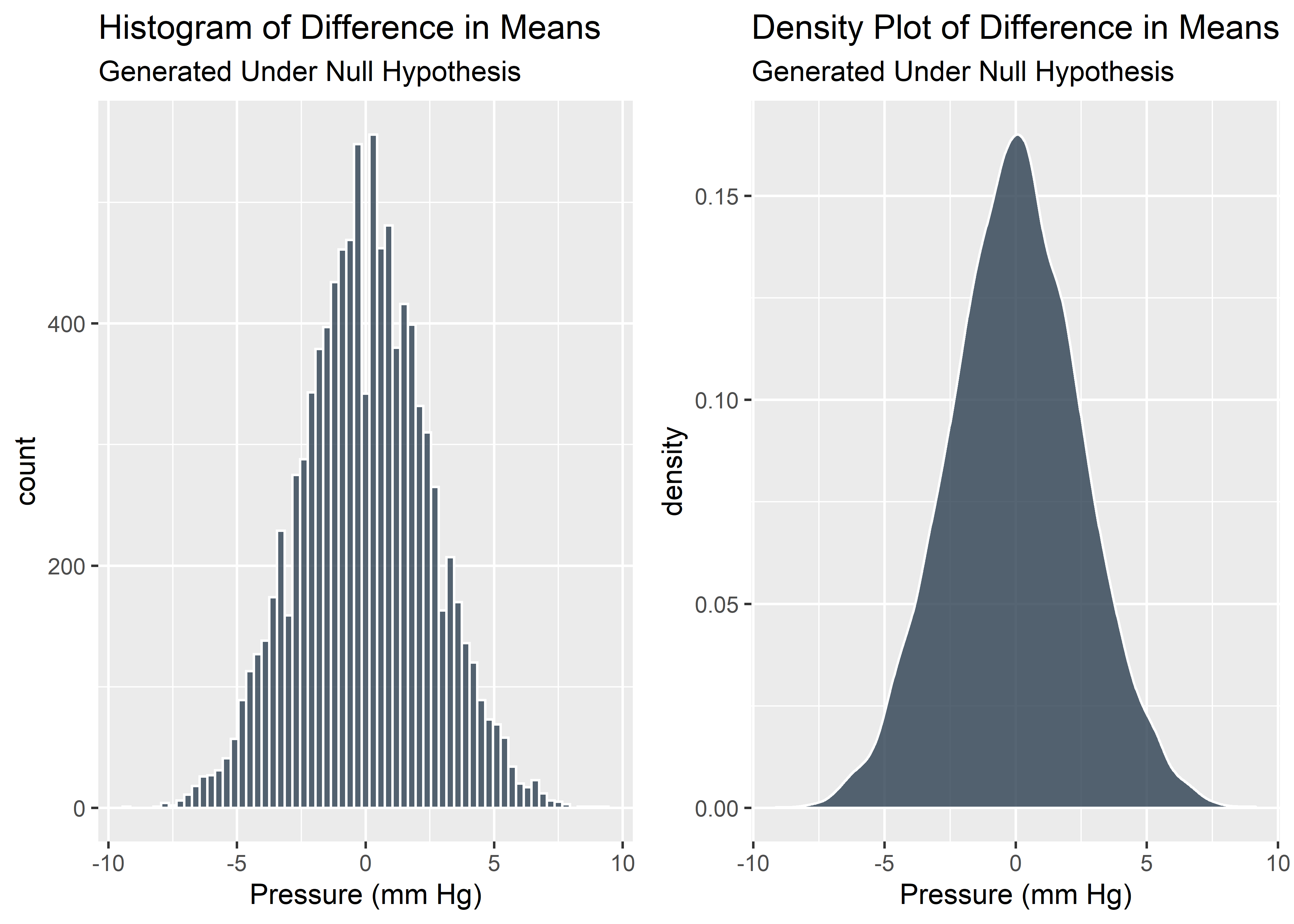
We just simulated many tests from the null hypothesis. These virtual data give us a good understanding of what sort of difference in means we might observe if there truly was no difference between the groups. As expected, most of the time the difference is around 0. But occasionally there is a noticeable difference in means just due to chance.
But how big was the difference in means from our real world dataset? We’ll call this “baseline difference”.
#Evaluate difference in means from true data set
predicate_pressure_mean <- mean(predicate_tbl$Pressure)
next_gen_pressure_mean <- mean(next_gen_tbl$Pressure)

baseline_difference <- predicate_pressure_mean - next_gen_pressure_mean
baseline_difference  %>%
  signif(digits = 3) %>%
kable(align = "c", col.names = NULL)| -5.85 |
So our real, observed data show a difference in means of -5.85. Is this large or small? With the context of the shuffle testing we already performed, we know exactly how extreme our observed data is and can visualize it with a vertical line.
#Visualize real data in context of simulations
g1 <- diffs_histogram_plot +
  geom_vline(xintercept = baseline_difference,
             linetype   = "dotted",
             color      = "#2c3e50",
             size       = 1
             )

g2 <- diffs_density_plot +
  geom_vline(xintercept = baseline_difference,
             linetype   ="dotted",
             color      = "#2c3e50",
             size       = 1
             )

plot_grid(g1,g2)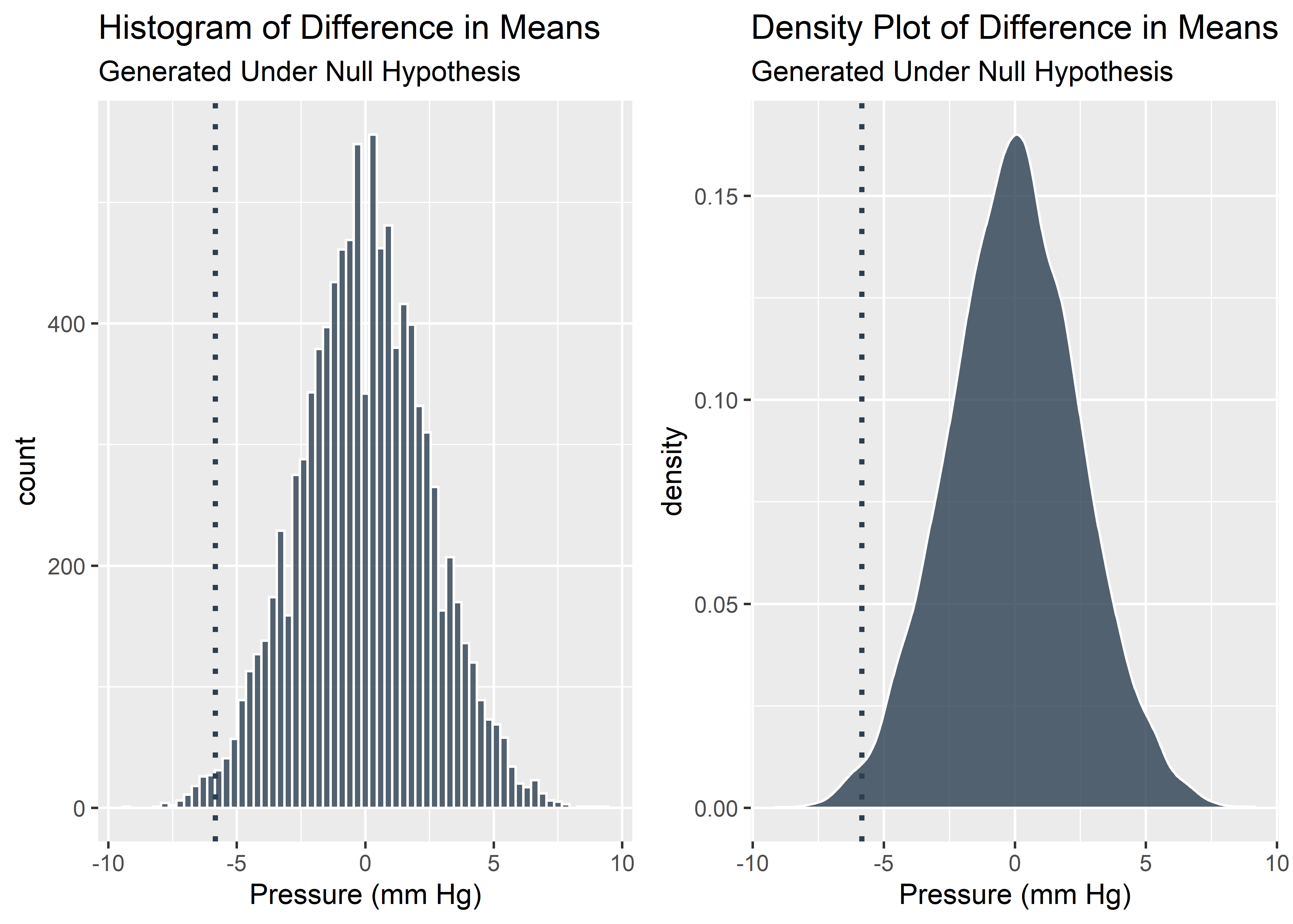
It looks like the our benchtop data was pretty extreme relative to the null. We should start to consider the possibility that this effect was not due solely to chance alone. 0.05 is a commonly used threshold for declaring statistical significance. Let’s see if our data is more or less extreme than 0.05 (solid line).
#Calculate the 5% quantile of the simulated distribution for difference in means
the_five_percent_quantile <- quantile(perm_diffs_df$perm_diffs, probs = 0.05)
the_five_percent_quantile
## 5%
## -4.153846#Visualize the 5% quantile on the histogram and density plots
g3 <- g1 +
geom_vline(xintercept = the_five_percent_quantile,
color = "#2c3e50",
size = 1
)
g4 <- g2 +
geom_vline(xintercept = the_five_percent_quantile,
color = "#2c3e50",
size = 1
)
plot_grid(g3,g4)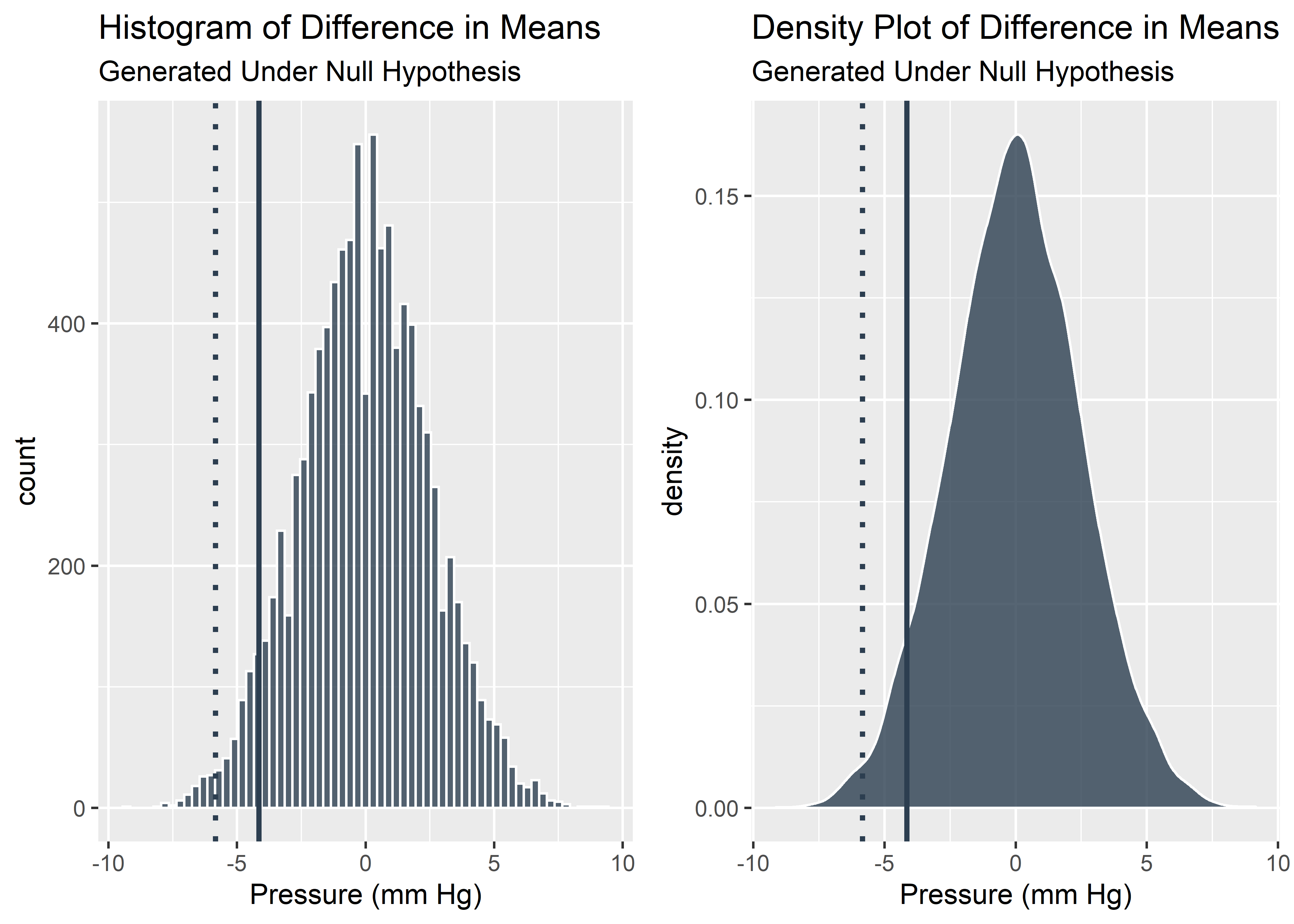
We can see here that our data is more extreme than the 5% quantile which means our p-value is less than 0.05. This satisfies the traditional, frequentist definition of statistically significant. If we want to actual p-value, we have to determine the percentage of simulated data that are as extreme or more extreme than our observed data.
#Calculate percentage of simulations as extreme or more extreme than the observed data (p-value)
p_value <- perm_diffs_df %>%
    filter(perm_diffs <= baseline_difference) %>%
    nrow() / n_sims

paste("The empirical p-value is: ", p_value)  %>%
kable(align = "c", col.names = NULL)| The empirical p-value is: 0.0096 |
Our p-value is well below 0.05. This is likely enough evidence for us to claim that there was a statistically significant difference observed between the Next Gen device and the predicate device.
Our marketing team will be thrilled, but we should always be wary that statistically significant does not mean practically important. Domain knowledge should provide the context to interpret the relevance of the observed difference. A difference in mean Pressure of a few mm Hg seems to be enough to claim a statistically significant improvement in our new device vs. the predicate, but is it enough for our marketing team to make a meaningful campaign? In reality, a few mm Hg is noticeable on the bench but is likely lost in the noise of anatomical variation within real patient anatomies.
Probably Overthinking It, http://allendowney.blogspot.com/2016/06/there-is-still-only-one-test.html↩
J ENDOVASC THER 2011;18:559-568, open access https://www.ncbi.nlm.nih.gov/pmc/articles/PMC3163409/↩
Simulations and Explanation of Unequal Variance and Sample Sizes, https://stats.stackexchange.com/questions/87215/does-a-big-difference-in-sample-sizes-together-with-a-difference-in-variances-ma↩