When doing comparative testing it can be tempting to stop when we see the result that we hoped for. In the case of null hypothesis significance testing (NHST), the desired outcome is often a p-value of < .05. In the medical device industry, bench top testing can cost a lot of money. Why not just recalculate the p-value after every test and stop when the p-value reaches .05? The reason is that the confidence statement attached to your testing is only valid for a specific stopping rule. In other words, to achieve the desired false positive rate we must continue testing speciments until the pre-determined sample size is reached. Evaluating the p-value as you proceed through the testing is known as “peeking” and it’s a statistical no-no.
Suppose we are attempting to demonstrate that a raw material provided by a new vendor results in better corrosion resistance in finished stents relative to the standard supplier. A bench top test is set up to measure the breakdown potential of each sample in a cyclic potentiodynamic polarization (CPP) test. Our goal is to compare the means of the CPP data from the old supplier and the new supplier. The null hypothesis is that the means are equivalent and if the t-test results in a p-value of .05 or lower then we will reject the null and claim improved performance. What happens to the p-value over the course of the testing? We can run a simulation to monitor the p-value and calculate the effect of peeking on the long-term false positive rate. For the test to perform as intended, the long-term false positive rate should be controlled at a level equal to (1 - confidence level).
library(tidyverse)
library(knitr)
library(kableExtra)
First, initialize the objects to hold the data and establish any constants we might need later.
#Initial offset constant to keep minimum group size at n=6
INITIAL_OFFSET <- 5

#Initial values for number of inner and outer loop iterations
n_inner_loop <- 50
n_inner_data <- n_inner_loop + INITIAL_OFFSET
n_outer <- 100

#Initialize empty vector to store p values
store_p_values_vec <- rep(NA, n_inner_loop)

#Initialize a tibble with placeholder column
many_runs_tbl <-  tibble(
  V1 = rep(NA,  n_inner_loop)
  )
The simulation requires 2 for loops. The inner loop performs a series of t-test adding 1 more experimental observation to each group after each iteration. The p-value for that iteration is extracted and stored. In the outer loop, the initial data for the 2 groups are generated randomly from normal distributions. Since we can’t really run a t-test on groups with very low sample sizes, we use an initial offset value so that the t-test loops don’t start until both groups have a few observations from which to calculate the means.
The p-value for a traditional t-test should be an indication of the long-term false positive rate. In other words: if we ran a t-test on samples drawn from 2 identical populations many times we would see a few large differences in means simply due to chance draws. Among all such simulations, the value at the 95% quantile represents the p-value of .05.
We can gut-check our simulation in this way by setting the two populations identical to each other and drawing random values in the outer loop as mentioned above.
#Set seed for repeatability
set.seed(1234)

#Outer loop: replicates a t-test between 2 groups
for(l in 1:n_outer) {

    #Generate simulated data for each group.  The parameters are set the same to represent 1 population
    example_group_1 <- rnorm(n = n_inner_data, mean = 10, sd = 4)
    example_group_2 <- rnorm(n = n_inner_data, mean = 10, sd = 4)

    #Inner loop: subset the first (i + initial offset) values from grp 1 and grp 2 (y)
    #Perform t-test, extract p-value, store in a vector
    #Increment each group's size by 1 after each iteration
    for (i in 1:n_inner_loop) {
    t_test_obj <- t.test(x = example_group_1[1:(INITIAL_OFFSET + i)], y = example_group_2[1:(INITIAL_OFFSET + i)])
    store_p_values_vec[i] = t_test_obj$p.value
  }

    #Store each vector of n_inner_loop p-values to a column in the many_runs_tbl
    many_runs_tbl[,l] <- store_p_values_vec
}

#visualize tibble
many_runs_tbl[,1:12] %>%
  signif(digits = 3) %>%
  head(10) %>%
kable(align=rep('c', 100))| V1 | V2 | V3 | V4 | V5 | V6 | V7 | V8 | V9 | V10 | V11 | V12 |
|---|---|---|---|---|---|---|---|---|---|---|---|
| 0.3960 | 0.0990 | 0.204 | 0.412 | 0.0686 | 0.1450 | 0.894 | 0.360 | 0.721 | 0.897 | 0.0535 | 0.668 |
| 0.1700 | 0.0628 | 0.106 | 0.951 | 0.2240 | 0.0834 | 0.802 | 0.614 | 0.750 | 0.886 | 0.3170 | 0.517 |
| 0.1410 | 0.0929 | 0.057 | 0.618 | 0.1360 | 0.0296 | 0.499 | 0.561 | 0.846 | 0.809 | 0.1740 | 0.410 |
| 0.1560 | 0.4050 | 0.146 | 0.800 | 0.1690 | 0.0625 | 0.724 | 0.700 | 0.857 | 0.687 | 0.3620 | 0.338 |
| 0.1140 | 0.2610 | 0.104 | 0.992 | 0.2550 | 0.1860 | 0.548 | 0.846 | 0.727 | 0.911 | 0.4270 | 0.334 |
| 0.0540 | 0.3400 | 0.143 | 0.889 | 0.3180 | 0.1740 | 0.775 | 0.768 | 0.795 | 0.666 | 0.5630 | 0.229 |
| 0.0693 | 0.4030 | 0.125 | 0.871 | 0.7340 | 0.0757 | 0.826 | 0.792 | 0.704 | 0.755 | 0.4810 | 0.694 |
| 0.0324 | 0.4050 | 0.181 | 0.930 | 0.8630 | 0.0617 | 0.738 | 0.564 | 0.501 | 0.611 | 0.3930 | 0.472 |
| 0.0206 | 0.4550 | 0.112 | 0.912 | 0.7560 | 0.0958 | 0.644 | 0.708 | 0.265 | 0.687 | 0.2520 | 0.638 |
| 0.0294 | 0.6690 | 0.103 | 0.777 | 0.8680 | 0.1700 | 0.664 | 0.703 | 0.284 | 0.912 | 0.2450 | 0.441 |
Each column above represents n=50 p-values, with each successive value calculated after observing the newest data point in the simulated test sequence. These are the p-values we see if we peek at the calculation every time.
We need to convert data into tidy format for better visualization. In the tidy format, every column should be a unique variable. The gather() function converts data from wide to long by adding a new variable called “rep_sim_number” and combining all the various runs from 1 to 100 in a single column. In total, we’ll have only 3 columns in the tidy version.
#add new column with row id numbers
final_runs_tbl <- many_runs_tbl %>%
    mutate(row_id = row_number()) %>%
    select(row_id, everything())

#convert from wide format (untidy) to long (tidy) using gather()
final_runs_tidy_tbl <- final_runs_tbl %>% gather(key = "rep_sim_number", value = "p_value", -row_id)

#visualize tidy data structure
final_runs_tidy_tbl %>%
  head(10) %>%
kable(align=rep('c', 3))| row_id | rep_sim_number | p_value |
|---|---|---|
| 1 | V1 | 0.3963352 |
| 2 | V1 | 0.1704697 |
| 3 | V1 | 0.1414021 |
| 4 | V1 | 0.1557261 |
| 5 | V1 | 0.1141854 |
| 6 | V1 | 0.0539595 |
| 7 | V1 | 0.0693410 |
| 8 | V1 | 0.0324232 |
| 9 | V1 | 0.0205511 |
| 10 | V1 | 0.0293952 |
final_runs_tidy_tbl %>%
  tail(10) %>%
kable(align=rep('c', 3))| row_id | rep_sim_number | p_value |
|---|---|---|
| 41 | V100 | 0.0515933 |
| 42 | V100 | 0.0509430 |
| 43 | V100 | 0.0386845 |
| 44 | V100 | 0.0567804 |
| 45 | V100 | 0.0762953 |
| 46 | V100 | 0.0933081 |
| 47 | V100 | 0.0755494 |
| 48 | V100 | 0.0558263 |
| 49 | V100 | 0.0731072 |
| 50 | V100 | 0.0496300 |
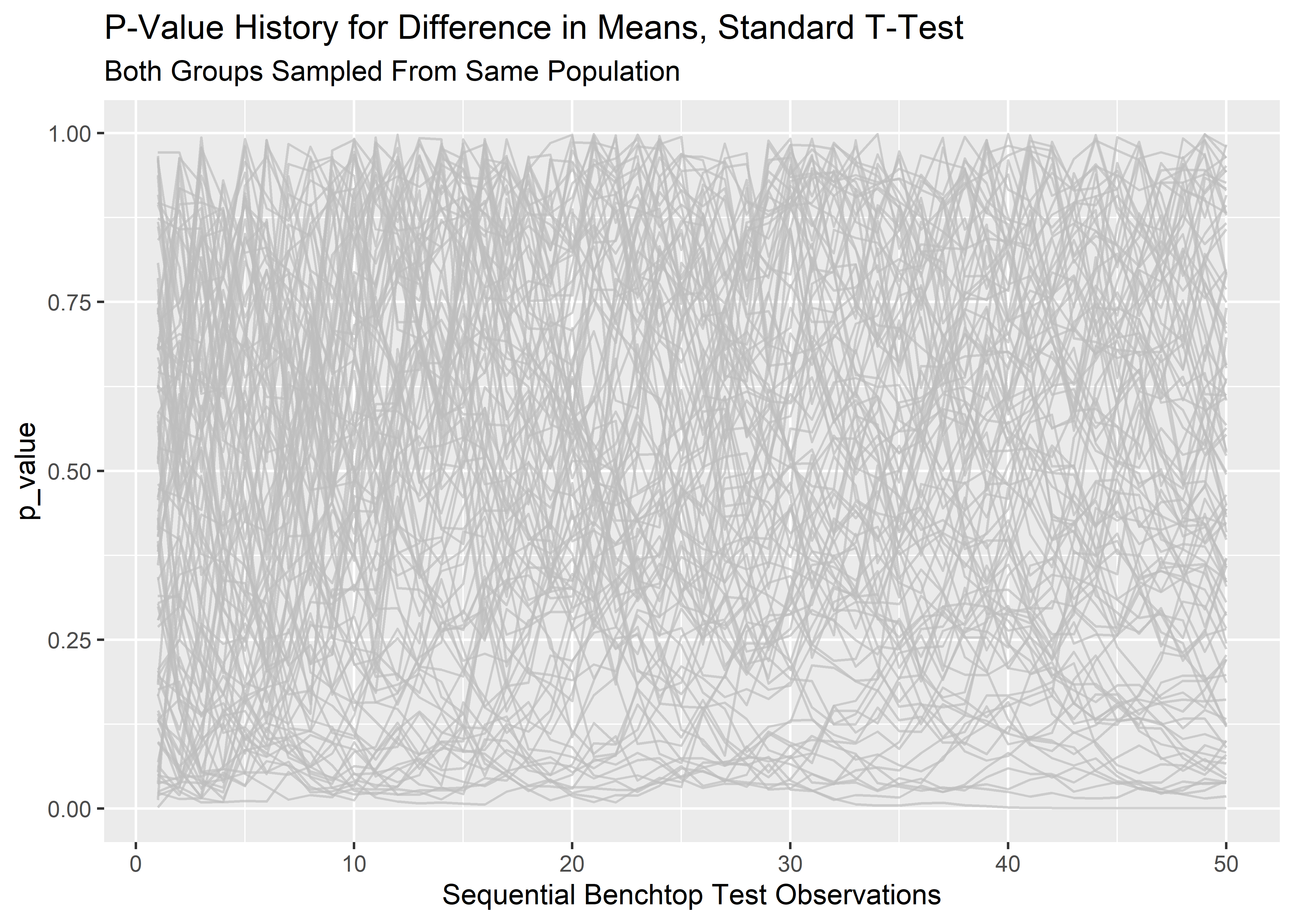
From here it is straightforward to visualize the trajectory of the p-values through the course of the testing for all 100 simulations.
#visualize history of n_outer p-values across n_inner_loop consecutive data points as lineplot
lp_1 <- final_runs_tidy_tbl %>% ggplot(aes(x = row_id, y = p_value, group = rep_sim_number)) +
  geom_line(show.legend = "none",
            color       = "grey",
            alpha       = 0.7) +
  labs(x        = "Sequential Benchtop Test Observations",
       title    = "P-Value History for Difference in Means, Standard T-Test",
       subtitle = "Both Groups Sampled From Same Population"
       )

lp_1
The p-values are all over the place! It makes sense that at the pre-determined stopping point (n=50) we would have a spread of p-values since the population parameters for the two groups were identical and p should only rarely land below .05. However, this visualization makes it clear that prior to the stopping point, the path of any particular p-value fluctuates wildly. This is the reason why we can’t stop early or peek!
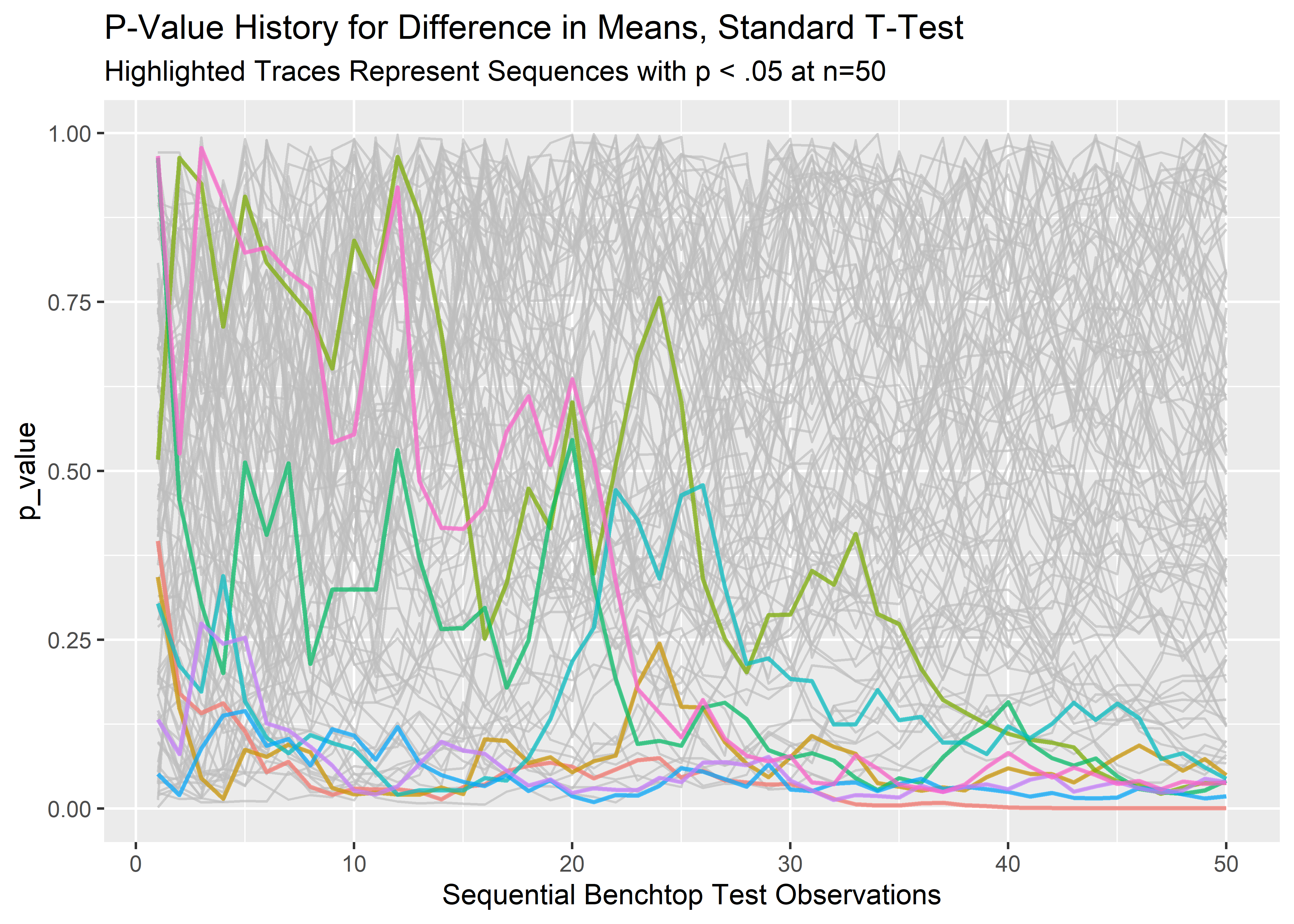
Let’s take a look at the false positives, defined here as the runs where the p-value ended up less than or equal to .05 at the pre-determined stopping point of n=50.
#filter for runs that ended in false positives (p < .05) at the last data point
filtered_endpoint_tbl <- final_runs_tidy_tbl %>%
    filter(row_id == 50,
           p_value <= 0.05) %>%
    select(rep_sim_number) %>%
    rename("false_positives" = rep_sim_number)

filtered_endpoint_tbl %>%
  head(10) %>%
  kable(align='c') %>%
kable_styling(full_width = FALSE)| false_positives |
|---|
| V1 |
| V23 |
| V48 |
| V54 |
| V77 |
| V86 |
| V89 |
| V100 |
So 8 out of 100 simulations have p-values < .05. This is about as expected since the long term false positive rate should be 5%. Having now identified the false positives, we can visualize the trajectory of their p-values after obtaining each successive data point. This is what happens when we peek early or stop the test when we first see a desired outcome. The following code pulls the full history of the false positive test sequences so we can see their paths before the stopping point.
#extract full false positive test histories.  %in% filters rows that match anything in the false_positives vector
full_low_runs_tbl <- final_runs_tidy_tbl %>%
    filter(rep_sim_number %in% filtered_endpoint_tbl$false_positives)

#visualize trajectory of false positives by highlighting their traces
lp_2 <- final_runs_tidy_tbl %>%
    ggplot(aes(x = row_id, y = p_value, group = rep_sim_number)) +
    geom_line(alpha = 0.7, show.legend = FALSE, color = "grey") +
    geom_line(aes(color = rep_sim_number), data = full_low_runs_tbl, show.legend = FALSE, size = .8, alpha = 0.7) +
    labs(x       = "Sequential Benchtop Test Observations",
        title    = "P-Value History for Difference in Means, Standard T-Test",
        subtitle = "Highlighted Traces Represent Sequences with p < .05 at n=50"
        )

lp_2
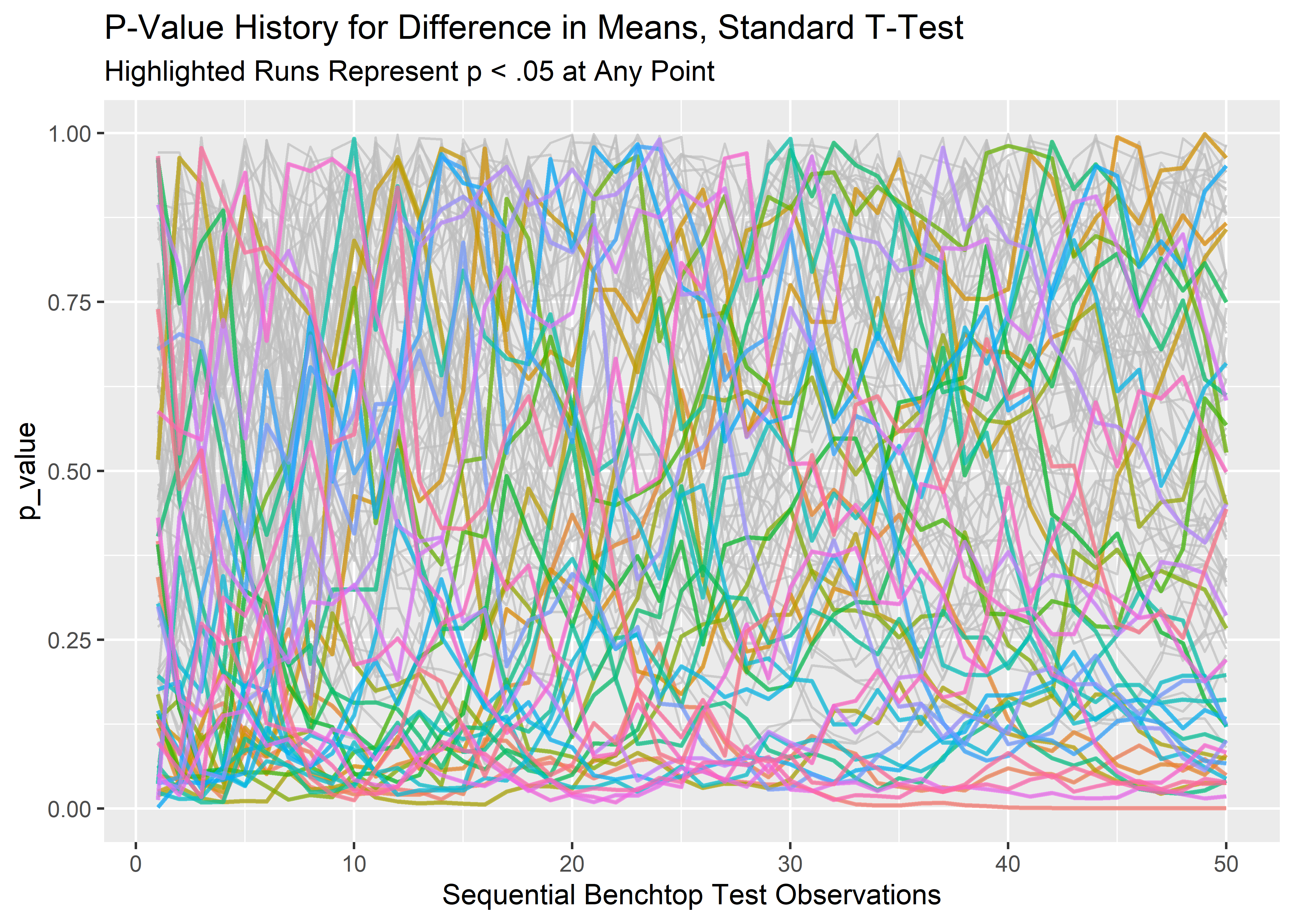
Indeed, the p-values that end up less than .05 do not take a straight line path to get there. Likewise, there may be tests that dip below p=.05 at some point but culminate well above .05 at the pre-determined stopping point. These represent additional false-positives we invite when we peek or stop early. Let’s identify and count these:
#filter for all run who's p-value ever dipped to .05 or lower at any point
low_p_tbl <- final_runs_tidy_tbl %>%
    filter(p_value <= .05) %>%
    distinct(rep_sim_number)

#visualize
low_p_tbl %>%
  head(10) %>%
  kable(align='c') %>%
kable_styling(full_width = FALSE)| rep_sim_number |
|---|
| V1 |
| V6 |
| V7 |
| V16 |
| V17 |
| V20 |
| V21 |
| V23 |
| V30 |
| V33 |
#count total number of false positives with peeking
low_p_tbl %>% nrow() %>%
  kable(align = "c") %>%
kable_styling(full_width = FALSE)| x |
|---|
| 37 |
The false positives go from 8 to 37!
#filter for only the rows where rep_sim_number here matches at least 1 value from low_p_tbl$rep_sim_number
#this extracts the full history of runs who's p-value dipped to .05 or lower at any point
any_low_runs_tbl <- final_runs_tidy_tbl %>%
    filter(rep_sim_number %in% low_p_tbl$rep_sim_number)

#visualize
any_low_runs_tbl %>%
  head(10) %>%
kable(align = rep("c", 3))| row_id | rep_sim_number | p_value |
|---|---|---|
| 1 | V1 | 0.3963352 |
| 2 | V1 | 0.1704697 |
| 3 | V1 | 0.1414021 |
| 4 | V1 | 0.1557261 |
| 5 | V1 | 0.1141854 |
| 6 | V1 | 0.0539595 |
| 7 | V1 | 0.0693410 |
| 8 | V1 | 0.0324232 |
| 9 | V1 | 0.0205511 |
| 10 | V1 | 0.0293952 |
#visualize the trajectory or runs that dipped to .05 or below
lp_3 <- final_runs_tidy_tbl %>%
    ggplot(aes(x = row_id, y = p_value, group = rep_sim_number)) +
    geom_line(alpha = 0.7, show.legend = FALSE, color = "grey") +
    geom_line(aes(color = rep_sim_number), data = any_low_runs_tbl, show.legend = FALSE, size = .8, alpha = 0.7) +
    labs(x       = "Sequential Benchtop Test Observations",
        title    = "P-Value History for Difference in Means, Standard T-Test",
        subtitle = "Highlighted Runs Represent p < .05 at Any Point"
        )

lp_3
All these differences in means would be considered significant if we don’t observe our pre-determined stopping rule. This could be a big deal. We might claim a performance benefit when there is none, or waste precious time and money trying to figure out why we can’t replicate an earlier experiment!
Thanks for reading.