In this post we will try to trick linear regression into thinking that a redundant variable is statistically significant. By redundant, I mean a candidate predictor variable that in reality is just noise (no effect on the outcome) but that we might include in an experiment because we don’t know if it is important or not. The trick is that we can set up the data generating process such that a redundant variable is highly correlated with the response. In such cases, the naive intuition is that the model would get “confused” about the importance of this variable and perhaps identify it as significant, just as a casual observer might when viewing plots of variable vs. outcome, given that rise and fall together.
It is commonly said that one should consider removing variables from the model when they are highly correlated to each other…but why? Because it messes with your model’s predictions? Because it messes with the estimation of the variable coefficients? Perhaps the uncertainty around the estimates? Let’s use the a simulation to see…
Load Libraries
library(tidyverse)
library(here)
library(broom)
library(gt)
library(GGally)
We’re going to build this dataset from scratch because we want to control the coefficients of each variable and also the overall effect size. There is going to be one numeric outcome and multiple predictor variables which puts us squarely in the realm of multiple regression. The model for MR is shown below:
\(Y_i = \beta_0 + \beta_1 X_{i1} + \beta_2 X_{i2} + \ldots + \beta_p X_{ip} + \epsilon_i\)
for each observation \(i = 1, ... , n\).
In the formula above we consider n observations of one dependent variable and \(p\) independent variables. Thus, \(Yi\) is the \(i\)th observation of the dependent variable, \(Xij\) is \(i\)th observation of the \(j\)th independent variable, \(j = 1, 2, ..., p\). The values \(βj\) represent parameters to be estimated, and \(εi\) is the \(i\)th independent identically distributed normal error.1
Let’s start by setting up some placeholder columns to hold the beta coefficients and the values of the x’s (predictors variables). Thinking ahead, we’ll want to be working row-wise to combine the coefficients, x’s, and error in order to generate an observation \(y\) for each row. Note that the values for the \(x\)`’s are just placeholders; we’ll assign them values after getting the structure of our dataframe into good shape. We’ll make 10 predictor variables total and 10 coefficients to go with them - a relatively large but still reasonable number of variables for a benchtop experiment in the medical device domain. The first coefficient is set to 1 so that the value of that variable will have a real, causal impact on the outcome. All other coefficients are set to zero, meaning they have no true effect with respect to generating the observations.
betas_tbl <- tibble(
  var_prefix = rep("b", 10),
  var_suffix = seq(from = 1, to = 10, by = 1)
) %>%
  mutate(var = str_glue("{var_prefix}_{var_suffix}") %>% as_factor()) %>%
  select(var) %>%
  mutate(case_1 = c(1, rep(0, 9))) %>%
  pivot_wider(names_from = "var", values_from = "case_1")

x_tbl <- tibble(
  var_prefix = rep("x", 10),
  var_suffix = seq(from = 1, to = 10, by = 1)
) %>%
  mutate(var = str_glue("{var_prefix}_{var_suffix}") %>% as_factor()) %>%
  select(var) %>%
  mutate(case_1 = rep(0, 10)) %>%
  pivot_wider(names_from = "var", values_from = "case_1")

betas_tbl %>%
gt()| b_1 | b_2 | b_3 | b_4 | b_5 | b_6 | b_7 | b_8 | b_9 | b_10 |
|---|---|---|---|---|---|---|---|---|---|
| 1 | 0 | 0 | 0 | 0 | 0 | 0 | 0 | 0 | 0 |
x_tbl %>%
gt()| x_1 | x_2 | x_3 | x_4 | x_5 | x_6 | x_7 | x_8 | x_9 | x_10 |
|---|---|---|---|---|---|---|---|---|---|
| 0 | 0 | 0 | 0 | 0 | 0 | 0 | 0 | 0 | 0 |
Now that we have placeholders set up to handle our eventual row-wise operations, we can proceed with populating the values for the observed variables \(X_{i}\) and the residuals \(εi\) and then eventually assembling the set of observations.2 After combining the columns using bind_cols() we use slice() to copy the setup structure many times, making a duplicate row for each instance (set by the each argument). The setup is consistent with the tidy format for data structures, where each row is an observation.
After replicating the setup, we use rowwise() to group by individual rows and allow our random number generation to be unique for each row. The next step is to replace the \(X\) values with a random number from the standard normal distribution by mutating across the \(X\) columns.
Now to the part where we try to trick the algorithm. The line mutate(x_2 = x_1 + rnorm(n=1, mean = 0, sd = 1)) replaces the randomly drawn \(X_2\) value from above with the exact value drawn for the one true predictor \(X_1\) plus a little noise. This is the critical step to our deception because we can see that \(X_2\) is still not involved with the data generation process since it gets multiplied to \(β_2\) (zero) before getting added into the observation. However, it will still be correlated with the true predictor \(X_1\) and also the observation \(Y_i\).
After laying the trap, we move on to combining the \(X\)s and the \(β\)s before adding a residual error term through resid = rnorm(1, mean = 0, sd = residual_sd)). The last step is to add up the bx and resid values to make the observation using rowSums.
set.seed(08062021)

residual_sd <- 1 # controls effect size
number_of_obserations <- 100 # number of observations we want in the dataset

full_wide_tbl <- betas_tbl %>%
  bind_cols(x_tbl) %>%
  slice(rep(1:n(), each = number_of_obserations)) %>% # copy the setup once for each desired observation in the dataset
  rowwise() %>%
  mutate(across(x_1:x_10, ~ rnorm(1, mean = 0, sd = 1))) %>% # assign x values
  mutate(x_2 = x_1 + rnorm(n = 1, mean = 0, sd = 1)) %>% # modify X_2 to match X_1 plus some noise
  mutate(
    bx_1 = b_1 * x_1,
    bx_2 = b_2 * x_2,
    bx_3 = b_3 * x_3,
    bx_4 = b_4 * x_4,
    bx_5 = b_5 * x_5,
    bx_6 = b_6 * x_6,
    bx_7 = b_7 * x_7,
    bx_8 = b_8 * x_8,
    bx_9 = b_9 * x_9,
    bx_10 = b_10 * x_10,
    resid = rnorm(1, mean = 0, sd = residual_sd)
  ) %>% # add a residual noise term to each observation
  ungroup() %>%
  mutate(observation = rowSums(select(., matches("bx|resid")))) # combine the bx's and the residual to make an observation for each row

full_wide_tbl %>%
gt_preview()| b_1 | b_2 | b_3 | b_4 | b_5 | b_6 | b_7 | b_8 | b_9 | b_10 | x_1 | x_2 | x_3 | x_4 | x_5 | x_6 | x_7 | x_8 | x_9 | x_10 | bx_1 | bx_2 | bx_3 | bx_4 | bx_5 | bx_6 | bx_7 | bx_8 | bx_9 | bx_10 | resid | observation | |
|---|---|---|---|---|---|---|---|---|---|---|---|---|---|---|---|---|---|---|---|---|---|---|---|---|---|---|---|---|---|---|---|---|
| 1 | 1 | 0 | 0 | 0 | 0 | 0 | 0 | 0 | 0 | 0 | 0.3395447 | 0.6799476 | -0.3331312 | 0.02533631 | -0.2857135 | 1.2768024 | -0.3205689 | 0.3193416 | -0.13623157 | 0.1504407 | 0.3395447 | 0 | 0 | 0 | 0 | 0 | 0 | 0 | 0 | 0 | 0.96925533 | 1.3088001 |
| 2 | 1 | 0 | 0 | 0 | 0 | 0 | 0 | 0 | 0 | 0 | -0.8526105 | -0.6350722 | -1.7195343 | -0.07721092 | -0.7417792 | 0.4862414 | -0.9801599 | 1.1703553 | 0.02182926 | -0.4346919 | -0.8526105 | 0 | 0 | 0 | 0 | 0 | 0 | 0 | 0 | 0 | -0.04323569 | -0.8958462 |
| 3 | 1 | 0 | 0 | 0 | 0 | 0 | 0 | 0 | 0 | 0 | -2.1833921 | -2.7169440 | -0.8642178 | -0.44676351 | 1.2837061 | 0.4657978 | 1.0804734 | -1.3062251 | 1.21380041 | -0.2091334 | -2.1833921 | 0 | 0 | 0 | 0 | 0 | 0 | 0 | 0 | 0 | 0.88849224 | -1.2948998 |
| 4 | 1 | 0 | 0 | 0 | 0 | 0 | 0 | 0 | 0 | 0 | -0.7433093 | -0.9123439 | -0.3321398 | 0.94530764 | -1.9000828 | -0.4433316 | -1.7927324 | 0.2250934 | 1.53592952 | 1.8170489 | -0.7433093 | 0 | 0 | 0 | 0 | 0 | 0 | 0 | 0 | 0 | 0.28102444 | -0.4622849 |
| 5 | 1 | 0 | 0 | 0 | 0 | 0 | 0 | 0 | 0 | 0 | -0.1853604 | -1.6034941 | 1.4372441 | -0.02187797 | -0.3158500 | 1.7377585 | 0.5419371 | -0.8313007 | -0.64240892 | -1.3688378 | -0.1853604 | 0 | 0 | 0 | 0 | 0 | 0 | 0 | 0 | 0 | 0.98018641 | 0.7948260 |
| 6..99 | ||||||||||||||||||||||||||||||||
| 100 | 1 | 0 | 0 | 0 | 0 | 0 | 0 | 0 | 0 | 0 | -0.1164012 | -0.2047272 | -0.2387522 | 0.65005294 | 0.7160411 | 0.9361878 | 0.2668423 | -0.7293151 | 0.24998149 | 1.0019955 | -0.1164012 | 0 | 0 | 0 | 0 | 0 | 0 | 0 | 0 | 0 | 0.27812099 | 0.1617198 |
Perfect. n=100 observations organized as 1 in each row, with the generative components available for examination in the other rows. Let’s see what happens if we plot the predictor variables vs. the outcome for each instance:
full_wide_tbl %>%
  pivot_longer(cols = x_1:x_10, names_to = "var", values_to = "val") %>%
  mutate(var = as_factor(var)) %>%
  ggplot(aes(x = val, y = observation)) +
  geom_point() +
  geom_smooth(method = "lm") +
  facet_wrap(~var) +
  labs(
    title = "Predictor Variables Plotted Against Outcome",
    subtitle = "x_1 is the only true predictor",
    x = ""
  ) +
  theme_bw()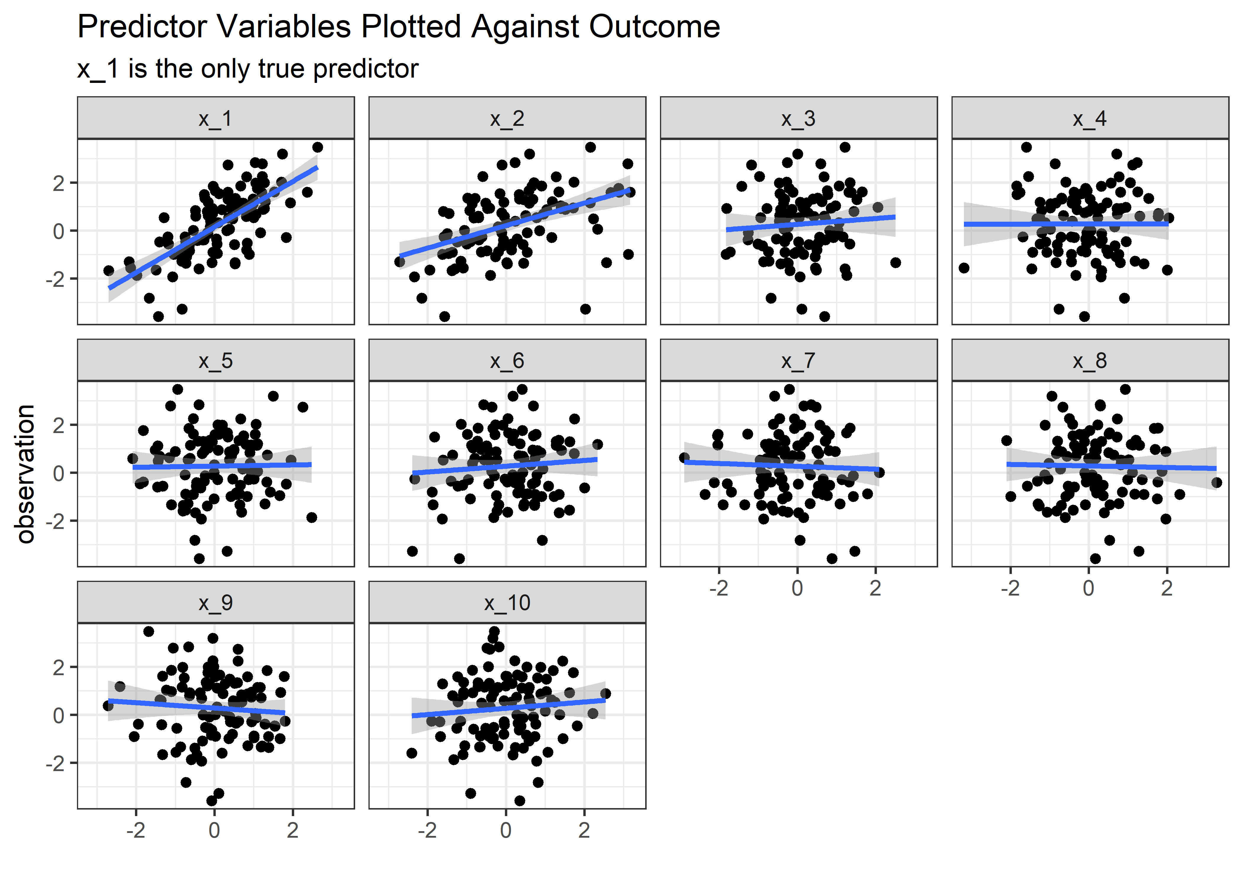
Now imagine you are the engineer who set up this experiment and you saw the above plot. The obvious thing to conclude is that both variables x_1 and x_2 are important in the outcome. If you were feeling really brash, you might say that that changing ‘x_1’ and/or ‘x_2’ cause changes in y. Let’s see if linear regression falls into this same trap.
lm(observation ~ x_1 + x_2 + x_3 + x_4 + x_5 + x_6 + x_7 + x_8 + x_9 + x_10, data = full_wide_tbl) %>%
  summary() %>%
  tidy() %>%
  mutate(across(is.numeric, round, 2)) %>%
  mutate(`significant?` = case_when(
    p.value <= .05 ~ "heck_yes",
    TRUE ~ "nope"
  )) %>%
gt()| term | estimate | std.error | statistic | p.value | significant? |
|---|---|---|---|---|---|
| (Intercept) | 0.15 | 0.10 | 1.42 | 0.16 | nope |
| x_1 | 1.04 | 0.14 | 7.62 | 0.00 | heck_yes |
| x_2 | -0.02 | 0.11 | -0.16 | 0.87 | nope |
| x_3 | -0.09 | 0.13 | -0.67 | 0.50 | nope |
| x_4 | -0.13 | 0.11 | -1.15 | 0.25 | nope |
| x_5 | 0.21 | 0.11 | 1.90 | 0.06 | nope |
| x_6 | 0.23 | 0.11 | 2.17 | 0.03 | heck_yes |
| x_7 | 0.05 | 0.11 | 0.47 | 0.64 | nope |
| x_8 | -0.06 | 0.11 | -0.59 | 0.56 | nope |
| x_9 | -0.13 | 0.11 | -1.15 | 0.25 | nope |
| x_10 | 0.19 | 0.12 | 1.66 | 0.10 | nope |
This is really pretty interesting. Not only has the model seen through our trap and ignored x_2, but it’s estimate of x_1 is quite reasonable at 1.04 (true is 1.00). Linear regression would not go report to the boss that x_2 causes the outcomes, or even that x_2 is associated with the outcome, but the naive engineer would based on the visuals! This is really nice evidence to use linear regression where some would say correlation analysis would do fine!3
But maybe this is just because we diluted the effect of x_2 too much. Perhaps if we just reduced the noise, then we could increase the correlation between x_2 and x_1 and cause the regression to think x_2 is important.
First, let’s convert our pipeline into a function that takes a noise factor as an input and spits out the table of simulated observations. Then a couple more helper functions to make the facet plot and do the inference.
sim_fcn <- function(noise) {
  betas_tbl %>%
    bind_cols(x_tbl) %>%
    slice(rep(1:n(), each = number_of_obserations)) %>%
    rowwise() %>%
    mutate(across(x_1:x_10, ~ rnorm(1, mean = 0, sd = 1))) %>%
    mutate(x_2 = x_1 + rnorm(n = 1, mean = 0, sd = noise)) %>% # control the strength of the correlation between x_1 and x_2
    mutate(
      bx_1 = b_1 * x_1,
      bx_2 = b_2 * x_2,
      bx_3 = b_3 * x_3,
      bx_4 = b_4 * x_4,
      bx_5 = b_5 * x_5,
      bx_6 = b_6 * x_6,
      bx_7 = b_7 * x_7,
      bx_8 = b_8 * x_8,
      bx_9 = b_9 * x_9,
      bx_10 = b_10 * x_10,
      resid = rnorm(1, mean = 0, sd = residual_sd)
    ) %>%
    ungroup() %>%
    mutate(observation = rowSums(select(., matches("bx|resid"))))
}

plt_fcn <- function(tbl) {
  tbl %>%
    pivot_longer(cols = x_1:x_10, names_to = "var", values_to = "val") %>%
    mutate(var = as_factor(var)) %>%
    ggplot(aes(x = val, y = observation)) +
    geom_point() +
    geom_smooth(method = "lm") +
    facet_wrap(~var) +
    labs(
      title = "Predictor Variables Plotted Against Outcome",
      subtitle = "x_1 is the only true predictor",
      x = ""
    ) +
    theme_bw()
}

inf_fcn <- function(tbl) {
  lm(observation ~ x_1 + x_2 + x_3 + x_4 + x_5 + x_6 + x_7 + x_8 + x_9 + x_10, data = tbl) %>%
    summary() %>%
    tidy() %>%
    mutate(across(is.numeric, round, 2)) %>%
    mutate(`significant?` = case_when(
      p.value <= .05 ~ "heck_yes",
      TRUE ~ "nope"
    ))
}
Sensitivity to Magnitude of Noise
With these helpers in hand, we can look at a few different scenarios for high, medium, and low noise. Another way to view this would as low, medium, and high correlation, respectively, between the true predictor x_1 and the redundant x_2.
High Noise
set.seed(1)
high_noise_tbl <- sim_fcn(noise = 2)

high_noise_tbl %>% plt_fcn()
high_noise_tbl %>% inf_fcn()## # A tibble: 11 x 6
## term estimate std.error statistic p.value `significant?`
## <chr> <dbl> <dbl> <dbl> <dbl> <chr>
## 1 (Intercept) -0.15 0.1 -1.42 0.16 nope
## 2 x_1 0.91 0.12 7.42 0 heck_yes
## 3 x_2 0.05 0.05 0.89 0.37 nope
## 4 x_3 -0.03 0.1 -0.33 0.74 nope
## 5 x_4 0.04 0.11 0.34 0.74 nope
## 6 x_5 -0.03 0.09 -0.36 0.72 nope
## 7 x_6 -0.01 0.11 -0.1 0.92 nope
## 8 x_7 -0.01 0.1 -0.09 0.93 nope
## 9 x_8 -0.03 0.1 -0.34 0.74 nope
## 10 x_9 -0.13 0.1 -1.3 0.2 nope
## 11 x_10 0.01 0.1 0.06 0.95 nopeMedium Noise
set.seed(2)
med_noise_tbl <- sim_fcn(noise = 1)

med_noise_tbl %>% plt_fcn()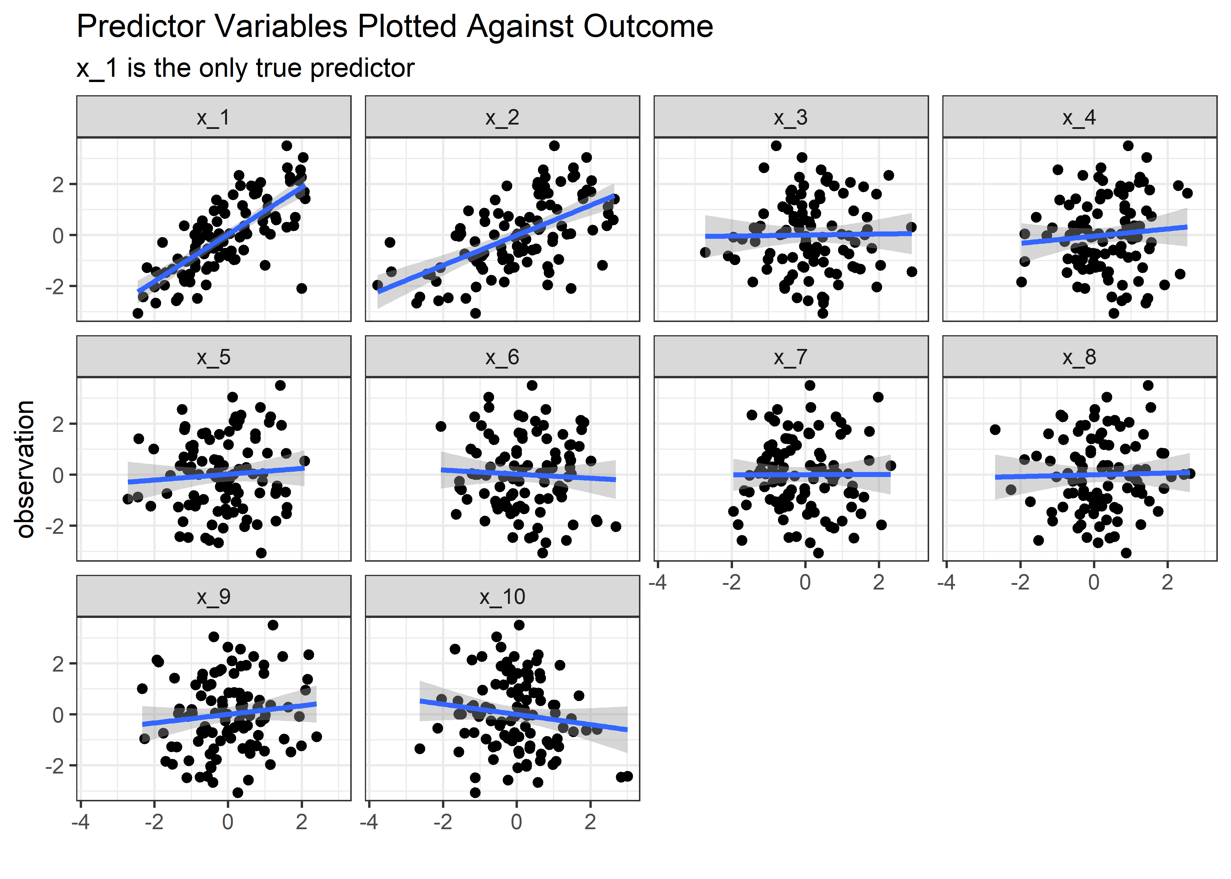
med_noise_tbl %>% inf_fcn()## # A tibble: 11 x 6
## term estimate std.error statistic p.value `significant?`
## <chr> <dbl> <dbl> <dbl> <dbl> <chr>
## 1 (Intercept) -0.07 0.11 -0.67 0.51 nope
## 2 x_1 0.84 0.13 6.55 0 heck_yes
## 3 x_2 0.12 0.1 1.15 0.25 nope
## 4 x_3 0.07 0.09 0.7 0.48 nope
## 5 x_4 0.19 0.11 1.72 0.09 nope
## 6 x_5 0.06 0.1 0.59 0.56 nope
## 7 x_6 0.02 0.1 0.21 0.83 nope
## 8 x_7 -0.05 0.1 -0.49 0.62 nope
## 9 x_8 0.19 0.1 1.86 0.07 nope
## 10 x_9 0.27 0.1 2.77 0.01 heck_yes
## 11 x_10 -0.04 0.1 -0.42 0.68 nopeLow Noise
set.seed(3)
low_noise_tbl <- sim_fcn(noise = .1)

low_noise_tbl %>% plt_fcn()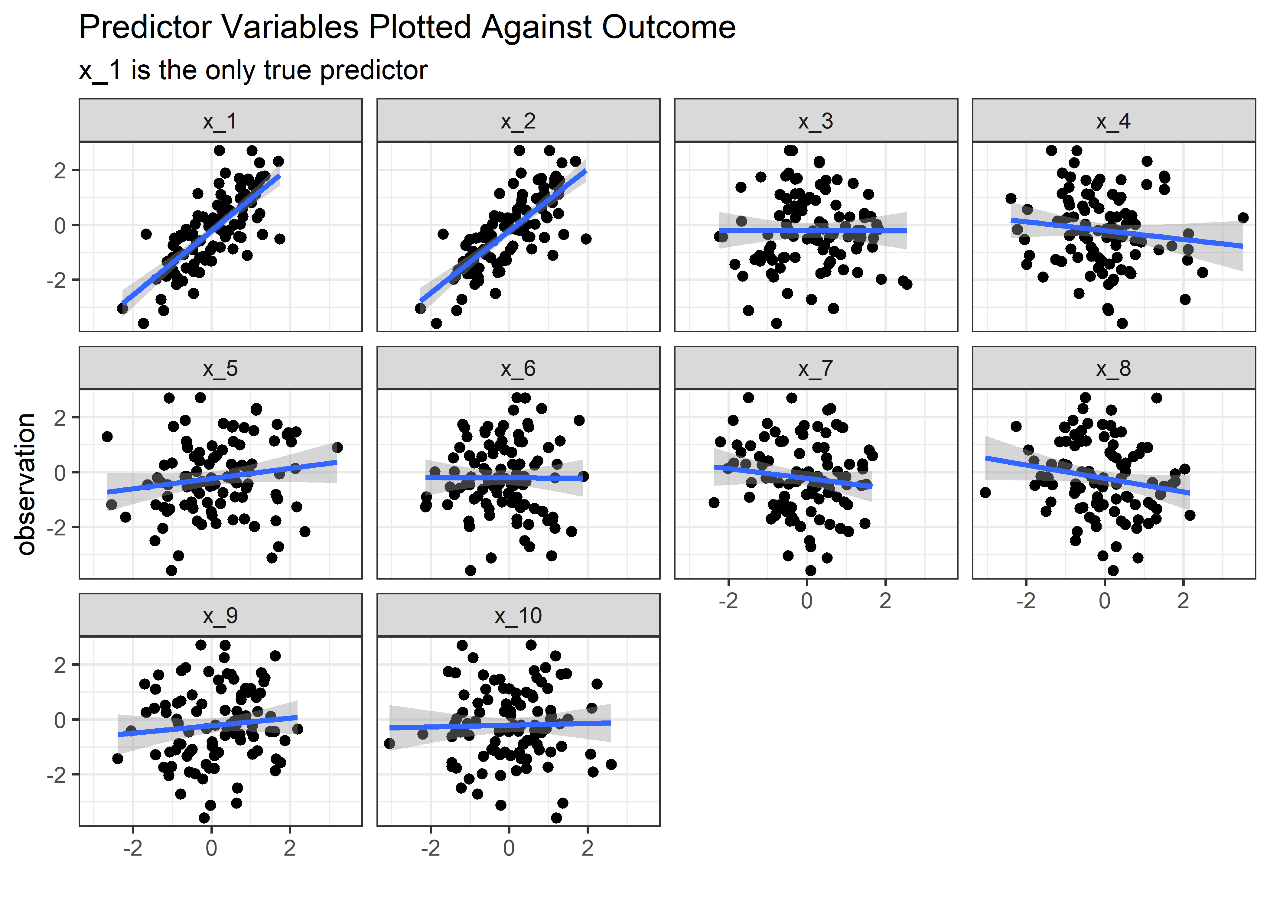
#low_noise_tbl %>% inf_fcn()Even in the low noise (large correlation) condition, the model isn’t tempted to see x_2 as important. So is there any cost to pay for leaving all correlated variables in the model? The astute observer might point out that the std. error of the estimate for \(β_1\) seems to trend upwards when the noise is low. Does this mean we are more uncertain about the estimate of the true predictor \(x_1\) when it is correlated with another predictor like \(x_2\)? Or was that just due to chance and the nature of the random draws in the simulation? After all, we only built 1 model for each scenario.
To explore this further we need a bigger experiment - or set of experiments - that looks at a range of correlation strengths between x_1 and x_2 and repeats each setting many times. This will also provide a nice opportunity to practice with nested lists, a workflow that is challenging (for me) but also elegant and powerful. Here’s how we could go about it:
- Set up a preliminary tibble as before that has columns for the betas and the x’s
- Set up a separate tibble with a list of the desired “noise”; this value is effectively the strength of the correlation between
x_1andx_2. When noise is 0, the two variables are perfectly correlated. - Use
crossing()to generate all combinations of noise with the beta’s and x’s
Set up the simulation parameters
prelim_tbl <- betas_tbl %>%
  bind_cols(x_tbl)

error_se_tbl <- tibble(
  error_sd = seq(from = 0.01, to = 3.01, by = .05)
)

setup_tbl <- prelim_tbl %>%
  crossing(error_se_tbl) %>%
  mutate(row_id = row_number()) %>%
  select(row_id, error_sd, everything())

setup_tbl %>%
gt_preview()| row_id | error_sd | b_1 | b_2 | b_3 | b_4 | b_5 | b_6 | b_7 | b_8 | b_9 | b_10 | x_1 | x_2 | x_3 | x_4 | x_5 | x_6 | x_7 | x_8 | x_9 | x_10 | |
|---|---|---|---|---|---|---|---|---|---|---|---|---|---|---|---|---|---|---|---|---|---|---|
| 1 | 1 | 0.01 | 1 | 0 | 0 | 0 | 0 | 0 | 0 | 0 | 0 | 0 | 0 | 0 | 0 | 0 | 0 | 0 | 0 | 0 | 0 | 0 |
| 2 | 2 | 0.06 | 1 | 0 | 0 | 0 | 0 | 0 | 0 | 0 | 0 | 0 | 0 | 0 | 0 | 0 | 0 | 0 | 0 | 0 | 0 | 0 |
| 3 | 3 | 0.11 | 1 | 0 | 0 | 0 | 0 | 0 | 0 | 0 | 0 | 0 | 0 | 0 | 0 | 0 | 0 | 0 | 0 | 0 | 0 | 0 |
| 4 | 4 | 0.16 | 1 | 0 | 0 | 0 | 0 | 0 | 0 | 0 | 0 | 0 | 0 | 0 | 0 | 0 | 0 | 0 | 0 | 0 | 0 | 0 |
| 5 | 5 | 0.21 | 1 | 0 | 0 | 0 | 0 | 0 | 0 | 0 | 0 | 0 | 0 | 0 | 0 | 0 | 0 | 0 | 0 | 0 | 0 | 0 |
| 6..60 | ||||||||||||||||||||||
| 61 | 61 | 3.01 | 1 | 0 | 0 | 0 | 0 | 0 | 0 | 0 | 0 | 0 | 0 | 0 | 0 | 0 | 0 | 0 | 0 | 0 | 0 | 0 |
Make Function to Generate Observations
Now we need a function that can look at each row in the setup_tbl and simulate many observations based on those setup parameters. This is basically the same thing that we did before with slice(), only now the noise variable error_sd can vary (which changes the correlation strength between x_1 and x_2.
gen_observations_fcn <- function(sd_row_number = 1, reps = 100) {
  setup_tbl %>%
    mutate(n_row = row_number()) %>%
    filter(n_row == sd_row_number) %>%
    slice(rep(1:n(), each = reps)) %>%
    mutate(n_row = row_number()) %>%
    group_by(n_row) %>%
    mutate(across(x_1:x_10, ~ rnorm(1, mean = 0, sd = 1))) %>%
    mutate(x_2 = x_1 + rnorm(n = 1, mean = 0, sd = error_sd)) %>% # control the strength of the correlation between x_1 and x_2
    mutate(
      bx_1 = b_1 * x_1,
      bx_2 = b_2 * x_2,
      bx_3 = b_3 * x_3,
      bx_4 = b_4 * x_4,
      bx_5 = b_5 * x_5,
      bx_6 = b_6 * x_6,
      bx_7 = b_7 * x_7,
      bx_8 = b_8 * x_8,
      bx_9 = b_9 * x_9,
      bx_10 = b_10 * x_10,
      resid = rnorm(1, mean = 0, sd = 1)
    ) %>%
    ungroup()
}
Use the Function in a Loop to Repeat the Simulation
Sincere apologies to the for-loop haters but I don’t currently know a more elegant way to do this part. First we establish the number of simulations we want - in this case 100 at each noise level will do fine. We then initialize a holder tibble; the data inside this one isn’t important but we want the column names to match what comes out of the simulation loop so that we can bind_rows to build out the superset of simulation data. The final step is to loop the simulation 100 times, generating 100 synthetic observations at a specified correlation each time through. Inside the loop, after the 100 observations are generated at each condition, the model is built and the coefficients, standard error, and p-values for coefficients are extracted and stored. When all is done, for every strength of correlation we should have 100 estimates based on 100 models of 100 data points generated under those specified conditions.
n_sims <- 100

# original_tbl <- tidy(summary(lm(observation ~ ., data = full_wide_tbl))) %>%
#   filter(term == "(Intercept)")

# for (i in 1:n_sims) {
#   unnested_mods_tbl <- setup_tbl %>%
#     rowwise() %>%
#     mutate(observations_tbl = map(row_id, ~ gen_observations_fcn(.x, reps = 100))) %>%
#     ungroup() %>%
#     select(observations_tbl) %>%
#     unnest() %>%
#     mutate(observation = rowSums(select(., matches("bx|resid")))) %>%
#     group_by(error_sd) %>%
#     nest() %>%
#     mutate(model = map(data, function(data) tidy(summary(lm(observation ~ x_1 + x_2 + x_3 + x_4 + x_5 + x_6 + x_7 + x_8 + x_9 + x_10, data = data))))) %>%
#     select(-data) %>%
#     unnest(model) %>%
#     filter(term == "x_1" | term == "x_2")
#
#   original_tbl <- original_tbl %>%
#     bind_rows(unnested_mods_tbl)
#
# }
Here’s what the output looks like:
cln_sim_tbl <- original_tbl %>%
  filter(term != "(Intercept)") %>%
  select(error_sd, everything())

cln_sim_tbl %>%
gt_preview()| error_sd | term | estimate | std.error | statistic | p.value | |
|---|---|---|---|---|---|---|
| 1 | 0.01 | x_1 | 7.96513254 | 12.8959803 | 0.6176446 | 0.53838682 |
| 2 | 0.01 | x_2 | -7.14281172 | 12.9118544 | -0.5531980 | 0.58151483 |
| 3 | 0.06 | x_1 | 3.31952029 | 1.6226721 | 2.0457124 | 0.04373651 |
| 4 | 0.06 | x_2 | -2.34648487 | 1.6284278 | -1.4409511 | 0.15310755 |
| 5 | 0.11 | x_1 | -0.17504497 | 0.8655740 | -0.2022299 | 0.84019853 |
| 6..12199 | ||||||
| 12200 | 3.01 | x_2 | 0.01955293 | 0.0411947 | 0.4746467 | 0.63620143 |
Now we can visualize what happens to the coefficient estimates, their standard errors, and the p-values as the correlation between x_1 and x_2 changes in strength. First, let’s look at the estimates for the coefficients.
cln_sim_tbl %>%
  ggplot(aes(x = estimate, y = error_sd)) +
  geom_jitter(aes(color = term), alpha = .4, height = .05) +
  xlim(c(-4, 4)) +
  geom_vline(xintercept = 1, linetype = 2) +
  geom_vline(xintercept = 0, linetype = 2) +
  coord_flip() +
  theme_bw() +
  scale_color_manual(values = c("purple", "limegreen")) +
  theme(legend.title = element_blank()) +
  labs(
    y = "SD of Random Noise in Relationship Between x_1 and x_2",
    x = "Estimate of Beta Coefficient",
    title = "Variable Correlation Strength vs. Coefficient Estimates",
    subtitle = "True Values are x_1 = 1, x_2 = 0",
    caption = "Lower Noise is Higher Correlation"
  )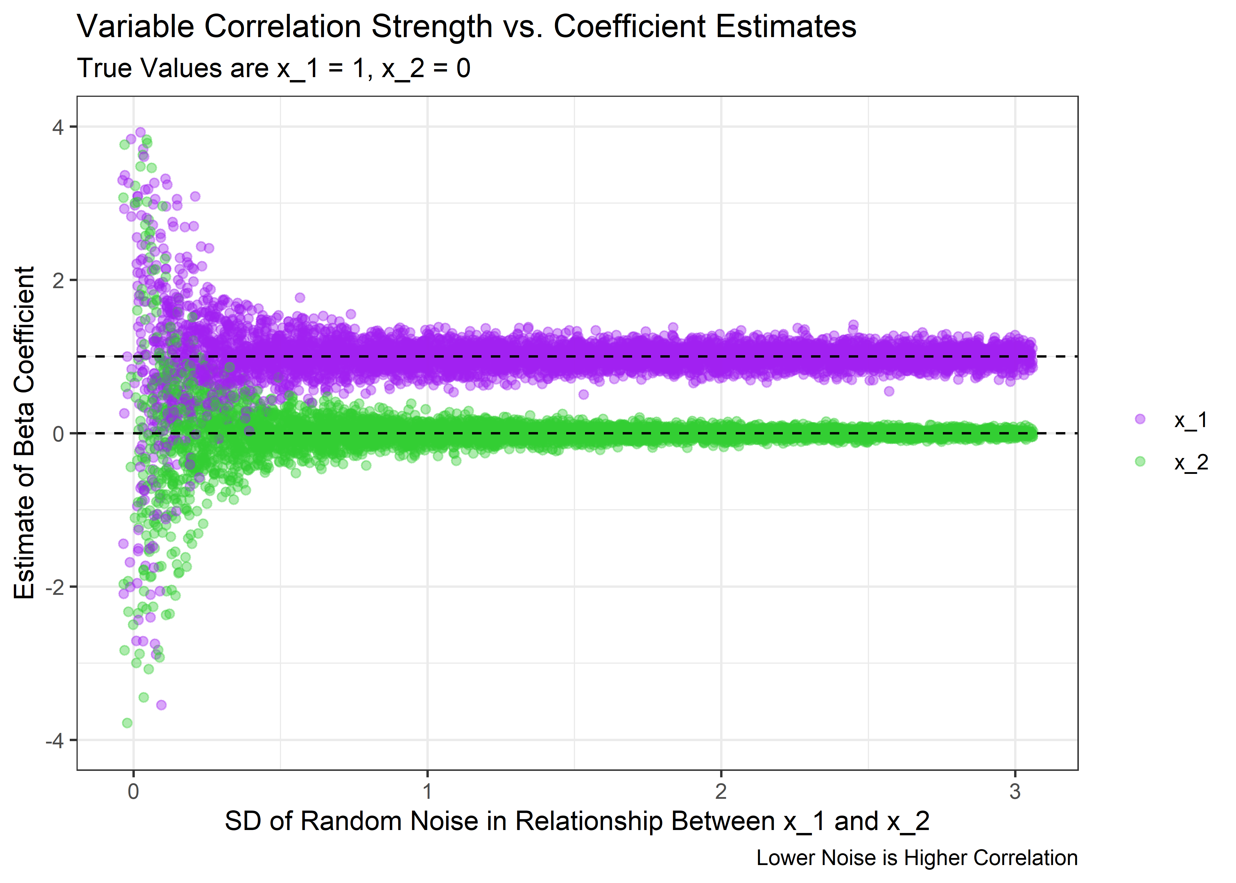
The above plot shows that we can indeed trick the model. When the correlation is high enough, the spread of the coefficient estimates get very wide. Even though on average the estimate is still correct, the model is very uncertain about the value for any particular experiment and will occasionally think that x_2 has a large estimated coefficient. And we usually only get to run 1 experiment in real life.
Based on these data, we should expect to see the standard error of the estimate to grow large at high correlation. Let’s see if that’s true:
cln_sim_tbl %>%
  #  mutate(error_sd = as_factor(error_sd)) %>%
  ggplot(aes(x = std.error, y = error_sd)) +
  geom_jitter(aes(color = term), alpha = .4, height = .05) +
  xlim(c(0, 1.2)) +
  coord_flip() +
  theme_bw() +
  scale_color_manual(values = c("purple", "limegreen")) +
  theme(legend.title = element_blank()) +
  labs(
    y = "SD of Random Noise in Relationship Between x_1 and x_2",
    x = "Standard Error of Coefficient Estimate",
    title = "Variable Correlation Strength vs. Standard Error of Coefficient Estimates",
    caption = "Lower Noise is Higher Correlation"
  )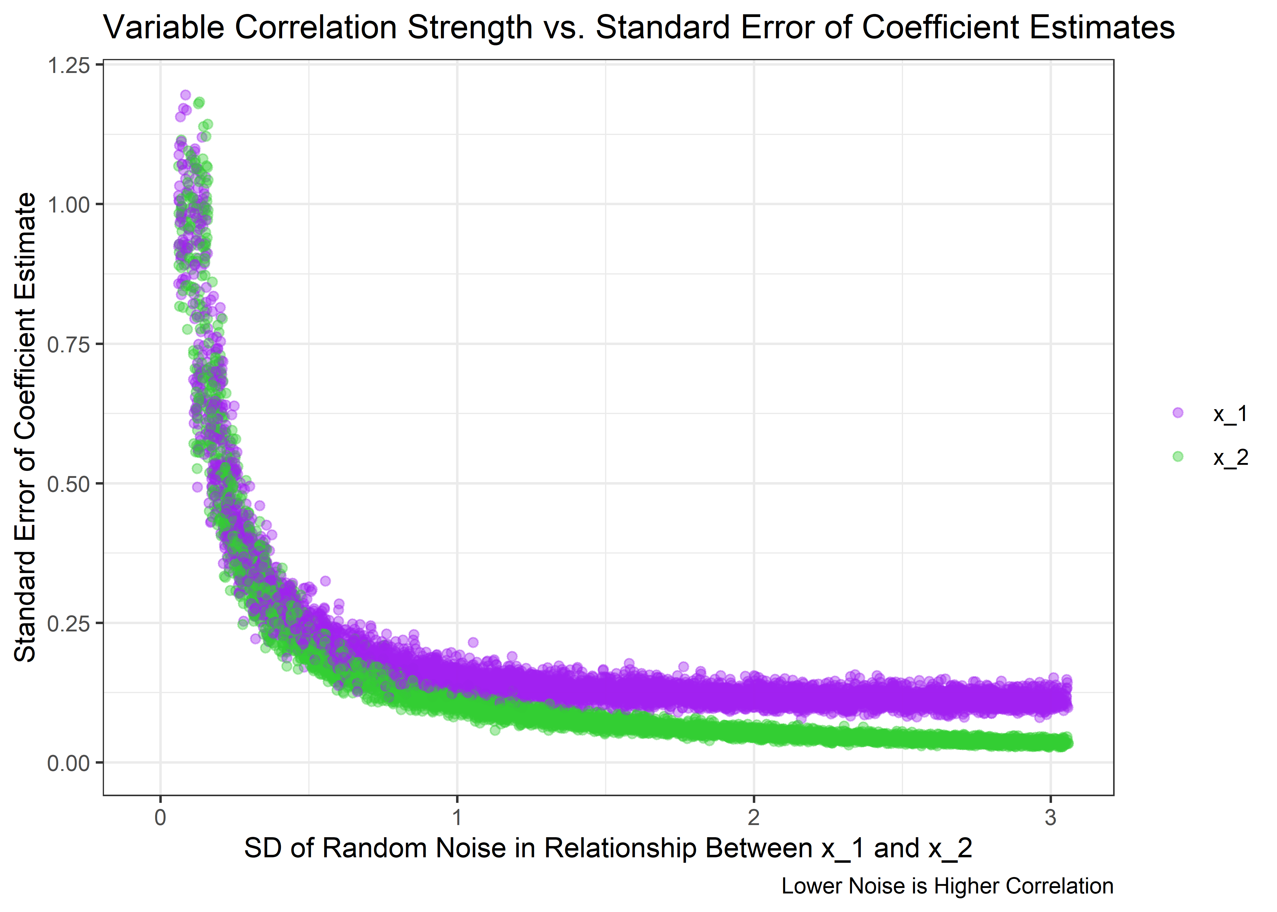
Just as expected - the uncertainty in the estimates spikes as the correlation between x_1 and x_2 approaches 1. But what happens to the p-values of the coefficients for each variable?
cln_sim_tbl %>%
  #  mutate(error_sd = as_factor(error_sd)) %>%
  ggplot(aes(x = p.value, y = error_sd)) +
  geom_jitter(aes(color = term), alpha = .5, height = .05) +
  geom_vline(xintercept = .05, linetype = 2, size = 1.3, alpha = .7) +
  coord_flip() +
  theme_bw() +
  scale_color_manual(values = c("purple", "limegreen")) +
  theme(legend.title = element_blank()) +
  labs(
    y = "SD of Random Noise in Relationship Between x_1 and x_2",
    x = "P-Value for Coefficient Estimate",
    title = "Variable Correlation Strength vs. P-Values for Coefficient Estimates",
    subtitle = "dotted line shows p = .05",
    caption = "Lower Noise is Higher Correlation"
  )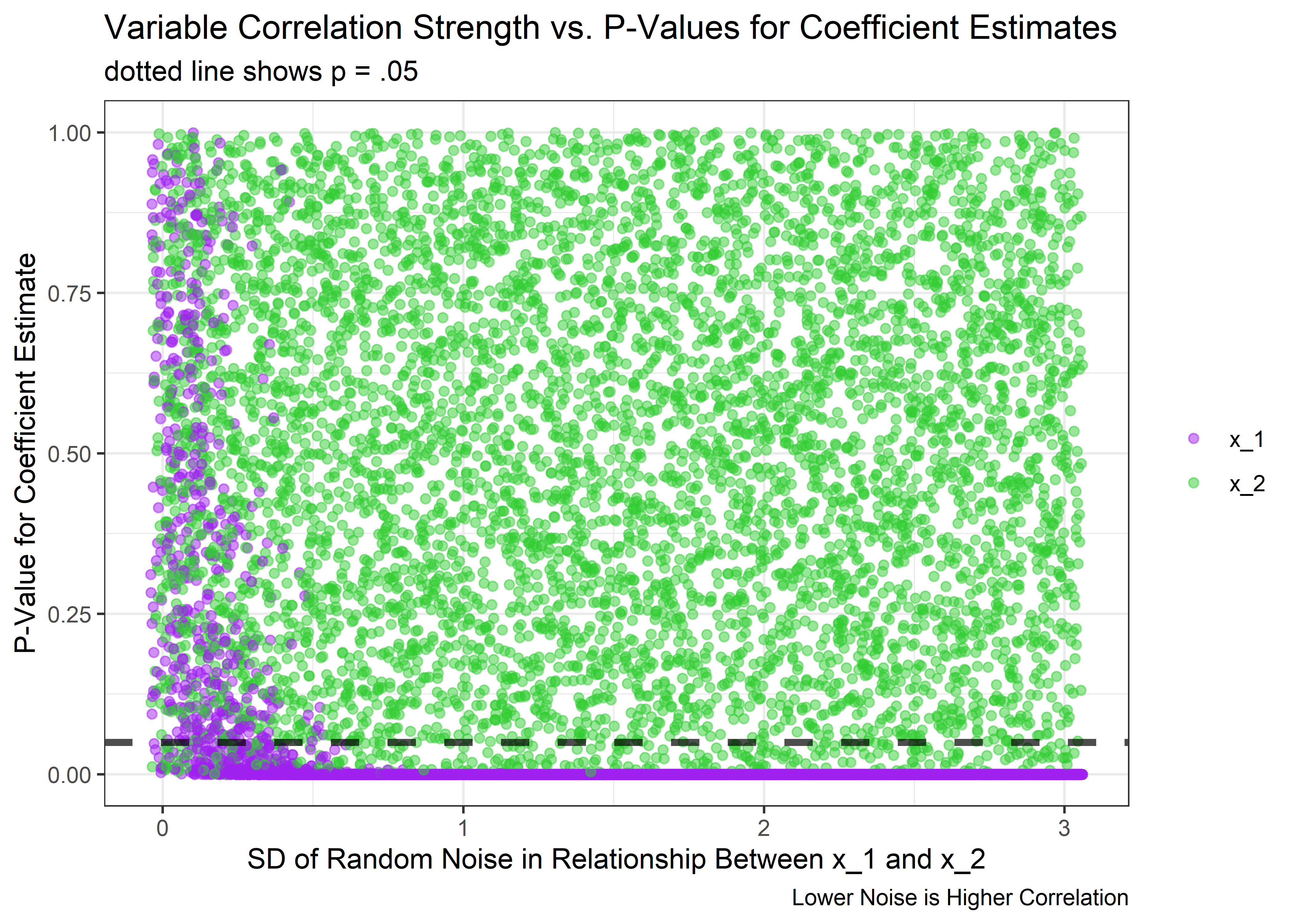
Yep - as noise goes to 0 and the correlation approaches 1, the p-values get very unstable and the true effect of x_1 can no longer be detected consistent relative to the null. But the good news is that as long as the correlation isn’t close to perfect, the model does its job quite well and the p-values for a true effect dive near 0.
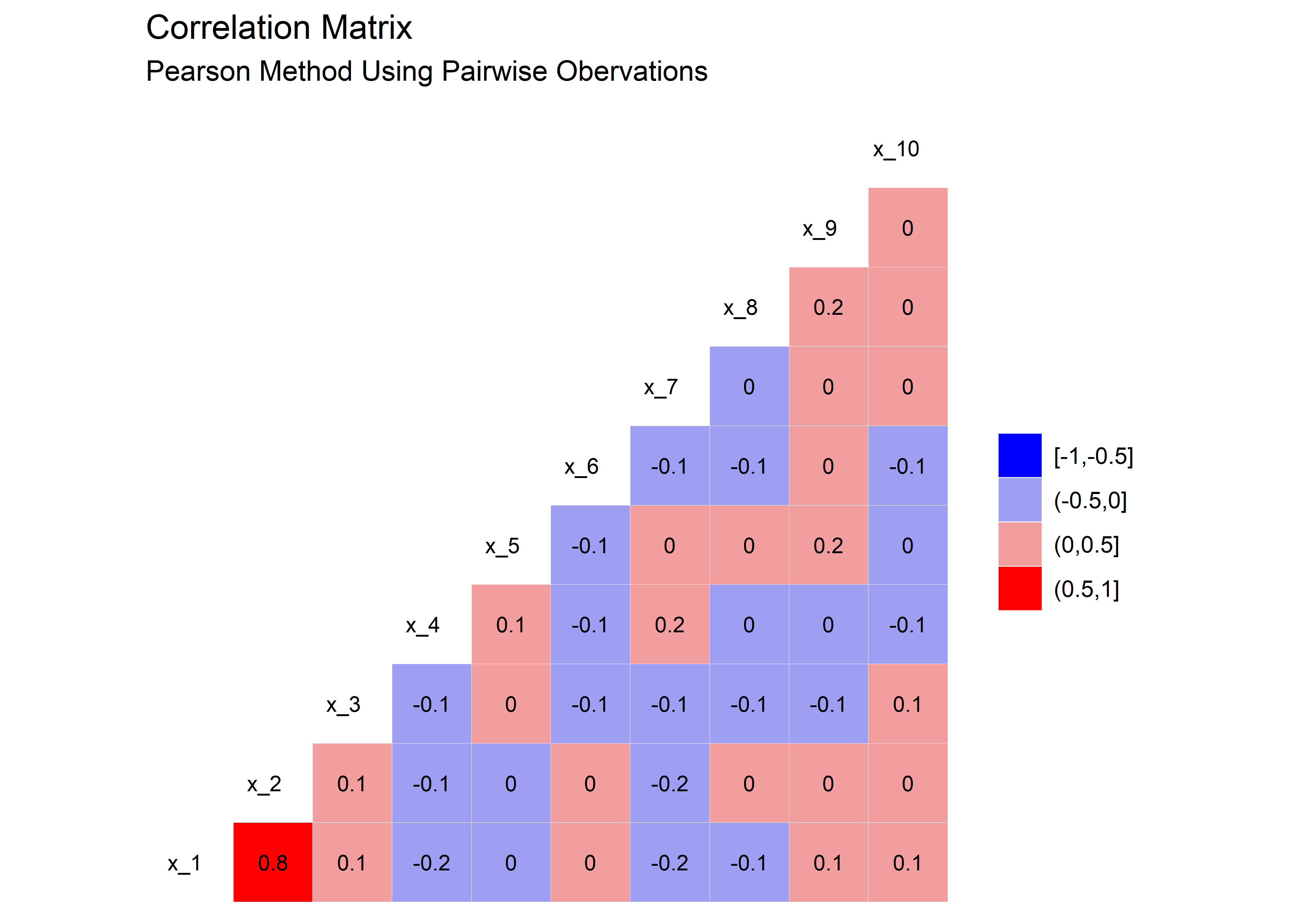
Just to drive the point home, we could look at the actual correlation coefficients between x_1 and x_2 at the point that things start to go unstable. From the above plot, it looks like the model starts to get confused at the time the the noise is around 0.6. We can use our helper function from before to quickly make a single dataset at that noise level and then evaluate the correlation of x_1 and x_2 in that set:
unstable_tbl <- sim_fcn(noise = 0.6)Here’s the correlation plot. We see that in this case, a correlation of around 0.8 is where things start to go unstable with the estimates.
unstable_tbl %>%
  select(x_1:x_10) %>%
  ggcorr(
  high = "red",
  low = "blue",
  label = TRUE,
  hjust = .75,
  size = 3,
  label_size = 3,
  nbreaks = 4
) +
  labs(
    title = "Correlation Matrix",
    subtitle = "Pearson Method Using Pairwise Obervations"
  )
Here’s the variables plotted against the observation for the above scenario, with x_1 and x_2 correlated with each other at a 0.8 level.
unstable_tbl %>% plt_fcn()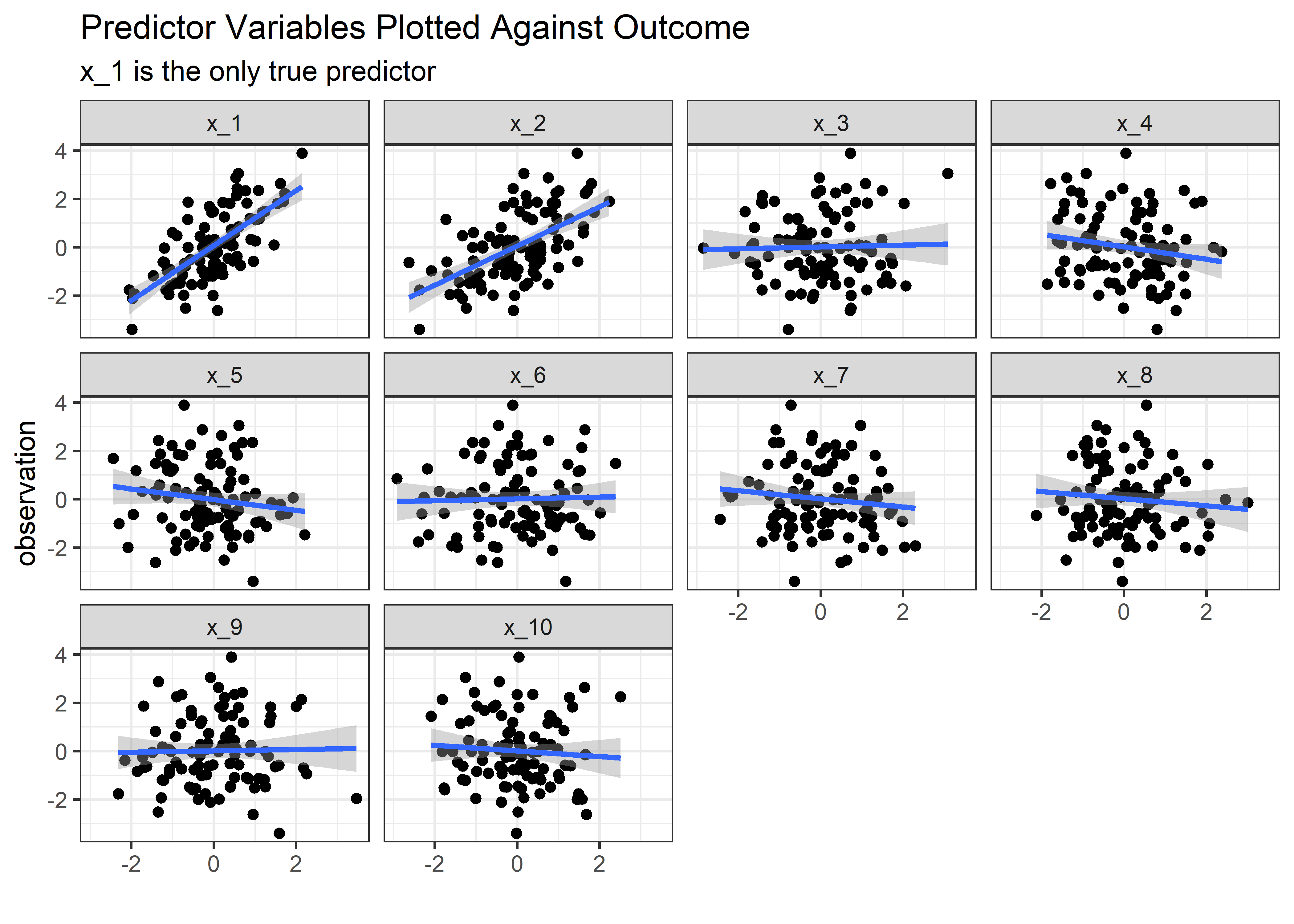
In the end, we found out that we can trick the linear regression model, just not in the way we expected. We were never really able to get the model to think that x_2 was important but we were able to make it uncertain about x_1. The average coefficient estimate remains stable even in the presence of highly correlated predictors, but it’s the uncertainty about the estimates that pays the price for correlated variables. So should we just leave them all in? Like most things in statistics - it depends on the purpose of the model!
Thank you for following along with this post if you’ve made it this far. If you prefer learning concepts from mathematical principles rather than simulation, please refer to this response on Cross Validated for some explanation of the the bahavior we just saw. You could check out variance inflation factor which is the same idea presented a different way.
Session Info
sessionInfo()## R version 4.0.3 (2020-10-10)
## Platform: x86_64-w64-mingw32/x64 (64-bit)
## Running under: Windows 10 x64 (build 18363)
##
## Matrix products: default
##
## locale:
## [1] LC_COLLATE=English_United States.1252
## [2] LC_CTYPE=English_United States.1252
## [3] LC_MONETARY=English_United States.1252
## [4] LC_NUMERIC=C
## [5] LC_TIME=English_United States.1252
##
## attached base packages:
## [1] stats graphics grDevices utils datasets methods base
##
## other attached packages:
## [1] GGally_2.0.0 gt_0.2.2 broom_0.7.8 here_1.0.0
## [5] forcats_0.5.0 stringr_1.4.0 dplyr_1.0.7 purrr_0.3.4
## [9] readr_1.4.0 tidyr_1.1.3 tibble_3.1.4 ggplot2_3.3.5
## [13] tidyverse_1.3.0
##
## loaded via a namespace (and not attached):
## [1] Rcpp_1.0.7 lattice_0.20-41 lubridate_1.7.9.2 assertthat_0.2.1
## [5] rprojroot_2.0.2 digest_0.6.28 utf8_1.2.2 plyr_1.8.6
## [9] R6_2.5.1 cellranger_1.1.0 backports_1.2.0 reprex_0.3.0
## [13] evaluate_0.14 highr_0.9 httr_1.4.2 blogdown_0.15
## [17] pillar_1.6.2 rlang_0.4.11 readxl_1.3.1 rstudioapi_0.13
## [21] jquerylib_0.1.4 Matrix_1.2-18 checkmate_2.0.0 rmarkdown_2.11
## [25] labeling_0.4.2 splines_4.0.3 munsell_0.5.0 compiler_4.0.3
## [29] modelr_0.1.8 xfun_0.26 pkgconfig_2.0.3 mgcv_1.8-33
## [33] htmltools_0.5.2 tidyselect_1.1.1 bookdown_0.21 reshape_0.8.8
## [37] fansi_0.5.0 crayon_1.4.1 dbplyr_2.0.0 withr_2.4.2
## [41] grid_4.0.3 nlme_3.1-150 jsonlite_1.7.2 gtable_0.3.0
## [45] lifecycle_1.0.1 DBI_1.1.0 magrittr_2.0.1 scales_1.1.1
## [49] cli_3.0.1 stringi_1.7.4 farver_2.1.0 fs_1.5.0
## [53] xml2_1.3.2 bslib_0.3.0 ellipsis_0.3.2 generics_0.1.0
## [57] vctrs_0.3.8 RColorBrewer_1.1-2 tools_4.0.3 glue_1.4.2
## [61] hms_0.5.3 fastmap_1.1.0 yaml_2.2.1 colorspace_2.0-2
## [65] rvest_0.3.6 knitr_1.34 haven_2.3.1 sass_0.4.0This is a straight copy-paste job from the mathy explanation on Wikipedia here: https://en.wikipedia.org/wiki/Linear_regression#Simple_and_multiple_linear_regression↩︎
Note that this structure for the simulation is perhaps a bit verbose and potentially not optimized for speed, but given that the purpose is to explore and understand, I prefer to make things more readable and easily observed at the expense of speed and length↩︎
On a side note, we see that just by chance
x_6was flagged as statistically significant. This would be expected to happen 1 out of 20 times and should be another consideration when selecting variables for a model, but isn’t the main point of this post so we’ll set that aside for now.↩︎